Whew! Wedding fever is over, and I’ve gotta tell you, I’m a little sick of white and lace and really sick of the news over-analyzing every single aspect of the royal wedding.
So lets move away from weddings and fancy dresses and look at something fresh and new and spring-green-y (or, possibly, dowdy and old and grandma-print floral, depending on how you feel about it.)
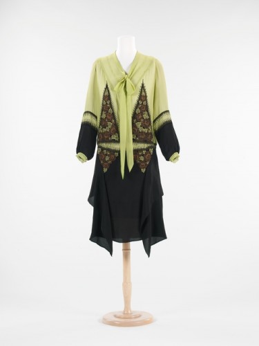
This week’s dress is a modest afternoon dress from 1928. It’s an unusual colour combination, and a very typically non-body conscious 1920s cut, with touches like the pussy-bow collar which anticipate 1930s fashions.
I’ve only ever presented one proper 1920s designs in my ‘Rate the Dress’, so I’m very interested to see how the decade fares in a wider scope.
Rate the Dress on a scale of 1 to 10


This is really weird yet I like it. There is a very delicate balance going on in design, texture and color. Example, some would find the green hideous yet the black and orange helps tone it down.
9/10
Hmm.
I really don’t know. For some reason, this dress just confuses me. 😀
I don’t like the length at all, but I do like the colors and neckline with the bow. I also am not too crazy about the triangles in it… it almost verges on being Halloweenish, in my opinion.
3/10 (I really hate the length!)
really like it…the inset goring, the contrast between solids and florals. Totally unique. 8.5
I like the color scheme, but the dress is altogether too weird for me. I would never wear it.
5/10
Adorable! It is a 1920’s dress that doesn’t look like a potato sack! The insets give it shape and form it doesn’t otherwise have. I am not sure I’d put spring green with black but being a quilter I can see how the inset pattern has been picked up in this combo.
It saves my least favourite era of 1920’s clothing, and for that I think it rocks!
10/10
I don’t really like this one. On one hand, I do think the green/black color combo is interesting and I do like the detail on the sleeves. Even the bow around the neck is tolerable (usually I hate these, but it looks ok here). But I don’t like the way the extra fabric hangs on the skirt – it just looks like they bought too much fabric and wanted to use it all. I also really really dislike the floral on the top. With the triangular design and the green bit in the middle it really looks like some sort of odd monster is getting ready to eat you. I think this dress had the potential to be stylish, but the floral fabric and weird patterns make the design confusing.
3/10
Oh I just followed its link to the museum website so I could blow it up and really see the details, and now I want to give it a 17!! And I want one!
It’s interesting, and I like the green colour, but the cut is horrible. 1920s dresses could be very elegant, but this one just looks like a dowdy, frumpy sack. I’m not crazy about the grandma’s couch floral print either.
1/10
Just … no. 0/10. Every possible redeeming feature has a counter-redeeming feature that serves to negate it.
10/10. This is fantastic, details upon details- it’s so interesting and quirky, I’d wear that.
I…I…I don’t like it…urrr, nice cut but the colors, blah! I give it a 2
I just love the 1920s, and it probably has a lot to do with the fact that I can see my body type doing really well in that decade. Of course, with that said, I can just imagine how big my hips would look with those insets. I know! So shallow! Whatevs, 6/10.
PS I love the mint-chocolate chip colors and the cut.
Clothes from this era are great but not usually on me. So often, I view them with mixed yearning and frustration. However, this one I could wear and it would probably look great. I checked it out up close too. I like the diversity of design elements they look balanced and really work well together. I love the cleverly combined colours and inserts. They save it from being yet another beige sack that only a pencil could look good in. It has a definate feel of the clever way the Japanese work with colour and pattern. Not for everyone but definately for me 10/10. I’d wear or own it in a second!
I love how you put how our perceptions are shaded by how we think we’ll look! It’s EXACTLY how I feel about the Directoire/Regency period! Well said!
Thanks Elise, I just can’t help being affected by the look aspect, as it is a major part of why I do this – to dress up and have fun with my lovely friends. I am entirely a big kid at heart and my dress up box could never be too big or varied. There are whole colour ranges and periods of fashion that I really like but just know it is nigh on impossible to do it justice. Well fortunately there are plenty more I like that suit me fine, so I’m never going to run out of opportunities. I really enjoy reading the comments of all the contributors and it still amazes me how we all see things so differently. And it is just as well we all do or the world be full of one style, one fabric…..now wouldn’t that be dull?
It is very fun to read all of the opinions, and I’ve especially liked yours, and Mrs. C. Way better than work. How lucky for you to have a lovely time with lovely friends and lovely dresses!
I think that the floral insets on the torso are ugly, but otherwise I rather like the dress. A 7.5.
This is a hard one to rate. I get the feeling that the dress would look beautiful in motion… and I can see a very beautiful woman wearing it, but then a beautiful woman could make a sack look good. I have reservations but I am putting them aside , it would look horrid on me (perhaps thats my main reservation), but I am rating the dress not me so I give it 9 out of 10.
I love the idea of it. I’m not sure I love the actual piece.
I love the geometricity and the fluidity and the green with black. I love the overall style (it helps that one of my favourite Czech TV series was set in that era…) I even like the idea of tying the two colours in with the print.
I’m not sure I like the print itself – although it looks better up close. In fact, it looks like it’s not actually a separate piece of fabric, so maybe embroidery on the black?!? – there’s no seam visible when I zoom at the skirt at the MET site.
And I’m quite sure I don’t like the spiky trim or what it is running around the geometrical shapes at the bust. It would look better left just geometrical, in that particular place. Or set off by a strip of black only.
Overall, 7,5, because I mostly love it and clearly see how I could love it more. Which means it’s not that bad.
First time commenter.
I really like this dress, the color combo is fantastic, The cut is interesting, and the floral print adds a nice touch of orange without making the dress to “halloween” looking.
The spiky stitching around the floral bits and on the sleeves is really the icing on the cake, adding to the overall whimsical appearance of the dress without making it to fiddly.
I’d give it a 10/10, but I might be biased because of my love for anything 1920’s
It seems like it’s trying to be “pretty-ugly” but it’s not quite making the “pretty” part. Also, the waist looks like a toothy mouth that’s going to devour me. 4/10