Last week’s St Patrick’s themed dress elicited some strong reactions. Some love, some loathing, and a lot of “Well, the skirt is great, but that bodice…ewww” and “I love the bodice…but the skirt is just OTT.” The dress needed to be cut in half! The divided opinions cut the rating to 7.4 out of 10 – not quite a pot of gold, but at least the shine didn’t completely disappear like leprechaun gold.
This week I’m leaving behind naturalism and historicism, and looking at geometry, and cutting edge design.
Well, cutting edge for 1840:
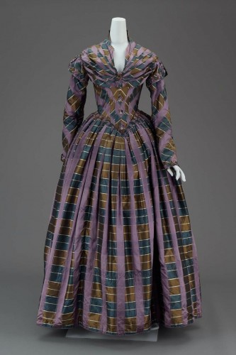
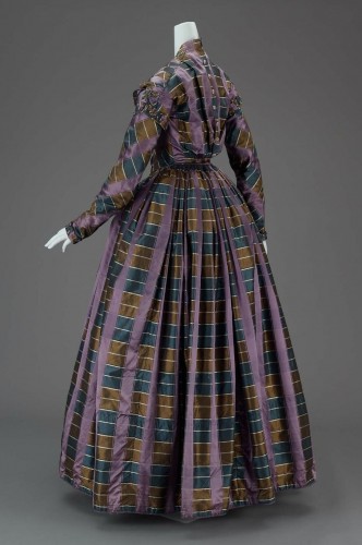
The skirt pleating, the bias cutting of the bodice, the elaborate pleated bertha, the wrapped sleeves, the buttons: every element of the dress shows off the distinctively unusual eggplant, mallard blue and mustard plaid.
What do you think? Does the unusual almost-plaid work? Does the drape of the dress work? Or is it all just a bit too weird and strange and experiemental?
Rate the Dress on a Scale of 1 to 10


I don’t know much about the period, so my opinion is very subjective. I like the cut, but the print? The combination of colours is not my cup of tea. Also with the stripes going in many different directions on the bodice and sleeves it looks very ‘busy’ to me. (On the other hand, the sleeves on itself are quite fun with the stripes.) I have the feeling this could be a lot prettier when a different fabric would be used.
I give it a 6/10.
I agree with Stephanie on this. I love the cut, but the print, not so much. I think if the maker took more time to try and match the plaid in the front sections, it would look more uniform and clean all the way around. I love the wrapped sleeves, though.
I give it 7/10
Wow, that dress is, well… Sort of cool. I love all the details, especially the wrap sleeves and bodice as well as bertha. Do you have any idea how to make those wrap sleeves?
Over all, I would rate the dress a 5 out of 10, for the details, but NOT the color. Bleh!
8/10
I like very much the shape !
Those colors may have been for an older lady ? Less colors ? In France violet was used after black when mourning.
I don’t like the showl effect on the shoulder, and vertical and horizontal lines together make something strange to my eyes.
I’m normally not a fan of plaids, but I love how the grain is used and manipulated here, and how the pattern highlights rather than obscures the clever construction. The eggplant color is totally my cup of tea, the mustard yelllow not so much, but all three colors together make for a very striking combination.
And the more I look at it, the more I discover just how genius it is. Truly a case of more than meets the eye. 10/10
I really like it! Well if you look at it from the 21st century it’s actually awful, but the busy-ness of the fabric is very typical I think of the times and I would be more than happy to walk out in this one (in 1840)… with matching bonnet? Or perhaps that would be too much even for then, ok with a plain(er) bonnet. The shaping certainly would make the waist appear nice and small even if it isn’t and the skirt hides a million personal flaws while not being too huge. I give it a good 9 out of 10 – it loses a point for the pleated bit at the back.
Well now, at first glance I thought, oh dear; ohhh dearrr. On second glance I thought, huh, pretty interesting. On third glance, I liked it, and now, I like it a great deal. The colors are muted and fit the period, and the use of self fabric to create the bulk of the effect, again, very much of the period and in this case, real genius. I could defintely see walking out in this one.
If anyone has seen Julia Roberts in the latest Vanity Fair magazine, in a gauzy blue and white dress which depends on similar geometrics for its effect, the idea is very similar and again, genius.
9 out of 10.
Can I call colors from 1840 trendy? My point is that they look like they belong in the catalogue for Pottery Barn–maybe on a throw-pillow? But I like the dress, I like how impressive the tailoring is done to make the shapes work for the body. I like the vertical lines it makes by pleating. The whole thing sort of winks at you! 8/10
Oh my god, that is the UGLIEST fabric I have ever seen! I do like most of the design elements, especially the way the bertha shapes the neckline – but it’s really hard too look past the monstrosity that this fabric. And as a general rule it’s best to only do one weird thing at a time, sometimes it will work and sometimes it won’t. 5/10
I adore the fabric 🙂
Overall it is sort of meh for me. I like the colors, but together they are maybe just a bit too drab. And the style of the dress is fine, but not exciting. Though there is nothing that I particularly dislike either. Overall it is just ok.
5/10
I had to look at this a couple times before I could comment. I have to say, I rather like it – of course this could be due to love of plaid. The bodice is incredibly clever and I love the distinctions in the skirt.
Overall, 8.5/10
Em
When I first had came over the first chock I think the dress is quite beautiful. The fabric is really crazy but I think the dress have great cuts.
6/10
When I first had came over the first chock I think the dress is quite beautiful. The fabric is really crazy but I think the dress have great cuts.
7/10
It is weird and strange and experimental, but I like weird and strange and experimental. I love the geometric effect. 9/10 from me.
The shape and silhouette are lovely, but the color scheme is a bit, uh, well, ugly. Horrendous, even. Sorry.
I couldn’t do better than a 3/10
I really like how the patteren is laid out, especially across the bodice, very flattering I imagine, but the fabric is just… odd. I say 4.5/10.
i like it ! it’s interesting, the stripes on stripes, plus the way the fabric has been sewn. neat = )
10/10
I like it. Pleasing shape, interesting fabric. Lots of thought and skill gone into this. The wee cap sleeves over the fitting 0n-the-cross sleeves are most pleasing. I like that pleating and angling on the front, and the simpler buttoned back.
9/10
I’m far from an 1840s expert, but based on what I already know of that period’s fashion (and don’t particularly care for!), I do like this dress! I’d give it an 8 out of 10.
Hm… It’s rather neat, actually. The person who cut out the pieces did a great job planning. I can’t say I’m a fan of the colors though, so that lowers the score. In particular, that odd shade of brown just doesn’t do it for me. 8.5 out of 10 (and if the pattern wasn’t done so well it would be a 4 out of 10 because the silhouette is so 1840s).
Good shape, LOVE the bias cutting -it makes the dress very structured, even with the busy print. And I’m totally in love with the sleeves on the bias. This gown has fixed all the things I usually dislike with this time period, and I’d wear it in a heartbeat.
9/10
I love the cut of the dress; the folded, bertha-like collar, the close fit of the bodice paired with simple, close-fitting sleeves. But the color scheme is too weird and drab, and the odd stripe-with-plaid effect of the fabric is too strange to be pretty. I’ll give it a 6, and if I had a pattern for the dress, I’d make one up for myself in a pretty solid color.
I love the shape of that dress, but the fabric is another story altogether. It would be amazing if it were all eggplant or a striped pattern (kind of how it looks in the front where the eggplant is inside the pleats). I’m afraid that is all I can think to say on this one.
Nine out of ten.
A beautiful and memorable dress. Love the statement. Not colors I would think of putting together but the effect is quite stunning.
10
I LOVE it! But then, I love purple and 1800’s styles…so this combined both! I would totally wear it! Needs a matching bonnet, and maybe a reticule.
I like the cut of the dress but the fabric is rather dark and drab. I don’t like the combination of colors. I give it a 3 out of 10.
I think the dressmaker did an amazing job of using this fabric, and I love the shape and cut. I think it is clever and racy given it’s a very covered up dress in a drab colour scheme. It’s more than the sum of its parts to me. 8.5/10
I wish we could rate the fabric choice separately from the cutting of the gown! Because then I could give a 2/10 and a 10/10, respectively. I guess that makes for a very boring and not at all indicative total score of 6/10.
So you like the cut, but not the fabric?
I find both the fabric and cut to be beautiful! I think someone wearing that dress in 1840 would have been quite the envy of the day. A 9 to me.
I luuuuuuuurve this! I frickin’ ADORE plaid, but this is , by far, one of the coolest ways I’ve seen of displaying it. I want it as a skirt!
10/10
This is the second ugliest Victorian plaid I’ve seen. The ugliest made me scream, prompting my sweetie to ask “what?” at which time I turned my screen for him to see, and then he screamed. (True story.). I want to give it a few points for the cleverly tucked collar and the interesting spiral effect that the cut of the sleeves gives to those stripes. It’s a classic yet unique 1840s cut. But that fabric is so terrible I’m still giving it a 1. In a simple two-tone broad stripe it would be just so beautiful.
I love the cut. I love the plaid pattern. With the cut and plaid you would end up looking seriously thin waisted in it and it would help the girl who wanted a bigger bosum. But the colors are kaka. 8/10
I like this quite a bit, particularly the geometric ways the plad works with the pleating.
In some ways, I like that it isn’t over the top – bright colors could easily make this look like a circus outfit. On the other hand, it’s just a little too dreary to get a really exceptional rating.
8/10
The back is a bit funky. I would have made it smooth. Otherwise perfect. 9.5/10
Without reading any of the comments, and bearing in mind that usually I love purple…. I am going to have to say “Urk.” The colour combination here is grim. Brown and blue, yes, all OK – even if the brown is a bit unfortunately scatological, but to whack wide purple stripes on top of it all – yeeechh…. Plus, the business of the fussy pelerine/capelet – no, it’s not helping. I like how it’s cut and in other colours it would probably be a wow, but… I am sorry, it makes me dry-heave, much as I appreciate it as a dress of its period.
I am forced to give it 2/10 – a point for nice cutting, but that fabric/colourway in this dress is an unforgivable combination.
Wow, I’m quite in the minority here… Never mind, I’m going back to look at the green and gold Lanvin trouser-dress that very few people liked but that I loved. 😉
I was otherwise distracted so missed commenting yesterday, but I’m utterly impressed at the tailoring of this dress-except for the back, Anna’s right about that, it should be smooth. the cut is simply amazing, and each of the details is a little gift. but the plaid! I love purple, but I do not like the plaid. the color combo. isn’t particularly good, and the lines draw your eyes in five different directions at once, which hurts! I give cudo’s for the sleeves. they are among the hardest sewing tricks to do, lining them up is like catching greased pigs, they’d rather do anything else. and a slippery fabric like silk doesn’t make it any easier. so I’m uber impressed with the seamstress’s sewing skills, and with how they worked the plaid, but not impressed with the fabric itself. come to think of it, that’s the color and shade of my brother’s plaid shirts from the ’50’s (and some of it came back into style in the early 2000’s), so it’s a little masculine to me. a more feminine color might be, well, lighter, at least? more pastel. and yes, it needs a hat, though I’m torn between a simple snood or something as bold as the dress…
I would give it a 9 or 9.5 if it weren’t for the cut of the bodice – I never like that cut. I prefer either smooth all over or the gathered front. Everything else is wonderful, though, so 8/10.
I love the cut but I don’t like the color combo, and the way the sleeves aren’t fitted at the cuff (although that might just be the mannequin). 6.5/10
I love all those colors. Just not at the same time. Together, they look just awful. Sorry, dress–the cut is fine, and you get props for the interesting use of the pattern on the sleeves and bodice. I just can’t get over how awful the colors look together–clashy and yet fusty and boring at the same time. A 4/10.
It feels like a beetle to me, in both a good and bad way, but mostly bad, sadly… 4/40
Ooops, that was meant to be 4/10, not 4/40! 😀
Thanks. I figured 😉
I’m chiming in late – I just found your website – awesome!
I love the layout of the semi-plaid material on the bodice and sleeves. The material also lends itself to the pleats giving the skirts something of a tromp d’oeil effect.
I’m not fond of the colours, though. I really like the mauve and thankfully that is the one that stands out.
I’d say 7/10.
Color me crazy, but I think the combination of colors is fabulous, the print fabulous, it’s so indicative of the time. The lines of the dress are gorgeous, and the clever way the print was manipulated is really what does the dress justice. Amazing gown.
Man, this is like History gone Star Trek…