
Usually I think it is silly to like or dislike a Rate the Dress based on how it would look on you, but I found I could only like last week’s very decollate 1810s frock if I imagined it worn by my early 19th century twin, both in body and temperament. Even when I’m not very skinny I have a very wide, bony clavicle and chest, so that even the most daringly low cut neckline looks respectable until it begins to show my navel. And I’m so innately prim and prudish and flat out innocent (usually) that I can make the tartiest dress look demure (in high school a classmate told me that if the whole class walked into a room and found me and a guy in our altogethers they would assume there was a perfectly innocent explanation for it – because it was me). So on someone that it could not possibly look provocative on? I love the dress! On anyone else? Oh dear…
The question of who it was worn by was uppermost in the rating conversation for all of you as well. Was it someone very small busted, who could pull off the plunging neckline? (side note: it’s not just about how small your bust is, but how far apart it is and how little jiggle there is in the middle that makes a neckline look revealing or not) Or perhaps it was the frock of a member of the demimonde? (though your discussions on this topic made me suspect that some of you have gotten far too much of your Regency history from romance novels!). Someone pointed out that the embroider pattern on the body of the fabric might not just be kissing lips after all, which does put a whole new spin on the dress! (I said “Oh, OH, OH”, and blushed on the other side of my computer screen). It came in at 9 out of 10, not surprising as only two of the 35 ratings were below an 8/10.
This week, for the last day of the fairytale challenge, I’ve picked a frock that could fit in a fairytale. It’s not the frock of the pretty young princess, or something for the wicked Queen, but rather a frock for the fairy herself: if she were a woman of a certain age and certain gravitas. I could imagine costuming Sleeping Beauty’s fairy godmother in this if the story were set in the late 1880s.
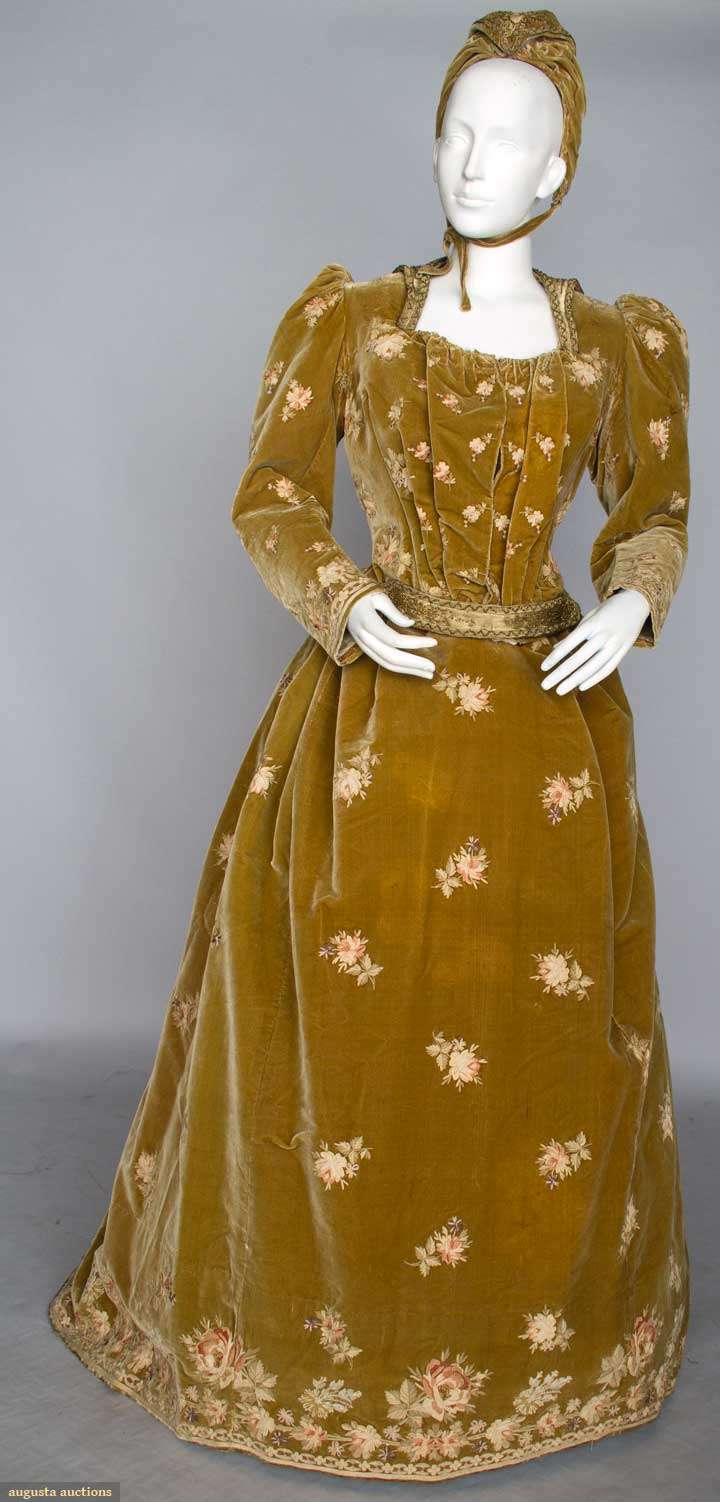
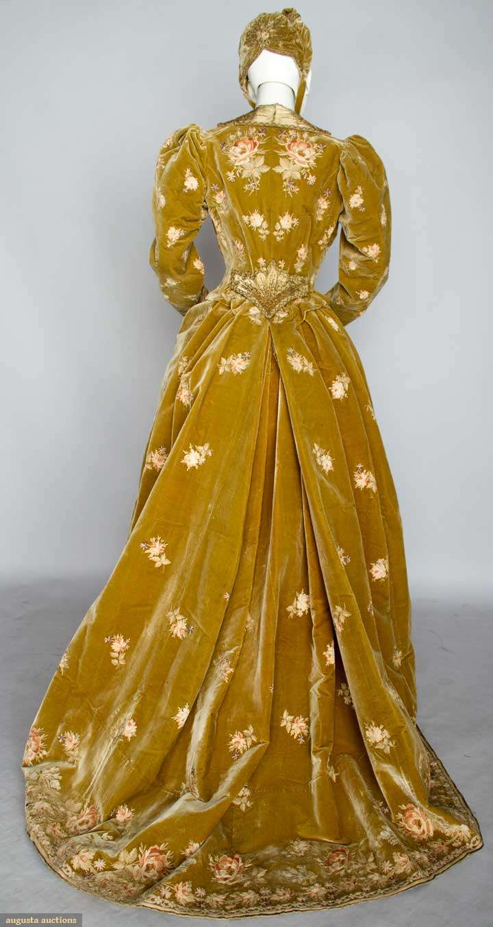
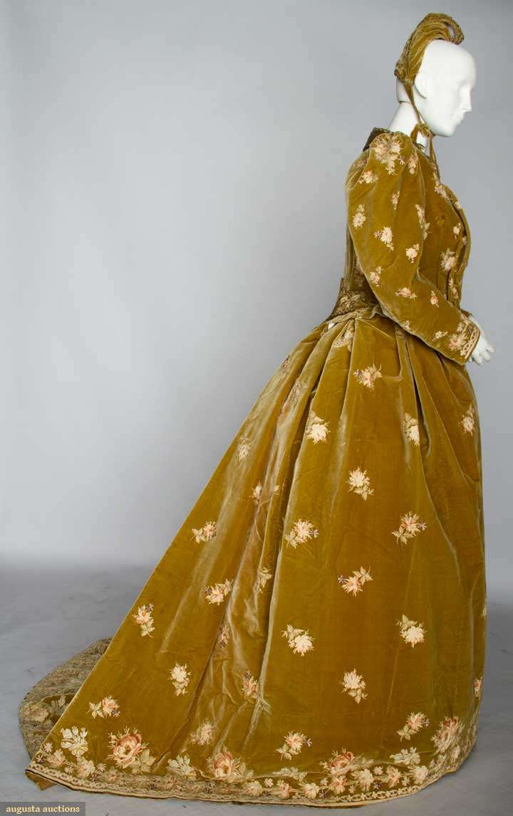
All of the details of the outfit are quite fantastical, from the lush florals to the beaded fan at the base of the jacket:
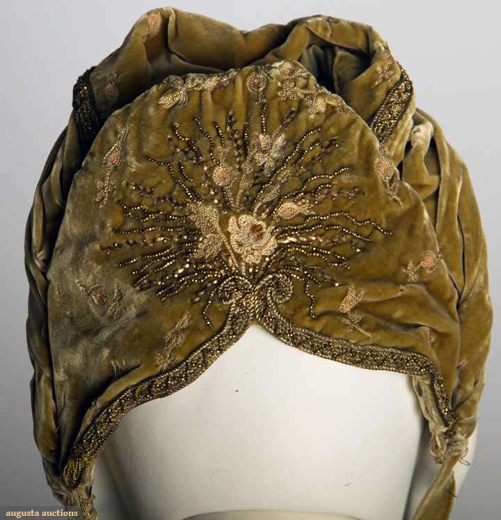
Even the matching bonnet is fairy worthy:
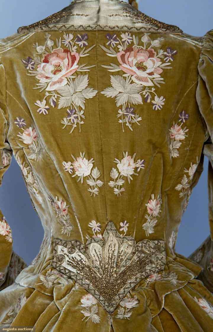
And look at the detail of the embroidery on the fabric! Even if you think the dress is hideous, you must admit that the needlework is exquisite!
Despite the whimsical collar, the fantastical beading and the romantic embroidery, this frock was no fancy dress outfit. It was worn by the wife of a senator to President Benjamin Harrison’s March 4th 1889 inauguration. Seen in that light, the lush velvet and embroidery become symbols of prosperity, the florals spring and hope and new growth, and the whole look makes sense for a politicians wife.
Green-gold and pink seem to have been very much the fashion for the inauguration, because I’ve shown another dress worn to one of Harrison’s inauguration events in a similar colour scheme. You were distinctly not keen on that dress, but perhaps this one will fare better?
Rate the Dress on a Scale of 1 to 10
This is definitely a Grandmere dress. I know the mannequin is too small for it; still, even at 63 I would not wear this. The colour is awful — and that ridiculous hat. 2/10 for the embroidery and bead work
Indeed the dress overall seems very matronly so I was not surprised when you mentioned that it was worn by Benjamin Harrison’s wife at his inauguration. So with that in mind: It has a very nice shape/silhouette and, I agree with you in that the pattern of embroidered roses are simply lovely. However, the color seems rather drab…I wonder if this is a result of fading over time. The same goes for the roses…the colors seem faded. Also, the velvet makes the dress seem weighed down and heavy, but as this was worn for Harrison’s inauguration, which was in March, I’m sure it protected against the chilly weather. I don’t really like the bonnet (except for the embroidery/beading), but then again, it was the style back then for older women. As displayed on the mannequin, the dress looks all rumpled up.
7.5/10
The dress was not worn by Caroline Harrison, but rather the wife of a senator who attended the inauguration – so a different politicians wife!
I actually like the color, and I’m stunned by the ornamentation. I love the back, but the front finds no favor, because the heaviness of the fabric makes the pleats overwhelming.
I have an aversion to the bonnet, and I really have no idea why (and am now reluctant to imagine. lest I be accused of over-reliance on romance novels as historical sources).
6 of 10
This dress is gorgeous, I give it a 9.5.
The velvet has faded, I feel that it was once a more intense color (green maybe?). The dresses from the 1880’s seem to be all about the back and this one is spectacular. I feel that I am looking at mirror images. Not only on the back and the shoulders, but also the sleeves!
The skirt hem is repeated on the sleeve hem. Lovely little detail. The amount of beading is just right.
I feel that the mannequin is not the proportions of the senator’s wife. The mannequin reflects the body of young woman, while I feel that the wife’s body would have reflected both her age and past pregnancies (in other words, the mannequin’s front is not as filled out as the dress requires).
I don’t care for the bonnet, as it ties below the chin. Yes I know that this is a ridiculous personal preference, but it’s there.
Given gloves, a cape and appropriate boots, this most likely was a perfect dress for a cold, maybe rainy outdoor event.
The cut and ideas are good, but the execution is no good. Poor color choice, oddness of flowers on that color choice… an even 5.
I’m glad i’m not the only one who doesn’t hate the color! Although, yes, I agree it doesn’t look great in the photo. It looks as though it’s partly an issue with the photo itself, as well as some fading of the fabric. This combination of blush pink and weird green has intrigued me for a while, to the point of me wanting to rip off a cocktail dress some contemporary designer (can’t remember who) came up with a few years ago. As for the other pink/green dress referenced, I rather like it. I think I could use the bit of green trim on the skirt to keep the sleeves/midriff from looking like an after thought, though.
As for this dress looking frumpy, it definitely is shown on a way too small mannequin, and i’m sure would be way more flattering on a more voluptuous figure that properly filled it out.
And obviously the embroidery is lovely. I would totally wear it if it was 1890 again.
I think i’d rate it at about and 8.
I really don’t like the colour; I think it would have looked stunning in a dark blue or forest green though. I like the shape and do wish they’d put it on a mannequin that actually filled it out correctly! Really don’t like the hat/bonnet thing, like one of the other comments I think it’s the tie; that sort of thing is for children and ice skating, not for an evening gown.
I’m going to drop it slightly for the colour and the bonnet, but it still gets a respectable 7.5/10 from me
I think it’s rather lovely! Perfect for the fairy godmother. The back is just lovely – the geometric pattern of the beaded piece at the back waist just seems to lift the softness of the embroidered flowers.
I think some of the problems arise from the mannequin – she is too girlish in form, and oops! No hair. The bonnet looks very promising, but displaying it on a bald head does it no favours. And yes, more hankies needed down the front.
It is very over-the-top, but I rather like that. Who wants to be a disappearing fairy godmother before one has waved one’s wand?
9 out of 10
I don’t care for the colors, but I think it’s my modern aesthetics. There is so much I like, though–at least appreciate. 7/10
Personally, I like just about everything about the dress. I give it a nine. I don’t care for the front of the bodice, but I love the color. The embroidery and beadwork gets a 10+.
I like it 8/10. for the time period and the social status of the person who wore it, perfect.
As much as I love the shape of the dress, and the embroidery and beadwork are beautiful, I have to give it a 5/10 for the colour. It is just a little too diarrhoeal for my taste
I find this genteel but ugly. The color of the velvet is fine, and the shape of the skirt is nice, but the pleating on the bodice is awkward, the beaded trim clashes with the velvet, the floral embroidery reminds me of overdone Victorian wallpaper. And that hat! Ugh.
5 at best.
“Genteel but ugly” – the perfect description.
I’m not as generous as you though – I’m giving it a 3, because I feel the gentility is rather swamped by the ugliness.
I actually sort of like this ensemble. The pink looks nice on the gold, and the embroidery and beading are gorgeous! 8 out of 10
Too much! Obviously the adage ‘less is more’ wasn’t around then.
I love the velvet, the colour, the embroidery, even the hat (gotta imagine it with some dark hair underneath)
But the pleating on the bodice front is messy and lost in the thick velvet and embroidery. That beaded fan on the back waist is AMAZING but completely lost, I didn’t notice it until you pointed it out. And while the two giant flowers are beautifully executed, they are jarring on the dress.
6/10
Style of dress…lovely! Embellishments (beads and embroidery)… to die for! Choice of fabric…rich. Color… could be better. To be fair it looks like the fabric has faded..maybe it was a darker, more olive green when it was new? I’m not sure whether I like the hat or not. I like the embellishment of it but there’s something about the cut of it that’s not doing for me.
Overall it’s an elegant outfit for that matron of a certain age and social standing. It’s a dress I’d wear ( with a different hat :-} ).
9/10
The embroidery is gorgeous, but nothing else is. I find the shape bland and the colour icky.
5/10
I love the embroidery, and the actual cut of the dress isn’t awful. But the fabric it’s made from is too thick and heavy, making the style look quite clunky. It would be much nicer if it was made of polished cotton or silk.
4/10
It is unfortunate that the dress is not on a correct size mannequin and I do think it is showing its age. However it must have been divine when new. Just based on its current condition and undersized mannequin it does seem it looked better exiting rather than entering. I say 8/10.
I love the embroidery, love the rose motif. Not a fan of the mustard color though. It kinda looks like someone took the curtains down and ran them through an embroidery machine. The design on the back makes up for a lot for me though and I end up with a 7/10.
7/10. I can’t imagine that color looking too flattering on anyone, but I do appreciate the details in the embroidery and beadwork.
Best,
Quinn
I love it!
I approach each Rate the Dress with excitement and hope that I’m really going to love or at least like the dress. My immediate reaction to this gown was distaste and sadness so looked at Augusta Auction website and studied the dress slowly. Less revolted but felt the French couturier was having it over on this woman. It all goes together–heavy material, large embroidery motif, over-all embroidery–but the whole is just awful.
2/10
The embroidery is spectacular, and the cut is okay for an older lady, but the colour is just horrible. 5/10.
That is a lot of look… I imagine the green/gold has faded a bit, and was probably a lot more green? But, if the wearer had grey hair this would wash her out. If she had stark black hair it could work.
3/10
I’m finding it hard to imagine what it would be really like if it weren’t rumpled and the mannequin filled it out. I think I’d like it. However, I hate the bonnet and the collar and I think, even if it fit properly, I wouldn’t like the neckline. I do like the applique thing at the waist on the back. I think, if it were pressed and on a propperly fitting mannequin it would be an 8/10 as is I give it a 5/10.
Not sure how to count your rating – so I’m going to skip it.
This was a hard one to rate. I don’t like the pleating in the front of the bodice at all. But as mentioned earlier the mannequin is on the small side, maybe the pleating would look better if the gown was filled out, so to say. The material, velvet, also makes it look very heavy and thick. I usually like velvet, but not here, my problem is, again the bodice.
I like the rose embroidery, but am not fond of the satin collar and applique in the back of the bodice. At a long distance I liked it, close up I didn’t care for it at all.
I wouldn’t wear this dress mostly because of the colour. I’d look sick in it.
However it’s not an awful gown so I’ll give it a 7.
I like this dress it is a warm rich colour and I think must of looked amazing under candle or gas light. The embroidery and bead work are a great detail. The only thing is that I would of liked maybe a little more decoration on the front. 8/10
It does remind me about a couch that my grandmother had, but I still like it. The colour isn’t my favorite, but I imagine that it was a lot more vibrant and strong when it was new, and then it would have been fabulous. The same goes for that it would probably have looked better on a fuller figure than the mannequin. The only thing I’m not too thrilled about is actually the embroidery in the back, to me that’s simply too much. I prefer the front with the more discrete roses, it’s the back that mostly reminds me of a sofa with some embroidered cushions. Still I give it an 8/10.
I’m trying to imagine the shape, since it doesn’t fit on the mannequin. Generally this is one of my favourite time periods for shape, but I can’t tell how fine of a specimine this is. I’d like to think the horrible colour is a result of fading, but I’m really unsure. I’m afraid the colour as-is really just looks like vomit. It irritates my retinas. I don’t like the placement of the all-over flowers, but the accent pieces are very nice and would be great on something in a different colour. And I have to say I DO really like the hat. For the bits I like I’ll pull it up to a 4/10.
Wow, I love it, 10/10 from me! (Since I’m the only 10 do I get to keep it? Please pretty please 😉 ) Even though it’s not my first choice of colour I don’t dislike it and the embroidery! The beading! Velvet! In Victorian times, more is more, which suits me just fine 😀
I think it’s rich and gorgeous! I love the image of sleeping beauty’s fairy godmother! Right on. Sort of magical and nurturing at the same time. I agree that the front pleats could be more filled out and it almost looks like they open. Could it be altered for pregnancy or opened for nursing? Also, I wonder whether the back ornamentation would be most visible if worn during an outdoor inauguration. I think you said it was worn by a senator’s wife–would her back have been toward the crowd?
Oh, for me a ten!
Someone said it before me : couch. It screams “I am a SOFA !”. Too bad, because taken separately, I love the velvet, I love the color, I love the embroidery and the beading. I think the matching hat is too much mitchy-matchty. But really, it’s the whole “furniture dressed as a reasonable human being” that makes me hate it. 2/10.
The mounting… yeow! Shame we can’t see it with hair and on a more appropriately padded figure, as I think it’s beautiful. even given the quick-and-ready auction house mounting. There’s almost something greenery-yallery aesthetic-y about the velvet and the pleated bodice and the square neckline. if not in the gorgeous embroidery and the matching bonnet is fabulous. It’s a very imposing but not too heavily so gown – a dress for a grown up woman, and I like what it does. Nice lines, the fabric and embroidery can breathe, not too fussy a cut or construction. I am rating it 7/10 as it’s not quite got wow factor, but it’s VERY, very nice and I like it a lot.
Exactly! I thought of the Aesthetic feel, too. What I like about this dress is that it manages to be a lot less stiff and Wicked Witch of the West-y than the late 1880s often seem to be. I think it’s the combo of the pleated front and the puffed sleeves, which seem so much looser and fuller than usual in the late 80s. I typically dislike the late ’80s look, where the sleeves stick up high and the waists are low and stiff, making the dresses seem very prissy. But this has a looser feel plus nice back interest. Neat belt, too, which helps it to avoid that late 80s stiff-backbone look. Not a fan of greeny-yallery with pink, and not much “wow,” but I’ll bump it up to 7.5 because I see it as a Woman Of A Certain Age bucking some fairly icky trends ever so subtly.
Daniel’s comments about the greenery-yallery color and the Aesthetic Movememnt made me look at the pleated bodice in a new light; those pleats really are something you’d expect in Aesthetic Movement style of dress, even if much of the rest of the outfit is still pretty mainstream. Still, it could account for the embroidered floral fabric, and the odd color, which, after years of revelling in aniline dyes, might be seen as a throwback to the ranges of colors common with natural dyes (if you’ve done much of that, you know how common odd yellow-greens are, comparted with reds, blues, and purples!), as well as the bodice front. I’m not totally clear on the late 1880s trends, so I am in the dark as to whether the fairly plain cut of the skirt was a fashion-forward trend that presaged the 1890s, or if it’s another Aesthetic Dress influence. Or both–there’s no reason it can’t be both!
The embroidery might have some oriental influences as well, given the influence of japonisme is a lot of art and fashion around that time.
I agree that it doesn’t sit well on that mannequin, and I wonder how much it would have been affected by lace-trimmed collar and cuff additions, which were not uncommon at that time, and whether the relatively high neckline was influenced entirely by the formality of the occasion (this would have been considered a reception dress, I guess, suitable for a hostess receiving guests at a dinner party, or for a very formal daytime affair, or for attending the theater or opers, or someone else’s dinner party, or a wedding…) and how much it was affected by Mrs. Stockbridge’s personal preferences–Wikipedia tells me Senator Stockbridge owned the Grand Hotel on Mackinac Island, but has very little to say about Elizabeth Arnold Stockbridge, except that she taught school before they were married, and (if my arithmetic is correct) that they’d been married around twenty-five years by the time of the inauguration. Of course, it could be another Aesthetic Dress thing, as a lot of the examples I’ve seen seem to have that sort of squared neckline with a collar in the back.
So either Mrs. Senator Stockbridge was a bit of a prim frump, which with the awkward neckline and baggy bodice, or she was very fashion-forward and in tune with the trends from Europe. Or she let her Parisian dressmaker get the upper hand of her because she was so overwhelmed at being in a French dress shop.
I’ll give it a 7, as that’s a hard color to wear, but at least it’s a little more than the usual post-bustle pile of fabric and trimmings, which makes it easier to look at. Maybe she was a paper-skinned red-head, or a delicate blonde.
Minus points for the hideous colour!
Plus points for the exquisite embroidery!
That leaves it squarely in the middle; 5/10
I like this dress and bonnet. The balance of the earthy colour of the velvet and the delicate colours and intricacy of the embroidery and beading works really well I think. The design of the dress, though mature and definitely unfrivolous is lovely too. I’m no expert (obviously), but I would give it a 7 out of 10.
7 out of 10. While the color isn’t great, the right person could pull it off. The embroidery is wonderful, and I like the shape of the collar and the back of the dress. The front . . . leaves something to be desired.
This is a beautiful example of “mature dress.” Mature dresses were made for ladies over 40 and were usually heavier and more ornate than the younger styles of the time; however, they were still considered the height of fashion (another good example of this is the bright purple 1890s dress in a previous RTD).
The craftmanship of this gown is amazing! The display is really holding it back, but pulled tightly over the corsetted figure, this dress would really bloom! The green-gold was popular at the time as a toned-down version of eye-bleeding chartruse that all the young folks were indulging in. This dress would exude self-confidence and charm without outshining the lady-of-the-moment Caroline Harrison. I can’t find a photograph of Elizabeth Stockbridge, but I think on a woman with strong features and dark hair, this would look amazing. Even though I have neither of those things, I want it for myself!
9 out of 10
Interesting comment on the “mature dress” style. I live in South Asia, and there’s very definitely a “mature dress” style here, too, that’s very similar to what you describe … a type of heavy ornamentation done on saris and salwar kameez for matrons that is quite different from the way it’s done on outfits for svelte young things.
I hate the color but that is more a personal preference. It probably looked fine on the original wearer. If it were a dark green I’d be drooling on my key board. If this dress was a cotton print, I’d be yawning. But, embroidered, beaded velvet is amazing! I bow to the skills of the person who did that! The hat is goofy but totally in style. There are things that are in style now that I think is goofy and people insist on wearing them no matter how it looks on them. 7/10 And I freely admit that it lost 3 points because the hat and color would look like crap on me.
metmuseum.orgI just found this on Pinterest and think it would be a great Rate the Dress:
http://www.metmuseum.org/collections/search-the-collections/82123
🙂
Ooh fab! I shall add it to my suggestion pile!