
Last week I showed you a plaid 1840s dress, and the loud pattern, amber and brown colour scheme, and uneven pattern matching failed to spark your interest and meet with approval, though the overall shape was deemed nice. The dress came in at a 6.9 out of 10.
This fortnight’s theme on The Historical Sew Fortnightly is ‘All that Glitters’ and glitzy, shiny items make for fun Rate the Dress posts. I’m really not going all-out with this one though, and have instead picked a dress with lots of shimmer – but all of it quite subtle and restrained.
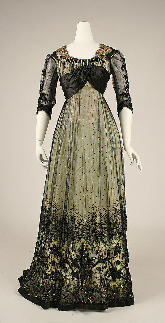
The Metropolitan Museum of Art calls this Regency-Revival gown a ball gown, but with its relatively high neckline, and longer sleeves, I’m not entirely convinced, and the train makes me really doubt the ball-gown claim. I suspect it was more of a dinner or reception dress. I also wonder if there is a chance that this was a half-mourning gown, though by 1908 the trend towards chic-black for its own sake was beginning to emerge (long before the Chanel advertising team laid claim to the idea of the ‘little black dress’).
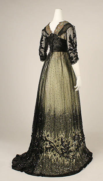
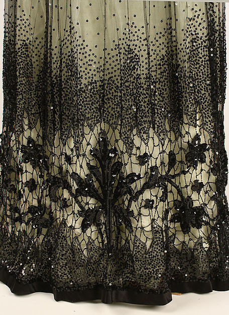
Despite the black, this gown is anything but dull. The white underlay (black lace or net over white was very fashionable right around 1908) lifts the dark colour, and the thousands of beads and sequins on the gown would have caught even the dim lights of older gas lighting, or the brighter glow of modern electricity.
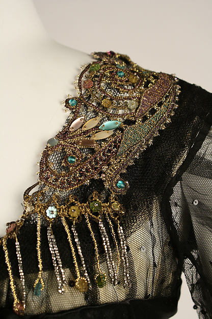
While most of the dresses sparkle is tone-on-tone black, a bit of gold and blue-green beading frames the neckline, adding colour interest (or weird contrast, depending on your take).
What do you think? Just the thing to wear to a holiday do in 1908, or dark and dull?
Rate the Dress on a Scale of 1 to 10.
The sleeves and hem are gorgeous, and the back of the bodice is okay, but that draped stuff on the front is really weird. I’m not overly fond of the multicoloured beading either.
8/10, because the hem is so amazing.
I love the silhouette of this dress–much more attractive and body-conscious than the pigeon-breast associated with 1900’s dresses. The subtle colors and sparkle are also great. My only major issue is the beaded fringe around the neck, which looks tacky and coarse. 8.5.
Louis Comfort Tiffany could have designed this! I love it! (Possibly the hanging beads in the front could have been a design in beads instead. Anyway, it is but a little quibble.)
My score 10/10
N.B. Another note from last week: loud pattern! — this must be a joke. The dress and its colours reminded me more of yet another governess’s dress. It was dull, dull, dull. Jane Eyre was the only character who came to mind.
*ahem* Many of the designers for L.C. Tiffany were women such as Clara Driscoll-Wheeler, Alice Gouvy & Agnes Northrop.
Ohoh! This is absolutley amazing! I want it! Even if I wouldn’t have choosen the fringe, or the draping to be asymmetrical in the front, it’s a total knock-out. 9.5/10!
LOVE. Having spent so much time up close and personal with photos of, a replica of, and the actual Maud Warrender Laurel Dress, the love of this look is well established in my heart. I think that the elements of this dress that are sitting a bit oddly, like the drape and the beading, are suffering from age, and would have looked amazing on the person it was made for. J’adore the shape too.
The lacework in the skirt border is like winter trees seen through mist. Exquisite.
Sigh, sigh sigh. It has to be a 10, because mean Momes won’t let me give things a 25 out of 10 to make up for the people who don’t give my favourites a 10 too 😉
It’s lovely and then that bit of drapery… is assymmetrical? Why is that? It seems to sit oddly on the manequin. Funny useless tidbit of info: just yesterday, me and my father reminisced that when his younger brother was high school age, the greatest insult in his class was “You’re assymmetrical.” In this logic, it’s the greatest insult to this dress – and it is, because I can’t think of another one to level at it. 😀 Just a mild indecisiveness about the bead fringe (the beaded pieces themselves are good).
One of the best uses of black lace overlay from this time I’ve seen, I believe: the way that pattern at the bottom fades into the sparkles above is quite perfect.
9/10
LOVE the skirt, HATE the bodice. The bottom is stunning – it looks like stained glass. The bodice sort of looks like a last minute mess made with leftover bits. I like the black/creme colors, but not loving the added colors in the embellishments. Bottom = 5/5, Top = 2/5, so, overall:
7/10
I LOVE the dress, but the difference in the color of the glittery collar is just a bit off for me. I could totally see wearing it (most likely without the collar) to a ball or very fancy dinner!
9.5 out of 10.
I remember this dress from an earlier post! To be honest, I don’t like what’s happening with the black draping on the front – maybe the mannequin dresser was sloppy, or it’s meant to be asymmetrical, but it throws the whole thing off. As for the beadwork on the neckline, from far away it’s jarring, but looking at it up close, I like the chilly pastels. Personally, I’d take away the fringe-y part across the front. Not necessary.
That out of the way, I love this dress. I can’t get over how much I love the shape and the way the skirt falls from the ribcage. The hem and subtle glitter is fantastic and probably only looks better in motion. The sleeves!
I’m a little unsure how to grade, because is the draping on the bodice true to the original design or not? It’s so hard to ignore the asymmetry – and if it’s deliberate, I don’t think it enhances the dress. Since I don’t know enough to guess, I think I have to go with what I see.
With an even bodice and a slightly toned down collar, this would be skating very close to a ten, but as it is, 8.5/10.
I love this dress and the train. At first I thought it was relatively simple, with netting and then saw the close ups. I agree that the front sits funny on the mannequin.
9/10
Lovely! 10/10
I’m not too sure about the coloured trim, nice though it is as a thing, but the skirt is just too beautiful for words! And I love the sleeves.
9.5 out of 10.
This is beautiful. 8/10 I can’t quite figure out what is happening with the draped bodice, or how the drape comes together in the back…I would like to see it in person to make a better judgement. I think that it wasn’t displayed well…agree that it is showing its age a bit. It would have been stunning on a living, moving young woman. I love the beaded collar!
Put a pink sash coming down the front and get rid of those dangly bits around the neckline and I’d wear something like it in a heartbeat. 9/10 because of the neckline stuff.
This is an easy 10/10 for me…I love this Edwardian style, especially the asymmetric bodice treatment. The dress is crooked on the mannequin, low on the right shoulder, and I’d prefer to see a bit of color in the underlay, but that’s not enough to to loose points. Elegant and absolutely gorgeous.
I’d love it if it were just the skirt. I’d give it a 5 but the draping on the back pushed it up to a 6/10.
I love it. Like so many others I’m a bit put off by the assymetrical draping, but I’m assuming that it’s because of age or not really fitting the mannequin. I’m not a big fan of the collar, but it’s not a big deal and doesn’t take away from the general impression of it. I’m happy to give it an 8,5/10. I
Asymmetrical boobage aside, I love this dress. I love the colours, I love the glitz, I love the beading on the shoulders and how it reminds me of oil in its iridescence. It’s beautiful.
9/10.
Love the shape and the fantastic skirt.
OK with the shoulder pieces of the collar, but don’t care for the drippy bits on the front.
Would prefer the underdress to be aqua rather than ivory.
Overall, 7.5 of 10
Thank you! 10/10
The collar and the bodice are odd, but the shirt & overlay are magnificent 8.5 of 10.
I love it. Individually I find some of the elements a bit funny, but together they just seem to work. It’s capturing my imagination in a way where I think maybe Professor McGonnagle would’ve worn a similar thing to her first Yule Ball or something. Anyway. 8/10
I do like a lot of it, but the beading on the neckline and shoulder doesn’t fit the rest of it taking at least two points off it.
7/10
7/10. I don’t like the clunky blingy fringe on the neckline but the rest of the dress is graceful and very pleasant to look at. But nothing really awesome or amazing – just a very nice dress.
9 out of 10
Points taken off only for the neckline fringe (almost a tacky touch on an otherwise elegant gown) and the unlined sleeves. The white lining adds a richness of subtle color and I would like the dress more if the sleeves had the same coloration.
The heavily beaded sparkly shoulder epillettes almost look like they were an after thought. Love the asymmetrical black sash and all the beaded net. Must of been heavy to wear.
From a modern point of view – If the epillettes were removed, it would make a lovely, special occasion gown.
Historical – 8 out of 10
Modern – with epillettes removed – 10!
The black part in the back is prettier than that in the front. Somehow it manages to be graceful anyway. 8/10