
Last week I cheated and started the New Year of Rate the Dress with something nice and easy and crowd please-y: a 1660s dress in gold.
There were some minor niggles about the bodice flange looking like an eel (ahem, eels are awesome), and the precariously low neckline (trust me, those bodices could have four 5 kilo weights suspended off them and dangling down your skirt, and you’d end up with majorly bruised shins but the bodice would STAY PUT), plus the fact that it isn’t a very move-able, practical cut (fair enough, though that was kind of the point), but overall it was love. 9 out of 10 love! Impressive!
This week we move from classic gold to a very unusual colour combination: tomato red and lavender (though I personally would say this is much more of a lilac than a lavender, and someone doing the catalogue at the GMD really likes the term ‘tomato red’)
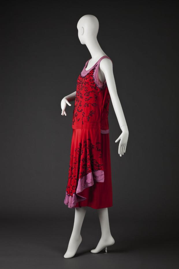
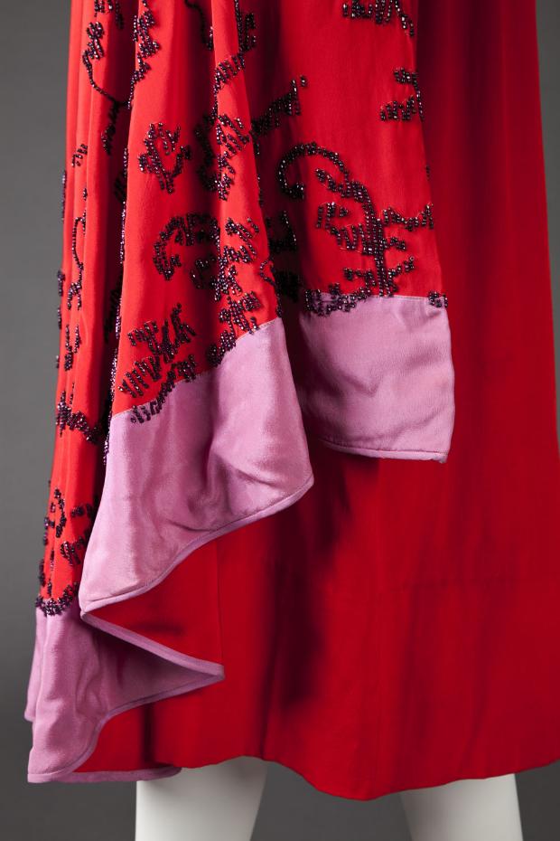
This frock is all about mid-20s decadence and design motifs, but the details aren’t as new as they appear. The vivid colours, rich abstract floral embellishments, and extremely chic (according to the period) unbalanced line all look extremely modern, but are directly derived from late Edwardian orientalism, ultra-embellishment, and asymmetry.
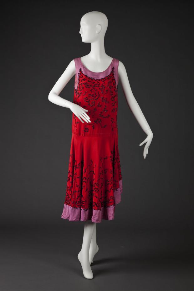
The skirt is almost as short as hemlines would go – in a few years the hem would climb to just under the knee in the ‘extremely short skirt’ of ’28-’29, which was already being called ‘absurd’ in 1932.
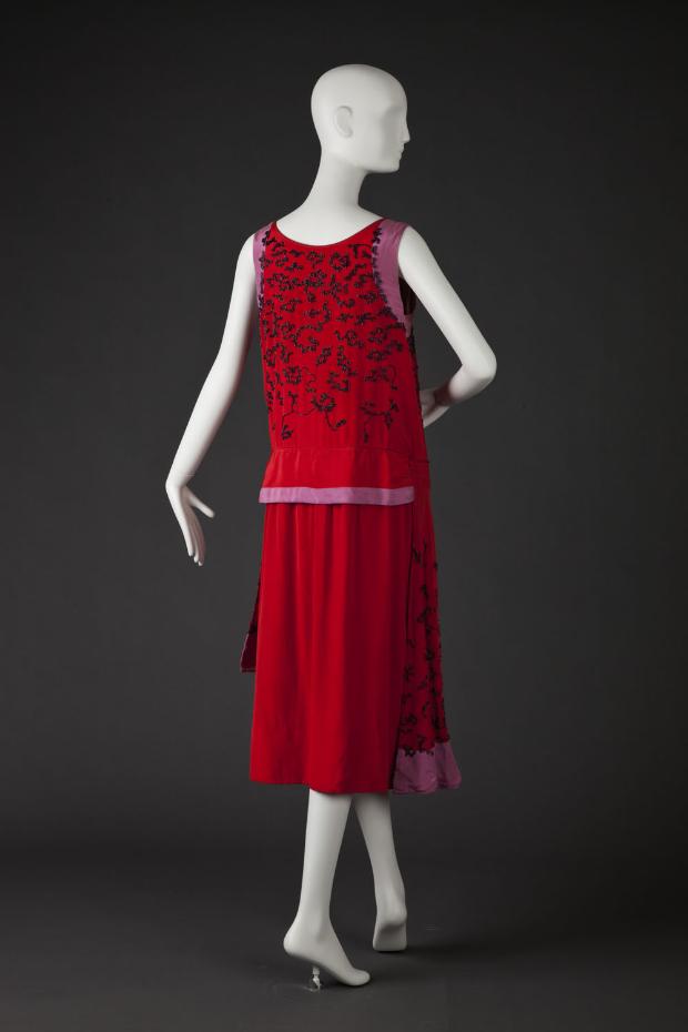
The dress is asymmetrical not just from side to side, but from back to front, with the full drape of the front replaced with a much more straight and severe back, and the lavender moved from the hem to the waistline.
What do you think of this frock, which looks backwards and forwards at the same time, and quite different from back to front?
Rate the Dress on a Scale of 1 to 10
It’s awesome!
Hmm. Does the appearance of this dress on Rate The Dress have anything to do with my comment on it on your Pinterest board last night?
No matter, it’s still a great dress for the purpose.
That being said, I find that the color combination of lilac and red works surprisingly well (or at least it does with lilac in the supporting role; I doubt it would work well the other way around). The beading is … interesting, and striking. I can’t say I like it, exactly, and I’d never wear it, but it’s interesting. Call it an 8.
Nope, you were just very good at picking up on what I’d already selected 😉 Great minds and all!
I find that we very often think alike, too, in Rate the Dress. 8/10
Awesome flapper dress. I love the way the lilac/lavender strip moved up to the waist in the back. Definitely a party dress
9/10
Me too! I love the back details!
Tomatoes must look different in Minnesota. I would call this raspberry red. Anyway, I like the dress. And it almost feels like it could be worn with both sides as front, and I kind of like the idea of all the draping going on at the back instead.
But I like it this way too: 8.5/10
Raspberries must look different in Sweden. 😀
Seriously, “raspberry” as a colour is rather the colour of raspberry juice than raspberries the berries as a whole, isn’t it?
An inspired cut and interesting details. The colour combination is not one that would immediately occur to me, but I think works surprisingly well. And the little peplum at the back is an eyecatcher!
9/10
Love it and like the combo of colours and the way you look good coming and going
9/10
I find it very interesting. I like the front. I like the back. I have a little difficulty with the abrupt transition from one to the other.
I wouldn’t have thought I would like the colours, but I do. And the black beading is just beautiful, and really makes the dress. A very effective garment. So not love, but respect, and interest.
8 out of 10.
Oooh, that embellishment makes my heart sing, so ornate and pretty! I’m also a fan of the asymmetrical skirt front, the drape of it makes me want to make something similar, stat! However I really am not a fan of the colour combination – the designer must have been on a high – as well as the severe back, even though to me the back seems more typical of 20’s style dresses than the front. So I’ll give it a 7, for the embellishment and the uniqueness, but the other bits let it down.
Oh my, I adore this; it’s the first garment from Rate-the-Dress I’d contemplate recreating although the 20s are just about the worst style for my body shape. I like the surprise of the rather severe cut of the back contrasting with the flow of the front; the skirt must move beautifully as the wearer walks (or foxtrots). The draping, colours, beading, and fabric choice are inspired – what a figure this woman must have cut as she sashayed across the room. 10/10 and would give more if I could!
Hmmm…I like it….but there is something not quite right about it for me. I like the drape effect at the front and expect it to continue to the back rather than stop abruptly. The colour combination is unusual too. I can’t decide if it is unusually good or unusually bad. I”m on the fence with this one. 7 out of 10.
Love it! My favorite fashion period and such a great example. Colours are so unexpected but really work- I’m going to go and try some new combinations with my stash! 10/10
I like the cut of it, it looks so comfortable and the embellishment makes it sparkle. I’m not a fan of the red/lilac combination though. I think they clash too much, so I will go for a 6/10.
Beautiful and interesting! I like the color combo. Individually I’m only so-so about tomato red or lilac, but put them together with black beading and I’m suddenly a big fan. 10/10!
I don’t really like the colour combination but love the drape and the beading. I’d give it a 6. X
You could actually sit down without crunching beading in this dress, so someone’s really taken that into account. I like how the beading overlaps the lilac bands, bringing the two colours together and making the dress whole. I don’t care so much for the wide horizontal band of lilac right across her backside, which is not terribly flattering, but I like the dress. Would like the beading to be a bit more flamboyant and less niminy piminy but it’s nice. The colour combination is not a personal favourite, so I think it’s a 7/10.
Thank you! I insist on things being decorated in the back, if they are decorated in the front, although beading creates a problem–because you cannot usually sit down happily! You can, however, in this dress. You can sit down, hold a martini or a cigarette, and enjoy your time in the jazz age.
The thing works! Even the weird color combination. 10/10
I love red and purple together–when it works. And it works, here! Yay! In fact, I can die happy now that I’ve seen this dress. 10/10!
An almost. A bit more stuff on the back and beading down by the hem (the part you don’t actually sit on). The lilac bits could be bordered (piping?) with something dark or the tomato red to tie it together with the red part of the dress. I’d love to wear this in all red or all lavender, but the combination doesn’t quite work for me as it is. So 8/10.
I’ve got this on my 20s Pinterest board, too. I can’t decide whether I like or dislike the color combination. Red is not a good color for me personally, and I don’t generally like this particular shade anyway because it’s so … glaring, I guess. But I don’t think what I would personally wear is the gauge by which all things should be measured. There’s something appealing about the color combo, odd as it seems at first glance. And the cut is divine, as is the beading embellishment.
All in all, it’s interesting and elegant. So I give it a 9 out of 10.
Love this. The unexpected color combination is so vibrant it almost seems like the dress can dance by itself. Miss Fisher would wear the hell out of it. 9 of 10
It’s beautiful, very 20ies – vibrant, playful, elegant, the teensiest bit naughty (absurdly short, haha).
9/10
9 because it seems to me that 20ies fashion does only look good on extremely slender women – if you are slightly less than willowy, these dresses make you look ltubular and inelegant.
I love the dress — the details, the embellishments, the flounce, the asymmetric hemline… all of it.
But I absolutely hate, repeat HATE, the color combination.
8/10
I like the front, but I do not like how all of a sudden the trim jumps up to the waistline at the back. It almost looks as if the dress were put on backwards that way! But just because I like the unusual color combination…
7 out of 10
This dress has two of my favourite colours: a gorgeous blue-red and a lavender/lilac. However, I would probably have liked the lavender more as a piping. The wide bands feel wrong somehow. I just love, love, love the beading. Score 9/10
Although not an era of fashion I greatly like I do like the color combination and the bead work. So withholding my opinion on the decade of fashion I gave it a 9/10. 🙂
I like the unusual combination of purple/red. Also variations like pale blue/red, pink/red and purple/brown.
As for this dress, if there was a design element that more strongly linked the back to the front of the skirt, I would give it top marks. I like both looks, but find the different styling a little jarring.
7/10
I quite like it from the front, but the front and back don’t really look like they belong together. 7/10
I love the dress, but I’m really not sure about the lilac. It looks as though it was red, but it has faded. Yeuch.
8/10
I love the combo of red and purple and I love the mid-20s evening dress, so for me there’s a lot to love here. Bold red, dark glittering beadwork, the fluttering asymmetrical hem.
I love the way both halves look, front and back, though put together they give the dress a strange aprony effect. I think the red would’ve worked better with a darker, jewel-toned purple.
The only part I really don’t like is the very top – the way the red sits on the lavender makes the chest/shoulders look weak and narrow, but it might work better on a living person.
8/10
J’adore!!! It’s absolutely magnifique!!! 10/10
I love the shade of red, though as someone else said it’s more raspberry than tomato. I think the lilac is a little too intense to really play nicely with the red. I like the front well enough, though the silk trim isn’t sitting quite right on the bottom which bugs me and I don’t like the abrupt change to the back. 5.5/10
6/10
I love the color combo (it’s very “modern”) and the beading. However, I don’t really enjoy the mullet-y nature of the back to the front. I love the asymmetrical front and all of the beading, but find the large un-beaded panel in the back to feel unfinished. It feels like the maker ran out of time or beads.
I rarely like 1920’s fashions and there are times when I run across one that works for me, even to the point that I’d wear it. However, I can’t say I like this one. At all. So I’ll be swimming upstream compared with just about everyone else.
To my eye, the red is too harsh against the lilac/lavender. If that purpley color was richer, or the red a bit tamer, I’d like it better.
I don’t care for the beading either, although it’s what seems to pull it all together and (as was mentioned above) you could sit down without destroying it. The assymetrical front skirt doesn’t detract but doesn’t add, either.
Having said that, I like the back much better than the front. If it was both the back AND the front, I’d be able to give it a higher rating – maybe a 6/10.
But rating it as it is – 3/10. Please don’t hate me. 😉