
Thanks to my annual Rate the Oscars post, it’s been two weeks since we had a Rate the Dress. In the last one, we looked at an 18th century riding habit. By and large you highly approved of the slightly unusual colours, and minor quirks that made it just that bit different, but only by and large, not unanimously. It did loose points for the colours (some thought the gold too green), and for a lack of balance in the proportions. Still, a perfect 9 out of 10 isn’t bad at all!
I know it’s cold in much of the world, but New Zealand is baking under late summer heat, and is in the midst of a drought, so that, combined with my recent trip to Napier, are making me think of linen frocks and resort wear.
Which might lead you to to think I’m going to post something 1930s, but no, this week’s Rate the Dress is a different take on linen resort wear: an 1880s summer frock in sheer linen gauze and linen lace (or so the museum dates it, though I suspect it’s fifteen years more recent).

Dress in two parts of linen and possibly silk, 1886, Abiti Antichi 165
The bodice and skirt are separate, with the join hidden by a faux belt trimmed with the same sky blue velvet ribbon that trims the rest of the bodice.

Dress in two parts of linen and possibly silk, 1886, Abiti Antichi 165
Unfortunately Abiti Antichi doesn’t identify the sky-blue fabric of the underdress, but they do give us something even better: a photograph of the original owner in the dress, so we can see what it looked like on:
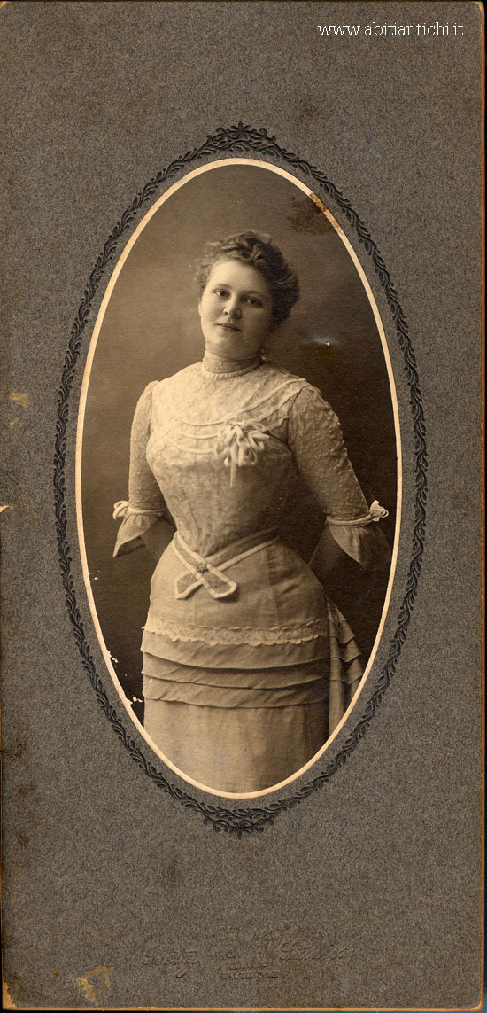
Notice how you can see the corset dents in her hips, and the line at her bust where it ends.
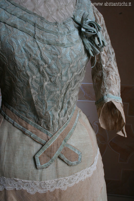
There is also a lovely close-up of the lace on the bodice:
Dress in two parts of linen and possibly silk, 1886, Abiti Antichi 165
What do you think of the frock? Fresh, cool and summery? Or at least as fresh, cool, and summery as one can be in 1880s layers?
Rate the Dress on a Scale of 1 to 10
Definitely 1880s fresh, cool and summery. Although I wonder if the colours have distorted with time – they look a bit too drab to be completely fresh and cool.
But oh, the linen gauze! The velvet ribbon!
9/10
In some ways the dress looks more Edwardian than 1880s, but in others, I see the 1880s thing. I wonder if it has been altered/had a second life. Looks lovely in the photograph! But in person, the dirty dishwater taupe isn’t so attractive especially combined with the fresh blue. I know it was a popular combination at the time, but it’s still a bit ugh. Seeing it on the original wearer though, it looks absolutely charming, so 7.5/10 for that.
I had that exact thought myself. But, you can see the most Edwardian features – the front gathers, and that soft pleated train – in the photo.
I agree Daniel it doesn’t look 1880s to me either. It looks to me like 1900 bang on. The skirt is too wide at the hem and the front of the bodice too indistinct – its beginning to puff out. Regardless, its a wonderful dress.
This is full of beautiful details, beautifully combined. It calls to mind sitting in a fan-backed rattan porch chair with a glass of lemonade handy. I suspect there has been some aging of the fabric colors, but even so, I find a really serene quality, like an interpretation of sand and sea. 9 of 10.
The photograph does remind me so much of my maternal Grandmother. However, she was definitely from the late 19th century and the Edwardian period, so no more bustles (and I am NOT that old — only 64). I would have liked the sleeve frill to have been a lot fuller. All in all, though, it is OK. I am just not a big fan of the period. 7/10
7/10. How tightly it fits around the neck seems to me like it would have been uncomfortable and itchy to wear. I feel a little claustrophobic when I imagine wearing it.
This is my favourite colour combination, soft beige with that gentle sky blue. It was a big fashion story in the 18th century too, so it seems really appropriate to have the elbow length sleeves with ruffles! The velvet ribbon is so tactile, the back view with inverted pleats delightful, and it’s a wonder to see the original owner wearing it in the photograph.
The lace makes me hesitate a little, otherwise it would have full marks from me, so I’ll give it
9.5.
Oh no! This of all weeks to feature a dress with horizontal tucks and rows of lace!! Is it white and gold or blue and black? 😉
Perfectly cool for a saunter on the boardwalk! That high collar makes me itch, though. 9/10
Three-year-old Nikki and I like it. Especially the lace. I think it’s about as cool and airy as you can get for 1880s without being what would have been considered indecent by the time period. I also love the color because blue is my favorite. And I love the large scale tucks on the skirt. So 10/10 for me, and Nikki gives it a 5/10 because she thinks it should be pink and purple to be perfect!
In theory, the colours are lovely but for me, in practice, it hasn’t worked so well. I’m sure that the fading has something to do with it, but Im not sure I love the style. As someone said above, almost rather Edwardian than 1880s.
I love the photograph and seeing how the corset sat is very intersecting for me, because I am currently attempting to make one. (No mean feat!)
The belt and lace of the skirt are a little bit meh for me, so I’d give it a 7.5/10.
I really like this one. I do like those colors together, and I do think it looks a cool as 1880’s layers are capable of being. The belt is just a tad awkward though. 9.5/10.
thank you for showing this, a lovely example of a gentle use of colour and relative simplicity of design, I’d give it 9/10 for being such a lovely fresh example of this type
This dress has suffered really noticeably from time and poor storage conditions; it looks sad, soiled and crumpled. Even trying to ignore that, however (the photograph of the owner wearing the dress), I am still less than thrilled by the dress. It looks too fussy and lace-y to be a strolling-by-the-sea resort dress, but the fabric is too casual for it to be anything else. To use a modern clothing metaphor, it puts me in mind of someone trying to pass off jeans as business wear by pairing them with a dress jacket. I can’t bring myself to go higher than 6 on this one.
Excuse the typo, I meant to say “the photograph of the owner wearing the dress helps in that regard”.
OOO, I like it! The shape of the skirt and those tucks seem to be foretelling the styles of the early 1900s. I would absolutely wear this. 10/10.
Best,
Quinn
Unlike me, this dress looks better in photos than in person 🙂 Although none of us look our best at a hundred and thirty!
If I was enduring a hot summer in the 1880s I’d probably leap at this as being the coolest I could be while still fashionably & appropriately attired, but not being under the same restrictions, it doesn’t appeal. The colours look a bit sad, and the bodice is just too fussy to look truly resorty. Layers of lace and velvet are not conducive to coolness.
6/10 – losing a point for being confusingly Edwardian looking, and gaining it back because I do like the skirt.
At a guess I’d say some of the ‘bustle strings’ -those tapes underneath that when tied together pull the skirt back to make the front straight and the back fuller – are either not tied or have gone missing. A good ironing before display would have been a good idea, but I know from experience that ten minutes wearing linen destroys all signs of smoothing out. It’s more a pale milk-chocolate than beige, actually quite a warm colour, which goes well with sky blue. It’s surprising how cool those old natural fabrics are to wear, even with all the layers – think of the Bedouin in the desert. As for resort wear – she would only be going for a gentle stroll at most in this dress, so it is fine for purpose. A bit fussy for today’s taste but quite restrained for it’s time. I give it 8 out of 10.
I really like it, the colours are sweetly reminiscent of the seaside, the blue of the water and the brownish grey sand. The shape is lovely. I admit the neckline is quite high and small, but it would have been fitted to the wearer and appropriate for the time
9.5/10
I have an idea that this dress was originally more of a light aquamarine, and that the color was selected to match the pretty original owner’s eyes. Perhaps her hair was honey blonde – in which case, the lacy trim also would have matched, and she would have looked quite striking in this lovely summery dress, just right for a gentle stroll, a chat with a gentleman admirer, or afternoon tea (if a coordinating hat were added).
Lovely, though it shows the effects of time. But somehow, that wear just helps recall those long-gone summer days…and how this very becoming dress must have added to the original wearer’s enjoyment of those days.
9/10
9. It is as delightfully cool as one could get, and although those colors are appropriate for linen-wear and summer, they’re dreary. If there were a little more contrast between them, I’d call it a 10. But I would def wear linen gauze and linen lace (omg I love that that’s a thing!) in the summers now!
Oh I want so much to give this pretty dress a 10, but I can’t.
The color of the of the lace and over skirt doesn’t bother me. As one reader said the dress is 130 years old and that would account for the cafe latte color. It was probably a light beige.
If you look at the 1st photo there’s a little bit of the under skirt showing at the hem and it looks as if the original color may have been a clear sky blue rather than the pale aqua it appears to be now. It’d be a treat to see the combination of colors when the dress was fresh and new. The velvet ribbon is a dead match with the blue of the dress.
Gotta say I like the belt. The belt and the tucks keep the dress from being too fussy.
Ok, now here it comes…I can’t stand the lace trimming on the over dress..eeek! It doesn’t look right at all. Feels like it was a last minute decision to stitch it in place. And it’s white! Why would they put white lace on the over skirt when the skirt and the lace on bodice are light beige? And even if the lace trimming was a light beige it still wouldn’t work. My guess is that the trimming was placed there to balance the skirt with the lace covering on the bodice. Better to keep the tucks and work in the same lace that’s on the bodice.
The pleating on the back of the dress with the tiny train is delightful.
The photograph of the dress and the sweet girl wearing it is a plus so I’ll add a 1/2 point for that.
Over all it only gets an 8.5. : (
I want this dress now, even if it’s snow outside my window.
10/10 from me.
Goodness, this dress is in the same shades as a March day on Bonbeach with
the white lace evoking waves tatting up the sand.
Hmm….I think whoever designed this dress was inspired by
Botticelli’s ‘The Birth of Venus’.
I’d like to have seen it with a hat.
8.5
I really like this. Definitely looks fresh and cool and you can be in the 1880s, but I wouldn’t really know unless I had the chance to wear it myself. Love the lace and the colors of the bodice. The one thing that bothers me is that I wish there were more blue in the skirt. The top and bottom don’t quite look like they should go together. 9 out of 10
I love the look of the dress, but I wish the colors were brighter. Seeing it on its original owner makes it extra delightful.
8.5/10
Although I do think the colour of the over-layer has aged, I am completely in love with this dress. I would wear it in a heartbeat. 10/10
I think this dress is just lovely. I would love to wear it. 9.5
I am not a fan of the skirt lace placement, too horizontal and doesn’t flow with the lay of the fabric well. The brown linen is ick. Either two shades white or darker and it would be lovely. This is not attractive. Lighter would definitively make me feel resort like. So 8/10
I don’t like it, I’m afraid. I do like the lace, but the colours and the general cut just aren’t doing anything for me. 3/10
If I were rating the dress based on the photo alone I’d give it an unreserved 10/10. But the colors don’t work for me at all. I love the blue, but I agree with others in that the greyish taupe sucks the life out of it. Neither do I like the bands of white lace on the overskirt – they make the taupe linen look even more drab – throws the entire color scheme off. And while the spaghetti-string bow on the bodice is a fun element, the same bow at the back of the neck would drive me nuts (but that’s beside the point). I wouldn’t have placed it as early as 1886, although Abiti Antichi usually isn’t very far off. I would love to see the hat she wore with it.
Overall, it’s the color that eats away at the score, but I give it a 8/10 because the dress seems perfect for her. Remove the white lace bands and it’s a 8.5/10.