
In keeping with the arrival of summer in the Northern Hemisphere, last week’s Rate the Dress was a warm-weather frock, 1870s style, in white cotton brocaded in red wool spots.
Some of you said the spots made the dress look as if it had measles, and some of you didn’t like the polonaised poof of the bustle, and some of you didn’t like those oh-so-Victorian sloping shoulders (question: if you hate the mid-Victorian look for its sloping shoulders, do you also hate the 1950s New Look for its revival of the sloped-shoulder look?), and some of you didn’t like the black ribbon (which, incidentally, is my favourite part of the dress. It’s the little bit of sex in an otherwise almost too-sweet frock. It says “imagine if the neckline were here” or “tug me and see what happens” – still tasteful, but just naughty enough to add dimensionality to the ensemble 😉 )
But most of you liked the frock, really liked it in fact, giving it a total of 8.8 out of 10 (despite the occasional score of only 5) and keeping up the rather nice winning streak we’ve been having,
This week I really wanted to give you a depiction of a medieval garment to rate, but there just aren’t that many images of medieval garments that are large enough, detailed enough, interesting enough, and obscure enough. So I settled for very late-Medieval-rushing-through-Renaissance-with-a-smattering Tudor portrait of Johanna of Castille:
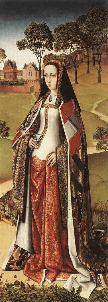
Joanna, noted both for her beauty and for her intelligence, before she became known for her madness (an indisposition that was suspiciously convenient for both her father and her husband, which I’m sure had nothing whatsoever to do with their determination to declare her mad and have her confined to a convent for the rest of her life so they could rule in her stead) was about 20 when this portrait was painted, and is depicted wearing a mix of romanticised costume, fashionable headgear, and status symbols.
The long, flowing skirt of Johanna’s gown looks back to medieval styles, and like her wide sleeves, provided an opportunity for the artist to meticulously render the sumptuous fabrics of her garments. The skirts may have been more fantasy than reality: other portraits of Joanna depict her in the fashionable Spanish farthingale that her younger sister Catherine famously introduced to England when she was married to Arthur. Her headdress is a current fashionable style, the black dye a particularly expensive colour, its severity serving to emphasise her noted looks.
The final piece to Joanna’s costume is her spectacular cloak, which presumably shows the coats of arms either of her titles, or of the nobles who owed her allegiance. The cloak increases the chances that the portrait was painted after July of 1500, when Joanna became heiress to the Spanish kingdoms after the deaths of her older brother, sister, and nephew. By this time Joanna had just begun to exhibit the first signs of what her family considered madness: religious scepticism, and an inclination to be lenient and liberal towards Protestants.
While probably not a strictly accurate depiction of Joanna, or what she wore, the Zeirikzee portrait is an excellent example of a the desired image of a Queen in the minds of the Spanish & Flemish: regal, elegant, devout, beautiful, fertile (note the emphasis on the roundness of her stomach), there to be admired, rather than to act.
So what does her outfit make you think of when you look at her? Does it appeal? A proper case of right royal raiment?
Rate the Dress on a Scale of 1 to 10.
Although the length of the skirt inspires fear of tripping over it, the color and pattern are tremendously appealing. I like the bodice overall, and I love the scalloped shaping of the bodice hem. The cloak I covet madly, even without coveting having several coats-of-arms from which to select to make it — it gives a very contemporary color-blocked impression.
9 of 10
I absolutely love this gown and ALL the accoutrements! Of course, I have never been a fan of the farthingale or its 18th century equivalent. Give me gorgeous fabrics flowing around a woman’s body any day. Rating: 10/10
I love the colors, especially the combination of the black veil and multicolored cloak. Also the combo of cream, bright red, and dark gold in the gown. There’s a lot of contrast – the angular gold designs vs the scallops, the pale cream fabric vs the densely decorated skirt.
As for its cut, I’ve seen other pictures from this period, and the women’s proportions confuse me – were their prominent hips/abdomens an artistic choice, or did dresses have padding there or some other kind of structuring? Assuming they didn’t and that the dress would just flow naturally down its wearer’s figure, I really like the cut too. Not a very practical outfit, but as a visual – just something grandiose to look at and admire – I think it works. Especially the colors.
9/10
(Gonna admit, I like the New Look but I’ve never really thought of it in terms of the shoulders. Maybe my hate for the mid-Victorian sloping shoulders is because they have droopy shoulders plus dresses with really high waists, so the torso just vanishes? I haven’t analyzed my dislike that closely, so I’m not sure.)
Ah, this is how I imagine a mediveal queen or nobel lady, love the armours on her cloak, the wide sleeves, the “tripping over” long skirt too 😀 10/10
I do really really really admire late medieval clothing. How interesting to have it be a sort of “throw back” to earlier clothing.
Also, I should note that this is the first “Rate the Dress” that my 13-month old daughter and I have done. She really liked the colors and squeaked. So…I’ll rate it a 10/10 from both of us!
A truly regal costume, made from the most sumptuous materials: precious metal brocades; ermine linings. The hood is the ancestor of the French hood, but I’ve always preferred the relative simplicity and grace of the earlier form.
However, I cannot find the costume beautiful. The scale of the heraldic cloak is too large, the folds of the fabric too heavy and trailing, the highlighting of her torso too bold, somehow. On the other hand, I’m certain bold, royal, and majestic was the effect Joanna wanted, and she achieved it in spades. I’ll call it a 7.
I wondered about this hood: it almost looks like an earlier incarnation of the Gable Hood, but I believed that to be an England-only look.
By the way, though signs of fertility were important for royal women in period, it was generally fashionable in the late 15th century century to look as though one were pregnant. All of the noble women you see in the period art have the same belly-forward, vaguely sway-backed stance that Joanna shows here.
Yep, that’s exactly what I’ve said.
Not exactly, though. I think this comment adds a little bit more context for curious viewers. Thanks, Catherine.
This was ‘fancy dress’ when it was painted. I have always felt sorry for Joanna – she was ahead of her time and she paid for it dreadfully. The costume seems to me to be exactly what it is intended to be – a show of wealth and power. The fabrics are gorgeous – imagine the time and effort that would have gone into weaving that brocade! The style shows that she was not expected to do anything approximating work – even walking would have been difficult. This is a picture of a RICH woman! As an example of suspended reality is superb. So I give it 10/10, as it reflects all that was intended by both subject and portraitist.
What bothers me about it now that I read about her is that all you would hear of her here in Central Europe is that she’s the famous “mad” predecessor to all the Habsburgs’ mental illnesses that got worse and worse over time because there was so much inbreeding.
But you only hear that she was an ancestress called “the Mad,” and never hear her full story. Hey, mad Spanish grandmother/great-aunt/whatever! You never learn that she also was a queen.
9/10 from me. I’m not all over it, but almost.
Right? If only she and Henry of Navarre could have married.
Lavish, royal, rich in colour & texture – I think it’s great. 10/10 for H.M.
Well, I hate to be the one to spoil the party, but I am as a general rule not a huge fan of the attempted pregnant look. At the time, I am certain it was very fashionable, but I just can’t quite love a dress with that style.
However, if I put that aside, it is a great dress, and very regal indeed, with the fabrics which are perfectly suited to a noblewoman.
I’ll give it a 7/10
Photoshop existed even then! Aside from the overly slim midriff I think it’s gorgeous, I love the flow and the colours; just perfect.
10/10
Lovely fabrics, and I like the pieced together look of the cloak, but I’m not sold on the colour scheme. The bottom of the bodice is also very strange.
8.5/10
For some reason, my earlier long-winded comment didn’t get through. It was mainly me fangirling about the colors and contrasting elements, so I’ll just restate my 9/10 and leave it at that.
My favorite part is the super smooth bodice! It is so unreal which is why I like it. I dislike the patchwork cloak. 8 out of 10
No, just doesn’t appeal to me at all. The silhouette looks all wrong, the colours don’t match at all – black headdress and white bodice? And red bits in the weird patchwork-y cape? Fabrics are great though.
Since I’m sure I can’t by any means be fair in judging this dress I’m not going to rank it – I look at it with 21st century eyes, that can’t be fair!
BTW: I read a book about poor “Mad” Joanna a couple of years ago in which the authors convincingly showed – as you also said – that she was not “mad” in any sensible clinical sense, but that it suited her family to have her regarded as “mad” because they could get her out of the way.
The cloak is a strange combination of fabulous and ugly; I’m kind of loving it. And the fabrics are beautiful. 8/10
I love it for all it’s ridiculous unwearableness (probably not a word but it should be). The sleeves, the skirt. I always love imagining how someone would have moved in such an outfit, which among other things must have been very, very heavy. I think the fabrics are incredible. Although not a fan of the pregnant look, overall I like it so so much. 10/10
wga.hue-codices.unifr.chwga.hue-codices.unifr.chShe’s wearing the late 15th century/early 16th century re-creation of the sideless surcote. The sideless surcote stayed as a “court” or “traditional” style mode of dress well after it was passe. There is this one from only a few years earlier that shows a similar styled surcote: http://www.wga.hu/frames-e.html?/html/m/master/moulins/altar_r.html It’s just easier to see that it is a surcote.
For Joanna, look under her arm to see the gold brocade of the underdress.
Here’s another example of a late 15th century surcote: http://classes.bnf.fr/echecs/grand/5_08.htm
Notice the lines of that one with the front are very similar. And another from 1480 ish: http://www.e-codices.unifr.ch/en/bge/fr0064/162r
The mantle is always included with it in the later “courtly” surcotes.
It’s meant to be more allegorical than a depiction of reality.
As far as the overall style, it’s…okay. It’s meant to look regal and I think because the time period it was painted in was undergoing a fashion transition to begin with and you have her wearing something that is basically a depiction of a fashion that is over 100 years old at the time, it just comes off as a bit weird. The crazy late 15th century/early 16th century big sleeves on the gold brocade undergown don’t quite mesh well with the surcote – and the surcote is styled to attempt to fit in with the changing mode but falls short. The hood is lovely however and pulls the entire thing up to about a 6/10.
love the colours
forgot to vote…..8/10