
Last week I showed you an unknown Italian woman in pink and ivory with gold. While late Renaissance fashions aren’t always the most popular, you felt that this was the best possible variant of the silhouette (though you were a bit squicked out as to the probable point of the portrait – to advertise the marriageability of the very young lady).
(I’ll get the tallied score up shortly – I’m currently occupied cuddling Felicity, and I can’t add them up without kicking her off my lap 😉
UPDATE: And, now, the score! Despite a few people who really didn’t like the dress (and possibly disliked it even more because everyone else loved it, because that’s how the human brain works ;-)), and a few high scores that I had to ignore because they were weird fractions (I’m sorry! Please spare my poor brain and keep your ratings to whole or half scores! Adding up gets far too complicated if I have to deal with 7.3 and 5.6s!) our lady was pretty in pink with 8.7 out of 10.
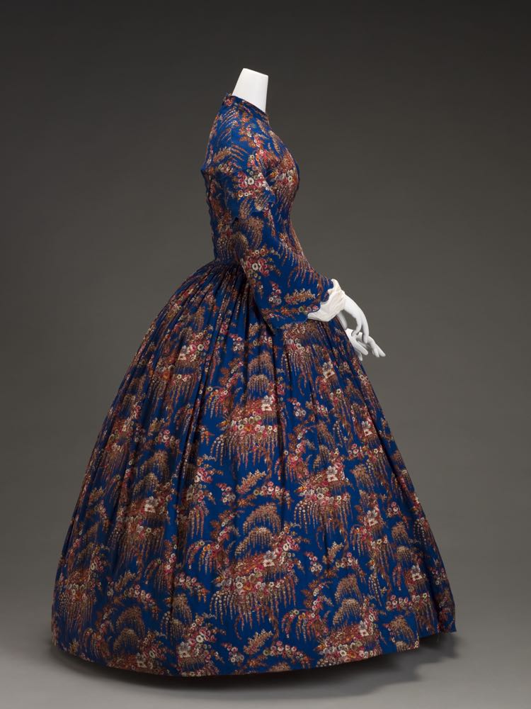
This day dress from the Indianapolis Museum of Art features a sleek silhouette, and a very busy floral print.
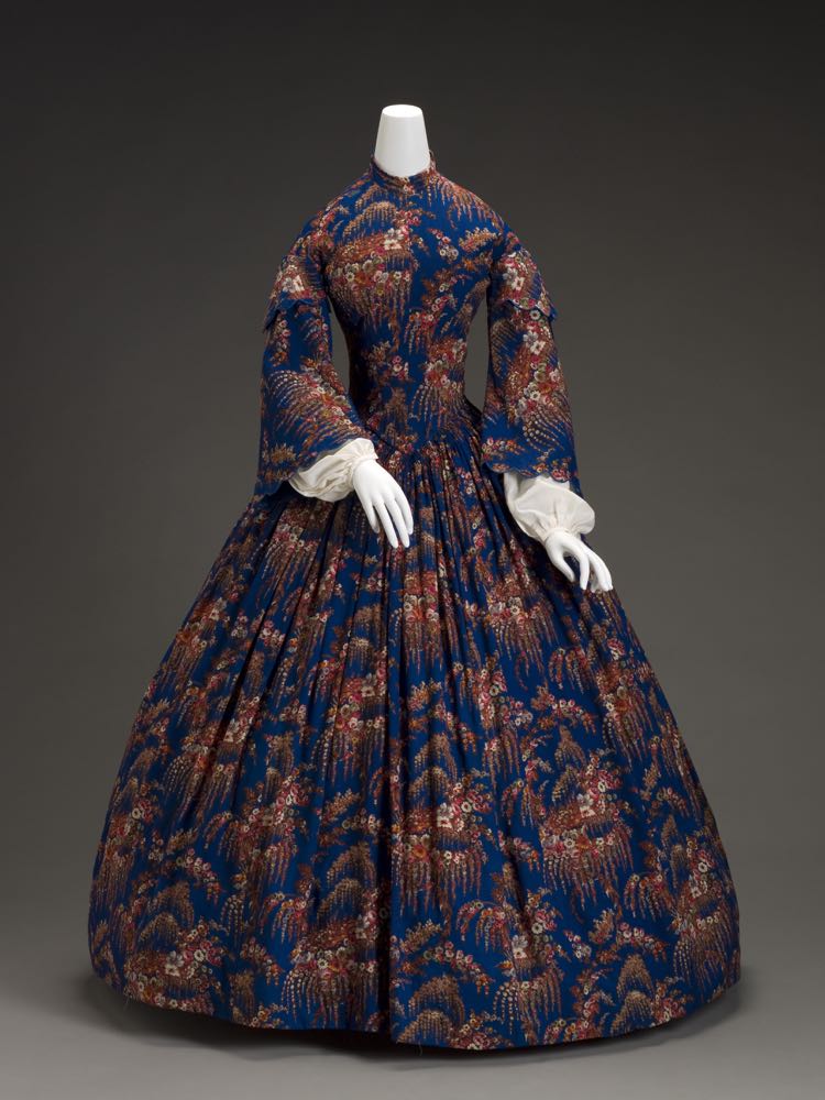
Dress, American, 1860s, wool, silk, cotton, metal, plastic, Indianapolis Museum of Art 2007.761
The intricate print, with swags of spirea and mock orange, and vivid colours of the wool challis are testament to the advances in both dye and print technology happening in the 1850s & 60s (dye & print innovations other than aniline dye, because while this print is very bright, this shade of blue was achieved with natural indigo rather than a synthetic dye until the advent of synthetic indigo in the 1890s).

Dress, American, 1860s, wool, silk, cotton, metal, plastic, Indianapolis Museum of Art 2007.761
The fabric would have been quite exciting and novel when the dress was first made, and the dressmaker has kept the focus on the fabric of the dress, with few design details to compete with it.
Dress, American, 1860s, wool, silk, cotton, metal, plastic, Indianapolis Museum of Art 2007.761
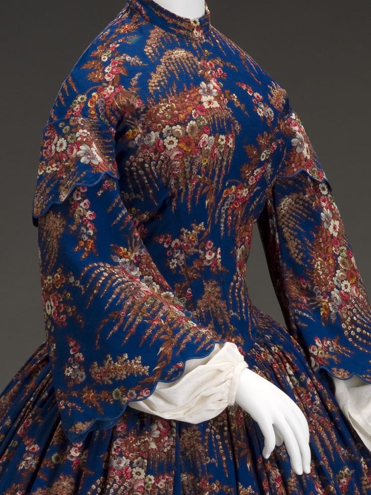
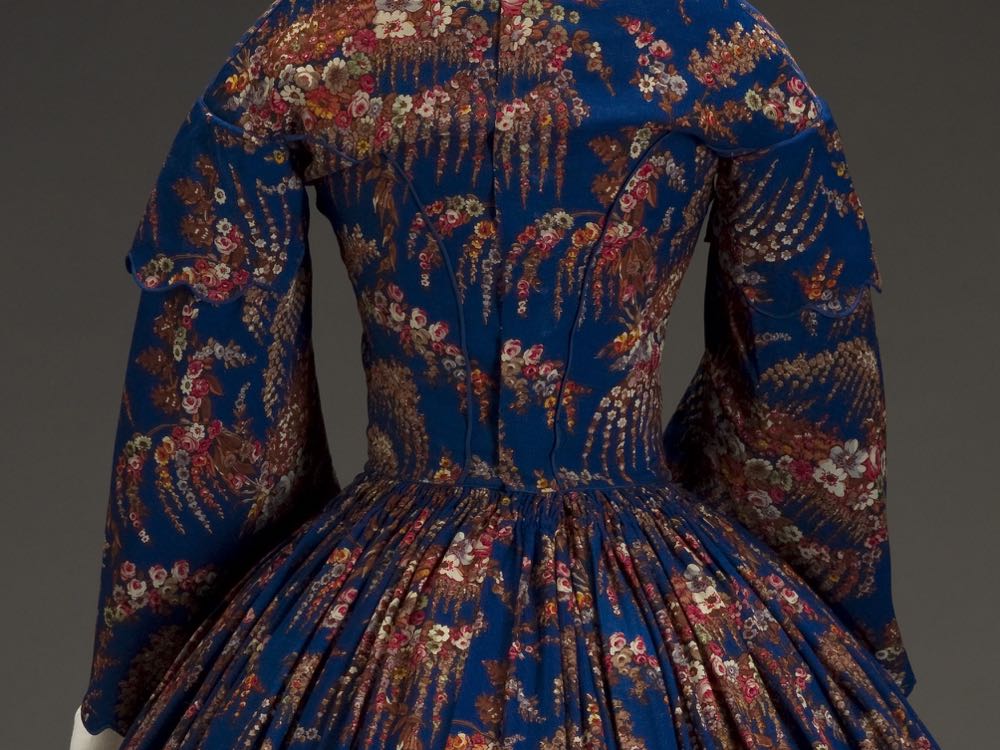
The only ornamentation is the scalloped edges of the double-layered pagoda sleeves, finished with blue piping.
Dress, American, 1860s, wool, silk, cotton, metal, plastic, Indianapolis Museum of Art, 2007.761
The same blue piping is used on the back seams of the bodice, and to define the line between the fitted bodice and tightly pleated skirt.
Dress, American, 1860s, wool, silk, cotton, metal, plastic, Indianapolis Museum of Art, 2007.761
Interestingly, the dress description includes plastic as one of the materials used, indicating that either the dress utilised the first plastic, Parkesine, which was briefly available in the 1860s; the dress was altered with more modern materials at some point; or simply that someone cataloguing the dress got a little confused about their materials list (which definitely does happen!)

Dress, American, 1860s, wool, silk, cotton, metal, plastic, Indianapolis Museum of Art, 2007.761
What do you think of the frock? Does the simplicity of cut balance the elaborateness of the fabric, or did the dress need a lot more details to tone down the print?
Rate the Dress on a Scale of 1 to 10.
The volume of the skirt can deal with the scale of the print, but the bodice offers too little scope, so to me the motifs look oddly placed (although I can’t really see how they could be well placed).
For me, the contrast between background an motifs is too strong, so that I almost get the impression that something exploded on her, although I find the overall shape quite graceful.
7 of 10
I agree for the most part–although did you see the flowers placed in the center of the collar–like a brooch?
I do like the dress–simple silhouettes really do set off a lovely new print.
8/10.
Sloping shoulders, pagoda sleeves, and the wide bottom of the skirt all keep forcing the eye downwards (though with an actual human head at the top of the dress, that effect probably would have been mitigated). Despite that, I agree with Cyranetta that there is something graceful to it, like a drooping, inverted flower.
The print’s arresting and fun, but I think it would work better offset by some solid colors. The big pattern plus the skirt’s shape makes me think of a lampshade. But there’s royal blue, that’s always lovely, especially on these big swishy dresses.
5/10
I like this. The simple silhouette is definitely one of the things I always like, and even if I’m not a fan of big prints the colour combination makes me like it as well. It’s not a total love, but I like it and I’m happy to give it 8,5.
I adore the fabric!
I like the wide pleated skirt and the pagoda leaves.
However, seen from the front, the upper body looks too long and the shoulders slope too much, which I find slightly jarring and repellent, as if this were an 1860s dress for the discerning Alien.
The collar and bust are, dare I say it, boring: nothing much going on, except a huge expanse of fabric covering up stuff. I feel the dress would have profited from a bit of cleavage, even though I’m aware that this is not a ball gown so cleavage wouldn’t have been appropriate. But then the fabric cries “ball gown” to me, I’d expect something more subdued for the “missionary wife” style shown here.
As you can see, I’m a bit on the fence, so 6.5/10.
Love the print, but used as it is for the entire dress, I think she looks like a magic eye poster. Think about it… she walks into the room, and everyone does that squinting-walking-back-and forth thing at her, trying to find the unfocussing point at which a woman will appear, as if by magic! (Actually, I’ll bet the Victorians would have loved magic eye posters… they had those two-pictures on a stick eye-glasses that make photos look three-D, after all. What are those things called?)
I think the dress is fascinating for what it says about its time, but it would be more flattering to the wearer if it had a solid-fabric near the face, like a bertha collar or something, so the woman’s face wouldn’t have to compete with the magic-eye stuff. And there’s nothing particularly interesting about the dress design. I give it 6 out of 10. My favorite part is the fabric, and not the dress. If I saw a bolt of that fabric, I would be tempted to buy some.
I think you’re thinking of a stereoscope/stereopticon? But yeah, agreeing with you about the magic eye effect of the pattern. It’s definitely for a lady who wants all eyes on her.
Yes! A stereoscope. I was playing with one in an antique store recently… the picture was a man on horseback surveying troops, and I wasn’t able to get the two pictures to merge into one… but then when I wasn’t trying, suddenly the horse became three-D and seemed to float in front of the troops. The simplest things continue to amuse!
The shape is so weird! The cut of the bodice (and possibly the sleeves) looks much more 1840’s than 1860’s…. For me, the print is too large and busy for the narrow bodice, though the colours are nice. It would have benefited from some solid trim on the bodice. 7/10.
I agree that the shape is quite odd for the 1860s, but the pagoda sleeve doesn’t really appear until 1849. I’d place this in the early ’50s myself, but stuck with the museum’s dating because I was too tired to really think about it! Perhaps it was made for someone who was quite old-fashioned about cut…
Yep, I’d agree with early 1850s too.
I’ve seen the odd example of modest pagoda sleeves several years before that (in the March 1844 issue of Godey’s for example), but no, they were not really a thing until the very late 1840’s. Early 1850’s does sound good on this one.
I am not going to pretend to know anything about historic clothing, but I do know what my eyes think. Overall I think the dress is beautiful, the colors are rich and vibrant. The shape is simple and let the fabric speak, which I also love.
However, I am bothered by the lack of print-matching on the bodice. On the front, the big cluster of flowers on the right chest is balanced out by the left sleeve, and work well. For the back, the print causes imbalance towards the left and make the right shoulder appear higher. The print also repeats in the back bodice pieces in an unfortunate way.
Perhaps, this is a result of limitations in the amount of fabric available, but still, it ruins it a bit for me. If lack of fabric is the case, I think the dressmaker has done a marvelous job.
I like it and want to give it 7.5/10.
I like the fabric very much and appreciate that the dressmaker focused on keeping that the focus. The sleeve caps are perfectly done, too, with the flowers mirroring each other. But I don’t think the scallops or lack of front piping (to define the bodice) were good choices. I think it rates a 6/10 for me. (so low for an era I love!)
You know, front piping and a collar would have been perfect!
I like the simple cut, but the fabric… is exactly the kind of advance in mid-19th century fabrics I shudder at. 5/10
It needs a collar. A crisp, white collar to cut through the fabric and balance the top out and finish it off properly. Also, to me, the cut and silhouette look more 1840s (as others have said) and I feel the crinoline is a tiny bit too large. The fabric is lovely with the colours and the print even if it does look a little like curtains. I’m gonna say 6/10 as it feels unfinished and incomplete and the underpinnings aren’t quite right, plus theres not an awful lot to rate.
I love the print and the scallop-y details! I just wish it had a small white collar (which could have been worn with it.) 9.5/10
I agree with Daniel and Ari, the dress needs a collar. But I do like the bold print and colours combined with an understated silhouette. The piped scallops are charming. 9/10
splendid, even with the slope-y shoulders. 10/10
Collar, yes. Love the fabric. Wish they could have matched the print better on the bodice, but for me, the thing works well. 9/10.
I really like the fabric print, and I’m not one to like bold prints. I think it was smart of the dressmaker to keep the cut simple and any fru fru to a minimum, but that bodice is….odd. It seems very long and the shoulders slope to the extreme. I agree with another commenter that it looks designed to fit an alien. The best view is the picture showing it from the side. The side profile hides the strange length of the bodice. But, the fabric, those colors are gorgeous. 6/10.
I like the shape, but not the print. I would have liked if it had been balance with a solid color to avoid looking busy.
6/10
9/10 I echo Gillian’s comments…a simple silhouette and beautiful fabric. I would wear this dress in a heartbeat.
The colour and actual print are stunning but it is a little too ‘busy’ for the style. Patterns like these do not show the construction details to advantage. 6/10
Ok Scarlett, put back that curtain and go for the green velvet one! This dress is totally bleeeehhhh…. 😛 Sorry, but the more pics you showed from it the more hated the fabric, it’s mere ugliness! It’s like the ugly duckling dress and we’re waiting with breathlessly to turn out something stunning latter…but no 🙁 It’s still ugly, the motifs I mean, like the printig machine would had vomited on the fabric! The piping and over-layer sleeve idea is great, and mere simplicity would be praised if the fabric was stunning, or one-colored with contrast pipings. We always think victorians had excellent taste for dressing, well this is a great wardrobe malfunction, a proof of bad taste and wrong design from their period 1/10
I love red and blue combinations, and floral prints, and simple cuts, and big skirts <3
Even though it still seems a little busy to my modern eyes I think when it was made an worn it would have been an absolute showstopper.
9.5/10
The pattern of this one is so powerful that your eyes practically slide past the bodice in the front view. There is absolutely nothing to catch your eyes up there which makes it look like powerfully patterned dress dummy with pagoda sleeves. The other views of the dress aren’t that bad. The simplicity of the cut is great even if the pattern is something I would prefer in a quilt rather than a dress. 5/10.
I love this bright fabric and I think the simple silhouette looks great with it. I would totally wear this dress. I love the bright colorful fabric combined with the simple details of the piping and scalloped edges. But as others have suggested, I would add a small white collar. So 9/10.
I agree for the same reasons posted above.
9/10
No, no, no. Yikes, what happened here?! It looks like someone used curtains to quickly put together a dress. I hate the cut and shape of it too, and its such a shame because I got so excited when I saw that it was an 1860s floral dress.
I am amazed so many people like this.
I give it a very generous 1/10.
I almost commented yesterday; however, I had to let it germinate over night. I do like the fabric and the sleeves; but, there are a few things I would have done differently. I DO NOT like and have NEVER liked sloped shoulders. Many lashes with the wet noodle to the seamstress for this. I also do not like the strangled look of the neckline. Instead of the school girl collars recommended by some of the responders, I believe that a portrait neckline would solve some of the main issues with the bodice. I can visualize it with at least 2-3 wide pleats, not quite off the shoulder with a bit of decolletage. It could be white.
Anyway, my rating is …. 7/10
Wow! That pattern and those bold colours are screaming 1920s at me – I can just see it as a robe de style or a wonderfully stylised fashion plate of one. But the pattern’s scale and repeat doesn’t seem to lend itself to either the very gathered skirt of this dress or all the narrow sections, darts and centre seams of the bodice. And I bet the dressmaker didn’t half kick herself when she realised just how much emphasis she’d given to her customer’s right breast. Or perhaps she also was too busy being freaked out by that very long and narrow torso and those phenomenally sloped shoulders? I like both the fabric and the dress, but as I don’t seem to like them together I’ll have to knock a few points off and give it an 8.
You do realise that I am now staring at the lopsided boob?
I feel the same way about one-shoulder dresses. Now…the dress has diminished…
5-6 I do like the simplicity of the design and the scallops but the fabric is way too ‘busy’ for my tastes. Since the fabric still looks amazingly bright, I’m wondering if the wearer of the dress didn’t care for it and consequently didn’t wear it much.
I gave it a day or so to see if the print grew on me. It didn’t, really. The colours are pleasant enough, quite rich, but the actual pattern doesn’t please. Like bad wall-paper or something. Someone pointed out the difficulties of getting the pattern to fit on the bodice. I agree, it just looks awkward.
The dress itself is a pleasing cut and style. Not too extreme, skirt beautifully pleated into the waist, and the sleeves are detailed without being fussy. For myself, I find those sloping shoulders rather spooky. I have shoulders Joan Crawford would have been proud of and I cannot imagine what would have had to happen to those like me to get us to fit the ideal of the time. So, a lovely style – of its time.
7 out of 10.
The simple design is perfect to show off such a busy print, I like the fact that the print has been allowed to “flow” naturally and no attempt at symmetry has been made (the scale of the print is too large for that). I even like the demure nature of the dress with this print.
9 out of 10
I have to say, I always dislike a lot of shapes from this exact period. I really don’t like pagoda sleeves or the band non-collar, both very popular in dresses around this time. I do love the fabric, both colours and pattern. And while I generally just dislike pagoda sleeves (sorry so many dresses!), I do like the scalloping. Adjusting to try to not hate on a whole common style, I give it a 6.
Also re: leaving out non-round scores, do you not just use a calculator to figure out the average scores? Is there some reason doing so would be difficult if you don’t?
I do most of the maths in my head. It’s quicker than a calculator (the typing it out part, not the actual math, I’m no prodigy!), as long as the numbers aren’t fussy.
And spares my arms, which get a serious workout between computers and sewing, so every little bit I can not do with my hands helps 😉
This dress has a delightfully warm tone to it. I think I would love it for its simplicity, except for the fact that the motif being off center in both the front and the back makes the dress seem a little off-kilter. 7 out of 10.
I’d like this on a black woman accessoirized with some creole jewellery and maybe a nice scarf. Her skin could be very dark for this. 8/10
It’s true that a simple shape sets off a rather busy fabric like this well, but a simple design feauture would lift the dress: if the skirt for instance was made of just three large flounces, that would add a nice touch.
…and yes, a white collar that corresponds with the white undersleeves makes sense.
…and in terms of putting a date. I cannot see why a lady shouldn’t have been able to wear this around 1860. There is a segment in the age of innocence where it’s mentioned that the old upper classes of New York around 1870 still considered it “vulgar” to be dressed in the lastest fashions. I agree that a smaller, more rounded crinoline would be a tad more graceful, but it cannot be too small,otherwise the skirt would be trailing all around. So I’d place this in the mid 1850s, but still wearable in the late 1850s, even without a cage.
Wow! This dress has certainly raised some issues. I think it’s a bit harsh to fault a dressmaker for following the shape of her client. She had to work with what was in front of her and what her client wanted. I have a friend whose shoulders slope as severely as those of this dress (although the rest of her torso is in more normal proportions) and this shoulder shape would work quite well for her.
I do appreciate the dressmaker kept the lines of the dress simple and allowed the fabric to do the talking/shouting. Those colors really draw attention, as does the crazy-busy print. Just the thing for “hey – look at me!”, which I have to believe was the intent. Together, the print and colors must have been the latest “thing” on the fashion scene.
I agree with what a lot of other people have said. It looks more early 1850’s, if not very late 1840’s. It looks out of context without the rest of what would have been worn. A white collar or a pelerine of some sort would probably help. A wide bonnet would provide a good deal of balance. The concentration of floral print on the right breast is worth a grin, but large prints weren’t necessarily balanced and mirror cut.
So, assuming the weird shape is nothing more than a reflection of the person for whom it was made: I like the colors. The print is a bit – ah- busy, but interesting nonetheless. It certainly calls attention to the wearer, who could not possibly have been a shy and retiring type.
If the rest of the accessory pieces were there to make a complete ensemble I’m sure I’d rate it higher. As it is, I give it 8.5/10.