
Last week I showed you a late 17th century ‘seamstress’ in pink petticoat and golden brown mantua, her dress covered by her sewing apron. Her sewing apron received a lot of flack for being so little, which I didn’t understand – it’s not like you really get dirty sewing! You just want something big enough to have a few pockets to hold things and a place to catch any little threads you cut off!
In addition to the apron, very few of you liked the colours, or the overall proportions, or the headgear, dragging the score down to 6.4 out of 10
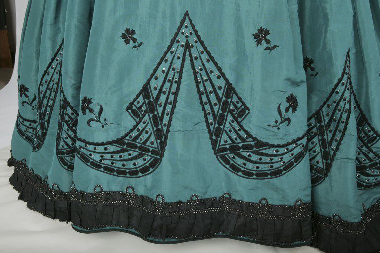
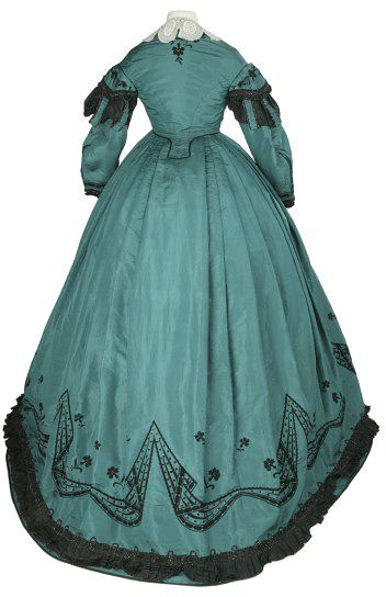
One of the criticisms about the fashion plate was that you can’t see the details, so this week we’re looking at a dress that while simple in silhouette, is all about the details. This dress from the Victoria & Albert Museum features black embroidery with geometric and floral motifs, highlighted with steel beading, and is further trimmed with black silk and steel beading.
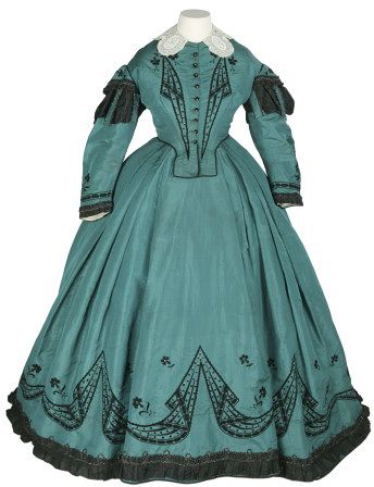

The silhouette of the dress is very typical of the mid 1860s, as is the teal green and black colour combination. Though achievable with natural dyes, the teal green is quite possible a new aniline dye, and may have faded with time.
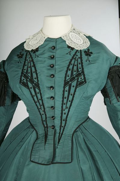
Though much of the dress is quite standard for its timeperiod, there are a few unusual elements. The floral embroidery, though not unknown, is fairly uncommon in the 1860s, when dress patterning tended to be either woven in or printed on, while applied decorations were confined to more bold, geometric shapes, such as the twisted ribbon patterning the florals are paired with.
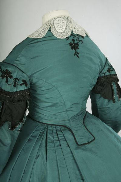
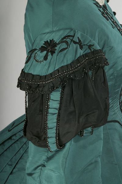
The sleeves of the dress are also rather unique, pairing the standard 1860s curved sleeves with a touch of Renaissance inspired slashing in the upper sleeves – a bit of historicism rarely seen in the 1860s.
What do you think? Does the combination of unexpected and unusual elements elevate the dress from a standard 1860s gown, or just create a weird mish-mash of disparate elements?
Rate the Dress on a Scale of 1 to 10
The details may be random, but for me the overall impression is one of unity, maybe because of the precision and discipline (and technical skill) used in its creation. The embroidery softens the severity of the color combination. Really impressive, and to my eyes, 10 of 10.
I really like this one. The only drawback, to me, is that I’m not fond of teal. But I love the geometric beadwork and the floral motifs, surprisingly, compliment it. 9 of 10.
I agree that a seamstress does not need to wear a large apron. What I disliked about the apron shown in last week’s fashion plate was that the apron was so small (barely larger than a serviette), and dark that it chopped up the lines of her costume. It didn’t help that I felt the dark green of the apron (and its floral embroidery) clashed horribly with the elegant simplicity of the rest of the costume.
Color?
YES.
Shape?
*insert typical mewling about melty shoulders and stuff*
Geometric black detailing?
MORE YES.
Slashed sleeves?
Huh, I dunno…. No, wait, it’s okay. Yes. Yes indeed.
Waist flaps?
Whuh? Why? So flappy and blunt. Why not just a neat little pointed waist? Or like a belt?
Little black flower at the nape of the neck?
STILL MORE YES.
And the sleeve-flowers?
ULTIMATE SQUEES.
But the collar?
Um. Hm. I guess it provides contrast, but I don’t want that particular contrast. I want more teal and geometric black.
Oh yeah, didn’t you have some opinion about that geometric black detailing?
YES.
That about sums it up. 8/10
I love this dress! The angled details remind me of Art Deco motifs, so to see it here is really stunning.
10/10
I also liked the last dress, and while not many people liked the apron, I thought is was really cute. Ah well!
I disliked the proportions of the apron, along with the clashing color (could have been the fading of dyes, who knew?) But I really felt that the apron added to the ensemble. And you know that the wearer of the previous dress would have pronounced that last word with a French accent– “enSAHMbleh”
The color combination is beautiful, I wonder whether it used to be much blue-er (aniline dye)?
The embroidery is beautiful and the abstract design even looks rather avant-garde to me, it wouldn’t be out of place as an art deco/Jugendstil design.
The silhouette doesn’t look very elegant or stylish – the strange waist flaps instead of the more elegant pointy things you usually see look rather pedestrian to me, not very sophisticated. The sleeves are too voluminous and there is this insufferably meek and twee white collar thingy – so very matronly and not very daring at all, as opposed to the beautiful color and embroidery.
So, 6/10
I love that you posted this. Occasionally I have a conversation that goes off on a rabbit trail when I describe a thing as “bice”. “You mean ‘nice’,” my interlocutor says. “No, bice. It’s a color. Like somewhere between blue and green,” I say. “Oh, like aquamarine?” “No, not so bright.” “Like teal?” “No, not so clear: more saturated, less blue.” “Soo… loden?” “No.” “Well what is it, then?” “Like metallic teal. But not as teal-y.” * blank stares *
The thing is, this is it! This is bice! I can now just send them a link and say “Like this”! Ignore the icky pastel hues that come up when you search for “color bice” online; this is quintessential, platonic-ideal bice. Lovely color. And the black trim and sheen of silk really bring out that metallic look.
I like the dress just for being this color. The geometric designs are the best of Victorianism: super detail and patience in execution, but not so overdone that you can’t see the wearer. The sleeves are interesting but not super exciting, and I’m indifferent to the collar. The collar would be changed out regularly, anyway, so I don’t think of it as part of the dress.
As for the pointed-front-vs.-flaps-in-front question, I have made an evening gown in two pieces with pointed front to the bodice. My experience is that without boning in the point, the tip will curl up, especially when you sit. Then you’re constantly smoothing it down. With boning in the point, the tip won’t curl, but the whole bodice will hitch up in front when you sit, causing interesting cleavage action. (This is alleviated somewhat by having small armscyes and closefitting all around). And it’s not that my bodice point extended too far down into my lap… it’s just that with all the volume in the petticoat, the lap came up to meet the point! I love the look of the pointed front, but for daywear, when she might be sitting and standing and sitting and standing, I can see the practicality of the softer flaps that rise and fall with the skirt and don’t lose their definition as they shift about.
I think the pointed front is tres elegant for dancing and posing in eveningwear, but works better if the dress is built all in one piece, instead of separates. Then the skirt radiates outward from the point, instead of competing with it. So much sewing is engineering!
My rating is 9/10, because I like it a lot and can’t really complain about any detail, but I don’t love it with a “must have it/wear it/make it” sparkle.
Your explanation about the waistline makes a lot of sense. While I’m still not crazy about how the flaps look, they do sound like the better option if you want to stay comfy.
There really IS a lot of engineering in sewing. I think that sewing should be compuslory–art, imagination, dexterity, engineering…so many things you can learn by sewing.
And now I’ve learned a new English word! Isn’t the internet amazing?
I’m not sure of the use of bice as a blue-green. I’ve heard bice blue, to mean a true, deep sky blue, and bice green, to mean bright green, both clearly originating from their historical uses of using bice to mean a dark blue or green paint with a pigment made from azurite or malachite, depending on the era. But I’ve never heard it used to mean a blend of the two, which may be why no one else has!
Color and details are a win for me… but I’m not huge on the art-deco looking trim. I feel like if there was a different style it would look more cohesive as a design for me. 9/10
I wonder, just wonder, if the wearer isn’t enjoying a bit of artistic dress within the context of Victorian fashion. As a teen in the 90s, I was always dressing weird, and sort of gothic. At the time, the aesthetics of the decade sort of vanished, so that all anyone could see where the historical elements. Looking back at photos, of course, I see a quintessential 90s teen.
So I wonder, with this dress, if the wearer/designer wasn’t similarly channeling the historicism, and just how much it would have stood out since all the mid-Victorian elements would have been effaced to the contemporary eye.
It sort of reminds me of steampunk: history through the contemporary lens. Beads out of STEEL but with SLASHED SLEEVES!
Anyhow, enough yammering: 9/10. Bice and black are lovely.
Interesting thought I should give more thought to next time I’m looking at a historical dress!
10/10 Lovely dress. Beadwork is stunning as is the color combination of teal() and black.
I like it a lot. I like the sleeves, colour, embroidery and collar. I’m not too sure about the waist. 9/10
Things I like about it: the colours, the embroidery, the way the skirt is pleated.
Things I don’t like: the dowdy 1850s bodice silhouette, the frumpy lace collar thingy, the Renaisance-esque sleeve details.
It’s not quite a 50/50 split, because I really like the parts of it that I do like, especially that gorgeous geometric embroidery. But the undercurrent of frumpiness is unfortunately strong. 6/10.
I love it, the only thing I’m not so keen on is the white lace collar, but I’m sure that’s removeable so I’m going to give it 9.5
I think is lovely both the color combination, the flowers (carnation) under the garlands and the dress shape.
For me 10/10
Love it. The color, the embroidery is magnificent, the shape. I wasn’t sure about the slashed sleeves until I saw the close-up, and then I decided they were okay. I don’t like the flaps on the front waist, because they just seem to dangle there. The back one is good.
All in all: 9.5/10
This looks very much like the sort of 1860s dress I would find very meh or even bleh in a less striking colour. I like the details, but all put together they are rather underwhelming, which I think is one of the reasons I don’t enjoy 1860s much – it happens with a lot of dresses from that era.
But still an outstanding example of an underwhelming 1860s dress.
7/10
Ah this is just beautifull 10/10
I love the femminime touch the flowers add
I adore it and would wear it in an instant! I especially like the detain on the back of the bodice. I am glad I don’t have to iron it though.
I love it, the color,the beading, everything. I’d wear it right now. The only thing that bugs me is that I’m not sure that particular collar was meant for it. It covers up the embroidery in the back and seems a bit off, but even so, 10/10.
I love this one. Love it. The geometric elements, the beadibg, the colour, the shape, all of it. 10/10, A+, would repeat.
I love the embroidery! I love the contrast of black agsinst teal, and the combination of flowers and an almost Art Deco geometric print so ahead of it’s time. The sleeves are quite intriguing so they’re a yes too. All good so far, though it doesn’t scream that it wants to jump in my wardrobe right this minute.
But. That collar. What is it doing on this dress? It half covers some of the flowers making me wonder if it’s meant to be there at all. And with the geometric embroidery on the bodice making a narrow V shape, shouldn’t it be a narrowly pointed collar instead? Lastly, in terms of colour, I would love the collar to have been in black lace instead. Maybe with more of the tiny beads woven into it to really set it off.
Overall, I’m going to say 6/10, because it is very lovely, just pulled down by the collar.
Love everything except the collar – wrong choice by whoever staged this frock. A small stand-up frill of white cambric would have been better, The embroidery at the back neck says to me that a floppy collar was not the intended look. 10/10 from me.
The embroidery is breathtaking on this gown. The only criticism really is of the waistline tabs – It doesn’t seem to flow with the rest of the lines of the gown or the embroidery of the gown. However, it’s a very small criticism as the rest of the greenish and black combo with the embroidery detail is really lovely. 9 out of 10
sigh! 10/10
I’ve been completely enamored of this dress since the first time I saw it. Absolutely love it – every single element and every little detail! 10/10
This would be just a rather boring dress with overly heavy looking sleeves and a mistake of a collar if it wasn’t for the gorgeous contrast of the black against the teal and that wonderfully bravura embroidery design — striking, well executed and yet not too overdone. I like how the embroidery elements on the bodice front mimic lapels and love their deft arrangement in swags on the skirt. I could easily believe that someone like Schiaparelli had time-travelled back to produce the design. A resounding 10.