
Last week’s Rate the Dress was a 1910s lingerie frock with lace and embroidery embellishments. And well, a LOT of you didn’t like it. You didn’t think the different shades of white worked together, nor did the different textures of lace and embroidery. But those of you who did like it, loved it. Almost 20% of the ratings were perfect 10s, which is pretty darn good (but there were also two 2s, which is really bad…) So, with a lot of mixed feelings, the dress got a mixed rating of 7.1 out of 10.
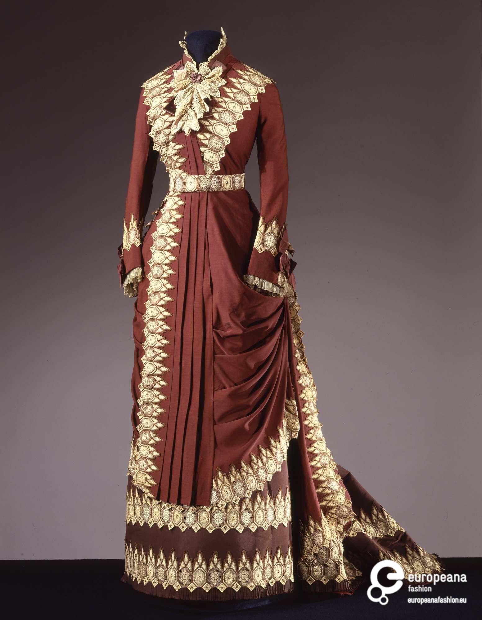
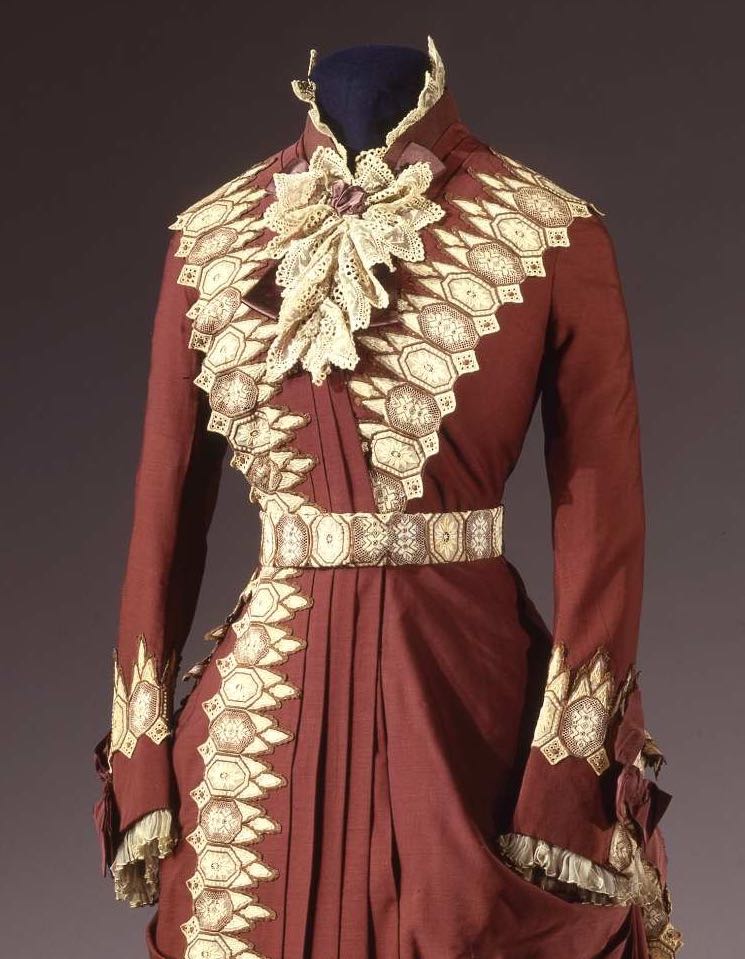
This ca. 1880s dress makes slight use of lace, in the form of a crisp lace jabot, which is echoed in colour and shape in the lace-like motifs of the trim (which may actually be lace – my very minimal Italian consists of knowing all the basic textile names, and google translate isn’t even that good, so all I could tell from the description was lace was mentioned a lot!) that frames the bodice and the tiers of the skirt.

What do you think? Will the crisp precision of this one better than last week’s soft (and far too random, in the overall opinion) lace dress?
Rate the Dress on a Scale of 1 to 10
WHOA! I’ve never been first to publish! WOO HOO! OK, to get down to it. I speak Italian but even I had trouble with the translating. Sorry. However, I love this. I seem to understand this dress better then some of the others. I don’t know why… Maybe because I’m Italian?? Maybe because this makes me want coffee? That beautiful color, like espresso. I realize its a rust color but I do love it. I’m going to pass this one in the exception column of my reds are out book. LOL! I don’t like the sleeves. Can’t explain why, they just make me shudder. So with that… 9 out of 10
I forgot to add, I think its the bows on the sleeves. I have found that if you can write a language then you can generally speak it. Try translating the words not from Italian to English but from Latin. That usually does a bit better and Latin is spoken a lot by Italians because of the Catholic faith. Well that is the case in my experience.
The strong contrast of lace to fabric is stunning, and there’s an interesting tension created by the lace “horizontals” against seamline “verticals”. I love the color of both lace and fabric.
The one thing I don’t care for is the asymmetry of the skirt treatment. Because of the strong contrast I fell like my eyesight is being jerked around.
8.5 of 10
Gorgeous use of trim, contrasts and colour. So crisp and precise. 10/10
I’ll take a stab at the translation:
Princess-line dress in brown wool, with front opening and ivory “passamentrie” and lace trim. Small band collar of brown grosgrain [I think] with lace trim, close-fitting sleeves that flare at the wrist. Belt at the waist in trimming. Underskirt in brown grosgrain [?] with wide pleats to form a train in back. Lining in ivory silk and satin. Wool “bayaleuse” [which I learned is an underskirt thing to protect your train!]
Also: rating 9/10!
Thanks! That’s about what I came up with, but I couldn’t figure out if the trim was ‘passementarie and lace’ or ‘passementarie, and lace’. Passementarie (we use the French spelling in English) simply means elaborate trim, and can include trims that are made in lace techniques. If I remember correctly, gros covers all ribbed silks – which can include failles, grosgrain, and ottomans.
The grosgrain was getting me. Thanks.
I know all the actual fabric names in most Latin or Romance based European languages, it’s just the connecting grammar and modifiers throw me, and sometimes not knowing those can really change the meaning of what you read!
I think you summed this dress up nicely as precision and pointy. It looks pretty sharp and no nonsense to me. If the person wearing it was the local librarian you would make sure you got your books back on time. I like the rust colour and the fact that it has a jabot, which is an excellent word by the way. I was giving it 7/10 but I’m bumping that up to 8/10 because of the jabot!
I love it. 10 from me. I’m pretty sure it’s inspired by a sari; it’s got the contrast edging, the asymmetrical drape, and the pleats of a sari. Since it works these details into a proper European gown, I would call this inspiration rather than cultural appropriation, even though it comes from a British atelier at the height of imperialism. But I’m sure the ethical implications are debatable. I like it though.
I would completely agree with you, except that it doesn’t look much like sari as shown in 19th century photographs, and in the drawings of ‘regional’ dress that were disseminated in Europe in the 1880s. According to the research I’ve done (quite a bit, as I’m working on a long running research project around the use of sari in historical costuming) the really crisp, pleated sari, which this gown resembles, is a 20th century invention that arose as sari wearing women entered the professional workforce.
The trimming inspiration is more likely to have come from Kashmiri shawls, which were worn with pleated skirts (using the term in the loosest sense of the word). Worth got his start selling Kashmiri shawls in a department store, so he would certainly have been familiar with them.
Ahhhhh.
If this dress were inspired by a sari, then I’d love it and give it a good 9.5/10
Without any reference to a sari, then I find that the lace edging is just a bit too severe in the bodice – with the jabot it’s just a bit over-embellished up top. Perhaps having the lace motif smaller over the bodice would have been more pleasing?
I love the colour, love the draping, love the asymmetry. 8/10
That’s fascinating, thank you! I would love to see a post on sari some day.
I love the asymmetry, the colors, the folds, and (surprisingly for me) the large jabot on the front, but it’s the spiked trim that really makes this dress perfect to me. It’s so austere, but the lacy jabot seems to compensate for that (in a good way).
I can’t tell if it’s a light/photo trick or if the underskirt is a slightly different, browner shade, but I like the dress either way.
10/10!
I like it tremendously! The only deduction is because I think there is too much passementatie on the skirt. That’s just for my taste, mind you. I love the colors and the fastidious pleating. 9/20
I’m of two minds about this one.
On the one hand, I like that the main fabric is rust colored, and I like the contrast between ivory-with-gold-trim-and-borders lace and the rust fabric of the dress.
On the other hand, there’s something about the toothed-edges of the lace, and the sculptural quality of the overskirt draping, that gives an almost military impression. The military impression is confused, and not softened, by the fact that the jabot’s shape resembles a bouquet of Christmas poinsettia. The overall effect is almost too severe to be attractive.
So I’m back to a 7 out of 10, though this dress is very, very different in effect, fabric, and tone from last week’s.
I love the drape– it reminds me strongly of sari styles. I’m also loving what this dress does for brown as formal wear and wool, too. 10/10.
I think that the tension between the strong contrast and angular trim, on the one hand, and graceful drape and asymmetry and lace, on the other, is practically perfect. I love it. The only flaw is the belt. It’s wrong, somehow – it’s the only place the ornate trim is truncated, and it doesn’t quite work. Not sure how I’d fix that. Maybe a self fabric belt? I also had my doubts about the cascade of lace at the neck but that does work. The dress would work without it, too, but would be more severe.
9/10
Oh, I love it! Especially on someone who looks classically Italian. 10!
Okay, as someone who normally gets a little tic over one eye from asymmetry, I love this. It seems not only balanced, but Intelligently Balanced. I also feel like the sleeves would be a little bit long, with the trimming set to emphasize that longness, which might throw the proportions off for some people. Good thing I like my cuffs to come down over my fingers…
9.5/10, because even expertly-balanced asymmetry is still asymmetrical.
Look at this gorgeous thing! The pleats! The crisp lines of the lace! The smartness of the whole thing! That rich color balanced by the cream lace!
It’s also in great shape.
10/10 it’s perfect and I want it
Oh and some have said the sleeves look non proportioned – based off of where the bend for the elbow is, I think it’s accurate. And my own mother has such odd proportions that her elbow bends at her HIP bone. She gangles oh so very much 🙂
I was just going to let this one slide, but I am open-mouthed that you all (so far) seem to like it so much. I’m a fan of ‘The Great British Bake-Off’ on television, and this reminds me of the kind of thing someone who never learnt to stop might do in the Showstopper Final on Chocolate week.
Someone (oh, dear Mr Worth!) had yards and yards of that very decisive trim, and was determined to use as much as possible. The jabot and the lace round the neck look really lovely with the colour. But the lace just wants to eat people. As if a special fancy chocolate had been watching ‘Jaws’.
3 out of 10.
Different tastes for different people! Keeps things fresh and interesting! 😉
I do like this dress, the colour, pleating, and trim all do it for me, as well as the asymmetry, I feel asymmetry is underused in fashion. And I just adore the teeny pleats at the hem. The only thing I think that doesn’t really fit is the lace Jabot, it seems too frothy for the crisp dress and trim. 9/10
Gorgeous! I typically don’t care for this era, as much of it is too ‘fussy’ for my taste, but this is completely amazing. It’s obvs a high-end Worth gown, as you can see the taste and quality throughout. Love the color and the contrast of the decoration; this has great ‘lines’ and detail and I wish there was a picture of the back.
9.5/10
I love this. The colour combination is a wonderful balance of warm and crisp. The pleating down the front is delightfully picked up by the micro pleats on the bottom of the skirt. The colour combination, geometric trim and drape remind me of a Thai silk sari, a British response.
The trimming of the collar I particularly adore, hopefully worn by a woman with a long neck and beautiful updo. The only thing that brings me down is the jabot, but then I just don’t like jabots.
I feel like Irene Adler may have worn this.
9
I like it a lot, but it’s overall effect is too severe for me to love it. I think it would have made a great dress for intimidating a social rival – perhaps a meeting with the in-laws?
7/10
I want to see the back. It’s a rather yummy chocolatey brown. I really like the effect of having one side with really strong vertical pleats, and the other side all swooshy draping, like a bipolar dress. It IS very severe, but the cream lacy embroidery is lovely and a warm complement and contrast, not a stark scary contrast, but a lovely warm milky pop against the rich chocolate. So, yes, it’s severe and looks very strict and uptight, but the shades of brown make it less so, so it gives quite nicely conflicting messages – I sense the wearer didn’t take any nonsense, but she was still quite warm and fair handed and commanded great respect, so although she may have seemed severe at first, once you knew her, you would have really respected and liked her very much.
I’m actually quite surprised this is a Worth! At the same time, I can kinda see it. I would rate this a 8/10, as while I like it, I really wish I could see what is happening on the back.
It struck me as an unusual style for Worth as well, but I feel he was a little more experimental in the transition between first and second bustle eras. And maybe the client had a lot of input.
Or maybe someone got naughty with re-applying labels from a true Worth in really bad condition… It does happen…
I’d never heard of label-switching, though I guess I’m not surprised. Does it still happen, or are people better able to detect it these days?
It definitely still happens. There are lots of collectors and small (and big) museums who have never handled a Worth (or Lanvin, or Poiret or Doucet, etc. etc. etc.) and don’t know exactly what one should look like. And there were lots of other designers creating works to the same level as Worth in many ways, but whose names don’t have the same cachet. If you have a Worth in poor condition, but in a known Worth fabric (as he used very distinctive fabrics and repeated them across numerous garments), taking the label off and applying it to a garment in good condition by someone else is likely to double+ the value of the non-Worth, without loosing much value from the Worth. Terribly, terribly unethical.
Not so much with Worth, but by the 20th century you get department store knock-offs of couturier garments, and I’ve heard of museums and collectors buying them thinking they were the actual couturier items. No museum can afford to have an expert in everything, and we all have our blind spots.
Best, Leimomi
Just happened with Ivanka Trump and Andrea Vittadini! Link from Glamour, so it’s legit!
I really like this from the front, so the rating is only from this angle: 8/10
I would like to have seen the entire dress.
Oh my god. I’m in love with this dress. I love the preciseness of the trim and the pleats, I love the shape of the trim that makes me think of a Medieval cathedral, I love the color combination….I really truly love that lace. It is gorgeous.
My only quibbles are that the collar shape and the dark bows on the sleeves look out of place. I think if the cravat was tucked in it would look better. I’d also let the pleated piece on top come over the belt, rather than under it, to match the loose drapery of the back. And I really do wish we could see the back!
9.5/10
I truly admire this dress. It was made for a woman my age, not a girl… good details, sharp styling, enough softness to be feminine still.
Can you not see our heroine, black hair swept away from her face, big brown eyes snapping with energy, organizing something-or-other?
9/10
At first glance, my reaction was, “Someone must have melted a box of milk and white chocolate together.” But upon second thoughts, I like the trim. It kind of reminds me of old reticella lace from the 17th and 16th century- that kind of angular and geometrical look. It does slightly overwhelm the dress, but it balances the rich tones of the fabric nicely, and gives it a more sharp and defined look.
I love the asymmetry, because who doesn’t love such crisp drapery? The vertical pleats jar a little bit, for some reason, but I love that swoop of fabric coming up which helps to soften the silhouette in an otherwise very geometrical dress. What really irritates me is that little pocket created by the drapery. Especially since it literally looks like the cuff of the dress is reaching into that little pocket to get something… Or maybe I’m just being unreasonable. And I love the little points of the lace sticking up near the collar… And the jabot… I’ve decided jabots are even more awesome than bow ties.
I’d give it a 9/10, because that pocket really annoys me but the lace is bold and I like the statement it gives.
I love the pocket. I like the dress but the clever design of the pocket turns like into love. 9
Alas, it’s not actually a pocket – just a drape in the fabric. 🙂
In essence I like this dress, I find the shape, the pleating and the colours to be in exquisite taste and beautifully arranged. But, and it is a great but, the trim is too wide to be used in the way that it is, and the shaping of it on the bodice hearkens back too much to early Victorian and a look which I’m… not fond of, to put it politely. Sadly, this does take down the score a bit on an otherwise delightfull frock.
7.5/10
it’s just so … rigid. Normally I like severity in a dress but this is almost concrete-like. And it doesn’t have that beautiful moulding over the hips that typifies most Worth gowns ( although perhaps that’s more obvious in his evening gowns). Not ultra-keen on the colour either, would prefer it in violet. But it’s beautifully made and very classy, so …7/10
I’m trying to think how I could remake this dress into a somewhat modern aesthetic because I love the combination of pleats and draping. Of course I’d have nowhere to wear it…….
That being said I knock a point off for so MUCH trim, it could use a subtraction of at least one of the layers of trim on the skirt.
That makes it a 9 out of 10, but I might knock more off if I could see the back. The bustle gives me some reservations because of all that trim.
From the book ‘Fabric a la Regency romantic Regency’ by Deb Salisbury ( an earlier period I know ) but it says Gros-grain, is grogram.
Grogram a kind of stuff made of silk & mohair which makes a stuff somewhat coarser than tafferty, or a sort of stuff all silk woven with a large woof ( weft? ), & a rough pile.
So it gave the skirt a stiff lining, hope this helps.
A good book full of interesting information.
I’m pretty late on this week and haven’t read what other people think, but I’ll take my stab at it.
I think the lines and draping and pleating of this dress are very cool. And I think the trim – so unremittingly large and unremittingly uniform and unremittingly everywhere – is kind of awful. Like, if the Brady Bunch had aired in 1880, this would be Carol’s favorite dress.
But the idea behind this dress is something I like very, very much. Soooo…
6.5?
My goodness, if a substantial brick building with cement dressings was ever
to be interpreted as a dress, this would take the cake!
Splendidly overdone.
6/10
I couldn’t make up my mind about this one. I feel like the top and the bottom kind of belong to two different dresses, in fact the top itself is two different dresses, what with the trim creating a bit of a dropped-shoulder look evocative of a decade or more earlier… The fact that my screen isn’t big enough to show the whole thing at once doesn’t help…
On the whole, I like it, a lot, but I don’t like it enough. There are inconogruities, but I like it, a lot. 8/10 is just the rating I give such dresses, I’ve decided.
Also, I might be surprising even myself here, but I don’t get why people complain about the amount of trim on the skirt. I’m having problems with the trim and the jabot, AND the collar, on the bodice, but not the skirt. It’s just of its time, that’s all.
I love it!
The colour combination, the pleats, the draping, the lines, the collar – it’s awesome.
I would totally wear it.
I’m not totally sure about the jabot, though.
I don’t think it really fits, but maybe it’s needed to break the severity of the dress?
So, overall:
9.5/10
Red and cream, asymmetry, geometrical trim, this ticks all of my boxes. 10/10.
A brown wool dress does sound rather drab and dull – but this is anything but! It even manages to almost conquer my aversion to asymmetrically draped skirts. Love the lavish use of a single trim, think the neckline is particularly attractive and am impressed at how imposing the dress is. 10