
Sorry for another run of Rate-the-Dresses in a row, with no posts between them. Unfortunately I’m down with a cold, so haven’t been up to much else.
Last Week: a late 1880s evening dress
A few of you liked last week’s Ludinart dress, but most of you weren’t enthused: you didn’t like the tacked on hem frill, or the abrupt difference between the front and the back. Opinions were divided on the bow sleeves: were they fabulous or terrible?
Daniel pointed out that it looked like a dress to get your portrait done in. I’ve been looking at a lot of Sargent this week, and I can definitely see one of his sitters wearing it. The portrait reviews would probably have been a lot better than the dress: Sargent makes everything look good.
The Total: 6.9 out of 10
Definitely not a Worth!
This week:
This week I’m going from a relatively unknown dressmaker, to a couturier who was an absolute acknowledged master of her craft. Love her work or hate her work, there is no denying that Schiaparelli was brilliantly inventive.
But not every work a master makes is a masterpiece. What about this one?
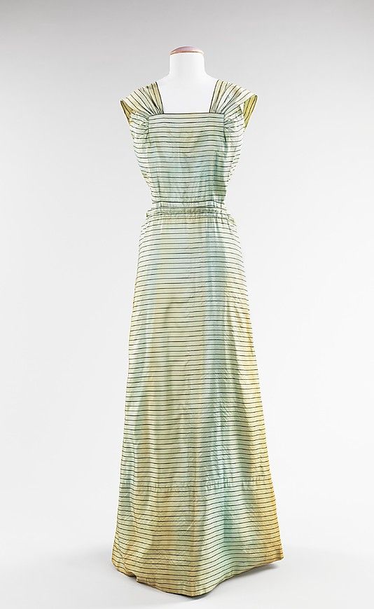
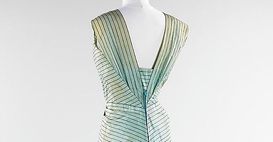
This evening dress is made from a shot silk (possibly blended with wool), which looks sky blue from some angles, and gold from others. Seen in person, the effect would have been of liquid movement: the sea at sunset, both aqua and ochre.
In a still photograph, however, the dress, unfortunately, just looks stained. It appears as if the glamorous woman who wore it had decided to roll around in the famous red dirt of Hawaii.
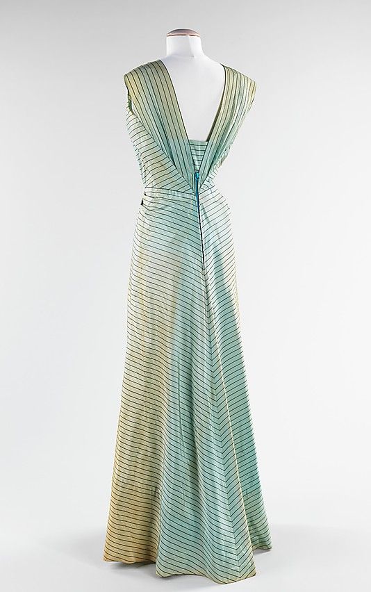
Along with the play of light on the colours of the dress, the cut plays with stripes. Horizontals and verticals and bias intersect at different points, leading the eye to one spot, and then bouncing it away.
In order to get a straight line of stripes around the waist while still fitting the contours of a woman’s body, two long narrow tucks have been taken in at the front waist, releasing at the back.
Like many elements of the dress, it’s a clever trick. But is the dress more clever than beautiful or attractive?
Rate the Dress on a Scale of 1 to 10
A reminder about rating — feel free to be critical if you don’t like a thing, but make sure that your comments aren’t actually insulting to those who do like a garment. Phrase criticism as your opinion, rather than a flat fact. Our different tastes are what make Rate the Dress so interesting. It’s no fun when a comment implies that anyone who doesn’t agree with it, or who would wear a garment, is totally lacking in taste.
(as usual, nothing more complicated than a .5. I also hugely appreciate it if you only do one rating, and set it on a line at the very end of your comment, so I can find it! And 0 is not on a scale of 1 to 10. Thanks in advance!)
I love the geometry of the back, although I get that it wouldn’t be everyone’s cup of tea. And the original color in person must have been fabulous. If I were rating the back only, it would be a 10 for me. But the front seems rather boring and the area under the shoulders looks a bit clumsy. Ignoring the wrinkles and that it looks stained in the photographs, I’d give this an overall 8/10.
engineer/artist partner just rushed across the room to look at this, he says it is gorgeous. I do like it, and am a big fan of shot fabric anyway, but he’s so enthusiastic it raises my vote to a
9/10.
The back of this is just fantastic. I love it’s elegance and modern geometric play. The front is kind of sad though! The color and coverage look like an apron, which is not likely intentional. This is a time when I wish I could see it on a human with some nice finger waves and bright red lipstick (and some steaming). I SHOULD love this dress because of so many (clean, modern, innovative) elements, but I just don’t. 7/10 because the back saves it a little.
I love–LOVE–the back. The front looks like a different dress, though it’s not bad. To me, from the front, it’s cute day dress. From the back, it’s elegant and for evening. Maybe because the back has bias cuts and seams and pleats, where the front has very few (obvious) elements. I realize that having the front bodice and skirt be one piece (or look like one piece) is a feat of engineering, but I think if the skirt had been cut on the bias and had the same great drape as the back, the front and back would go together better.
This is a dress that really would need to be seen on a living model so you could see the fabric move and the play of light. It is beautiful, it’s just that on a mannequin you have to try and imagine it as it was when new. But I love the simplicity and elegance of it, just add statement necklace maybe?
I would give it as it is an 8.5
I agree with other commenters. I absolutely love the back and am unimpressed with the front. The horizontal pleats in the front are extremely distracting.
6/10
I don’t care much for the front—it’s very plain and the overall effect is meh. But the back! I love how everything comes to a graceful conclusion. I wonder if dropping the point of intersection to the point of scandal (just an inch or two below the waist) would make it even more delicious!
6.5
I think we like the back because of the chevron effect and not the front because of the horizontal lines. Not feeling it.5
I love the back of the dress, that’s flawless in my opinion. The front… not so much- it just seems a little plain for the dress and kinda brings down the design. Overall I’ll give it a 7.5.
I’m swimming against the tide. I don’t care for the back. It looks almost like someone tried to do an envelope fold to take in a shapeless dress. The front, however, is worse. All those horizontal stripes and not much else going on. The lightly gathered shoulder to bodice bits are nice and have a lovely flow – almost reminiscent of a robe a la francaise, or one of those built in evening dress capes in the 30s, but the awkward waist only makes me think “1940s house dress” and not “evening glam”. Maybe it was better in person, in movement – it would almost have to be, given how you’ve described the fabric. I love stripes. I adore the clever use of stripes, cutting on the straight and the cross and yes, the diagonal, to make something exciting out of what is simply lines, after all. This dress, however, isn’t that. And it’s a real pity, because it could have been so much better.
5/10 – and much of that is for the gorgeous changeable fabric that I can’t even see.
I spent some time really considering this
The back is absolutely brilliant and technically genius
I could see tearing my hair out trying to pull all those intersections, keeping all those stripes even and symmetrical…and then the side seamless skirt going from horizontal to gentle chevron in the back (and over the zipper)
and the longer I thought about the genius of the back, the more I realized that the front was just as genius and the simplicity let the fabric speak
And a dress that is to be worn and not a dress that wears the person
10/10
The back is perfect, but the front seems to plain in comparison. The fabric is probably really beautiful in person , it’s a shame that it doesn’t photograph well.
8/10
The back is drop dead gorgeous. Incredible. I love the shifting color. The front is not quite as good. The shoulders/sleeves and neckline are lovely. Very flattering. The skirt needs a good steaming. Not sure how those horizontal stripes would look on a real live woman with actual hips. I do love the sleek cut of this. I would wear it with some 40’s pinned up hair.
9.5/10
The condition of the dress and the unfortunate qualities of the way it’s displayed do this one an injustice.
Even so, the silhouette is very elegant. As others have said, the back view is a masterpiece. The front view is less so; it looks more like a sundress than an evening gown. I think some kind of ornament where the shoulder pieces meet the top of the bodice would help, but I’m not sure what kind. Some glittering rhinestone clasps? Modest black bows? Maybe not those, but something. And it could use a narrow belt, possibly with a small gold or silver buckle or clasp. And I’m not sure what I think about the absolutely horizontal lines around the skirt in the front view.
I was going to give it high marks anyway, but every time I take another look at the front view I want to take off another point.
So let’s just say–7.5 out of 10.
I’m finding myself in with the crowd this week; the front of the dress just looks sort of meh at first glance…but understanding that it’s actually shot and not stained helps considerably. I get the feeling it wasn’t well pressed out before being put on the model; it just seems kind of rumpled, which doesn’t help the lines of it any. As someone said above, it looks rather like a sundress. But the back is brilliant. So much beautiful geometry going on there that I had to go back and look at the front again to see that there is also some pretty cool architecture there, too…it’s just kind of lost in the presentation, maybe. Which is not the fault of the dress. All the same, the front horizontal tucks look a little odd…puckery, even. Which may be the presentation and not the dress. I’m gonna go with 8.5; I’d make it higher if I knew it could be smoothed out a bit in a couple of spots.
Masterpiece? Maybe not. But still a very respectable effort on Schiaparelli’s part. Everything about the back is perfect, and the cut of the front bodice is rather nice. My one criticism is that I don’t love the straight stripes across the front waist; I think they would actually look better with carefully matched darts that would visually curve the stripes slightly. The lighting clearly is doing this dress a major disservice, but I can picture it in its fully glory and it seems like just the thing for someone who wants to look effortlessly smart.
8/10
10/10 No, it’s not for everyone, but Elsa Schiaparelli was wildly inventive and her clothes beautiful. One of my favorite designers.
Had to chime in. I love the back, of course. But the other comments about how the front let’s the whole dress down I totally disagree. Imagine if it was as elaborate as the back? Too overdone. A decent steam, and on a figure that the dress fits perfectly and the front has just enough interest to draw the viewer in, without competing for attention with the back. Also on a real person you almost never see totally front or totally the back, so imaging it from different points it becomes to me a more cohesive whole. It looks to me like a dress for a glamorous tropical night, though, with a nod to the 30s playsuit style of glamor, not a temporate-climate ballroom.
Also, shot fabric in those colours is divine. Had a plain cotton skirt in it once, and it was stunning.
metmuseum.orgHave a look on the Met’s site – there is a jacket as well. This may explain why the front seems so plain.
https://www.metmuseum.org/art/collection/search/80095927?rpp=20&pg=15&ft=*&who=Elsa+Schiaparelli&pos=299
Still not sold though.
7/10
There is indeed a jacket with the gown. Unfortunately, the jacket destroys whatever love I’d mustered for the dress. It has pink patches, embroidered with flowers. Thank heaven I’d already voted, before I saw it!
Thanks for sharing. That jacket is really unfortunate, though. At least in my opinion.
Oh wow that jacket is busy. I don’t like those pink flowers at the top, if it was just the pockets…. But it’s not, it’s a giant mess.
I love the back of the dress, I really like the way the stripes bring the eye into the waist and the CB seam gives enough fullness to without too much. Although, as you say, the photo doesn’t quite capture the colour change, I can imagine that when it was moving it was stunning. The front, on the other hand, disappoints me. The shoulders are great but the front bodice neckline and waist don’t quite feel in balance. With the focus on the back, you would want a plain front but on the stand, it looks a bit too boxy. I’m wondering if the wearer had a bustline that the front really worked for and on the stand, it doesn’t look so good. I also love the way it draws the eye to make it look more revealing than it probably actually is.
8/10
The back is stunning but I really like the front too. I imagine it uncrumpled and on a person, and supremely elegant in its apparent plainness. The contrast with the back is part of the charm – the cleverness there becomes an impressive reveal after the cool simplicity of the front view (I say simplicity, but am not at all sure it would be simple to make – I think Schiaparelli has made it look much easier than it is). I am less keen on the embellished jacket from the Met, but can also see how that works with the ensemble. 9/10
Very much part of the choir – the back is a delight of visual movement, but the front I do not find at all pleasing. It’s almost like “Upstairs Downstairs” encapsulated in a dress, since the front did make me think of an apron – the front belongs to the cook, and the back to the titled guest.
7.5 of 10
I’m going to go ahead an envision this on a person, with all the lovely fluidity of the lines of the stripes and the colors in the fabric, and I think it would be absolutely breathtaking on. I love the use of the stripes and how everything matches up so nicely. The only detraction is those two darts at the sides of the neckline, I think they ruin the shape of the front a bit. 9 out of 10.
Love it. I’m a sucker for stripes and the effects they can give. Very much the elegant dinner at the ambassador’s house kind of dress.
The front is plain – I’m assuming there would be some stunning jewels to wear, but this is one of the modest front, exhibitionist back dinner dresses the era was fond of.
9.5
It could easily be worn today… but a lot shorter. Not sure the stripes are the best fabric for it. It’s a timeless cut that is innovative for its time and can transcend time. I give it a 9 out of 10.
metmuseum.orgI love the cut and the placement of the stripes. I agree this dress could be worn today. I feel like there is something missing from this piece – perhaps an accessory was lost or removed. It just seems incomplete from the front.
If you want to study further the Met has over 300 items in their collection you can view here (her and her house combined):
https://www.metmuseum.org/art/collection/search#!?q=Elsa%20Schiaparelli&perPage=20&offset=15&pageSize=0&sortBy=Relevance&sortOrder=asc&searchField=All
8.5 out of 10
That back is just jaw dropping. 9/10
As others have said the back is lovely but the front reminds me of a maids dress in a not too affluent household. I went on the website and the jacket is awful totally out of context with the dress, however we are judging the dress on its own. Shot silk does crease so that’s probably what it looked like on. It would have course been made for a straight figure which was the fashion during the 1930s and the beginning of wartime.
As I don’t like stripes it’s 6/10
The back is so stunning, but the front is soooo… lackluster? disappointing?
Add that to the 30s/40s already not being my favorite period…this dress is just not hitting the spot. It’s clever, for sure, and the tailoring is excellent. This is one that I would love to see on a living. moving model to make a full decision.
4/10
Loved the back at first glance, and the fabric is probably wonderful. The front looks haphazard, and for all the trouble taken with the darts to make the waist stripes horizontal, they didn’t exactly match right. I wish the mannequin had arms because it looks to me like if you tried to bring your arms forward the fabric would cut into them and prevent movement.
Then I followed the link and looked at the jacket, and didn’t know whether to laugh or cry. Dress by itself: elegant and sophisticated eveningwear; jacket: cute, daytime, vacation outfit.
Dress alone 8/10; dress with jacket 6/10
I love the back. The front I’m indifferent to, but I still really like it. I feel like we’d all rate it higher if we could see it on a real person.
8/10