
Last week’s steel buttons and hat trim weren’t popular with most of you, and I know that this week’s buttons, and buttons, and buttons won’t be popular with at least one of you! So apologies to anyone with koumpounophobia. However, if you are a fan of buttons, maybe you’ll enjoy this week’s Rate the Dress.
Last Week: a 1780s redingote in purple silk
Alas, as fun as I find fashion plates, you don’t find them very fun to rate – there . There were things to like about the ensemble though: the rich colour, and jaunty collar. No one was a fan of the long torso and the scalloped peplums of the redingote, just like no-one liked them on the yellow 1780s number we looked at a few months back. And the hat definitely wasn’t winning friends and influencing the rating in a positive manner.
The Total: 7.8 out of 10
Not terrible…but certainly not great.
This week: a 1910s suit with all the (button) trimmings
This week we’re going from a late 18th century suit, to an early 20th century suit.
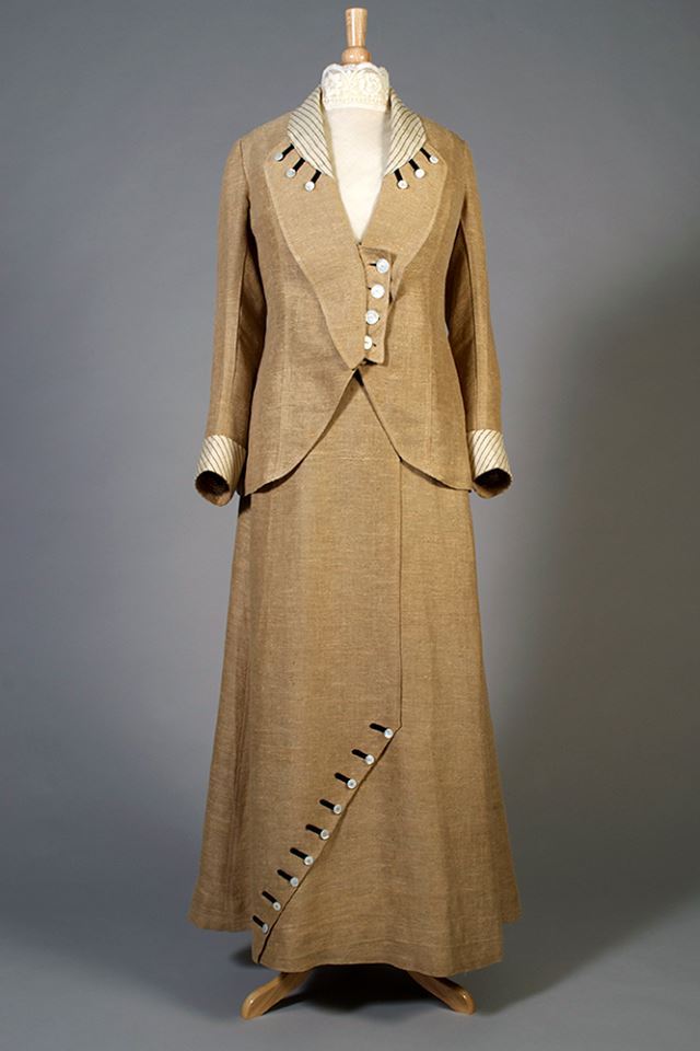
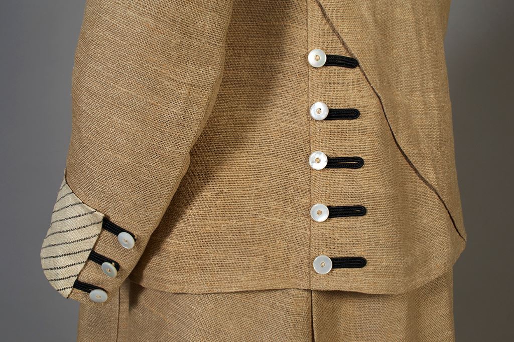
This 1910s number is typical of early 1910s fashion. It features a slim silhouette, with just enough fullness to make walking easy and practical. The asymmetrical effect of the overskirt is balanced by the wrap collar and the asymmetrical buttoning of the jacket.
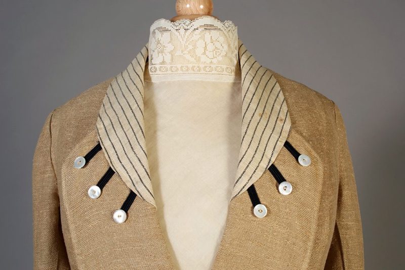
The buttons-and-more-buttons trim, and contrasting striped collar and cuffs, are classic bits of 1910s whimsy.
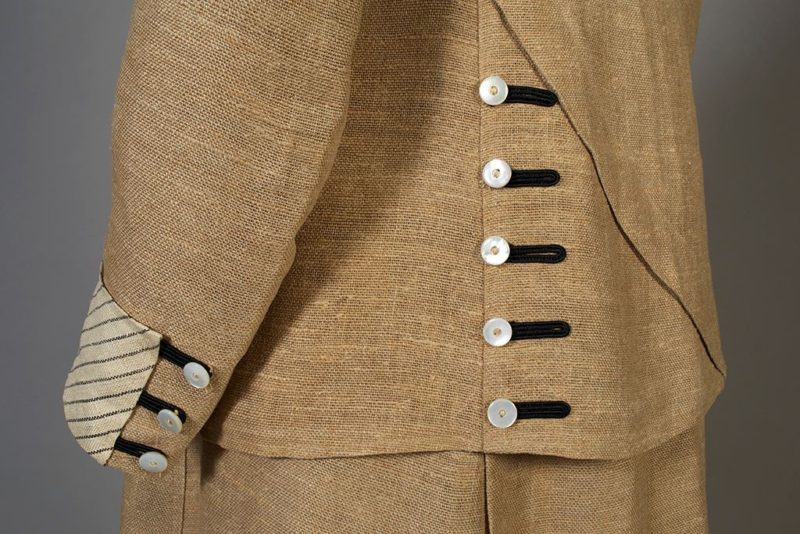
Despite the quirky use of buttons, the suit is generally quite conservative. Since last week’s extremely moddish ensemble was considered a little too devoted to style, perhaps you’ll prefer this one: fashionable, without being faddish.
Do you like it?
Rate the Dress on a Scale of 1 to 10
A reminder about rating — feel free to be critical if you don’t like a thing, but make sure that your comments aren’t actually insulting to those who do like a garment. Phrase criticism as your opinion, rather than a flat fact. Our different tastes are what make Rate the Dress so interesting. It’s no fun when a comment implies that anyone who doesn’t agree with it, or who would wear a garment, is totally lacking in taste.
(as usual, nothing more complicated than a .5. I also hugely appreciate it if you only do one rating, and set it on a line at the very end of your comment, so I can find it! And 0 is not on a scale of 1 to 10. Thanks in advance!)
Love the striped collar and cuffs and the general silhouette, and like the use of the smaller buttons, but the larger ones bother me (perhaps it’s the size of them, or that they don’t have the black loops).
And although the color is certainly suitable, I keep wishing to see it in a more defined color.
But these are small considerations, so 9 of 10
I think it’s lovely. I like the asymmetrical buttons on the skirt, although the buttons on the front of the jacket look awkward, and out of place with the rest of the outfit.
9/10
Hi, new visitor here. I really like this outfit, I wouldn’t mind trying to make something similar. I agree with the previous comments about the buttons on the front. In fact, I’d leave off that tab all together and use a different kind of closure at the center front.
9/10
I think this is superb. It manages to be both understated and avant-garde. I love the subtle colors, and the exquisite finish. And I’m blown away by the amazing condition of this ensemble. It looks as crisp and smart as it must have the day it was first worn. 9.5/10
I really like everything, except the front closing on the jacket. It looks, to me, like an afterthought.
If it hadn’t been for the tab I would have given this a 10, as it is it distracts me so much that I just give it 9/10, and I feel sad by rating it so low. 🙂
I really like everything, except the front closing on the jacket. It looks, to me, like an afterthought.
If it hadn’t been for the tab I would have given this a 10, as it is it distracts me so much that I just give it 8/10, and I feel sad by rating it so low. 🙂
The bottom detail is beautiful. It’s giving me ideas maybe, it certainly lifts the plain colour of the suit. The shape and proportions of the jacket and skirt are just right, with the flare in the skirt and the shorter jacket balencing each other
A solid 10
I absolutely love everything about this!! 10/10!
I really love this piece! Its very idiomatic of its time, and just charming overall. The button trims are light and fun and both not overdone and giving some interest in a fairly plain outfit. The stripes are cute! I would wear this almost every day if I could and probably should make something like this. That being said, my heart doesnt go pitter patter when I see this. I like this a lot, but Im not in love. I think its the shapeless bag of teens walking suitcoats.
9/10 for like but not love
It’s jaunty! Definitely a city lunching suit.
The only part I don’t like (looking at the museum’s full front view) is the midriff with 4 big white buttons and no braid trim. It’s out of place. I wonder if the front should wrap a bit more and cover them.
9.5
I like it overall, but something about the jacket closure bothers me……so, 8/10.
I love the linen fabric, and the overall cut. The cuff treatment is nice, but the other details are a bit too “quirky” for my taste. They have a look of being added for their own sake, and not to contribute to the overall design.
7.5 out of 10, again.
10 out of 10.
Wow! This is so smart. I love the style – the ‘sensible’ silhouette, the elegant yet practical skirt – and the way this example has expressed the ideals of the time is very pleasing indeed. The colour, the natural linen shade. The coarseness of the linen fabric is celebrated (And I do applaud the curators who prepared this for display – imagine pressing that! And it is so smooth and crisp.) and the simple mother of pearl button decorations look so good with the black button holes.
How to keep it simple and look a million dollars!
LOVE everything about this outfit except that wonky looking packet with the buttons on the jacket. It just doesn’t make sense to me at all. One or two buttons closing in the center would have looked oh so much better.
9/10
Count me in with those who dislike the closure on the jacket. It just looks clumsy and out of place to me. I love the striped contrast in the collar and cuffs. The button ornamentation doesn’t really do anything for me, but I don’t outright dislike it, either. 7.5/10.
I generally like this but agree with most in that I think the front closure is awful. 9/10
I find the color drab. And while the buttons add something, it is not enough. And I dislike the cut of the waist.
6/10
I love this! 10/10
I do like the skirt. The diagonal buttons are charming. The jacket doesn’t appeal to me. I see those collar buttons as the eyes of some sea creature. A 3-eyed sea monster! The striped fabric would have been nice just on the cuffs. The linen fabric is nice, and looks so crisp with the high-collared lace under blouse. The jacket has too many quirky elements for me. Lovely, wearable skirt, though.
7/10
I agree with the majority — the front closure just doesn’t cut it. I thought at first this was a reproduction, the fabric is so crisp. I wouldn’t like to see it after a day in the park- linen,you know. I do like all the other buttons with the loops and the striped collar lightens the overall effect. 8/10
Another vote down for the button tab. Its asymmetry clashes with the smart looking, assymetrical skirt. This has an interesting architectural feel about it. It has interest from the side view, too. The collar is lovely.
7
Not crazy about the button tab on the jacket front, (seems like that could have been done a little better) but I like the use of buttons as embellishment, and the simplicity of the design as well. It’s not fancy, but I find it attractive. It needs a nice hat to go with it.
Have to agree – the front closure looks as if it has been added. Was it made a little wider at some time?
I think this is a wonderful piece. Whimsical and elegant at the same time and a walking display of fabulous technique. Then again, I adore buttons, the more the better. The asymmetry of the jacket close suggest that it could be worn unbuttoned, with the button hole placket folded back. I would love to see the jacket open. The thin stripes on the contrast collar and cuffs, to me, are echoed in the black cording (button closings?) around the buttons. They almost seem like rays of the sun emanating from the collar. and then the cross body slash down the front is a terrific piece of designer grandstanding. I love this!
Weirdly, amongst you all, I was happy to see that placket! I have a suit I am making over right now, redesigning it to conform to a 1910’s look. My suit is a little too small for me at present (although I am losing weight) and one of the solutions I had thought of was just such a placket, but I was holding off because I wasn’t too sure of the accuracy. Now I am thinking that I can do this if I can keep it a bit subtler than this one. 8/10
I was already to go all Spinal Tap on this and give it an 11, but I’m getting in line with the front closure votes.
9/10.
Such a lovely shaped ensemble, you could wear it now EXCEPT too many buttons . It would bE so much better without the buttons on the collar etc. I agree with others the front placket doesn’t look right, shame the whole thing wasn’t left more simple. It must have had a good pressing before being displayed and I can imagine it would soon crease on wearing and not look as good.
So as I’m imagining it without the buttons 8/10
This is not my favorite era, but I think this would be flattering on a live model.
I agree that the placket on the jacket is odd – it gives it a “homemade” feel and detracts from the otherwise beautiful construction.
9/10
Love the trim, hate the color…it looks like burlap. 7/10
Near perfection 9.5/10