
In between bouts of paper marking, the masquerade stays are coming along. They may actually even be finished on time (amazement).
In any case, I have an event to wear them to on the 9th, so they have to be done by then!
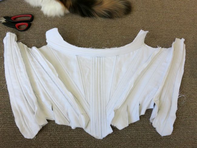
So far, with help from Miss Fiss, I’ve completed all the boning channels and inserted my boning, and sewn together the front, side front, and side back pieces in preparation for fitting.
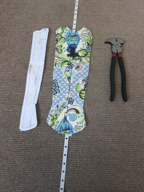
I’ve also cut the lining and outer fabrics for the back piece, and have inserted my lacing bones. I’m using fenestrated metal boning, because it’s the only boning that I have around that’s both strong enough to support the back lacing and long enough for the length of the stays.
At the moment things are at a pause while I coat the ends of the lacing bones and let them dry. I’m just using nail polish – it’s worked well in every previous application!
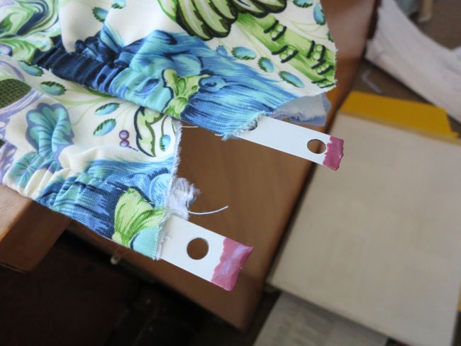
Things are also at a pause while I ice my thumb. There was a little problem in inserting one of the lacing bones, and bones and nails alike got bent at unhappy places.
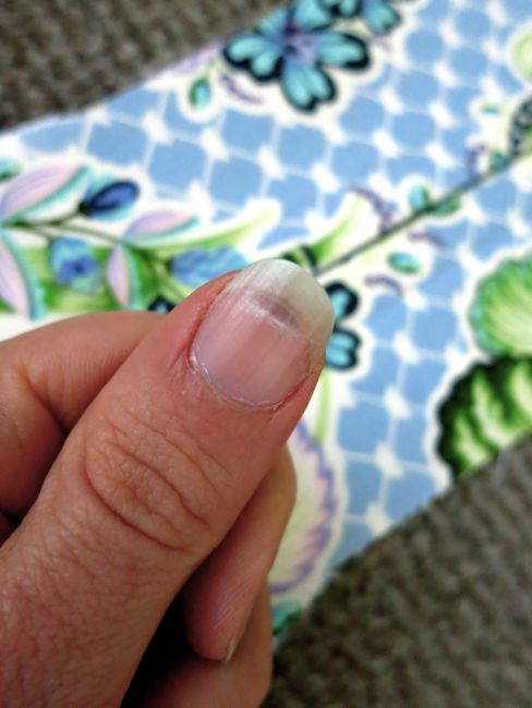
Ow.
Anyway, while ‘real’ progress isn’t being made, I need you’re help in progressing the thing that I’m really bad at: design decision making.
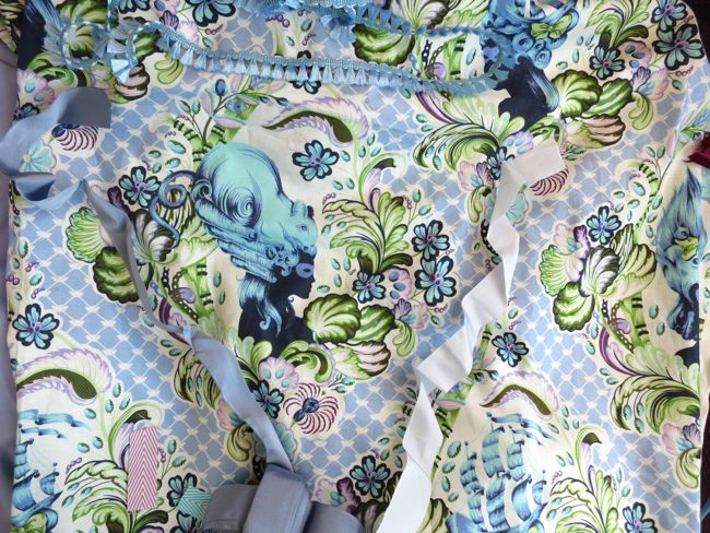
Before I’m going to be able to get much further I need to pick the ribbon to cover the seam channels and decide what I’m going to bind the stays with.
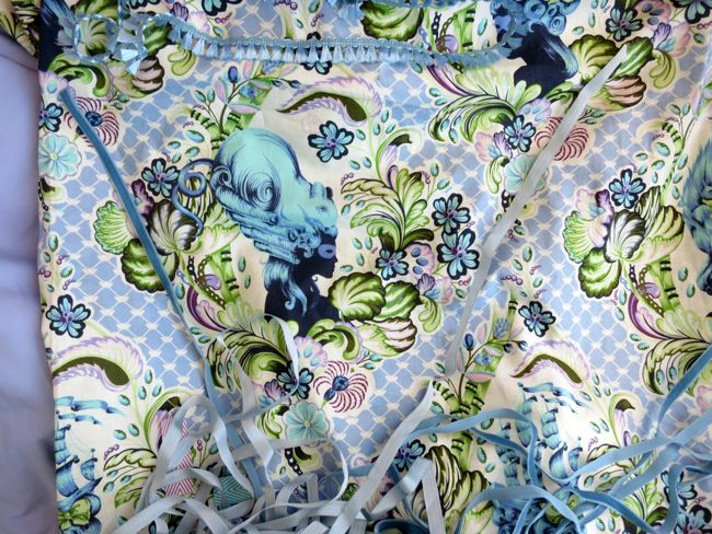
I’m lining them in the lavender cotton to the left in this photo, and may or may not try to incorporate that blue fly fringing into the trim.
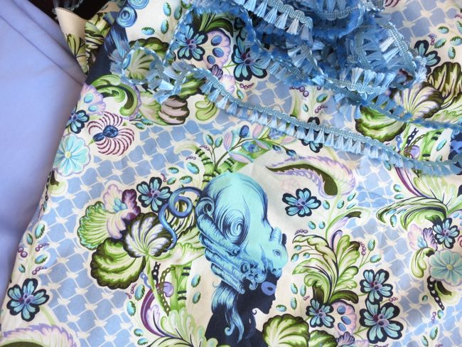
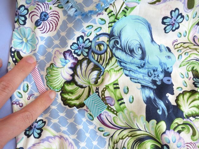
As a reference to what I’m talking about, the seam channel ribbons are those white lines that go up vertically, and the bindings are the white edges of the tabs.

Half-boned stays, 1770s-80s, French, Musee du Costume et de la Dentelle
My options for seam channel ribbon are:
A1: ice blue velvet ribbon or A2: mulberry velvet ribbon

B1: Mid blue velvet ribbon or B2: narrow palest blue rayon ribbon.
C1: sky blue rayon ribbon (folded in half, and also an option for the binding) or C2: lilac satin ribbon
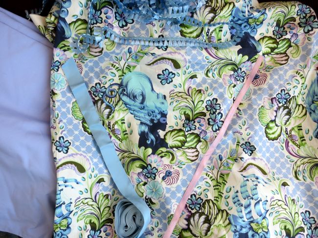
D1: Wide mid-blue rayon ribbon (folded in half, and also an option for the binding) or D2: wide palest blue rayon ribbon (folded in half, and also an option for the binding).
And finally, E1: lilac chevrons tape & E2: turquoise chevrons tape.
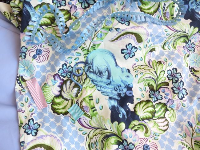
If I choose one of these, I’d probably fold it in half for the seam channel ribbons, and I’d definitely use it for the bindings as well.
So, dear readers, what do you think? Which of the options from A1-E2 should I use for the seam channel ribbons, and should it be combined with C1, D1, D2, E1, or E2 for the outer stay binding?
I love the colour of C2, but am afraid the satin won’t wear well. With that in mind, I’m kinda leaning towards B2 combined with one of the wide rayon ribbons, though E1 or E2, in their mad carousel-ness, are extremely tempting.
The only problem is that they are the only ribbons I don’t have in stash, and I’m rather poor at the moment due to finding silk ottoman on sale for $30 a metre, and how could I possibly not buy it at that price, even though $30 a metre does add up rather quickly in historical garment lengths…
I love the pop of the mulberry for the seam channel ribbon! It’s as exciting as the fabric!
Laurie
And then one of the blues for the binding, that you have available and that is durable.
Mulberry
Do you have anything in the dark midnight blue of the silhouette, or the dark camo green from the leaves? Otherwise I like the mulberry and the sky blue
B1 – the mid-blue velvet. Clear winner – tasteful without disappearing into the pattern. And I love the wee floofy fringe.
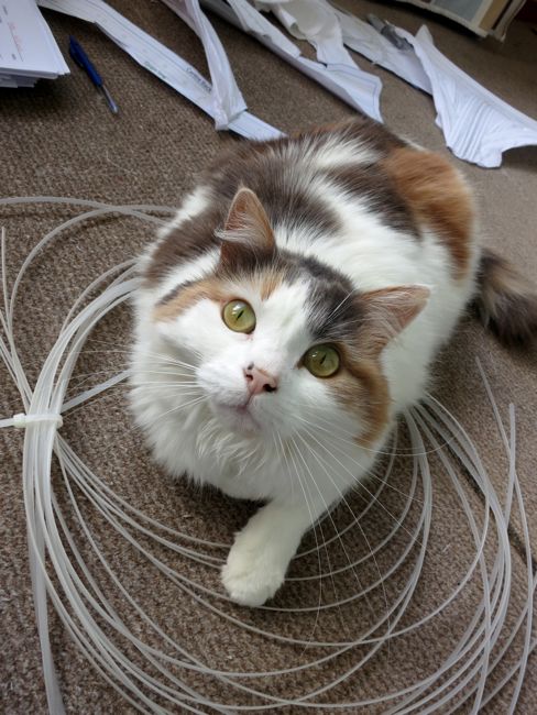
And Felicity says, “See how I’m treated? She leaves me with the bones!”
B1 and C2 are my favorites! So many options, it’s so hard to choose!
My first instinct was C2, but it sounds like you’re already ruling that one out.
I like the contrast of A2 – it picks up some of the mulberry colour of the petals of the flowers.
If you think the mulberry is too bold, then I quite like B1.
I like the contrast of picking up one of the darker colours in the print. The paler colours will get lost in the print, so it will depend on the final look you’re going for.
Good Luck!
The mulberry (A2) ribbon for the seam channels, and the sky blue rayon ribbon for the outer seam binding (C1). I like the idea of the pop of mulberry too, and think it would pick up interesting pink tones in the print.
I vote for the mulberry! It’ll give it a lovely pop that will also serve to break the print up a bit. I’d pair it with the mid-blue binding.
I adore this fabric! What a find. I can’t wait to see it when you’re done!
C2 to cover the seams and C1 for binding.
Ouch! That does look terribly painful! I’ve had stuff like that happen frequently (I’m cursed with being accident-prone, unfortunately) I hope it gets better and un-sore soon!
As for the trim, when I was looking through them, I personally liked B2 for the seams and D2 for the binding, but I am a bit of a bore (and definitely in the minority with my boring self!). If it were a plain fabric, I’d say go all out with fun colored trim, but the fabric is such a statement on its own that it doesn’t really need anything loud and unsubtle to “steal” attention away. Of course, I’m sure whatever you choose will end up looking wonderful, no matter what combination it is!
I think that B1 (the velvet ribbon) is definitely the best for the seam channels, but it makes it harder to choose the binding. I would probably go with D2 for the binding, to make it not look like you had tried to match the channels and binding and failed because they aren’t exactly the same colour.
I would stay away from the chevron tapes, the fabric is so busy that it would look bad to introduce yet another pattern.
Poor thumb 🙁 I love the lilac chevron rbbon, I know it’s not a helpful choice but I love it for the same reasons you said. And you can have it too, as it is the only one I don’t use for bunting because it doesn’t pop in that context, but it sure does in this one! 🙂
I’m a fan of the A2- mulberry or B1 – middle blue. I think either would provide lovely contrast. Also, I know the pain of flipping a nail all too well! I hope it doesn’t turn purple/black like mine tend to do. 🙁
Youch! Nail bending injuries always leave me still squirming, hours after.
I quite like A2 — the way it pulls the colour in the petals to the forefront is just lovely.
I vote A2 with E1!
[WORDPRESS HASHCASH] The poster sent us ‘0 which is not a hashcash value.
Considering the sample of 1770’s-80’s which has a bold contrast I would choose the Mulberry A2…It makes everything ‘pop’. The other colour choices are pretty but I feel would blend in with the print fabric and not be noticed… I would also use the Blue chevron tape for the binding…..Good luck!
B1 for the seams, and one of the wide blue rayon ribbons to bind.
I far and away prefer B1 for the boning channels and would preobably use E1 for the binding. That mid blue paired with the fabric just leapt out at me as a lovely balance. I think the mulberry might dominate the print too much whereas the mid blue (to my eye) accentuates some of the darker lines and shapes in the pattern with taking them over. Those chevrons are fabulous and really keep up the movement in the print. Fun.
I do also like sky blue for binding.
I like B1 with C1 with that fabric; looking good so far!
I love the pop of color the mulberry gives to the fabric. personally i’d probably want to use that for both…although it maybe a little much.
I like B2.
I like the option of B-1 because the color is subtle enough that it doesn’t take away from the pattern, but it also is deep enough blue that it stands out against it. I also like the texture that the velvet adds. For the binding, I would pick the C-1…I just think a slightly lighter blue on the binding would look nice and clean.
Good luck with it! I can’t wait to see it all finished.
Your poor thumb!
I vote for mulberry velvet paired with pale blue rayon for the binding. I think that gorgeous fabric needs something dramatic to go with it.