
This week’s Rate the Dress goes from bold, bright stripes, to soft, subtle stripes.
Last Week: a early-mid teens dress in bold stripes and bold cut
Last week’s rate the dress wasn’t very popular with some of you. Whether it was the fabrics, the cut, or the fichu-effect lace, almost everyone found something to criticise. Except for Sarah, holding the flag for a perfect 10!
Many of you also criticised the presentation, which isn’t one of the things that we take into account with Rate the Dress. Not every garment is robust enough to be steamed and pressed for presentation, and even when a garment is, a museum can’t always afford the time, money, and expert hours it takes to steam a garment, pad a mannequin, and create proper supports. If museums only shared photos of garments they had the resources to perfectly present, we’d have far fewer garments to admire and research.
The Total: 5.5 out of 10
So extremely high fashion 1913-1914ish was not your thing!
This week: an early 1840s dress with blue stripes
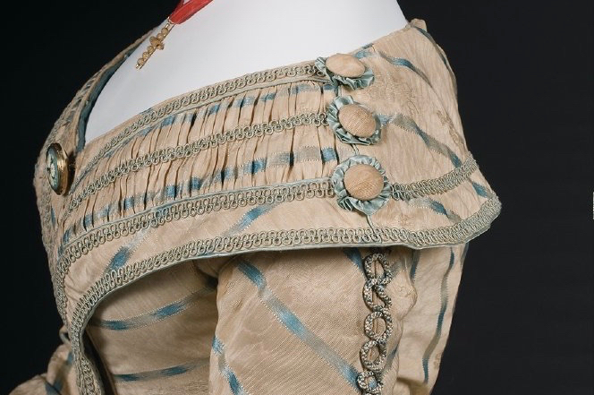
One of my current costuming obsessions is late 1830s/early 1840s dresses with asymmetrical skirt trim. In searching for examples of this very specific style, I came across this dress.
It is not an example of the type: you can just, just see the edges of the matching stripe and circular rosettes decorating the other side around the far curve of the skirt.
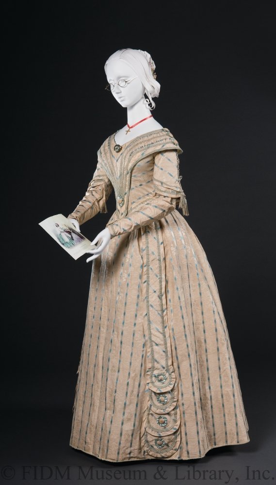
Although it’s not the kind of dress I was looking for, it’s a fascinating dress in its own right, and the closer you look at it, the more interesting it is.
The ground fabric is actually moire, with tiny damask flowers. The blue stripes are satin, but with an additional tromp l’oeil trick that pumps up the sheen factor: the are woven from warp dyed threads that slide from pale blue to bright blue, creating the illusion of areas of high shine.
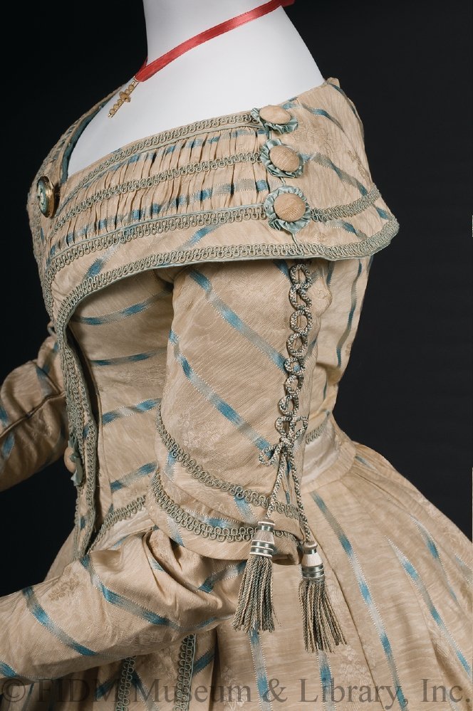
The lacing effect on the sleeves was a fashionable touch in the early 1840s. We looked at another early 1840s dress with laced and tasselled sleeves back in 2017.
What do you think of this dress which gets more detailed the closer you get to it?
Rate the Dress on a Scale of 1 to 10
A reminder about rating — feel free to be critical if you don’t like a thing, but make sure that your comments aren’t actually insulting to those who do like a garment. Phrase criticism as your opinion, rather than a flat fact. Our different tastes are what make Rate the Dress so interesting. It’s no fun when a comment implies that anyone who doesn’t agree with it, or who would wear a garment, is totally lacking in taste.
(as usual, nothing more complicated than a .5. I also hugely appreciate it if you only do one rating, and set it on a line at the very end of your comment.
I don’t like the silhouette of the 1840s in general. There are some beautiful dresses (especially evening gowns) from this time but this one is not. I also don‘t like the colour and the decoration.
5/10
I think its enchanting. I love the details on the dress, it has enough prettiness without looking at fussy and overdone. Pale colours to me can often look washed out, but the blue stripes give the fabric a lift, and definition. This is an era l like, it’s a transitional one which in this case produces some lovely styles, as you still have the fun and frolic of the previous era, but toned down a bit, before Victorian gloom descends (ok, l am being a bit hard on the later 1840s , l looked up the previous green dress ).
Think it’s a 10 from me, by the way, thevgreen one was a stunner too
I love it. It’s very interesting, on first glance it’s very pretty but the more you look, the more little details you see. The fabric’s just gorgeous and I love the trims. I also really like the design of the bodice and sleeves.
10/10
I like it a lot. I like 1840s a lot. And the more I think about it, the more I think it’s a colour that may look good on me.
The skirt decoration looks a bit like a rushed afterthought, though.
9/10
I love it. Especially the triple sleeves with the braid and tassels. I think I have trim like that (not vintage). I love the weave of the fabric (do yourself a favor and enlarge it). Even though I’m not particularly fond of the skirt decorations, I think the flowers in the center ate charming. 9/10.
Do we think the pink color has faded? It’s such a drab shade. I like the odd ornaments on the skirt and the rosettes on the sleeve. The weave structure is fascinating. The overall shape is well proportioned. The garment is in apparently wonderful condition. And yet it doesn’t make my heart sing. 6/10
I agree with Emma. this dress is a 10 for me.
I already had this, and the green dress, saved because I loved the subtlety of the tone on tone details. Every time I look at it I find another lovely detail. Would love to recreate it if I could find a suitable fabric!
10/10
I very much like the fabric – the colorway isn’t appropriate for me but would look lovely with the right skin tone/’hair color. I find the ornamentation kind of a split decision – I find it interesting and skillfully done, but I don’t really care for the look of it.
8 of 10
This dress is lovely. Stripes and plaids are my favorites. Fabric is sumptuous, and I like how the variable blue stripe is woven into the fabric. The muti-tiered sash with its details is unusual and really adds to the gown. I couldn’t tell if it was tacked down onto the dress skirt, or left to hang freely. Overall score: 9/10
overall, i think it is a pretty dress. i cannot tell if the main colour is peach or buff; it’s fine either way. what i like most about it is the way that longer or closer looking reveals ever more detail: the moire aspect, and shaded blue stripes, and the finely done trim elements. it’s ornamented but not over-loaded; rich but not ostentatious; interesting but not daft. it was probably pretty flattering to wear, too.
rating: 9/10
Enchanting, except for the odd skirt epaulets. Ornamentation should enhance, not detract. Upon further reflection, ditto for the elbow tassels. Maybe they offered nice movement when the wearer walked. I like lacing details, but not how this cording was applied to the backs of the arms.
Perhaps the tacked on looking skirt patches were just that. They covered a flaw, so the gown could continue to be worn. The bodice is wonderful.
8
I like this dress much better than last week’s.
I agree that the fabric, though muted, is fascinating. I love the bodice and sleeve design (except for the dangling tassels at the elbow). And I don’t care for the self-strips of fabric, ending with roundels, on the skirt, though I see they are intended to coordinate with the bodice. I don’t think such a heavy-looking treatment works on a skirt.
I see why the museum posed the mannequin with a book and glasses–something about this dress looks very scholarly to me. It’s not a dress for everyone, but it *is* a reasonably coherent, dignified, and attractive look. (I’d like it better without the skirt decorations, though).
8 out of 10
I like the extra detailing in the stripes, and the rosettes add visual interest around the hem. It’s interesting to see the absence of 1830s super-sleeves and how the tinier waist illusion relies on the collar and skirt (or maybe that’s my uneducated rambling there).
8
I really like this dress, muted color notwithstanding. So many lovely details…but they really don’t fight with each other, as some do. The buttons on the collar leading right into the braid on the upper sleeve, for example. The skirt panels that cover the seams and mitigate might might have been a jarring mistmatch of differently angled stripes on the seam; the matching between the fabric and the trims. Nicely done ruching. I looked for something I could use to justify knocking off a point or two but couldn’t find anything. Maybe the elbow tassels, but, hey, if they were popular at that time I can’t even fault those. 10/10.
Love this dress the trim is so pretty. Suspect the original color was a bit brighter.
9.5
10/10
Pretty colours, pretty shape, like the embellishments too, they’re non-frilly and a little unusual. The boyfriend liked it too.
8,5/10
I think it is pastel perfection! The stripes are beautiful. I thought they were metallic silver until I zoomed in and saw the blue gradient effect. The bodice puts a lot on display, but manages to look demure in this style. I know we’re not supposed to take the model presentation into account, but this dress is helped by the little red-ribboned cross and the mannequin with glasses studying a fashion plate! I love the tailoring and the color palette on this. I’ll never like tassels on clothes, but this is a minor point.
9/10
I suppose that the color faded or changed in time a bit.
I like the double sleeves ( I have seen another 1840 dress on display, where the lower sleeves were tied in if needed, adding variability to the dress), I even like the tassels. The fake lacing is a bit silly, though. The rossetes are nice, but not my cup of tea. And I dislike when decoration ends at the shoulder.
All in all, the bodice is very well done, with great skill.
The skirt makes me think that the maker of this dress was short of fabric (wich would explain the collar decoration issue). If the weird flap – as in, asymetrical skirt decoration – was put on because a jarring seam, I can understand it. But it irks me with everyhting possible, from the round ends to the grain of the fabric. I’m repulsed even by the rossetes there.
7.5/10.
Ohhh! This is so beautiful. Fabric, colour, style, embellishment – I can’t fault any of it. Especially given it was made by hand. I particularly like the way the collar thingy (thats a technical term!!!) goes into a Vmon the bodice – very flattering.
10/10 from me!!!
I absolutely love the fabric! As others have said, I don’t care for the scooped decorations on the skirt. But I love that the bottom two stripes of the collar center front are matched to the stripes on the bodice, and the pleating in the collar is giving me serious heart eyes. Overall, I can easily overlook the odd skirt decoration in favor of the subtly gorgeous fabric!
8/10
I love the colours! The muted tone paired with the electric blue stripes works really well. I like how the laced sleeves work with the trim on the collar, and I think the curved edges in the decoration compliment the striped fabric.
I don’t mind the sashes on the skirt, although I am skeptical about how well they would look
when the wearer sat down.
Also do my eyes deceive me or is there a floral weave to the fabric that can only be seen when it catches the light?
9/10