Last week I showed you a full-steam-ahead 1870s dress, crammed with all the tassels, pleats, lacing and trimming it could possibly hold: right up to the parasol pocket. I guessed correctly that a lot of you would go totally gaga over it, and there was an impressive swathe of 10s. But a surprising amount of you held back and couldn’t quite commit to a full score, and so there were an equal number of 8 & 9s, and just a few who weren’t quite convinced, bringing the dress in at a still-impressive 9.2 out of 10.
Personally, I’m in the minority in feeling that there is something not quite resolved about that dress: a bit of imbalance in the colour arrangement that kept my eye stuck on one spot, and when I really pulled back and tried to look at the whole there were all these little tiny things that just niggled at me (and, like Cathy, I couldn’t dismiss the sneaking suspicion I would hate the front). It’s like a movie where the actors are so good and the characters so appealing that you love it when you see it, and only later do you realise that there were massive plot holes all over the place. I HATE that! It’s almost worse than a bad movie, because the letdown when you figure out the plot holes is even harder because you liked the characters…
But I digress!
Let’s stick with the theme of over-the-top embellishments this week, but move from the 1870s to the 1820s, and from tasselled fringing to three-dimensional puffs.
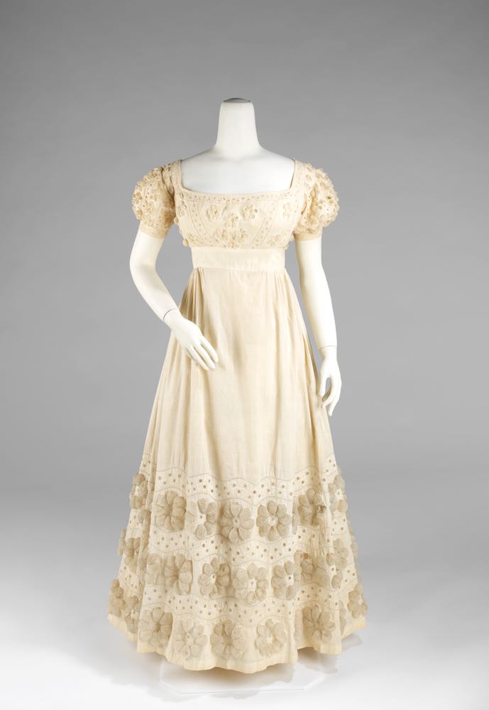
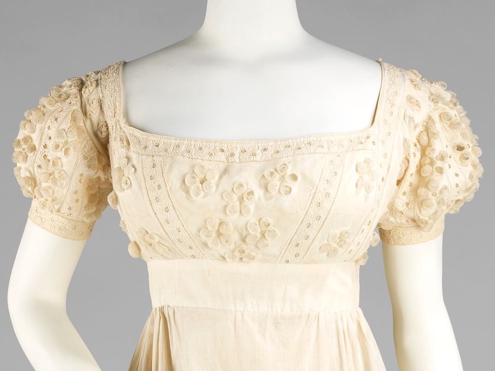
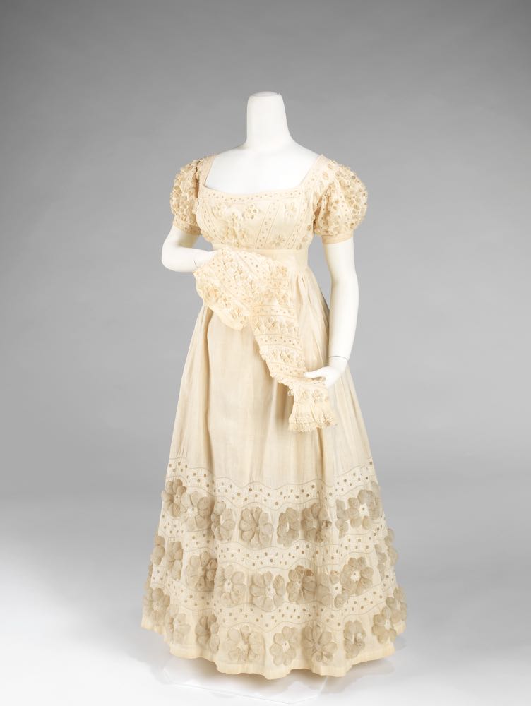
This evening dress is in classic Regency white, with visual interest created through the use of whitework embroidery and gauzy three-dimensional daisies formed from puffs of delicate fabric.
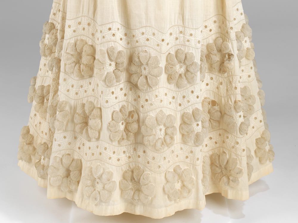
The daisies are arranged in rows at the hem of the skirt, and smaller versions decorate the bodice and small puffed sleeves.
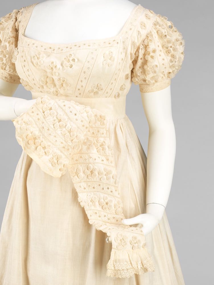
The daisy and embroidery decorations completely cover the detachable long sleeves of the dress, which made it suitable for a wider variety of occasions and weather. Sadly, only one of the long sleeves has survived, so we’ll just have to imagine what the dress looked like with both.
The all white of the dress is a taken from the classical Greek & Roman inspired fashions of the earlier Regency, but the puffed sleeve decorations give the dress the slightest nod to the Renaissance, another popular source for dress designs in the 1810s-30s.
What do you think? You’ve been pretty lukewarm on all-white Regency frocks in the past, but does the superlative decorations on this one lift it out of the ordinary? And does the pale palette and delicate ornamentation keep it from being too heavy and fussy: the frequent criticism levelled against the 1820s. Or are the daisy chains just ridiculously twee?
Rate the Dress on a Scale of 1 to 10.

I really like this dress. It just ‘works’. 10/10 from me. I’d love to know how the decorations were made.
Love it. Nicely balanced decorations without looking too heavy. Full marks!
10/10 love it!! would happily wear it
Oh man, I hate this dress.
I usually really adore regency white, and white-on-white detailing in general. I saw only the top of the dress, and my reaction was “Hmm, I’m not sure about the detailing, but I really like the shape of the bodice and *scroll* OH GOD WHAT IS THAT?!” That skirt is just dreadful. The puffs are childish and out of proportion to the rest of the design. It’s everything I hate about peasant blouses of the 60’s and 70’s, and those terrible quilts that are made of all the little puffy circles.
The puff technique is not terrible, and if used in a different design, I would probably have approved of the results. Though as it is, the effect reminds me of flaccid jellyfish parts, or empty snakeskin flakes, or any number of unflattering things. It’s possible that they have just aged really poorly–as evidenced by the significant wear and holes on the shoulders and places that would have been rubbed–and I suspect they would have probably caught the light in interesting ways when this was a new garment. Funnily enough, I do think they are more interesting on the long sleeves, and feel it echoes its renaissance roots quite well but I wish that was the ONLY place that they showed up.
3/10
This looks surprisingly modern, like a 1930s-Hollywood-does-Jane-Austen dress. I LOVE that.
What I don’t actually love is the puffiness – it kind of makes me think of bubbly potato crisps and that sort of heat-set synthetic fabric with weird textures, even though obviously it’s a cotton dress. But there’s something a bit too exaggerated about the puffiness which makes the dress look a little cartoonish – again, the Hollywood effect, as if it’s meant to be seen from a distance or show up on camera.
On another level, something about it makes me shudder a little bit and I can’t quite say why. Something about those little puffs is triggering something in the back of my head. As if they’re zits waiting to be popped or there’s something nasty lurking in the holes underneath. Weird, I know, but it sort of gives me the heebie jeebies for no reason.
I love the idea of this dress and I love its boldness and exaggeration and the fact it’s almost quite brash even though it’s demure and white. But… weird heebie jeebies. And an odd aversion to the puffy bits. Strange, as I am sure that if it were embroidered in colours I’d love it.
Tough rating. I want to give it 4/10 just because of how it creeps me out, without my being able to explain why. But I look at it and I think its boldness is amazing and very laudable so it deserves more than 4, so let’s say 6.5/10.
I am really glad I am not the only one who had that reaction. They are really unsavoury in a very indefinable way.
That’s a great way to say it–like the 1930s does the 1830s. While I agree with the tension between cream and grey, I have a suspicion that it is because of discoloration, not intent.
Honestly, I like it. It’s balanced, it’s symmetrical.
10/10. Done
I saw zits too.
Or maybe it’s like the dress is actively bubbling?
I gave the top a once over and was so close to handing out top marks… and then I scrolled down to the grey, bubbly “flowers” and was so repulsed that my skin literally started itching.
As an explanation, I’ll just quote straight from the Wikipedia article on Trypophobia:
Arnold Wilkins and Geoff Cole of the University of Essex’s Centre for Brain Science were the first scientists to investigate trypophobia. They believe the reaction is based on a biological revulsion, rather than a learned cultural fear. In a 2013 article in Psychological Science, Wilkins and Cole write that the reaction is based on a brain response that associates the shapes with danger. Shapes that elicit a reaction were said to include clustered holes in innocuous contexts such as fruit and bubbles, and in contexts associated with danger, such as holes made by insects and holes in wounds and diseased tissue. Upon seeing these shapes, some people said they shuddered, felt their skin crawl, experienced panic attacks, sweated, palpitated, and felt nauseous or itchy.[4] Some said the holes seemed “disgusting and gross” or that “something might be living inside those holes”.
0 out of 10.
Oh god yes, that’s exactly it.
Oh, yep. Definitely.
There’s a name for this??! Scaly anteaters, also called pangolins give me this feeling!
I know what you mean, though I am myself not effected by it. This explains about several people in my life and their interesting reactions to things, though.
Thank you, Stacey, Daniel, and R!
I find it unsettling, too. I coped with the top, but scrolling down to the skirt! Daisy-paloosa! It happened all over again in the 1970s, only without the puffed sleeves.
Even though I’ve twitched at the puffy daisies, I think I might have liked it better with the long sleeves, and yes, more daisies. But that way, they would be more like an over-all pattern. The short puffed sleeves sometimes worry me in this period, and the dresses become more substantial and give the lower skirt something to balance with. They seem to be crying out for an under-layer, the way modern sleeveless dresses in wool seem designed for layering. Or for the longer sleeve shown – it would be ‘as well as the puff’, yes? So that it had the look of an Elizabethan coat?
7 out of 10. Because I think it could be another game with the long sleeve.
I love this! So pretty and just on the right side of twee. I also like the flat front and side gathers.
10/10
As redundant as they are, I quite like white Regency gowns. When they’re done right – light, simple, but with some unique details to give them personality – I think they’re hard to improve on.
This one has me conflicted though. I think it’s the 3Dness of the embellishments. I like the cluttered areas – I like how they visually partition the dress – but at the same time, the bodice/sleeves have me seeing dozens of large white pimples (in tasteful patterns). As for the skirt, rows of large 3D flowers (as a concept) haven’t aged very well. It makes me think of a Barbie dress from the 90s. The white-on-white keeps it restrained, but overall it feels too large and heavy.
That said, put the long sleeves on and I like it much better. I think it’s because I stop seeing it as an airy summer dress. The large embellishments work better for a dress worn in colder weather.
8/10
The silhouette is pleasant enough, if one doesn’t mind the 1820’s; the slightly raised waist, conical skirt, and puffed sleeves, and the color is a harmless neutral. So far that’s fine; it seems like a young girl’s gown, but there’s nothing wrong with that….
But then the eye lights upon the weird, 3D daisies decorating the skirt, and suddenly the effect is the 1820s trying to do the 1960s, 140 years too early. Ugh.
Perhaps my prejudice is irrational, but I hate the effect. 5 out of 10.
The puffs remind me of cocoons and so the dress gives me the heebie jeebies too. From a distance I don’t mind it. 4/10
I usually like the heavily trimmed hems of the 1820’s, but this one does give me the creeps. It doesn’t look quite healthy, like it’s inflicted with some illness, or have the spawn of a parasite growing on it… Basically what R said. Perhaps there are too many petals on the flowers, making it look too busy…. Would be perfect on a ghost 😉
So, liking the overall shape, don’t like the trim. 4/10
I think the flowers are cute, although the big ones on the skirt seem a bit too big to be elegant. But I think the effect would be nice in person, and I admire the seamstress who made all those puffs! The top is worth a 9, as I also really like the long sleeves, but the lumpiness of the bigger flowers makes it an 8/10.
In my opinion, the bodice is what the experts I think call “swoonworthy”. Very elegant, beautiful shape, lovely subtle decoration (it works because it’s all one colour). The shape of the skirt is just right, too. But the monster daisies, oh my. They remind me of those B-movies from the sixties in which a mad scientists tries out some sort of atomic rays on ants and then the ants suddenly grow to 10 meters overnight and wreak havoc on the mad scientist’s hometown…the daisies look exactly like something the mad scientist bombarded with such rays. They remind me of 70s curtains – huge stylized THINGS, usually in bown and orange or three unhealthy shades of green. At least we are spared the psychedelic colorways in this dress.
The detachable sleeve – glorious idea, but a bit too much puffy daisy goodness – I think plain sleeves would look better.
So: I object to the monster daisies at the hem and the sleeve, but since the overall shape and the bodice are so beautiful and the idea of having a detachable sleeve is so great:
8.5
From a distance, I liked the form of the dress, but the giant daisies at the bottom made me thing of Daleks. I can’t get that image out of my head now.
I love the small daisies at the top, though. So, I’m going to have to give it 5/5…because Daleks.
May I ask…why Daleks?
Daleks as in Dalek bumps…..
I like Regency white on white details. Then I scrolled to the bottom of the dress and all I could think was, “Why would they put pom poms on that dress?!” Okay, so we know that these aren’t actual yarn pom poms, but I can’t get away from that initial thought. I love the bodice detailing, but I just can’t stop looking at the bottom and thinking, “There went a perfectly good dress.” Especially when you realize there are smaller versions going down the entire length of the detachable sleeve. Bodice – nice, hem – a bit too much, long sleeves – overkill. Definitely a case of too much being a bad thing. 6 out of 10.
I love this dress! It’s silly and a bit twee, but beautiful with intricate details. I would 100% wear it, I don’t take myself and my style too seriously. 10/10
I really want to like it, but it’s just too twee for me. I agree with others, the puffs are just to girlish and there are too many of them. If this was a child’s dress I think it might just work, but at for an adult it’s just not doing it for me. 4/10 just cos technically I can appreciate it and it’s clearly beautifully made.
I really want to like it, but it’s just too twee for me. I agree with others, the puffs are just to girlish and there are too many of them. If this was a child’s dress I think it might just work, but at for an adult it’s just not doing it for me. 4/10 just cos technically I can appreciate it and it’s clearly beautifully made.
I saw my late sister’s senior prom dress (1971). Well, not quite; but, it was fairly close. The lines are actually fairly nice for a debutante’s dress, as it is meant for someone not yet twenty. Those flowers! Flower Power 1820! It was not a good look back in the late 1960s-1970s (I remember when) and it certainly is not one in 1820.
My score 5/10
I concur with the childishness of the daisy puffy trim (particularly the skirt). My first thought was so want to see the petals more of an elongated vesical shape (which might not help the “ew” factor, though).
Otherwise, I love white on white and the basic look of this era.
8 of 10
This would have been a 10, until I scrolled down and saw the daisies at the hem. Those were way overdone, and don’t feel “Regency” to me at all.
I love the three-dimensional effect on the bodice and sleeves, and feel that that scale and amount of ornament is perfect to add interest to a Regency gown. Why, why, did we have to have giant daisies at the hem? They ruin the delicacy of the dress.
7
I really like the decoration on this dress. If I had seen it in all its glory when it was first made, I probably would have gone crazy over it! I am just trying to imagine how on earth all those delightfully puffy daisies were made.
However there is something I don’t quite like that I can’t really put my finger on, so I am giving it a…
9 out of 10
Meh. Daisy overload. Possibly worn by the Kate Middleton of the era. 2/10
I love it. Usually I’m not that fond of Regency styles but I really like this one. The only thing that caught my eye was the waistband as it’s not straight. Perhaps the original owner was a bit asymmetrical. Still I’d give it 10/10
I quite like the bottom. I can even get behind the top, somewhat overdone as it is. But the middle, I hate. After the insanity that is the bodice, it’s incredibly jarring, and it does nothing to tie the larger-scale motifs of the skirt to those of the bodice. Also, because it’s white, it puts me in mind of a just opened tub of lard or crisco.
3/10
I love the top wih the small adornments, but the skirt’s huge flowers freek me out too!!!! Although it might had been lovely back when “fresh and airy” white instead of todays faded grey tone, but still, it would be better with small adornments like on the top! 7/10
I like how this takes something that can all look same-old same-old (even if pretty same-old-same old; I like a nice white Regency gown) and makes it very interesting. The technique on the details is just so interesting and beautiful.
It looks quite childish, however, so I can only really see a very young lady in this. (Or an older person who just enjoys children’s fashion.) The childish look is keeping it from perfection for me, so 9.
Trypophobia., eh? Wonder if this dress was worn by a very shrewd heiress to a fortune
who was sorting out the men from the boys.
6/10
Tea-bags!
To me, it looks too much like bubble wrap and not enough like the puff and slash of the 16th century on the bodice and sleeve. The flowers on the skirt look like mini hornet’s nest artistically arranged. I do like the embroidery and it terrifies me to no end that someone did all that by hand but the hornet’s nest flowers are dragging this way down. 3 out of 10
I wonder if it has yellowed a bit with age, and might have been a brighter white originally. I don’t mind it as is, but don’t think I would like it in a brighter white.
I don’t have a problem with the daisies on the skirt. Generally I like these 3D fabric manipulation decorative features, and while this isn’t the best one I’ve seen, it’s okay. The bodice looks a bit overdone with too many little fabric puffs, though it is a clever use of Renaissance influence, and the long oversleeve is definitely too much. Add on two of those and the outfit becomes ridiculous. 5/10
Um, do those look like little wasp nests to anyone else?
3/10
Somebody said hornet’s nest already. I guess it comes from the papery thin looking fabric and the fact that there are holes in it. It probably would have looked better when it was first sewn, but not by a lot.
Hmmm.. Usually I quite like regency frocks. But this one is a bit – meh. The daisies in the bodice and sleeves are ever so darling, but the three bottom rows of the skirt use the garden gate post to pound home the idea.
No way I can go above 7/10
I love Regency puff dresses. No revulsion or creepy-crawlies. They are twee. They are over the top. But I think they fit in their era perfectly. Would be happier if the puffs were of regular muslin and not gauze (I do understand the wasp-nest factor there), but I’m still OK with it. Although I’d never wear it. 10/10
As a child of the 60’s, I went through my teenage years 1967 through approximately 1974. I look back with regret at all of the daisies I plastered all over everything. This dress unfortunately reminds me of that. I’m afraid I can give it only a 7/10.
As with lots of you, I really rather liked this dress …….. until I scrolled down and saw the bottom which did indeed make me shudder. I’ve never been much of a fan of what you might call extreme, 3D fabric manipulation but, even allowing for fabric colour changing over time, this really is yuck. Then I saw the long sleeve extension. Oh dear. The little daisies over the bodice and puff sleeves look pretty and feminine and almost dainty. On a long sleeve they look like skin eruptions. 4/10
I coulsn’t make up my mind. In the end, I think it’s because I like the top with the smaller flowers, and dislike the bottom with the bigger ones. But overall, it’s still got a nice balanced silhouette. 7/10