I missed Rate the Dress last week due to my brain switching into complete holiday mode, but at least I left you on a high note! Peter de Kempeneers 16th century Italian noblewoman in blue-green was almost universally popular – but only almost, because there is always one or two who don’t like something! Because of the only almost, our noblewoman came in at 8.3 out of 10.
I’m feeling quite grey this week, so picked a dress to match:
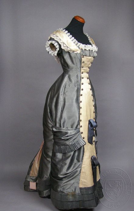
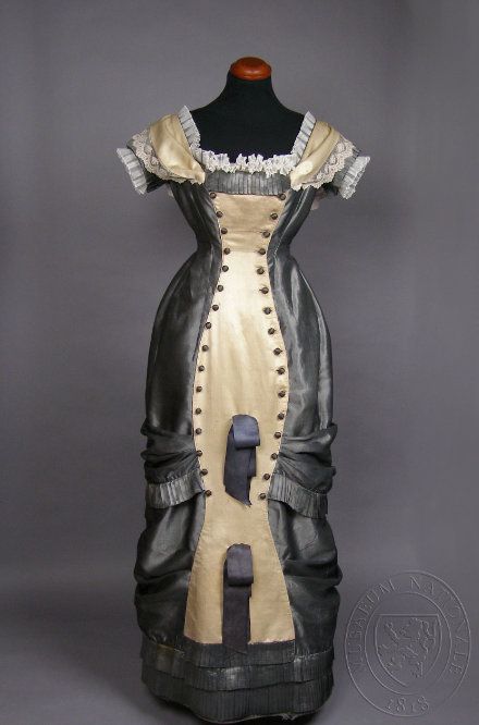
This circa 1880 evening dress from Czechia an unusual grey, and tonally, reminds me of the last Rate the Dress. It features the (relatively) figure hugging natural form silhouette of the late 1870s and early 1880s. The body conscious silhouette is emphasized by a curvaceous cream panel, beating 2011’s illusion dress trend by over a 130 years!
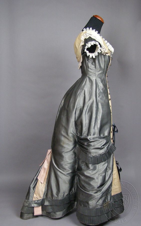
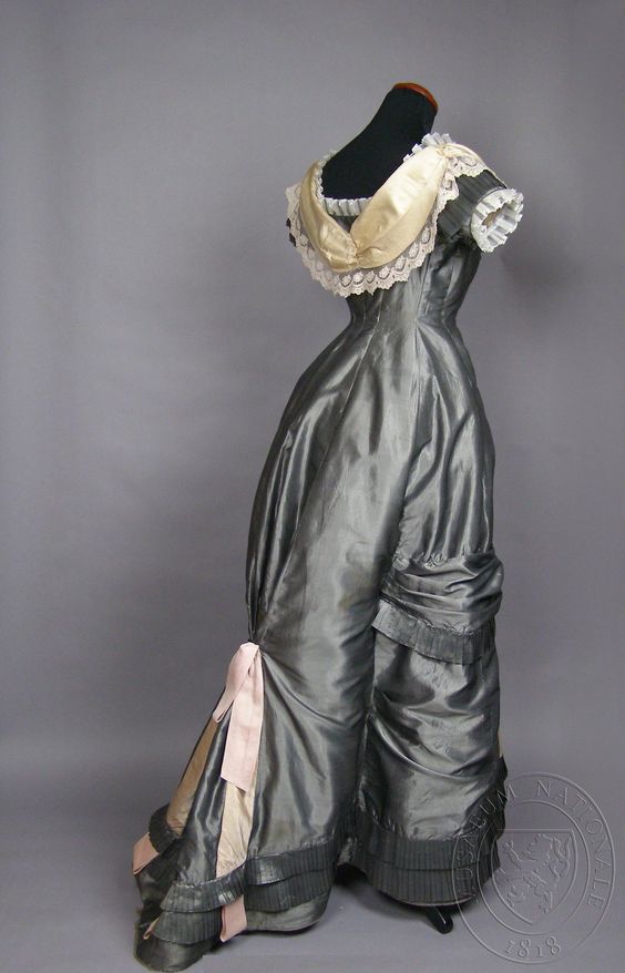
Curve conscious it may be, but the curves are definitely Victorian: with full hips, and back emphasis that would have been supported by a small bustle.
What do you think? Can grey be good?
Rate the Dress on a scale of 1 to 10

I do like the color, and the crispness of the contrast between the gray and white, but as to the rest, I had a general reaction of dislike.. The first impreassion was “too fussy by half” and the decorative features on the skirt are decidedly odd.
It does have me6 ofrit from the precise skill of construction, but I wish that skill had been deployed more harmoniously.
6 of 10
I think that the back part is supposed to resemble 18th century soldier’s jackets like the buttons on the front do. It’s a very interesting dress, and I like how the cream fichu sort of transmorgafies into the military type buttons. I think it’s clever!
8/10
It’s gray here too, today!
As for today’s new Rate the Dress, I am of two minds. I like the silhouette, and the choice of colors–the shiny gray silk is lovely, and goes well with the cream panel and pale pink ribbons.
What I don’t like is the excess of decoration. The central cream panel that looks as though it’s buttoned on to the front is surprising, and striking–but the dark gray ribbons pinned to the lower half of it are ugly, and look tacky and out of place. The gray pleated bits that look as though they’re pinning the skirt back near the bottom are interesting–but the same pleated bit along the top edge of the bodice just looks excessive. The pale pink ribbons, though nice in themselves, look as though they were tacked on at the last minute–they bear no relationship to anything else on the dress. If the maker had just settled on a few decorative themes, and applied them throughout the dress, this gown would have been a 10. What a pity.
As it is, 6.5 out of 10.
Looking at it again, I’d also say that the side and rear views are much lovelier than the front, which manages to be downright dowdy. For some reason, all the cream and pleated lace on the bodice in the front makes me think of a maid’s uniform.
Looks like a gown for a prisoner with rather impractical bondage accessories smack in the middle oft the skirt. And the buttons give it a prison-matrony-look. 1,5 drab grey points, sorry.
this is one of my fave gowns of all time! im so happy to see it here. i love everything! the color, the buttons, the bustle, the bows, it is a dream gown for me.
10/10
Gray & cream beautiful, back beautiful, side beautiful, front looks goofy with buttons, bows & springs panel 6 /10
It’s gorgeous! I love that warm, asphalt grey, always have, and with the warm cream it is saved from being stark. You’d have to have jut the right colouring to shine in it though.
The button down front reminds me of spats – so dapper, and I instantly thought ooh, steampunk. I like the smart rows of pleats and the tailored bows, and the minimal use of lace just to soften the edges around the bodice. I even like the odd bows in the front panel – because when I tried to imagine them away, I felt the front looked like it needed something. Which I imagine is the thought process followed by the creator.
10.
Er…
My brother peered over my shoulder at this one and said “That doesn’t know if it’s the maid, the mistress or the ironing board — it’s even got the iron stuck on the front!”
Having seen it this way, I can’t draw further conclusions 😀
Your brother has just permanently affected how I will ever see this dress ever again. He is absolutely spot on.
I’m saying 5/10 for this, as I think there’s a certain clunkiness about the way it all comes together, even though it is very precisely and well made. But that front panel is crashingly unsubtle and stark, and it does look VERY literally upholstered with the buttoned down edges. Well cut, but some of the draping, especially on the collar back, looks a little off.
I do wonder if the wearer was from a Quaker family because this is the kind of high quality, neat and fashionable (but not ostentatiously so) attire in gentle, deep, non-flashy colours that I would associate with Quaker dressing.
5/10, to repeat the ranking again – it actually reminds me a lot of those granny bags where you buttoned different cloth bag bodies to a pair of wooden handles, so I keep imagining this dress with a number of crazy button-off/on front panels, none of which really work….
I love this, and I’m saying that as not a fan of gray (we’re house-hunting and ALL the realtors have advised their sellers to paint everything ‘Hipster Gray’ in an attempt to attract younger buyers — of which we are not.).
The form is lovely and I actually like the contrast panel — altho the buttons are a bit over the top, but if you subtract some of the other nonsense, they aren’t too bad; it would have been nice for them to repeat the button detail elsewhere instead.
I really don’t care for the 2 ‘bows’ attached to the front cream panel; they seem quite misplaced and awkward. The pleated lace around the neckline is nice, but the extra flouncy bits on the cream shoulder sash are a bit much, as is the ruffle at the front neckline. This could be so sleek and elegant if the ‘fluff’ was exchanged for better details, but it’s still lovely…
… and a good, solid 8/10.
It looked odd but I couldn’t quite place it. And then, aha. Especially with the colour combination, the buttons down the front and the curve to the front panel at knee-height … it is reminding me of a robot waitress…
Torso moulded to be predominantly female, wide hips accommodating machinery, narrowing at the middle of the knee where the vertical strut is then widening out at the base for the single, ubiquitous wheel.
Yup, robot waitress.
5/10
You are spot on, Panth! Robot waitress it is. I’ll join you in the 5/10.
Hideous! Burn it. If I can’t give 0/10 it will have to be 1/10.
I like the colors, and the general silhouette. But I have a few problems with it–the bows down the front, of course. But those side swags that hold back the bustle shape are not only ugly, but mechanically, I think they’d make this dress enormously difficult to walk in. I realize that bushes required a great deal of grace and skill to maneuver under the best of circumstances, but this one brings the term “hobbled” to mind.
6/10
I love the back so much; the cream collar drapes so gracefully. I’m unimpressed with the front, however. Too much going on there and the two navy ribbons are bizarre. 7/10
For all the wonderful elements and colors I’m stuck between the impressions of
1) Pull the tab to open
2) Added the panel to cover a massive spill.
3/10
It’s a big no from me. The colour is passable but the design looks like it was done by someone learning how to do upholstery. It looks incredibly uncomfortable. The tags on the front panel look out of place and contribute nothing to the overall look of the dress. I sure that somewhere there is a matching armchair to go with this dress. 3/10.
Ooh! I love the colour and the lines of this. 10
Obsessed with this! Total 10!
I’m seeing this on a young woman. I like most of it except for the lower half of the front. Somehow it’s not right – perhaps the shape, and the buttons should have continued all the way down?
7/10.
I think you are correct! It must have been for a younger woman, mid-teens. Then I thought maybe she had a twin brother who was at a military academy, hence the buttons and ribbons, etc. It definitely is designed for accentuating the curves of an hourglass figure.
We all look at these pieces of clothing through the lens of today, and our totally unstructured, undecorated, mostly knit clothing. Someone wore this dress and probably flitted around a party, chatting and flirting and having a wonderful time. She would have looked perfectly scrumptious and been envied by others who weren’t so well dressed.
The more I look at it, the more I like it. 9/10
I like that dress quite a lot. The only thing I do not like is the odd bows – they could be done away with! That drops my rating, and I shall give this a 9/10.
Omg! It’s a Victorian fancy dress Dalek costume!
Sorry, I can’t unsee that enough to rate.
I love this shade of grey, it’s warm and deep.
The bustle and the draping on the skirt is scrumptious, and the cream back neckline draping is superb too.
But lordy…. it truly looks like an ironing board has been riveted onto the front of this dress. It is such a big area of blankness. And then two wads of navy toilet paper staple gun-d onto that as kind of an apology.
I don’t mind the lace around the neckline, but around the arm holes is so short and stiff and sticky-outy it looks wrong and cheap, like how posh lamb racks have those little frilly paper things attached to the bone? You know?
Plus, accents of pink AND cream AND navy blue? Should have stuck with one, maybe two.
I agree with the person who said that this might have been referencing soldier’s jackets – but it’s a giant NOPE from me. 2/10.
It looks not so like it was sewn, but welded. A bit ‘Rosie the Robot’. An interesting piece of sculpture 6/10
Looks depressing and industrial. I normally like grey, this just is a downer. I declare it my least favorite ever and give it a 3. That’s a tribute to the dressmakers skill. 3/10
I don’t like the strange ribbons- they seem very random.
6/10.
Love the overall shape, love the silvery grey color. Do not love the white accents, nor the ribbons. I find my eyes zipping up and down the dress, with no place to rest. I imagine with the right accessories or hairstyle the wearer’s face would be the focus? But the dress alone, on the form, gets only a 6 from me.
This is a delightful dress – I love the colors, the lace at the neck and sleeves, and the delightful curves of it. I can’t get quite past the milkmaid-ish quality. It’s fortof like the dairy version of the lace and ribboned ceramic shepherdesses that never touched a sheep in their life. I can’t quite square that with evening wear. So 8/10.
[[Cough Cough]] This is not my favourite gown by far although I do love the grey silk.
How do I enumerate my dislikes?:
1. Sleeves/lack of sleeves (silly white froufrou)
2. Milk bottle shaped central apronesque which over-emphasizes every curve (and I like curves)
3. 2 silly looking ribbon do-hikies on milk bottle
4. combining cream and white (in this particular venue — not a good idea)
5. there are a few nice things going on but they are over-whelmed by all of the above
Final Score: 3/10
It’s a sensible dress the heroine might wear in the afternoon for a short scene. I can imagine it promptly covered with an overcoat as she is whisked into a carriage to go make calls. 6/10
I like it, except for the weird ribbons on the front of the cream panel. It’s a solid 8 from me, I don’t love it, but it’s still looking nice.
8/10
This looks like something from a Steampunk comic that the serving android wears….I like it….just not as a dress, but as a COSTUME. Victorian android lady…5/10, I guess, because I like it as a costume but I’m judging it as a dress?
Whoever wore this must have been a remarkable woman, a cross between Mae West and Victoria! I do love the grey and cream, and the architecture of this garment. One builds a dress of this sort. 8/10 only because I could not imagine wearing this, but would love to go to tea with the woman who did.
Remove the weird pocket ribbons (it looks like an over the top pocket form from ribbons), and the side sashes that are giving it an odd look on the skirt panels, and I love this dress.
Since I can’t do that………
5/10, I’m vying wildly to rate it lower for those horrid pocket ribbons and higher because I see such potential.
This has always been one of my favorite dress. It just looks so much like a movie costume rather than an actual extant dress, and yet it is an extant dress, that I completely love it. The bows, pleats, and pastel play contrast is just perfect to my eye. Love it. 10/10
I really love the colour, and I like the neckline and the pleated trim. Hate the weird elongated plastron effect at the front which looks like a bowling pin. Also weird is the way the side bolsters are gathered and tuck into a side-back seam – it looks like the corner of a bed with an old lady’s flash duvet! Could have been fabulous but they overdid almost everything. 6.5/10
I love most of it, but do think the bows on the front panel are an afterthought, a bit like the “pimple on a pumpkin” that you see on houses that have had one single room added upstairs.
If I mentally remove the pimples it’s perfect so I’m giving it 9/10
The front panel is poorly resolved, the trim on it superfluous and awkward; and the train is weirdly angular, yet I rather like the dress as a whole. The color scheme, and relatively modest trimmings are a relief from the often garishly- (or blandly-) colored, heavily-upholstered fashions of the era. I’m pretty sure, with the exception of the lower half of the front, this dress would look smashing on an appropriately voluptuous model, especially if someone would loosen the strings that likely are the culprit for the rigidity of the train. Having said that, I definitely appreciate the more deprecatory comments (rivets, anyone?!) about this piece.
7/10
Oh my. There are a lot of things I love about this, and some that just leave me feeling bewildered. The grey silk is certainly gorgeous. I really can’t decide whether I like it or not.
6.5
Whoa! Ye gads, looks like armour.
What a waist of a good dressmakers talent. 1/10
I’m too late to rate, and rather glad of that, because I’ve always had mixed feelings about this one. (But I’m very amused by a couple of the comments here, and that lifts my spirits about it.)
I feel I need to point out, though, that this isn’t from the Museum of Decorative Arts, this is from the National Museum, as the watermark indicates.
The possible provenance also makes it likely – the two women were the daughters of a prominent 19th century Czech politician and clearly very interesting women in their own right. I’m finding out Marie Riegrová (Jr), married ÄŒervinková, was a writer (having written the librettos to two of AntonÃn Dvořák’s operas, among other things), and LibuÅ¡e, married Bráfová, was a philanthropist, women’s rights activist and ethnographer/collector. And I’m glad this prompted me to look them up.