Last week’s Rate the dress took us to the 1740s. This week we’re travelling back in time half a century to ca. 1690, AND forward half a century to ca. 1790, and finishing up ca. 1890, all in one dress. Only Worth would try that! But did he succeed?
Last week: An unknown young lady of ca. 1740 by Bartholemew Dandridge
I’m always a bit trepidatious when I post a historical child for Rate the Dress because of the children-as-adults issue. Luckily the response to our girl-on-the-cusp-of-adolescence was (almost) unanimously positive. You thought she was perfectly dressed for a young lady in her first almost-grown-up frock, with the ideal balance of frills and boldness.
The Total: 9.3 out of 10
It was the princess dress to appeal to both our inner little-girl and our more critical adult selves!
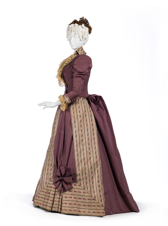
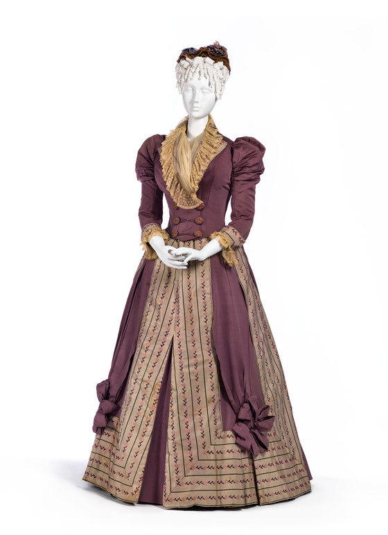
This week: A House of Worth Reception gown of ca. 1890
This grape purple and pale gold Worth reception gown from ca 1890 is heavy on the historicism. It has a skirt inspired by mantua fashionable in the 1690s, and a bodice that gives a nod to redingotes fashionable in the 1790s.
The interesting stripes, which run vertically down the front of the skirt and then turn to run horizontally around the hem are an unusual and distinctive design feature. They aren’t common in many eras, but appear in 1680s & 90s fashion plates:
The House of Worth has added their own twist to the stripe frames, by placing them around elaborate bows which anchor ribbon ‘sashes’ falling from the waist.

Woman’s Two-Piece Dress, Worth, France, Paris, circa 1890, silk faille & silk twill with silk embroidery, linen lace, and silk plain weave trim, LACMA, 55.19a-b
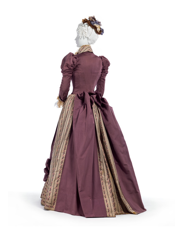
The dress of the skirt is picked up in a sculptural ‘butterfly’ bustle that evokes the the bustling of late 17th and early 18th century mantua

Woman’s Two-Piece Dress, Worth, France, Paris, circa 1890, silk faille & silk twill with silk embroidery, linen lace, and silk plain weave trim, LACMA, 55.19a-b

Recueil des modes de la cour de France, ‘Femme de Qualite en Deshabille d’Este’ Jean LeBlond (France, active circa 1635-1709) France, Paris, 1682 Prints Hand-colored engraving on paper, LACMA M.2002.57.65
While the lower half is all 17th century, the bodice takes its cue from double-breasted Georgian redingotes, with a soft, lacy collar inspired by fichu.
What do you think? Is this tri-cententenial mashup one for the history books? Or is this take on la mode 16-17-1890 demode in any era?
Rate the Dress on a Scale of 1 to 10
A reminder about rating — feel free to be critical if you don’t like a thing, but make sure that your comments aren’t actually insulting to those who do like a garment. Our different tastes are what make Rate the Dress so interesting. However it’s no fun when a comment implies that anyone who doesn’t agree with it, or who would wear a garment, is totally lacking in taste.
(as usual, nothing more complicated than a .5. I also hugely appreciate it if you only do one rating, and set it on a line at the very end of your comment, so I can find it! Thanks in advance!)


Aw. I want to like it, and it is obviously very high-quality, but my eyes don’t know where to pause–it’s too complicated in design. The embroidered and pieced skirt is in conflict with the bow/sashes. I do like the bustling in the back, the sleeves, and the fichu-like collar, though!
For the fussy frock, 4/10.
I had the opposite reaction – it seemed to me very well organized, and because the color scheme is so restrained, the various elements flow easily in my sight.
9 of 10
I love the dress… but I can’t deal with the colours.. I keep looking at the beautiful colours on the fashion plates and thinking what a missed opportunity… I’m so torn..
7/10 because it just my particular aversion to maroon that’s making me dislike It, especially as I really want to love it.
8 out of 10
I think the second set of vertical stripes in the back is overly complicated. The front is fine, and I appreciate the difficult construction of joining the vertical and horizontal sets of stipes. The sashes are lovely; a spot of softness in an otherwise structured garment. I love the bodice and wish I had those sleeves on a jacket, myself.
Somehow this just works for me. My first thought was that it is a perfectly balanced ensemble. I love the ruffled neck line, the not-so-overly-puffed sleeves, the plum and gold colours and the stripes becoming horizontal around the hem. It is an interesting dress with plenty to catch the eye without being over the top. I raise my hat to Mr. Worth.
8 out of 10.
I find it utterly delicious in every way. SO much energy, leading the eye where it wants you to go. Yum.
10/10
I don’t think I’ve ever commented on one of these before, just looked… but I just think this is marvelous. The House of Worth is aptly named! I LOVE the historical inspiration you’ve pulled out, and I just like looking at it. 10/10
In general Worth really can’t go wrong for me. I don’t really like the neck ruffle but other than that I really like it. It’s certainly much busier than I would usually go for but it pulls together really well. I especially love the bow on the bustle for some reason.
9/10
For me, there’s a lot going on and in kind of a distracting way. The stripes are graphic and geometric in layout with a delicacy to the pattern that is really charming, then you have the big poofy bows and swathy drapes in solid purple, and it doesn’t seem to quite synch. It feels almost like a child drew the original design and Worth kindly made it up exactly as specified without trying to “fix” it.
Not an easy dress to love or even like unreservedly. I’m going to say 6/10 as I like the references and it’s quite a creative dress even if it doesn’t quite work perfectly.
I like it, overall. It looks kinda dingy in color; maybe that’s just the way the fabric has aged? The only detail that feels off to me is the sleeves; I think the ruching gives the impression of being much too tight; it looks uncomfortable. 8/10
I think it works. It doesn’t quite seem as if it should but it does. The color hasn’t aged the best.
As a minor digression, I’d like to weigh in on the children dressed as adults discussion apropo last week’s rtd. We still dress our children like ourselves. It’s just that the general styles have changed over time, and so it looks a little different now. If you don’t believe me, please take a good look the next time you’re out and about.
Any way, back to this week’s dress. 8/10
I love it!
10/10
I cannot explain what it is about this dress but I think it nailed it. Love the textures and the rhythm of the dress and the limited color scheme pulls it all together. 10/10
I like all the details of the dress, especially the miter of the stripes. I find myself wondering if this dress would be worn for a special reception or party, or for a few times a month for social calls, and if it would be uncomfortable to wear for hours at a time. ( I can not imagine me wearing it).
10/10
I am sorry, I love most of the Worth designs… but this is not mine. The redingote and the strip placement is nice, but this old fashion fichu and the butterfly on the back are worst chase.
The color combination is nice.
6/10
7/10
This is awful. The colours don’t work at all, making each other flat and just bad. The shapes argue with each other. The lines are confusing without adding interest.
1/10
It’s so pretty with those stripes and the cute buttons!
10/10
I dislike the color scheme. Mauve (it doesn’t look grape purple on my screen, sorry) and muted gold together are boring. But I love the historical styling details–the directional changes of the stripes, the double-breasted jacket-bodice, the ruffles around the neckline, all of it.
It’s better than a 7.5 because of the details, but the color drags it away from a possible 10.
8 out of 10.
I’m wobbling … it’s either subtly muted or depressingly dull. It’s either wonderfully inspired by the past or a pastiche of styles. The fichu is either modest or granny-style.
The workmanship and use of the fabric as a design detail is good. Mitered panels instead of the predictable ruffles, an open bow-bustle instead of a fantail worthy of an aircraft carrier.
9.0
To me, historical elements only work if the overall silhouette manages to be currently fashionable. In that respect, I think Worth hit the nail on the head, because it’s still an obviously fashionable 1890’s dress, just…..quirky.
I think the color scheme works. I don’t love 17th century fashion, but the butterfly bustling is one element that I love both then, and in this example. I also really like the use of the striped panels. The bow anchors draw the eye downward – almost? – but I wonder if it might not have been very flattering.
The idea of the redingote bodice is a good one, but I don’t feel like the harmony between the two works. The skirt feels like the inspired, and the bodice is a neccesary evil. If they had incorporated some of the covered buttons or the lace of the bodice into the skirt, they might look like they went together? Although I think the 1890’s sleeves work perfectly with the butterfly bustling.
The fichu? Awful. I almost think I can see striped lapels underneath it, and it might have managed to make the design a little more chic for 1890’s. 6/10
A definite 9, minus one for the giant rosettes on the front panels. this one has ben added to my portfolio for ideas on the 1890 dress I need next year.
Somehow feels like a comfortable afternoon by the fire on a rainy day. I love this, it is both glamorous and put together while being warm and cozy.
I would love to design a modernised ensemble based off this! In saying that I would happily wear this as is.
10/10
Oh my gosh I need to make this NOW. I don’t usually comment but this dress is too perfect to pass up. The color scheme is just gorgeous. The bows on the skirt, the bustle, and the sleeves keep the look from being to angular, and since all of those details are in the same solid color, they balance the simple lines of the slightly busier gold fabric.
10/10
Oh wow I like almost everything about this! I’m kind of eh on the back part of the skirt but overall I think the design comes together well.
9/10
I love the colours perfectly matched opposites on the colour wheel.
The dress is super except for the horrible bows on the front, and as someone said previously the sleeves look uncomfortably tight. Perhaps the wearer had skinny arms!
8/10
I like the colour balance. Rich, subtle, interesting, would be flattering on a lot of people.
The stripe arrangement is very clever, although it might be better without the skirt rosettes
Like the bodice, like the small puffed sleeves and the way they’re being used to make the waist look smaller
Don’t like bustles, ever. It’d be unfair to take pints off for that, though.
Not sure about the fluffy collar. Too amorphous to really match the geometry.
9/10, would wear if it didn’t have the bustle.
I love it. The bustle is surprising to me having always thought that it went out of fashion completely almost overnight in 1889!.Apparently not so.If the gown is indeed 1890 there are still references to the bustled dresses of the 1880s especially the drapery at the back and the trimming at the front.
I am not an expert but like what I like. It is elegant, I think the colours may have faded over time but that does add to its charm and also not surprising after 130 years. I love the 18th Century influences so popular with Worth. Not entirely enamoured with the bows but they are in keeping with the design, are cohesive and work. He was an artist. His gowns are literally beautiful works of art.
I think it is delightful and want to say 10/10 but am erring towards 9- oh its so elegant what the hell 10/10.