What consistent ratings last week’s Chanel fireworks dress received! It’s very unusual for so many of you to agree on a dress, but excepting one 7, every single rating was an 8, 9 or 10 (no Sadie, you can’t give it an 11 – or you can, but I’ll still count it as a 10!). Not surprising that the final rating was a balanced 9.3 out of 10. The only mark downs were for the lack of resolution at the waistline. It almost looks as if the dress ought to have had a sash or belt.
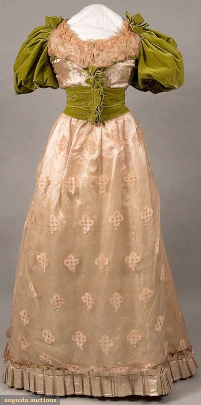
This weeks dress definitely has a sash. It may not be a Chanel, but it does have an impressive pedigree, having been worn at Benjamin Harrison’s inaugural ball in 1889. It’s come down in the world a bit them, having sold at August Auctions in 2009 for a measly $540 (even if you don’t like it, you’ll have to agree that was a steal).
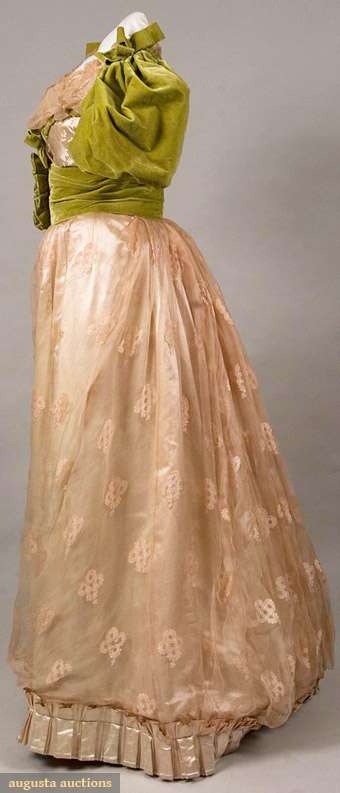
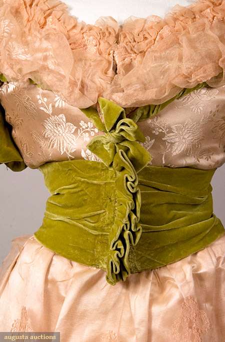
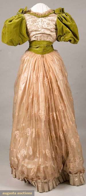
The dress combines silk damask, silk velvet, and silk brocade chiffon ballgown in pink and green. Pink and green usually a popular combination, but what if the green is a sort of chartreuse/poison shade, and the pink is barely blush? And what about the combination of all those different fabrics?
There is a lot to ponder when it comes to this dress. What is your verdict?
Rate the Dress on a Scale of 1 to 10


Oh goodness. I’m really not quite sure what to say about this one! I like the blush base of the dress – the fabric is really pretty and I like the fluffy trim at the neckline, although the hem pleats give it a slightly unfortunate resemblance to those awful “bubble” skirts. But the green velvet…. looks like it was added later by an amateur. And what is going on with the front of the sash? Is it *supposed* to stick straight out like that? Weird… I think if the sleeves and sash were better matched to the dress in colour and weight, I would like the gown but as it is, I just look at it and think “What were they thinking?”
4/10 from me, and only because I like that damask so much.
Although I love the fabric of the skirt, on the whole it looks like two completely different dresses from two different seasons in a mashup. The velvet seems especially heavy applied to the delicate skirt fabric.
I’d give it a 3.
What a horror. The pink and green fight; the chiffon and damask look like rags because of the juxtaposition of the velvet; and it has ruffles in all the wrong places. The fact that it’s badly displayed adds to the train-wreck quality. A ONE (1).
Wow, that is truly awful. Either the green or pink would be fine on their own, I’ve even made a gown out of that acid green before, but together they’re simply horrendous. I would like the hem ruffle on a different dress, it just looks tacked on as a last thought here. And the velvet ruffle down the centre front of the bodice is just…buh.
1/10
It’s not good. That stand-out pie crust ruffle down the middle is particularly distressing. The sleeves are atrociously set in, and from the front look like her arms are sprouting out of her back shoulderblades. Not lovely. And what’s with the sad little ploomphy puffbally hem above the pleated frill at the hem? All rather tired and deflated and very much the morning after the HARD night before. With a lovely shade of green to enhance the biliousness and general over-indulgedness from the night before, just what every girl wants for the walk of shame in the early morning….
It’s just unfortunate. A lot of that is probably because it’s not been properly mounted (just popped on the form for the auction, minimal work), but the colour combination and the fabrics are not playing nicely together. That green would work amazingly well – and has worked amazingly well – with other colours. The cadaverous pink, like the foundation an undertaker slathers on a corpse, is not one of those colours. In another context, it would probably work nicely too, but not here. It makes the green look phlegmy and bilious.
Did she only have a few tiny scraps of fabric to make the dress from? Some velvet cushions from the sofa, a bit of brocade left over from a wedding dress, some net curtain, an old satin underskirt, let’s see what she can do with these? If so, then it’s creative. Otherwise, oh dear, dear.
Do we really think this is 1888, by the way? I’d say highly unlikely with those sleeves – which are more early 1890s and seem really rather advanced for 1888…
So. Poisonous. Deflated. Tired. Probably misdated. Weird pie crust thing which sort of manages to suggest all sorts of green gynaecological grislinesses . Yuk. 1/10 here, too.
My goodness… that is rather atrocious.
The green and pink do not go together – either the pink should be a lot darker or the green a lot paler, and I’m not sure even that would rescue the clashing.
The textures/fabrics also clash. I cannot imagine why anyone would chose to use those fabrics unless they were making a dress from remnants and the pinks match too well to suggest that.
The shape is … ok. Or, rather, the bits of it that are pink have an ok shape. The sleeves are far too OTT and the rest of the green bits are horrid (the neckline and the centre front of the waist stick out horribly).
Overall… 1.5
I somehow want to see what the person who wore it to Benjamin Harrison’s Inaugural Ball looked like, to see if it was as awful then as it is now.
All right, I don’t hate it as much as some people–it seems like “an OK dress” until you notice . . . DAT RUFFLE. SERIOUSLY WHAT. You went to all that trouble of wearing a corset, then you drape some chunky velvet around your waist which is already problematic and then . . . DAT RUFFLE. 4
Well, you missed my lowest of all votes on last weeks! To be fair, I think I posted it at about five this morning (my time). I didn’t even read the other comments–I’m almost ashamed to have given it such a low rating!
So, onto this beauty… I love it! I’m a sucker for most things green, and green velvet is even better. The pink color is darling, and those little lace or embroidered details on the skirt are beautiful, and the damask is also beautiful! I wish I had been the one to buy that dress–it was a steal at that price!
Ten out of ten (what contrast to last week’s!). Ahh, the benifits of being early.
Poor dress! I do like the unusal shades of color and fabric combination, especially for January. It combines spring colors (pink, green) with winter fabric (damask, velvet), without it feeling out of season. The dress looks a bit tired the way it is displayed (is the upper bodice of the mannequin not a bit too short?), but that is I think due to age, not original design. Was the waist ruffle supposed to be in the back? My vote is 8/10.
yuck.
yuck colour, yuck shape…total yuck 1/10
etre.comSerious question: Was the maker red/green colourblind? That condition could make the pink and green appear to be similar shades.
If you drop the image into a colourblindness simulator (here’s one: http://www.etre.com/tools/colourblindsimulator/) you get something – ventral-fin ruffles notwithstanding – that’s not entirely awful.
Since I am not colourblind: 1/10.
Blimey – the colours really do look a lot prettier in all three colourblind views.
This is just gross. The sleeves look like two enormous dried peas!
The lumpy green and the floaty pink fabric clash horribly. The pleats on the bottom of the skirt are bad too, they would be fine on a different skirt, but on a sheer fabric like this? Blaugh!
The ruffle in the front is the worst part, not to mention all that icky pink meringue around the neck.
I’ll be generous and give it a 1.5
Wow, I thought I’d be sever giving it a 4 or 5 – I don’t like any of the colors, the lines are muddy and there are too too many textures – and what is with ruffles at 90° to the torso?!
3/10
Nothing can change the misapplication of ruffles or the clash of textures, but the color clash largely vanishes if viewed as a colorblind person might see the dress. With tritanopia, the dress appears to be pink with lavender trim and sleeves–rather pleasant. Perhaps the designer was colorblind–that would explain a lot.
Hate the colour combination and that sash makes her look like she has no waist (and considering all dress dummies have a defined waist that’s impressive!). Also hate the frou at the neckline; it has no redeeming features at all in my book. 1/10
I actually kind of like it! I know it’s about 70 years off but it kinda makes me think “Mrs Bennet” blustering about at some ball or another… She’s still sort of trying to be fashionable and show that she is monied but also not wanting to detract from her daughters, leading to a dress that actually steals the show because it’s just so odd!
That shade of green and the pale pink, sort of work together though I’d like to see a tiny bit of darker pink in there as well. I love the patterns on the pale pink fabric and I also love the “fluffies” round the collar.
7/10 for me, looses some points for that frill and difference in the fabric weight between the bodice and the sleves/sash.
(though I can’t help but wonder if maybe the frill on the sash lay flat at one point and has become raised due to age/poor keeping)
I’ve worked it out. It was a nominally pretty pink dress, sleeveless. It got given to a theatre company at some point, and the wardrobe mistress added the green velvet so it could be worn by one of the ugly sisters in a panto of Cinderella! It’s the only possible explanation!!
1. 😉
My first intention was to give it something like a seven but reading all the comments and looking at the dress again I think I have reevaluated my opinion a bit. Yes, the green waist ruffle is horrible, and the different patterns on the bodice and the skirt don´t work that well on second look, but still I kinda like it. The colour combination is weird, but not really that horrible to me. All together it looks a bit like someone trying to have fun with fashion to me, but ending up with something that is just a bit off. But not completly off to me. So I´d give it a 5/10
Kinda ugg…not my favorite combination of fabrics or colors. 5/10
I think Gillian said it all at the beginning, the good and the ‘oh, dear!’. 4 out of 10.
Yes, Gillian said it best, but I wonder if she was too generous. 2/10. Poor lady who wore it. (Maybe the colored dye faded???)
You know, the more I think ‘That poor lady’, I wonder more about the story behind the dress. Was a poor woman invited who had nothing to wear but did her best? What this woman in a lower social class? How did the other women react? I guess I’m hoping things turned out all right…
You have to feel sorry for her, whatever. Even if she thought she looked good.
The only thing I like about this dress is the skirting fabric. It seems the sleeves and sash are an add on. From the picture the bodice fabric looks new….I think it needs a serious re-do.
Good god! Why the front ruffle fan?! It is blocking my view of an otherwise pretty dress.
6.5 out of 10
Things I like: Pink. Pretty blush pink. And that we know where it was “unveiled” so to speak.
Things I don’t like: Holy mother of bubble skirts! I hate the style now, and this is like the great-grandmother of modern ones. Perhaps unintentional, but the heavy pleating at the bottom makes it cut in too much. Also, her bosom is expectorating peach fluff. Also, the sleeves not only look like Scrooge McDuck’s money bags tacked onto her dress, they’re in that goshawful 1962 sofa color. Hurk.
3/10. Sorry, dress 🙁
I would have liked to have seen the person actually wearing this, but I seem to have been born nearly a hundred years too late for that. Do you think the waist-cincher is on backwards? It seems to be interfering with a bow at center-front that matches the ones on the shoulders. If it were turned around, I think it would improve the dress. That aside, there are parts of this dress I really want to like, green velvet puffed-sleeves for one, but with the delicate color and texture of the filmy main dress fabric, the heaviness of the velvet and the contrasting color is not making for a pretty overall dress. 4/10.
10/10 FABULOUS! I would wear it and will possibly make something I can wear if I find fabric in those shades. Color block tee perhaps? The combination is unusual and that makes it lovely to me.
Maybe the ruffle on the front of the cincher needs to be pressed open.
Otherwise it looks “off”.
I like the silhouette of the dress and “flesh-toned” pink parts.
But the pea-green stuff is not happening. That ruffle on the hem looks very lonely. They should have used that ruffle element throughout the dress instead of the green.
3/10
Mash-up indeed. Are you sure this wasn’t made in the South? Like…by a drunk Scarlett O’Hara? “Three sets of curtains and the trim off my dressing gown and another sherry, thank you very much!!!” That would account its queasiness. Yurk. I give it a 3 out of 10.
I don’t mind it. 8.5/10
C’est catastrophe! The only thing I like about it is the silk brocade chiffon unfortunately. The green does indeed look like sofa cushions. The whole look of the dress is out of balance in every sense. An new lowest score from me I’m sorry to say. 3 out of 10.
I HATE giant puff sleeves (although a few regency-romantic border dresses manage somehow to work them). At least they’re not leg of mutton. I almost like the sash, but I feel like the ruffles should open out instead of sticking straight out. That is, I feel maybe they did, and have come to stick straight out? But maybe not. If that’s a purposeful slight bubble hem in the back, that’s really interesting. I’m reading the color as cream on my monitor instead of pink as some people have commented, and I like the color combination that I’m seeing. I think it’s got lovely couture details that don’t quite all fit together, as from someone trying to design a Worth but just not being Worth-level. It’s skating the edge of loving it for me, but REALLY falling short. Ditch the bows above the sash, and make the puff sleeves smaller or de-puff them into flutter sleeves, and suddenly I’m sold, although I still wouldn’t like the mixed prints, probably. But I’d sure LIKE it.
Oh sorry, number. 6.5
Also I’d totally buy it for $540. Where can *I* get authentic late Victorian pieces for that price?
Were the green and the pink the original colours? Dyes sometimes change over time.
1/10 for the horrible combination of fabrics and the ugly shapes, though, anyway.
I love green and I like pale pinks but this really doesn’t work at all. I might’ve gotten over the colour combination, but then there’s the fabric combination and it just gets worse. 3/10
Ouch, mine eyes! What an eyesore… that velvet sticking out in front and playing peekaboo with that huge neckline ruffle.
I’m not really surprised it didn’t fare better at the auction.
3 out of 10 from me
1/10 ick for all of the above reasons!
I know I’m in the minority, but I adore that shade of green. It is one of the few shades of green that I can wear! I don’t care much for the style, though, it looks haphazard and that awful shade of beige is much too close to a caucasian skin tone.
I love it, too. It’s not exactlymy shade, but I’m daring enough to plan to wear one such when I make my saree Regency dress one day. 😀
Part of it might be the presentation; or it really just does not sit well on the body. All the bits sticking out… especially at the centre front. I’m not one to use this normally, but, really: WTF?! (I’d love to insert something else than the “F” here; any ideas?)
Plus the bow at the front is just too close to those sticking out bits and gets completely lost. Tone down those sticking out bits and give the bow more breathing space and it gets a bit better instantly… but: the bubbly shape of the skirt: was that intentional, or is it, again, just the way the dress sits on the manequin? The skirt’s askew…
4/10. I love the general idea, but not the execution. I even wanted to make it 3/10, but then I realised I really, really loved the sleeves. 😀 It seems to have some shades of 17th century as well (you know, like the BrožÃk portrait I supplied a while back), and while I’m not very keen on many 17th century fashions these days, some of it still remains my first historical clothing love. First loves can never be forgotten, can they?
I really like the all colors and all of the textures of all the fabrics – I like the lines – I like the sleeves – I like the velvet trim – albiet that frontal attack fan is puzzling – what would it look like if it was ‘opened’? I think it would look lovely ‘opened’. I would surely wear this dress to a re-enactment if given the opportunity!!
9.5/10
The horror! Those sleeves are atrocious, and what is with that sash? It looks like there is a dinosaur growing out of her stomach. I am not a fan of the color combo at all. What makes it worse is that individually I think the fabrics are really pretty! I am not a fan of the pleat at the bottom of the skirt – it looks like an afterthought. The overall verdict is “ick” and it gets further point deductions for ruining such beautiful fabric.
1/10
I love those colours separately. I like the general silhouette and styles of this period. All together in this dress, however, = ick for me. I don’t even want to bother taking more time explaining why.
3/10