2017 is the fifth year of the Historical Sew Monthly, and to commemorate, many of this years challenges are repeats of some of the most popular challenges from the first four years.
February’s challenge, Re-make, Re-use & Re-fashion, definitely deserves its place as the first repeat of the year, both for its popularity the first time it ran, and for how important it is as a historical concept. Until very recently, and in every period covered by the Historical Sew Monthly, fabric and materials were very expensive, and people got as much use out of them as possible.
The challenge asks us to ‘make something that pays homage to the historical idea of re-using, re-making and re-fashioning. Turn one thing into another. Re-fit or re-fashion an old gown into something you would wear again. Re-trim a hat for a new outfit, or re-shape a modern hat to be a historical hat. Re-purpose the fabric from an old garment (your own or a commercial one) into a new garment.’
Fabric re-use is a very common type of re-making, re-using and re-fashioning. Many, many 18th century gowns in museum collections show evidence of re-making.
There are numerous examples of gowns made from 18th century fabric that were re-made a number of times in the 18th century, and then re-made again in the mid-19th century, a hundred years after the fabric was first woven.
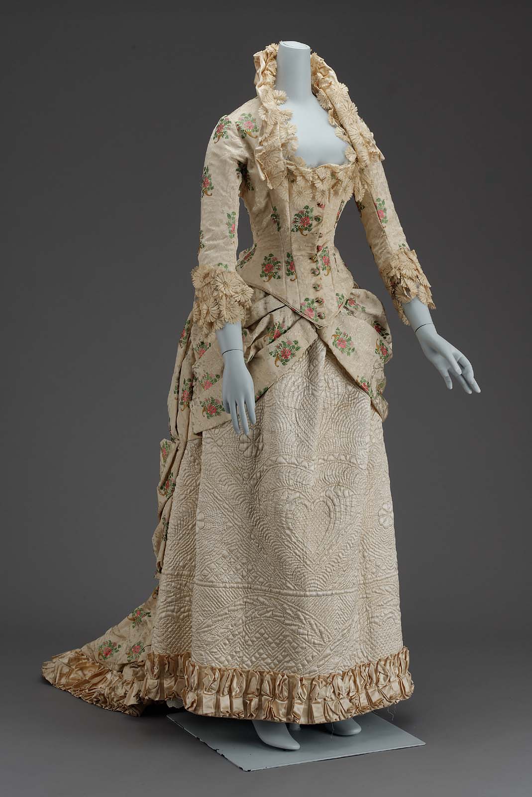
One of my favourite examples of 18th to 19th c re-use is this ca 1880 dress with an under-skirt fashioned from an 18th c quilted petticoat.
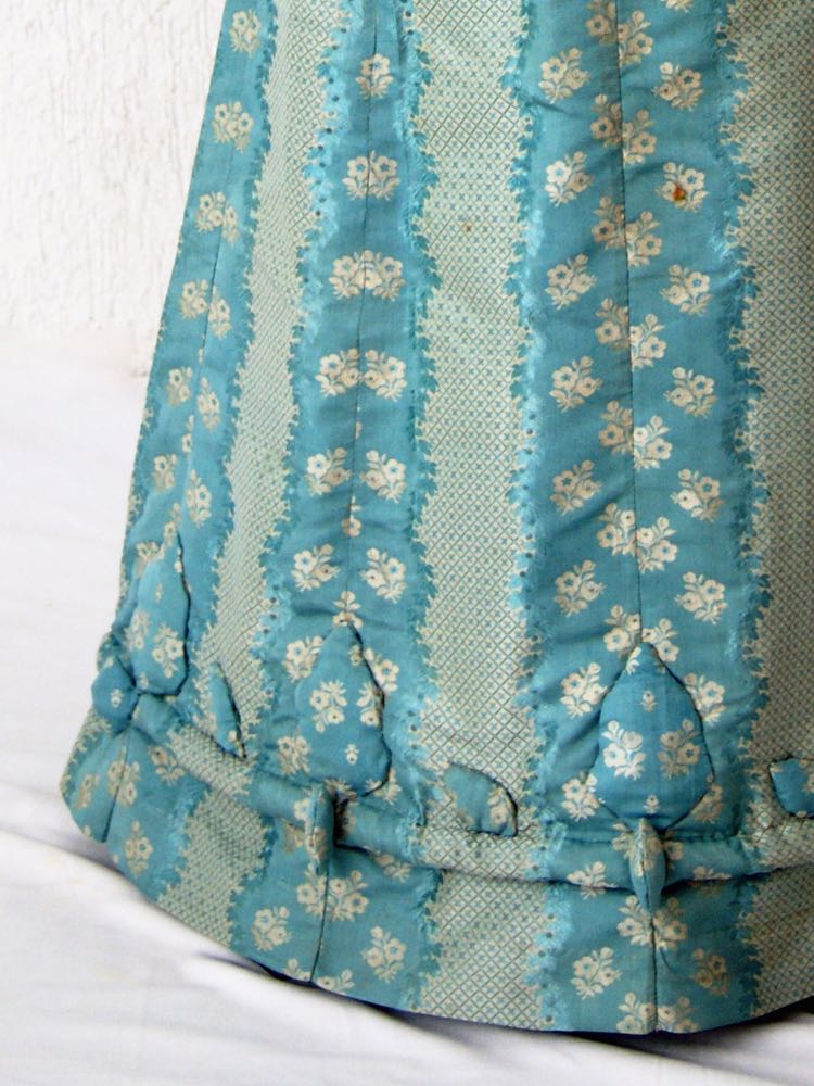
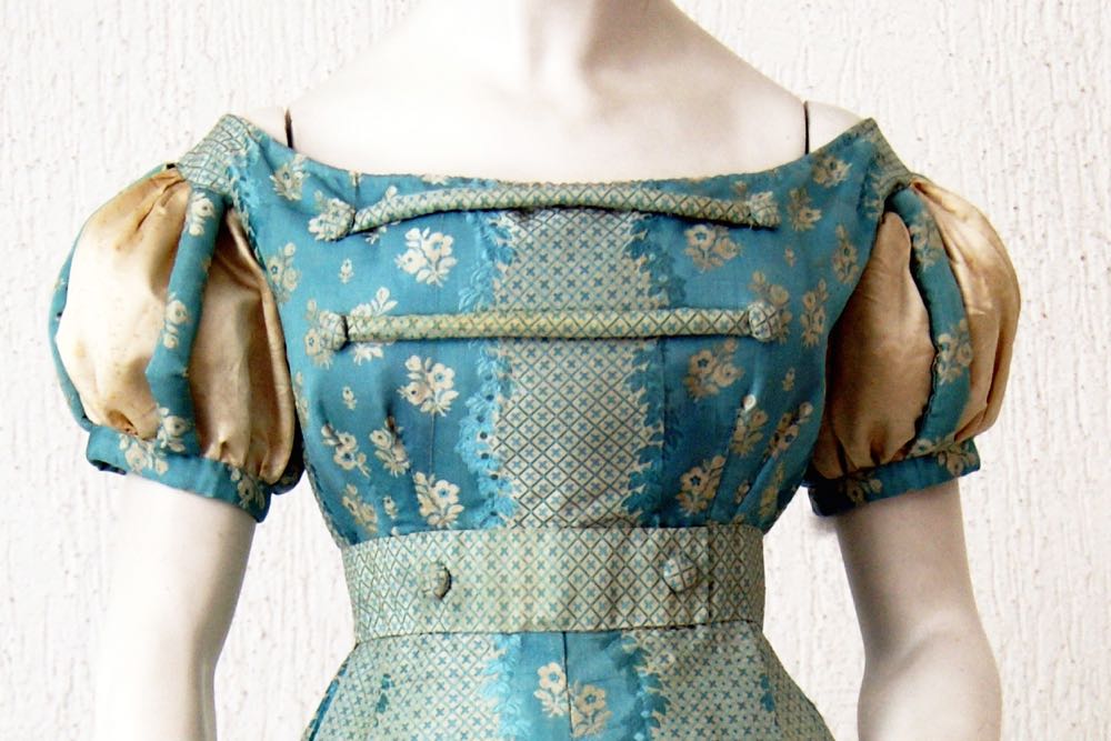
My most recent Rate the Dress post is another example of 18th-to-19th century re-use: an 1820s dress made from mid-18th century fabric.
Garments were re-made from more contemporary fabric throughout the 19th century as well, just as they had been in the 18th century. They aren’t as obvious and common as their 18th century counterparts, in part because many fashionable 19th century fabrics weren’t as durable, and in part because the innovations of the industrial revolution made fabrics cheaper, and fashions change more quickly, so garments tended to be re-made after only a few years, meaning that the difference between the fabric’s creation date and the garment’s style is not so obvious.
Louisa May Alcott’s ‘An Old Fashioned Girl’ has an entire chapter devoted to describing how poor minister’s daughter Polly helps previously rich Fanny to make a new spring wardrobe out of her worn out garments from past seasons.
A ‘grey street suit, faded past cure’ is turned wrong side out to show ‘clean, bright fabric’, which, with ‘fresh trimming and less of it will finish you off as smart as ever’. Fanny has never worn a turned dress in her life: but clearly knows it’s a common enough practice for those with a little less money. Polly cheerfully admits ‘I’ve worn turned and dyed gowns all my days’.
‘Two draggled skirts and a stained waist’ are ‘transformed into a whole rig’ through clever re-use which takes advantage of the change in fashions ‘Gores is out, and plaits is in; therefore, as the top of this skirt is quite fresh, we will take off the ruffles, turn it upside down, and leave it plain. The upper skirt will be made scanter, and finished with a frill. Then the waist can be refreshed with the best part of these wide flounces, and out of those new bits we will concoct a hat.’
Hats also came into their own for re-furbishement. Polly asseses Fanny’s old hat collection and predicts that with a bit of ripping and re-trimming ‘out of three old ones we’ll get a pretty new ones’
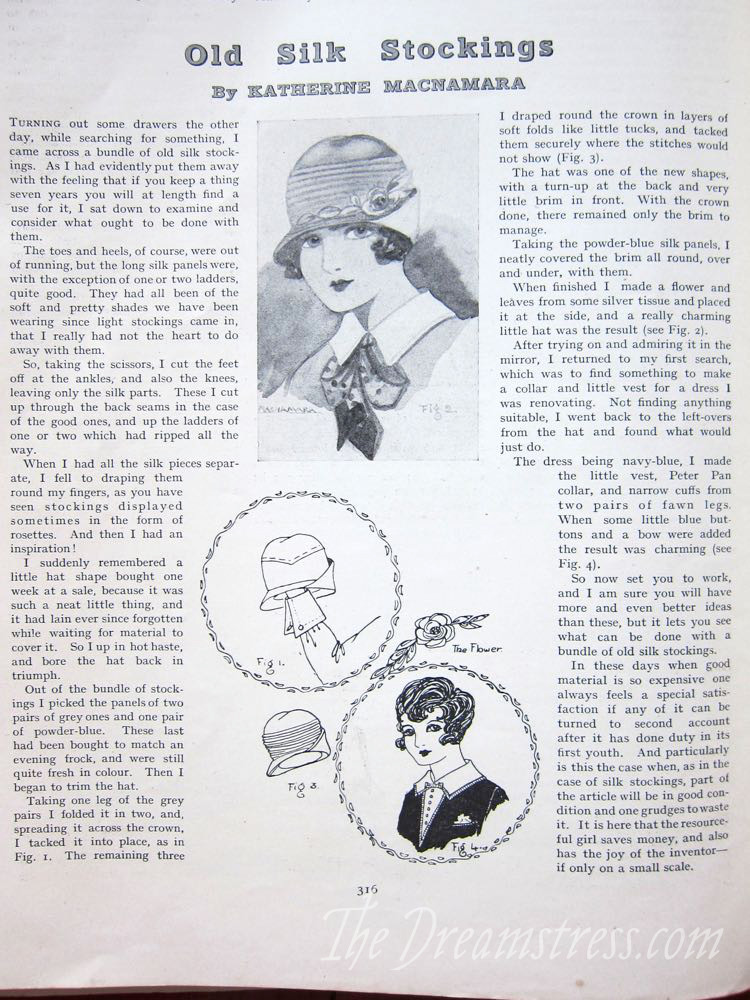
This type of re-fashioning and re-trimming continued into the 20th century. I posted this article on trimming hats with old silk stockings from Feb 1928.
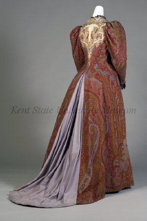
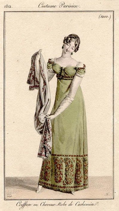
While it’s hard to identify many19th century re-fashions in museum collections, one common one is re-made Kashmiri shawls. The fabric is distinctive, durable, valuable, and datable, so it’s quite easy to see all the ways in which it was refashioned into garments, such as in this tea gown:
And this gentlemen’s dressing gown:
Kashmiri shawls are also an excellent example of historical re-fashioning: taking an item that was meant for one thing, and re-using it for another. Early shawls were woven in Kashmiri as discrete garments, but European fashionistas also used them as fabric lengths which could be sewn up into garments.
Re-fashioning is extremely common in the historical costuming community. The exact materials and items to make period items often no longer exist, so we have to make do. We re-shape modern hats into historical shapes, hack shoes to be as close to period originals as possible, re-fashion paint stirrers as busks for stays.
I love historical accuracy, but I also love re-fashioning for practical reasons. I’ve shown you hot to turn a cheap modern fedora into a 1920s style cloche, and a straw sunhat into an 18th c. bergere style hat. I’ve turned 1990s heels into 1870s shoes, 1980s sinamay race hats into 1920s garden party hats, vintage tablecloths into 1900s blouses, sheets into petticoats, and lots more! While all of these were practical, some also manage perfect accuracy: as we re-make and re-fashion, we’re continuing on a grand tradition, which probably goes back beyond written records of garments.
I can’t wait to see what everyone else adds to the tradition!


