When I introduced the first HSF colour challenge (White) I hinted that there would be a second colour challenge this year, and that it would be a little more challenging.
The challenge? Green – from palest spring green through to darkest pine green, and from barely-there eu de nil, to vibrant chartreuse.
White, I think, is easy: almost every historical costumer has a number of white items, just because for most periods white would be the standard colour for most underthings. Green might be a little harder. It has been used in most periods, and while it’s never been the pre-eminent dye, redolent of status and riches, it’s often been a very expensive desirable colour. Green, for all that it is the colour of nature, is actually a very hard dye to achieve with natural dyes, and for most of history it took a double dye bath (first yellow weld, and then an over-dye of indigo or woad (which is indigo, but that’s another story) to achieve green.
Green was complicated to dye, and has an equally complicated symbolism. It’s been the colour of purity and holiness, and the colour of corruption and deceit. The woman in the Arnolfini portrait wears green, and her dress divides art scholars. It’s a pretty obvious clue that the portrait is not, after all, a marriage portrait, but what does it actually mean? Does it symbolise hope? New life? Or a less desirable attribute? Robin Hood & his men wore Lincoln green not to blend in with the forest, but to advertise their loyalty to the area (Lincoln being famous for its green dye), and their success as outlaws: Lincoln green was a reasonably expensive dye (which suddenly makes them seem less like rebels against an unfair ruler and more like Depression Era gangsters in fancy suits).
Whatever green means, it’s certainly not as ubiquitous as white, and it may not be everyone’s favourite colour. As much as I love Flora Poste, she did describe it as “such a trying colour.” Still, I hope many of you will embrace the spirit of the HSF: to be a challenge, and to inspire us to try new things, and use Challenge # 21 as an opportunity to dig in your stash, think outside the box, embrace the colour, and expand your palette.
Or perhaps you already love green!
I love green: it’s probably my favourite colour, and I own oodles of delicious green fabric. Oddly though, the only green item in my historical wardrobe is the Luna Moth frock, and I don’t even like the shade of green. Clearly it’s time for me to add some more green to my personal costuming palette!
Here are a few of my favourite pieces in green to get you thinking about the most verdant of colours:
The aforementioned Arnolfini Portrait. Whatever the gown symbolises, if it does indeed mean anything but that Van Eyke thought a large addition of green would balance the painting, it is certainly gorgeous.
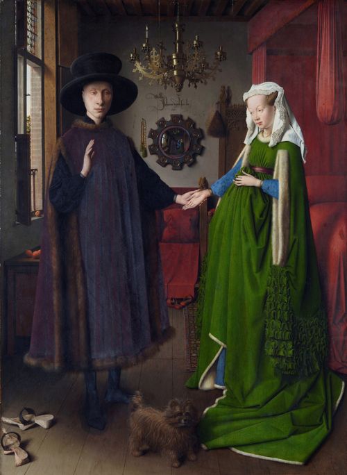
The Arnolfini Portrait, Jan van Eyck, 1434, National Gallery London
There are many, many 18th century green frocks that make me drool and dream of endless sewing time and fabric budgets, but this one probably takes the cake. Oh, that fabric!

Robe a la Francaise (detail), 1755-60. Silk damask brocade with silk trimmings.
One of green’s associations in English tradition is with the faerie queen and the fey world, which is probably why these green shoes, with their little turned-up elven toes, just seem so right to me.

Shoes, 18th century, Nordiska Museet
You know how I hate fringe? Well, as much as I hate fringe, I love bobbles, and this ensemble comes in one of my favourite shades of green, and has bobbles. Love it!

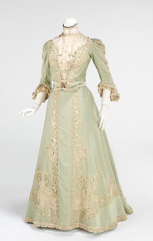
Oh, oh, oh, the next one is just deliciousness! It’s looking a bit mossy in this photo, but the dress is rich emerald green, and everything about it is stunning, and I just can’t imagine another colour it would look half as good in.

Tea gown, 1895, Worth, featured in Paris Haute Couture
I’m sure that when I posted this frock as inspiration for my chinoiserie gown you all swooned. Barely-there is not my favourite style of green, but it is so characteristically Edwardian, that I have to love it for being perfectly of its time!
Promenade dress, ca. 1903, American, wool, silk, Metropolitan Museum of Art
For those of you afraid of green, not every outfit has to be all green to qualify. This outfit is mostly not green, but the pop of green, so unexpected, is what makes it effective:
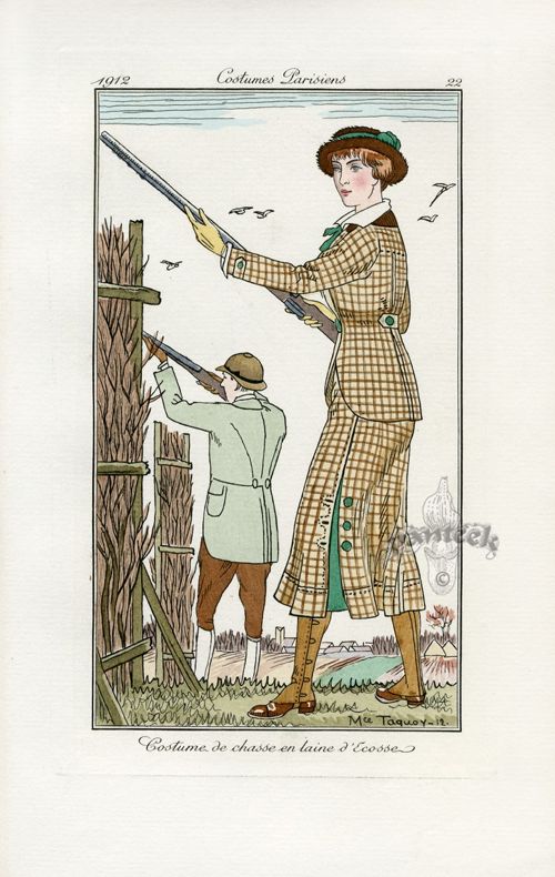
Journal des Dames et des Modes 1912
I think part of what makes the hunting suit so effective is that the flash of colour is green, not the more expected red, and that it is jade green, not the more expected hunter or forest shades. And jade green? Jade green is just sublime in almost all applications!

Chiffon & lace dress, French, c.1923, from the Vintage Textile archives
One of the periods that really did green, and did it fabulously, was the 1930s. This green striped dress (and matching hat) is just amazing. The way the stripes are turned across the dress, and open up into pleats with the skirt? Gorgeous!

I hope some of these greens got you inspired! For more inspiration, I have an entire pinterest page of green gorgeousness (it goes roughly backwards from the 1930s)
Challenge #21 is due October 21.