Last week I showed you a very embellished (and everything elsed) yellow ballgown from 1889. You were a little confused by the bodice design – and you weren’t the only one. The Met couldn’t decide which was the front and which was the back either. A few of you loved it, but most of you felt that there was just too much embellishment, and too many different kinds of embellishment, and it came in at a rather disappointing 6 out of 10.
This week, since it is the Embellishment challenge on the Historical Sew Fortnightly, I’m going to risk it and post another heavily embellished dress, this one from a decade before the yellow ballgown. Like the ballgown, this afternoon/dinner dress is monocolour and has a variety of different kinds of trim: beading, ruching, buttons, bows, ruffles and pleats, arranged asymmetrically around the dress.
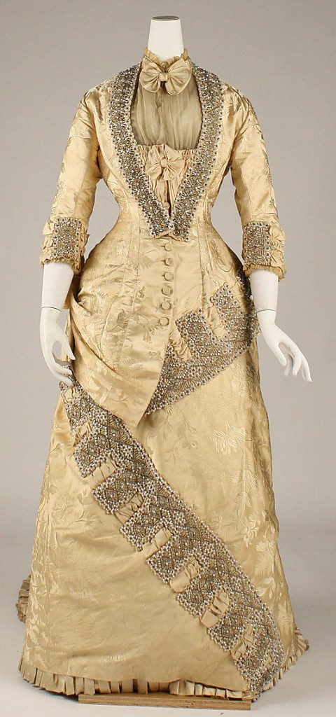
Dress, ca. 1879, French, Maison Cecile Laisne, Metropolitan Museum of Art
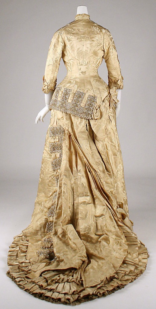
Dress, ca. 1879, French, Maison Cecile Laisne, Metropolitan Museum of Art
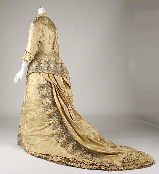
Dress, ca. 1879, French, Maison Cecile Laisne, Metropolitan Museum of Art

Dress (detail), ca. 1879, French, Maison Cecile Laisne, Metropolitan Museum of Art
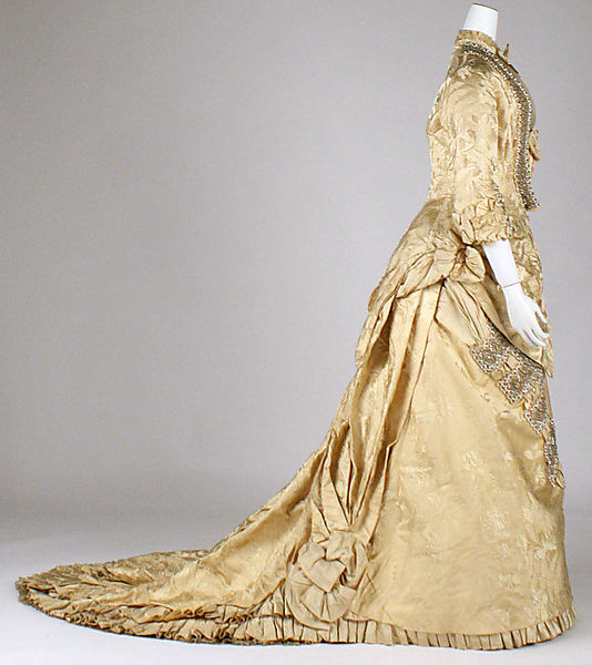
Dress, ca. 1879, French, Maison Cecile Laisne, Metropolitan Museum of Art
What do you think? Does this frock manage to harmonise all its different embellishments more successfully than last week’s frock? Or is it another example of too much, with too little logic?
Rate the Dress on a Scale of 1 to 10

I would SO this.
This dress is divine. Love the color, it has the right amount of decorations, lovely designs. Plus it’s probably in the Natural Form period. The only thing that erks me is the asymmetrical peplum, it’s beautiful in the front however the back peplum (the part on the right hand side) looks like the seamstress forgot to finish it.
Nevertheless, LOOOOVE IT!!!
9.5/10
Yes. You said it perfectly. I’ll give a 9/10
Oh, I like this one a lot more – it feels more avant garde and daring in its assymetry and it’s much more controlled and restrained – there’s fascinating construction going on here, I like the angularity and the sharp angles and the contrast between them and the sections of drapery and fabric manipulation (although I’m not entirely sure about the sharp-edged folds here and there.
And bow ties are cool. The top part, without the train, is like a dress the Eleventh Doctor would wear, if the Doctor were a woman.
Not absolutely wild about the colour – but I really like it. And the adorable silliness and whimsy of the bow tie has charmed me. I’ll give this one a 8.5 out of 10 – not perfect, but more than respectable.
“And bow ties are cool. The top part, without the train, is like a dress the Eleventh Doctor would wear, if the Doctor were a woman.”
Yes. Someone had to say it, and someone said it before me. I think I’d love seeing this dress on River…
I do not quite like the asymmetricity around the hips – it’s kind of throwing the hips out of balance (the center front is out of centre at the bottom, maybe that does it), which I think may not give a good impression of the wearer, though I do like the asymmetricity elsewhere on the dress.
But it’s charmed me, too. 8/10
P.S. I think for it to work at the hips, the bodice should end at the same spot on both sides – as it is, it’s longer on the wearer’s right in the front… and whatever’s going on at that side, it somehow ends higher in the back. Weird.
And now I actually desperately want to see this dress on River. AARGH!
I love it. I love asymmetry, and this does a fabulous job. It has great details, and the color and fabric are nice. My only points of non-love are the bow right at the neck and the fact that the shoulder shape seems a little odd. That might be how it sits on the mannequin or possibly the shape of the lady for whom it was made.
9!
I actually quite like this one. I think it shows a sort of carefully controlled extravagance. My main problem is that it’s all squashed like they just took it out of a storage box! Also, the fabric reminds me of an old armchair – which is not to say it doesn’t work as a dress, it’s just an odd associate for me.
Anyway, I like it. 8/10.
Excepting the neckline, this dress is successful in my eyes. The design is handsomely sculptured, with the lightly textured-but-flat beadwork a nice foil for the silk brocade.
The color may be original but I fancy there’s been some fading and discoloring, especially in that neckline.
Originally I think folds of the bustle and train were a +bit+, but not much, puffier. It may be that the conservators felt the fabric could not be moved out of its current flattened folds without splitting.
The neckline doesn’t work, to me. The low open neck is common for this period; coverage by a chemisette may have been requested by the wearer or demanded by a conservative occasion. Ordinarily such an opulent dress would have been at least for afternoon receptions, if not for even more formal occasions. To my eye, a lace tucker would have looked better, especially if the wearer displayed a handsome necklace and earrings.
I’d say 8 out of 10.
Very best,
Natalie
I like this one way more than last week’s dress, but without a good reason. Something about the shiny and the asymmetry appeals to me today. The toned down fabric color is a good match for all the “bling”. 9/10.
I love the workmanship of this gown. I can’t imagine how many hours went into the beading. All by hand, done by natural or weak light. Amazing. Absolutely breath-taking.
9.5/10 for me.
I love the color, the silhouette, the train, the fabric. The workmanship is exquisite, as others have said. But I don’t like the asymmetrical nature of the embellishment; it makes the dress look oddly unfinished. So it’s a 6, I’m afraid (would have been 8 with a more symmetrical placement of trim, because I’m on the fence about the bows down the center of the bodice).
I love it, the only thing I’m not sure about is the bow at the neck so it’s going to lose half a point for that. Love the assymetry and the embellishment fits it perfectly 9.5/10
Oh, this is SO much better! The only thing I don’t really care for is the asymmetry; a little is okay, but this it going a bit silly on the left side of the front and right side of the back. Other than that, I love the beaded trim! It’s not too much, while (in itself) is a lot, if you catch my drift. I also like the fabric–the pattern on it is really nice. I’m not crazy about the color, but it’s okay. A jewel tone would have been amazing!
Eight out of ten.
This is so awesomely coherent. Sure, there’s lots of trim, but it’s consistent–there isn’t fifty rows of fringe here and 19 bows there and 4 yards of beadwork there and 6 strange beaded motifs appliques at random spots. If you can use the term “less is more” with Belle Epoque womenswear it applies here.
The willingness to confront and tweak expectations of balance and symmetry is neat, too–especially since it’s paired with the monochrome, which keeps the whole thing from sliding over the top. Then the bow tie, in there to make the afternoon neck filling a little more playful.
9/10, which may be because it’s not entirely well-presented.
I give it a 9 out of 10. I like the color and love the trim, but asymmetry is always a little hard to for me to love.
Best,
Quinn
Upon a second examination, I think the thing works fairly well. The asymmetry is clever, but I have the nagging feeling that Worth would have taken the idea and produced something brilliant, where this gown is just. . . nice. I’ll give it a 6
Good taste tells me that I should like this one more than the last–it is much more coherent, less YELLOW!, less over-the-top with the sleeves…but somehow I’m not quite sold. It is sophisticated and dramatic, but not quite theatrical (I can’t decide if that’s a good thing or not, but I do love me some theatrical gowns). I don’t care for the high neckline and the beading around the neckline, which looks overly bulky to me. At first glance, I loved the color, but the more I look at it, the more sick of it I become. Gold is lovely in moderation, but that is a LOT of shiny gold-ish fabric, and I think it desperately needs something to contrast with it. 5/10
I’m a bit relieved to see that neckline combined with those sleeves, as it’s similar to what I may or may not be doing for the stripes challange. Also, the assymmetry makes it positively edgy. Like!
9/10
The dress’ trimmings do seam to harmonize a lot better than last weeks example, though I don’t necessarily care for all of the trimming myself.
7 out of 10
Oh dear, I really don’t like this one :/ Normally I love asymmetrical designs but this one to me it makes it look like the bodice is missing a piece. Not keen on the trim and I don’t like the sleeve length. I will say however that it is very nice fabric. 3/10
11/10!! This is sooo wonderful!! I could EAT this dress!! Thank you for bringing it to us!!
I don’t like it. It just looks crooked to me. And the colour is icky.
1/10
This dress is interesting, beautiful, fantastic, and perfect. I LOVE it.
10/10
The shape, fabric, and embellishment are pretty, but I can only describe the overall design as haphazard. 4/10.
Whoops, I didn’t know this was going to post twice! You can delete this one. Sorry!
I do like this one. I like the colour, I like the cut, and I especially like the asymmetrical trim. 9/10
I love it–any other color (except maybe grey…hmmm) and it would be garish, but as is? Perfect. I love the contrast of rich brocade and sheer at the bodice, and the way all the elements of embellishment are *doing* something–bands of asymmetric lines and grace notes on the sleeves. The asymmetrical details make it look fresh to me–all symmetry and this style could have looked fuddy-duddy. It all looks like it was carefully designed, totally balanced, but not overly cerebral when you just look at it. Beautiful. I wants it.
This may be my first…10!
The big rows of tooth like things are nice, but I don’t like the way they are arranged. I’m not to crazy about the bodice front, either.
It’s pretty, but somehow it’s also bland. 7/10
I’m with the other commenters who are very distracted by the over-wrought asymmetry.
6 out of 10
Last week my PC crashed just as I was attempting to post a comment, so I didn’t get to say how awful I thought the dress was.
This one is much better, asymmetry and all. Everything seems to be there for a reason, rather than just thrown on for the sake of it. The only bit I don’t like is the trim at the bodice back, it ends rather abruptly.
8.5/10
I have been looking at this dress for an hour now. Here is my take on it. The pick-ups for the dress should be on the left near the end of the beading, it would then be picked up from the right hand making the pleats swag. The beaded trim would then match the angle of the jacket back and match up with the beading on the jacket front. This would bring up the back of the dress so it would not drag for walking , or dancing and the bows would still be seen on the right side of the dress.