
Well, if last week’s stripey Doucet Rate the Dress taught me anything, it’s that I can never predict how you will react to a particular garment!
I thought last week’s dress was awkward, blatant, incredibly boring for something that should have been bold, and really poorly done, especially in the bodice and the stripe transitions. It’s only saving grace was a really lovely collar/neckline, paired with an unusual and quite modern sleeve. A handful of you agreed with me, but most of you were extremely enthusiastic (in full caps with exclamation marks) about the outfit, and brought the rating up to a sparkling 9 out of 10 (you agreed with me on the shoes though, as the rating goes up to 9.2 if it is paired with them!).
This fortnight’s theme on the HSF is ‘Art’, which leaves the field wide open for all sorts of fabulous ‘Rate the Dress’ options. This week I’ve picked a frock artist: one more known for painting elaborate gowns than for capturing evocative likenesses.
While not as famous as Tissot among the costuming community, Toulmouche also created sumptuous records of the (possibly slightly romanticised) fashions of the 1860-80s. Here we have his aptly named ‘The Blue Dress’, which shows a girl in the titular frock impatiently checking the clock: someone is late for a rendezvous.
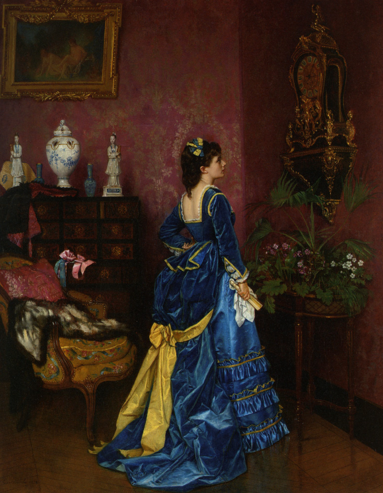
Auguste Toulmouche (1829-1890) The Blue Dress
The gown has a shockingly low back, framed with a border of pale gold and a frill of delicate lace. A hint of lace indicates that the front neckline is equally revealing. The sleeves and peplum-tail of the skirt are also picked out in light gold. There is a hint of Renaissance historicism in the white undersleeve. A perfectly matched bow ornaments the model’s dark hair.
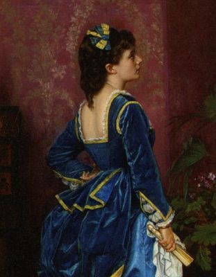
Auguste Toulmouche (1829-1890) The Blue Dress (detail)
The bustled train is pulled back with a bow of the same light gold, revealing a lighter blue underskirt.

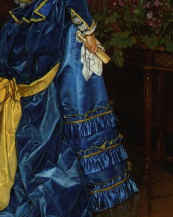
Auguste Toulmouche (1829-1890) The Blue Dress (detail)
The heavy satin underskirt is trimmed with three rows of self-fabric ruffles, backed in the light gold.
Auguste Toulmouche (1829-1890) The Blue Dress (detail)
What do you think? Is the pairing of sweet hair bow, sophisticated neckline, sumptuous train and frilly skirt, plus historicism, just too much, or do all the elements build up to one glorious, harmonious outfit?
Rate the Dress on a Scale of 1 to 10.
I love the colors in this gown, and the velvet and satin contrast. And I don’t mind the low back. (Though I wish I could see it from the front!)
The only things I don’t like about it are the ruffles on the front of the underskirt (though I know that’s par for the course for the 1870s) and the perky peplum on the rear of the bodice (which is fine, but doesn’t work well with the overskirt pouf). 8.5 from me.
I’m absolutely loving the back half of the dress. The front, not as much. Don’t care for the ruffles. Altogether though, gorgeous…8.5
Quite pretty. I like the blues and gold. The low cut back is a little unusual. 8/10.
Best,
Quinn
I love this particular painting, along with a few of his other paintings featuring a model with dark coloring and a sumptuous blue dress. The color combo could be considered garish, but I think it comes off as rich and playful. I love the low back, which adds a hint of sexiness to the otherwise conservative cut of the dress. The little white details really pull the look together. I definitely want to make my own version of this.
10/10
This is so beautiful! I love the mix of colors and the bows and ruffles and that beautiful low back. 10 for 10!
It’s a beautiful dress. Very seductive. Imagine it in a pile on the floor.
The back is very fussy — no matter where it ends up. But, it is truly a lovely evening gown.
Worthy of “Tosca” — as performer or audience.
Wow–on the floor! I was thinking that it is some kind of subversive bridal gown, since wedding dresses are more important from the back rather than the front, and because this dress seems as virginal (bows and lace) as it does seductive (low-cut with vibrant colors).
Blues and yellows together are one of my favorite color combinations, but I feel that the cut of the back makes the proportions off. 8/10
Will there ever be a Valasquez rate the dress? The Prado has an entire room of imperial women on horses–with incredible brocades spread out over the horse. It’s a very intimidating room!
Yes, yes, 100 times yes. I would give it a million out of ten if I could!
I’m loving the crimson wallpaper (my dear old dad was a painter & paper-hanger).
Beautiful dress and colours. That low back has me thinking ‘stethoscope’ though. Very medical exam friendly.
Warm hands please.
9/10
I still remember the first time I saw this painting, and I fell totally in love with it. Since then my taste has changed though and now I think the back of the bodice is a bit too low, the velvet bustle is a bit too heavy, the yellow bow a bit too big. So should I go with my first impression of it, or what I think today. It’s sooo hard.
I go with 7,5, which is somewhere inbetween.
I love it, aside from the little flap of fabric on top of the bustle. 9/10
I love it, except for that bow at the back- it disrupts the line of the bustle. I’ll give it an 8.
I want to know how those shoulders are staying put. A low back and a low front together means no horizontal tension helping the shoulders to stay out, especially with a heavy sleeve. Oh the joys of paintings, which are after all works of fiction! 😉
I love the sleeves, I love the little pierrot tail peplum. On MY planet, I would have had a simpler skirt. But, in the 1870s, that is not fashion rolled, so going with the More is More flow of it, I give it a 7.5. Because while I don’t think it is the sum of its parts, I REALLY like its parts!
I was quite worried about the potential effects of gravity too. That tastefully lacy neckline wouldn’t look quite so elegant as a waistline (as apparently happened to some poor young royal bride of Ages Past).
Looks good stationary in a painting but it’s all just too much if she moves – assuming she can move in all that.
5/10 because it does look quite nice taken all together – mercifully less than the sum of its many parts.
I LOVE the colours in this painting. Not just in the dress but also in the walls, and the little ornaments on that gorgeous oriental tallboy, and her beautiful skin.
The dress is stunning. I’m not normally one for yellows, but I love how it sets off the blues in the velvet and satin. The neckline is just gorgeous (I’m quite partial to a low-cut square neckline, probably because it suits my own shape).
I’m not crash-hot on the peplum. It just seems a bit too much when combined with that big bustle. And I think the bustle-bow could stand to be a bit lower-key, but all-in-all I like it a lot.
I’m thinking 8/10.
Side note: is the dude in that framed painting in the nuddy?
That’s not a dude, that’s Diana at her bath!! By Francois Boucher…
Hah, I was just about to come back and say that, having been looking up Bouchers to check which one, as I was sure it was one!
The painting shows two women artistically draped in wisps off chiffon – no dudes!
Gorgeous colour, gorgeous fabrics. It’s like something Scarlett O’Hara would wear isn’t it? Love the pow of the yellow against the blues too, perfect contrast. For the purposes of the image it’s FABULOUS. I love it. Okay, the buffle is a bit silly, but it does give a little extra saucy kick up to the bustle, which is a touch of lightness needed with all that heavy ten ton drapery. Okay, it’s stunning, and does exactly what it’s there to do, and I love seeing blues on brunettes rather than the traditional blonde, so I’ll say 9.5/10
Still having Spamhaus trouble so commenting via iPad…
My favorite colors are rich blues, so of course I love this dress. The two colors of blue pull together nicely with the sunny yellow. I love the big yellow bow that ties in the bustle. I will agree that the peplum is just a little odd. Very pretty, I can’t imagine the dress without it, but just odd because it really stands out.
When ever I look at art work I always like to look at the other items in the painting besides the main focus. And I really like the two figurines on the table, and what looks like a fur cape on the lovely yellow chair. I rate the dress a 10! I love the low back, the ruffles, and the way the dress scrunches up at the bottom. And who doesn’t love a brunette (I’m one)!
8/10 from me, I think… it’s just a bit too much for me to like unreservedly. Including the colours. And MrsC has a very good point about the neckline! But overall it’s an impressive dress with an interesting fabric combination that seems to work well (at least on the painting). And I very much like the sleeve detail. 🙂
(For the record, I think I forgave last week’s dress a lot for that fantastic neckline. I’m glad we agree on that. It just made me think it’s the kind of blatant dress that I would be able to wear myself, so once in I while, I went with that rather than my overall impression.)
Would love this dress more without the yellow bow – 9/19
Just lovely. The dress reminds me of a dark blue ruffled German Iris, one of my favourite flowers. I would love to see the front.
9.5-10/10
The dress, the details, the colors (my alma mater’s colors!!)…are all simply gorgeous and sumptuous. Some might say the dress is perfection. But I find it a little too elaborate for my tastes. I just tend to like simpler styles most of the time. Was this girl even able to sit down wearing this dress?? For it’s time, it was perfect, but as for me, I give it.
9/10
I love everything about this dress except the sleeves. They just seem too stuffy when the rest of the dress seems youthful. Otherwise I love the cut, colors, and decorations.
9/10
Those colors – oh, those sumptuous colors! – are very contemporary patriotic Ukrainian. Especially that delightful little blue and yellow hairbow.
That said, it’s a bit on the fussy side for my own taste. The rich colors could be “heard” a bit better without quite so much frou-frou.
Just a question: are the sleeves and bodice velvet, while the rest is silk? The textures are depicted differently. If this is the case, my too-fussy theory is validated even more. Let the colors and the textures be heard – the ruffles and flourishes just detract.
But oh, those sumptuous, slightly poignant colors! So – it’s an 8 for me.
I love this and would love to wear it… 10.
[WORDPRESS HASHCASH] The poster sent us ‘0 which is not a hashcash value.
Love the colours together; love the velvet; love the bustle, the peplum, the sleeves. Don’t love the low back, I’d be thinking of a modesty panel. 9/10 from me.
I love a good bustle gown, and this one’s gorgeous. She loses a point for that neckline (where is she hiding her corset?) but I’m going to remember those sleeves!
9/10
I think this one is gorgeous! Love the blue and gold colour combination. The details are sumptuous
9.5/10
I love the colors. I love all the detail! I’d copy that dress except I’d cover the back. I’d cover the back because it would be a pain to find a corset that wouldn’t show. And the best reason is I am a fluffy girl and so a corset causes some extra curves in my back. Probably wouldn’t look as sexy on me as it does the model. So 9/10 (loosing a point to not being flattering on all figure types…looks great on the model though…she can pull it off).
I like the blue and the contrast between the velvet and satin textures. And the low back seems like a good way to stop the poor woman cooking under all those layers of garments. But I don’t like the big yellow bow, or the rows of fussy skirt ruffles, or that peplum. 5/10.
Couldn’t be better except for the small bow in her hair which could have been larger or something else entirely. If the 1870’s style is over the top then be over the top Renaissance sleeves, squared peplum, squared back, elongated bow and all. I’m torn between “She looks like a beautifully wrapped gift” and “Oh, those poor women.” But the dress is a 9-9.5/10.