
Last week’s dress was deemed quietly elegant and almost offensively in-offensive. Beautiful (excepting, perhaps the sleeve bows), but too retiring and neutral to inspire much passion on either end (excepting, perhaps, once again, when it came to the bows). So this week I’ve chosen a dress, that while in (technically) neutral shades of browns & blacks, and sleek in silhouette, is determinedly un-neutral in every other respect. You might, in the end, decide it is also elegant, but not for reasons of quietude!
Last week: early Victorian neutrals
Things I took away from your responses:
- You thought the dress was pretty but ultimately a little boring.
- You don’t like brown.
- You really, really didn’t like those sleeve bows.
- But even if you don’t like brown and bows you recognise and reward good construction.
The Total: 8.4
Exactly the rating that a dress that would be supremely appropriate at any event without ever drawing attention to itself would be expected to get. And I learned a lot about early Victorian trims that kind of look like tatting, so totally worth it!
This week:
The brief for this week’s dress was ‘shades of brown & black with a simple silhouette” (well, 1880s simple), “but definitely not boring”.
And the dressmaker/couturier (the extremely high-end American based Mme Uoll Gross) delivered.
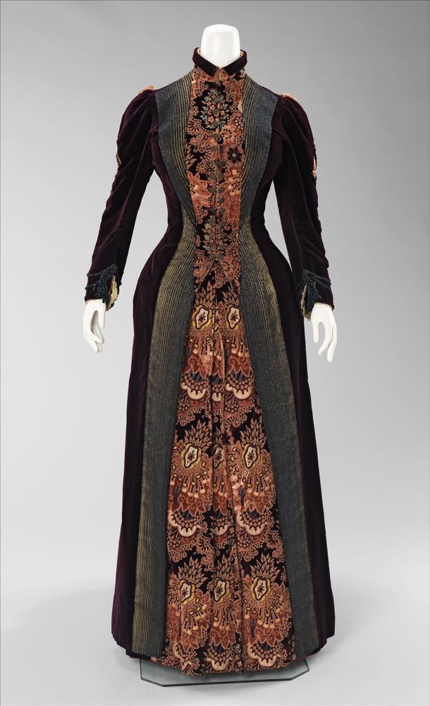

She took rich plum-brown velvet, and paired it with a wildly pattern art-nouveau meets bizarre silk in shades of rust, peach, and bronze, with hints of blue & bronze.
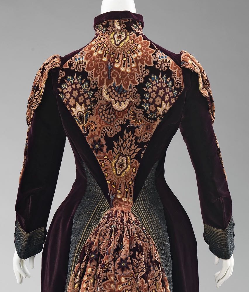
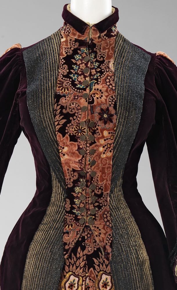
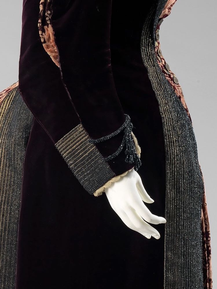
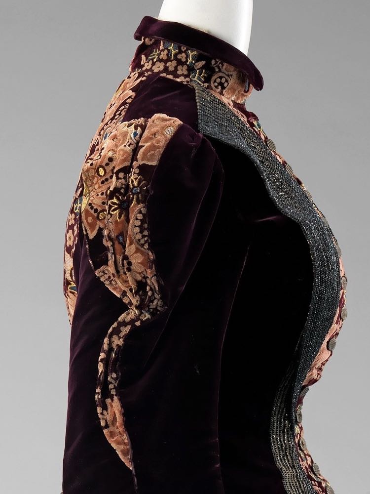
To this she added beads (I’m 90% sure they are cut steel) in shimmering graphite black, arranging them in subtly variegated lines on fawn brown to create a trompe l’oeil effect which enhances the continuous princess lines and nipped waist of the late second-bustle-era silhouette.
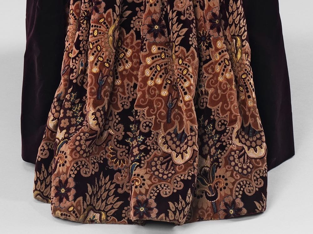
On the back of the dress, the beads highlight the bustle, sculpted of the heavily pleated patterned silk (which almost seems to include a velvet or chenille texture).
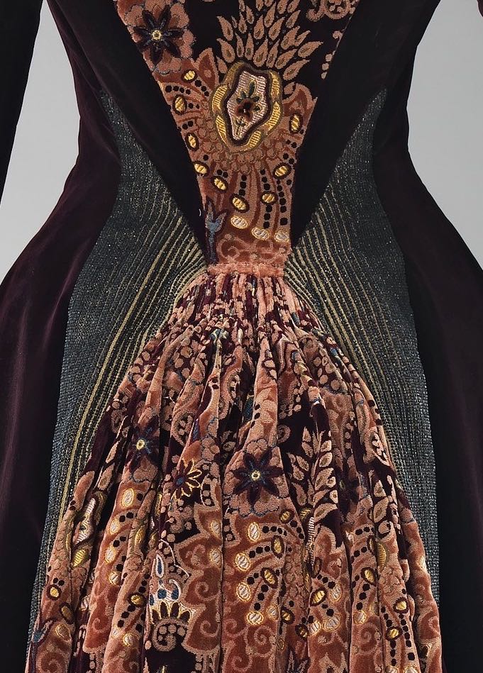
On the front of the dress the lines of beading are echoed in the stripes of the buttons that frame the front of the dress. Sadly some of the buttons appear to be missing. It’s not clear if a full 5-6 buttons are missing at the top of the bodice, or if it switches from double buttons to single from the bustline upwards.
The contrasting textures and lines of the dress create a continual play with the silhouette, and the interplay between compression and volume, soft and hard, tailoring and drapery.
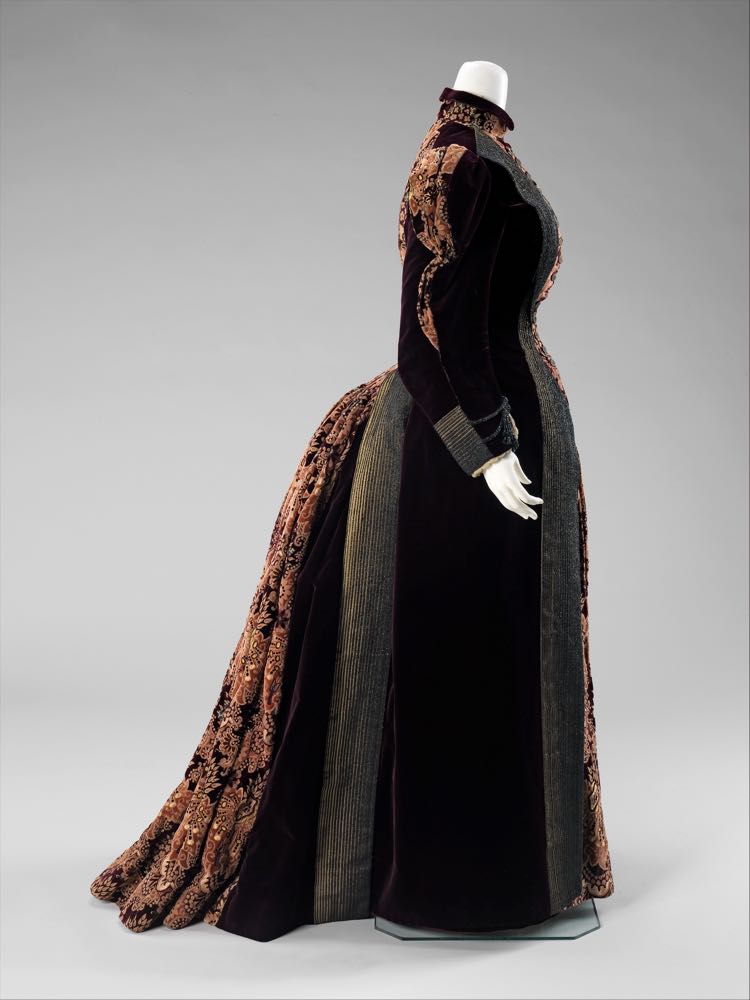
Mixing textures, materials, and fabric trims and manipulation techniques are quite common in later Victorian fashion. This example is, however, particularly innovative and experimental in its mix.
Retiring it is not. At the same time, it somehow manages to avoid being quite as shouty as a basic description would suggest.
What do you make of it?
Rate the Dress on a Scale of 1 to 10
A reminder about rating — feel free to be critical if you don’t like a thing, but make sure that your comments aren’t actually insulting to those who do like a garment. Our different tastes are what make Rate the Dress so interesting. It’s no fun when a comment implies that anyone who doesn’t agree with it, or who would wear a garment, is totally lacking in taste.
(as usual, nothing more complicated than a .5. I also hugely appreciate it if you only do one rating, and set it on a line at the very end of your comment, so I can find it! Thanks in advance!)
Wow! Gorgeous! The beading has me speechless. Also “Irene Adler” popped into mind while reading this.
10/10
This dress is incredible. It looks so heavy and stiff, as if the dress would move as one entity around the wearer rather than move with the person inside. Does it even need a mannequin to stand on its own?
But that doesn’t mean I dont like it. The upper front rather intrigues me. To me it looks a bit like a waistcoat and I would love to see it with a plain skirt instead of more of the patterned fabric.
The beading is just beautiful.
The dress does not make want to wear it, just admire it. Can someone tell me if this would have been a house dress or to which occasion someone would wear it?
I give it a 6.5.
The dress is lovely, but gives off a strong whiff of Victorian stuffiness. The design is striking and attractive. The plum is luscious. The floral doesn’t do all that much for me. But the beaded sections are incredible! The color and the shape! I especially like the back view – it reminds me of those birds that have those isolated shining blue feathers in their wings, just a small startling patch in contrast to the rest of their plumage – like mallards. The beading is elegant, even a bit sensuous, and probably dazzling in person. I could stare at it for ages.
It’s really stuffy looking, and in some ways I feel like the dress is less than the sum of its parts. Looking at it, I think of how hot it would be, and probably dusty to boot. And that floral chaos. But it is also a really lovely, striking, detailed gown, and I feel like I want to score it on that more than its overall effect.
8.5
I love the sleek, Late Victorian silhouette of the dress. I like the color scheme, and even the absurd floral pattern. The contours of the floral areas make me think of some of the color blocking on modern “bodycon” dresses. In light of the recent Lucile dress, I especially love the fact that floral zones appear on both front and back of the dress.
However, I don’t care for the beaded stripes surrounding the floral areas–they add a peculiar and unpleasant drabness to the dress, robbing it of its potential 10 status.
8 out of 10.
l love anything Edwardian or Victorian. the dress is beautiful, elegant and beautifully made. I wish I could try it on.
I actually like the contrast between the striped sections that almost seem inspired by menswear and the exuberance of the floral sections.
If I were to say who I would be wearing this, it would be patroness of artists. It would make a stunning outfit in which to have one’s portrait painted.
10 of 10
10 of 10
Absolutely beautiful. Evening wear.
I’m sure I have seen that pattern as end-papers in some book before! 🙂
My takes on this dress are in conflict, so I will separate them into pros and cons:
Pros: The colors make a nice blend, all drawn from the patterned fabric. The construction appears impeccable. The gradient bead-work is inspired; I especially love how it makes the panels appear to reverse at the front waist. I could steal the cuffs, or maybe the whole sleeves!
That full, lush bustle appears to bloom out of the tapered back panel, visually narrowing the waist in a most attractive way from the back. The silhouette is elegant from every angle.
Cons: The buttons definitely switch from double to single at the bust line, for there are no buttonholes on the right side. That is killing my OCD. The pattern looks good on the little waistcoat, and it looks good in the skirt panel, but, because of the strength (understatement?) of the pattern, one looses the waistcoat effect at any distance. I will have to grant that it may not be so in person, and the elongated effect remains unbroken this way.
My other gripe is that the fabrics put me in mind of upholstery, but I’m always fighting that when I look at sturdy garments of this era. Velvets, corduroys, sturdy brocades–nothing cheap, here! A woman could go for a stroll in the snow wearing this!
So, for the most part, this dress is a wonderful thing. It is brave and beautiful. I would just like the buttons to be one way or another.
9/10
The dress is lovely, especially the trim, but I really don’t like the patterned fabric, and I don’t think it fits the dress.
6/10
This is a rich and striking dress with marvelous textures. I would love to see (touch!) that patterned silk. The contour effect of the beading is masterful. I like the contrast insets in the upper sleeve, and the beaded cuffs/swags on the lower sleeve, but the entire sleeve looks very disjointed in side view. I have a feeling I would love this dress in person and that the photos aren’t quite doing justice to that plummy velvet. Not having seen it in person, it doesn’t quite make my heart sing.
7.5
I was ignoring the switch to a single row of buttons, assuming they were missing. I would rate lower if that was an intentional choice, as the lack of buttonholes above the bust on the left side seems to indicate. It is so unbalanced.
I love it! This is the a dress I would wear any day of the week. The silhouette is sleek, but the material choices just grabs your attention. The soft velvet, the hard beads, and then that luscious silk in the middle. I can’t find any faults with it.
10/10
The first thing that came to mind was “carpet sample”. Then it occurred to me that it might be a little busy for carpet (unless we’re talking about one of those patterned “Persian” rugs), so “hotel curtains” might be a better descriptor.
Either way, it’s not working for me. I don’t like the mix of patterns, and even though I like the fabrics individually, I don’t like them as this dress. The way the bustle is gathered so close at the top and “floofs” through that narrowish space just adds to the “curtains” effect. (And add me to the list of people whose OCD is sobbing at whatever’s going on with the buttons.)
I can appreciate the effort that went into the beadwork, but it needs a different garment, I think.
4/10
So glad to see I’m not alone, I kept reading all these great scores and thinking but that fabric!
I can see the impressive amount of work going into this. The tailoring is impeccable, but I can’t get past the combination of fabrics, and that patterned fabric is killing me.
I will join you in the
4/10
At first I looked at it and completely didn’t like it, but the more I looked, the more I appreciated it. I especially like all the different materials used! Still, because of my initial gut reaction, it receives:
8/10
I love this, so rich and sleek looking. There is something about the velvet pattern that almost reminds me of bird feathers.
Magnificent! I love the colors…the plummy brown velvet makes me love brown again. And the patterned silk is even prettier than the velvet. The beading takes my breath away. The only thing I would change is the beading on the cuffs. I wouldn’t have had the stripes of beads stop so abruptly and then added the heavy black cord and tassels.
I left the number off if my previous comment! 9.5 out of 10
The artist in me loves this dress. It has the air of a man’s suit and yet is totally feminine. The woman who wore this was one who knew what she wanted and how to get it. I’m trying to figure out how to update it to wear to an evening event that’s coming up. I don’t like the buttons changing from double to single, and would like the back view to have a solid bodice with the bustle left as it is to make it even more dramatic.
9.5/10
I almost love this.
The colors of the patterned and solid cloth go together sumptuously – it’s a veritable feast for the eyes. I do love a dress that looks like an older lady might wear it, and this dress is worthy of a Grande Dame.
That said… while the workmanship of the beading is impeccable, I don’t care for the effect, either in color or slight stripeyness. It puts too much distance between the fabrics that want to snuggle up and be plushly perfect together.
I’m still going to give it a high rating – because while I don’t care for it, it’s a work of craftsmanship that deserves every bit.
9/10
Absolutely stunning dress. Magnificent group of colors. The pattern of flowers are designed that when are are looking at the dress from a distance, the patterns beg you to get closer just to see the details. The perfect example of what a dress (or dress coat) should’ve looked like.
What an absolutely fascinating dress! The patterned fabric looks almost like featherwork which is an intriguing enough concept to preoccupy my thoughts as I look at this. There’s a lot going on but remarkably it all pulls together. That’s really masterful. However…. Why doesn’t it entirely succeed? Because even though it pulls together on one level, on another, it does not. I think the main issue is, surprisingly, that dominating patterned fabric. I don’t think there’s any dress in the world that could cope with that textile in large doses. It’s just too much going on all at once, and I think that even though the dress shows good taste, it achieves this in spite of having an aggressively demanding, distracting, arguably hideous (but somehow not ugly?) textile as one of the key components.
I’m going with a 8/10 because at least this dress is interesting to look at, it’s compelling and it is truly brilliantly put together with some fantastic ideas and the heading is particularly exciting.
Not heading. Beading. And I’m actually really weirded out by the sleeves because in the cuff detail it looks almost like two different dark sleeves with different cuffs converging into a single hand and visually my brain is shivering.
Yes! The different cuff designs look fine in front or back views, but from the side…
I haven’t loved and hated a dress this much in a long time. Technically, I think it is done quite well, design-wise I love it. I think the colours work and the contrast is striking. Don’t even get me started on how orgasmic I find that faux-lapel effect of the beading on the bodice.
Yet I hate the paisley. I hate the texture of this whole dress to be honest, from the beads to the trim at the sleeves, but the paisley is particularly offensive. Worse than the texture–which reminds me of those sculpted, over-complicated colour-yourself children’s black velvet monstrosities, just done up in earth tones and then left to moulder in the basement for a few decades–is the fact that it is clearly a non-mirrored diagonal pattern that someone has painstakingly tortured into acting like a traditional repeating/mirrored on-grain pattern, and the inconsistencies just do my head in the more I look at it.
Also the buttons. Dear god the buttons. Double row, all the way, please, or gtfo.
Still. I think it would have been an incredible dress at the time, and my high score is representative of that, and the technical skill. 9/10.
I am in love, the detailing of the beading, like lapels, so subtle, just amazing. The textures of the different materials are sumptuous and beautifully combines. The patterned silk would be overwhelming in a whole dress but as the central panel I love it.
I love the silhouette and the sudden fullness at the bustle works perfectly with the lines of the contrasting fabrics.
10/10
I was looking at this, noticing how cozy and simple and easy to recreate it would be… And then you pointed out that those lines were beads and not stitching! It instantly skyrocketed up to Very High End Understated Wealth. It looks comfy, it packs a punch about how much work went into it, and the colors are pleasing without being boring. I think it is a little too severe, which keeps it from being a 10.
9/10
Oh wow … at an afternoon formal tea or theater matinee this would be impressive. It reeks of money. (as do the other two dresses by this designer they have if you follow the link and look at her as creator)
The floral fabric is awesome. Perhaps cut silk velvet?
I agree that the brown and floral are soul mates, but that beading is just strange. It does have a nice faux lapel effect, and is slimming, but it is rigidly geometric and coldly glittering and the rest of the dress is warm, soft and flowing. Great trim, wrong dress. Would have been better with some warm-toned beading, better yet without it.
The sleeves are strange – are they hiding puffy floral sleeves in there? Something is trying to escape from those sleeves. and the cuffs are odd
The switch from double to single buttons – is that a museum hiding some missing buttons? there’s an odd pucker right where the switch happens.
8.5 (because mostly the trim annoys me).
My second reaction on looking at this dress was to quickly check the caption to make sure I was looking at an actual example from the time period, because I have to say my very first reaction was to declare “that’s a costume from a production of Hedda Gabler”. I agree with other posters, there are some borrowings from the “masculine” clothing vocabulary here; the palette of the print silk and plummy velvet seem drawn from a gentleman’s dressing gown. I do like this dress, but I certainly do not have the stature which I suspect would be necessary to carry off such a demanding garment.
8/10
What a beautiful autumnal dress! The static display doesn’t do it justice at all – it needs
to be seen in motion, walk through the park in the sunshine of fall with a hat decorated
with pheasant tail feathers. Really captures the thanksgiving spirit – it’s a holiday dress!
10/10
I do want to like it, but although the beading is very technically impressive I don’t like the color. On this dress, it just seems washed out. Two points off for that. But the velvet is very nice, and the pattern isn’t too overbearing, so it could be much worse. (And the buttons perplex me, which has dragged the rating down another point.)
7/10
The buttons are visually lost on that patterned fabric, so I wonder if a plain jet button would have worked better. If the design choice was to go from double to single buttons, I’d deduct another point, but the top right buttons may be lost, or cannibalized for another project. I love the beading, but the cuff details that differs from front to back sides somehow upset me. I like the back, but the front leaves me uncertain. The patterned slice in the middle maybe should have been nipped in more about the waist, like the back. The shape of that front patterned inset is offputting. Maybe things were going on that I don’t understand. For example, this dress’ inset may have originally had a slightly different vertical line. When it was fitted, maybe an adjustment needed to be made to accomodate the wearer’s waist, so things became finessed. Maybe it was created to accomodate a changing waist for pregnancy or post pregnancy. I’d like to see it with a giant apricot cameo on the collar, since the buttons don’t show as an accent.
7/10
Brilliant! I think you solved the mystery of those irritating buttons–they were doubled where the panel was set in to enlarge the waist! I do wish the person doing the alteration had continued to run the extra row up to the collar, though.
10/10 I am a book, with beaded lines for the fore edge & lovely brocade end papers.
If this was in shades of blue, purple, grey or really any other colour than 1970s pub carpet, I’d absolutely adore it. As it is, I love the shape and the print, but my eyes are watering from the pub carpet fumes.
9/10.
Really not sure about this one, it’s almost like the maker couldn’t decide if it was going to be a dress or a house coat. I actually like the bodice but I feel the fabric is too much with it going into the skirt and the bustle and the sleeves and I’m really not sure how I feel about the bustle being a completely different fabric and peeking out from all of those gorgeous beads.
It would have to be a 5.5 for me
I’m afraid I don’t like it. The combination of the fabrics does not work for me. The patterned fabric is very dominant and does nothing for the lovely steel-beading that is doing such a good job of giving a pleasing shape to the dress. The wine/brown velvet is overwhelmed by the pattern, too. A shame. If it weren’t for all that work on the beading, this would look like a “what have I got in stash that I can make a dress out of?” kind of thing. I can cope with fabric that looks like curtains – I wear it myself! But not when it monsters such pleasing and refined work.
3 out of 10
I LOVE this dress! The details (aside from the missing buttons) are sophisticated and complement each other well. I hope I mature into a woman who could carry off something this potent and emphatic, and frankly BOLD. 9.5 out of 10
Seeing the front of this dress full-on, I really like it. A bit darker, not quite stuffy colors, perhaps for a more mature woman? Someone my age would never have worn it. The side view too is lovely, really accentuates a narrow waist by thrusting the skirt back; a perfect display of bustle fashion. The back view is kinda…eh…I dunno, I guess the panels of dark velvet, beads, print, beads, velvet again just don’t work for the back of the dress. I have no problems with the beads themselves, contrary to many of the other comments, and you can’t blame the designer if the top few buttons fell off in the century+ since it was made. I agree with Tsu Do Nimh that it looks like the museum tried to hide the missing buttons by folding the right front piece over. I also like Ava Loy’s suggestion of plain jet buttons that would be easier to see. Perhaps a jabot of off-white lace (stark white would clash horribly) could be worn as a better way to hide the missing buttons? Pinned with something fancy in black and bronze?
I’ll take one point off for back-paneling nonsense (IMO, would be better with velvet all the way round the back) and a half point for the hard-to-see buttons, NOT the missing ones–like I said, I’m not blaming the designer for those. Score: 8.5
I just don’t like this one, it’s just too much all at once for me. It’s quite clever but although I like the brown velvet and the paisley is fine (I dislike the beads immensely) altogether they just strike me as overwhelming. I don’t think the lines are very graceful. And I don’t like the buttons.
2/10
I actually really like it! At first glance all I could think was ‘my sofa pattern’, but the more I looked the more I loved. Except for the sleeves. It looks really weird to me, especially at the cuffs there. I still love the dress overall, though.
8/10
I really want to like this a lot more than I do. Gorgeous plum coloured velvet, brilliantly done beading, a richly ornate figured velvet, a lovely overall silhouette and excellent workmanship. But somehow, despite being carefully matched (and perhaps it looks better in real life than in photographs), the different fabrics don’t seem to work well together and are perhaps having even more of battle with each other because of the way they are disposed. This also looks as if it might be a very heavy dress to wear even by 1880s standards.
6
From the front, I love it. From the back, I mostly love it, but there’s something about the puff of patterned fabric at centre back that doesn’t quite do it for me, but I can’t put my finger on exactly why. I love the fabric and the beading though, and the overall shape.
Like some of the other commenters, I have a bit of a problem with the front buttons. However, I’m not going to dock points for that because I assume there was originally one row of buttons which had to be altered when the lady’s figure changed slightly.
9/10