
I’m very excited about this week’s Rate the Dress choice, because it’s a dress I’ve actually examined* in person. It’s not often that I get to show one of those! I may love it because I’ve seen it, but will you love it for what it looks like?
Last week: a late 1910s Lucile dress
Well, Lady Luck doesn’t wear green as far as Lucile is concerned, because a lot of you DID NOT like the dress – though the vivid green colour was one of the few elements that was almost universally popular.
There were a few people who did like the dress for the overall impression it created, but for most of you, it just wasn’t working.
The Total: 5.8 out of 10
Ouch. Anything below a 6 is pretty unusually bad!
This week:
Last week’s Lucile dress may have been a little too heavy on the quirkiest details of 1910s fashions (though you may be surprised to find how many examples of dangling-bust-trim were made in the 1910s), so this week’s pick is an example pared back to the most classic elements of the fashion of its era:

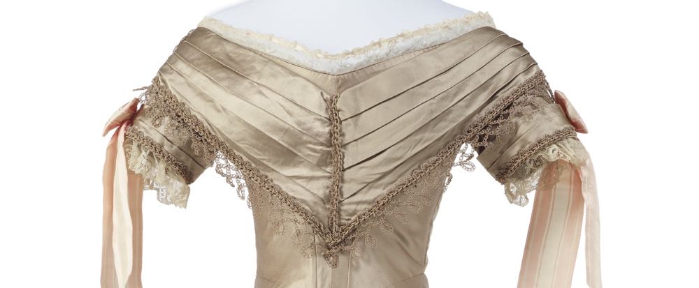
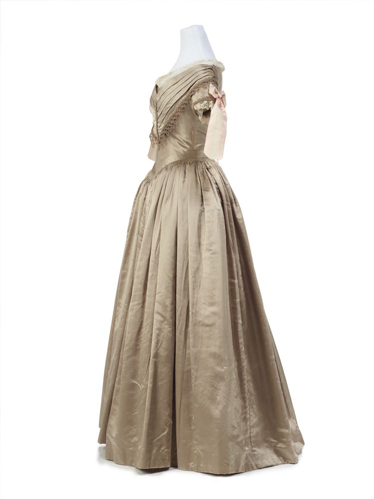
This ball gown is pure late 1830s, from the pale pink-brown shade, to the gentle bell skirt, to the pleated bertha, wide neckline, and little sleeves.
In an era dominated by a small set of standard design elements, the exact application of those elements, and their finish, were what set a garment apart.
This dress is noteworthy for the tatted trim that edges the berthe and sleeves (possibly a later addition, but I saw no obvious indication of this when I saw it in person – though I wasn’t looking for that), and for the pointed band that frames the waistline, highlighting the tiny, beautifully worked cartridge pleats.
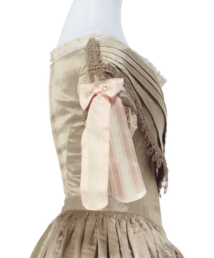
The only elements of contrast are the sleeve bows, which may also have been replaced, but most likely in-period, simply to update and change the look of the dress.
At some point one of the back skirt panels was damaged or removed (I have visions of the wearer standing too close to the fire and scorching her skirts, a la Jo March), so the skirt has been stabilised and conserved with an alternative panel.
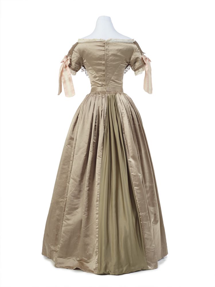
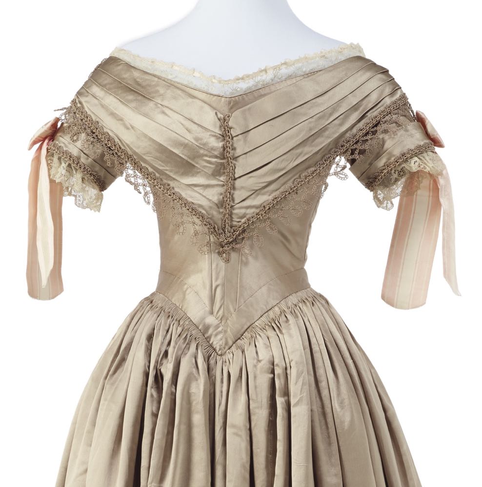
The back view of the dress allows us a clear view of the mechanics of the dress. If I recall correctly it hooked through hand-worked eyelet holes to close.

What do you think? Is this classic ca. 1840s ballgown a classic beauty, or a basic bore?
Rate the Dress on a Scale of 1 to 10
A reminder about rating — feel free to be critical if you don’t like a thing, but make sure that your comments aren’t actually insulting to those who do like a garment. Our different tastes are what make Rate the Dress so interesting. It’s no fun when a comment implies that anyone who doesn’t agree with it, or who would wear a garment, is totally lacking in taste.
(as usual, nothing more complicated than a .5. I also hugely appreciate it if you only do one rating, and set it on a line at the very end of your comment, so I can find it! Thanks in advance!)
*albeit not in-depth, and I didn’t take notes.
I’m impressed with the overall construction and the general impression. Even though it’s not a color I would wear (not too fond of shades too close to skin tones), it works well to show off the lines of the dress. The pleating is beautifully done on the skirt.
I like the idea of that tatted time, but I would find it more pleasing if it were the same color as the lace.
8 of 10
I had a bit of a “meh, pretty” reaction at first glance, but then I read your description and looked more at the details. I do like the banded effect of the sleeves and the bertha, as well as the lace, though it all terminates very abruptly in profile on the shoulders. The color is quite pleasing, and this style of dress has a simple, youthful loveliness.
The standout detail for me is the sleeves, but they don’t stand out in the best way. They just don’t seem very well chosen to suit the rest of the dress. I can imagine them as a last minute addition before a party:
The Hon. Miss Marianna Wellheeled: “Jane! Jane, come here! I simply must have some new ribbons for my frock! Is there anything in the scrap box?”
Jane: “Just these pink and white ribbons, miss.”
Marianna: “…Do you mean the deep rose velvet ribbons or the ones that look like frilly rashers of bacon?”
Jane: “The frilly rashers of bacon, miss. We used the rose velvet for napkin rings.”
Marianna: “Oh, la! What a day I’m having!”
I do think a darker ribbon would have been better, though these look like they have a bit of shine, which maybe would have worked okay with the luminous dress.
There’s nothing really to dislike about the dress (except the ribbons), but I don’t find it very exciting either.
7.5
This is a lovely and elegant dress, but doesn’t stand out much to me. I don’t care for the ribbons on the sleeves at all. 8/10
I like it. I don’t like the bows, because their ends are too long, but I like it despite its plainness. The fabric is beautiful, and the crocheted trim is exquisite.
It could use some accent of some kind–perhaps a sash, trimmed in the same crochet?–and accessories, but otherwise it is a great example of elegant simplicity.
8 out of 10.
I like it. Fascinated by the way the tiny cartridge pleats disappear under the waist band. How was that achieved? Where does the bulk of the pleat-heads go?
8 out 10
Ooh, this is gorgeous! The silk is so lustrous and yummy, and that cartridge pleating, and the band at the waist! Also love the angled seams on the back of the bodice, they make everything look so trim and tidy. The trim is pretty. It looked like tatting at first glance, but after zooming in, I can see that the structure is completely different. It appears to be crocheted of two different weights of cord or gimp, mostly in chain stitch. I think the larger cord looks just a little too heavy in combination with the lighter one, but I only noticed that close up. The bows are very pretty, love the striped ribbon. They don’t seem to have much to do with the rest of the dress, but I can easily imagine the wearer having a bow or other decoration of the same ribbon in her hair, which would tie everything in nicely.
So neat that you got to see this in person. I am curious what the inside was like?
9
I find it breathtakingly elegant, not plain. I love the trim, and even that it blends smoothly with the dress fabric. The bows don’t enhance it for me, but they don’t detract either.
10/10
I really like it…all except the sleeve bows. I don’t care for the stripes or the color…too light and too pink. The person who described them as “rashers of bacon” was exactly right!
8.5/10
What a divine colour! Utterly scrumptious! Beautiful understated details such as the immaculate cartridge pleats. The upper part of dress carries plenty of embellishment but nothing feels heavy or clumsy except the floppy sleeve ribbons which feel more like the wearers choice than that of the dress maker. I would have loved to have seen some of the details echoed at the hem of the skirt to give the whole piece a connected feel. The pleated Berthe is beautiful but I wish it could have extended around the back as one of my personal pet hates is when the back is left plain, as it feels unbalanced. I have no idea if this is a common aspect of the style of the time but I looked online and found instances where the Berthe extended all the way around and I liked that a lot more.
I am disappointed I am having to give this dress a 7.5/10 because it is such a gorgeous little biscuit.
I don’t like the pink bows, they don’t seem to fit the dress and I don’t like the crochet trim but aside from those details I really like this dress. It feels beautifully made and put together to me. I love how nicely the cartridge pleats are done and how well everything’s finished. It’s not over-trimmed and I think it’s elegant.
9/10
I find it really beautiful! The pleats are gorgeous, and the sheen of the fabric in the pictures is mesmerizing.
10/10
While I admire the beautiful construction details, the overall impact of the dress is low.
7/10
Simple and white is always pretty. I only have two complaints: 1) Why are the tails on those sleeve bows so long? 2) I wish the bertha extended around the back as well. Dresses that skimp on design details in the the back can look a bit cheap.
8/10
I like it! The hue might be a tad too much on the ‘brown’ side of ‘pink-brown’ for me if that’s really what it is (but I’m one of those froufroufrillygirls who’s going to be in here making grabby hands for all the eldritch pink monstrosities crushing everyone else under the weight of their cupcake-ed madness), but on my monitor, it’s almost more of a darkened/weathered ivory, or some similar off-white that’s had a lot of experience. The replaced panel makes me sad, but I’m not going to mark it down for that, because it’s not the gown’s fault, and I bet if it happened while it was owned and worn, the lady was probably just crushed by having to repair it that way (which might be something I have experience with myself).
Not huge on the dangling sleeve-bows (on another dress, I might love them, but they don’t quite click with this one), and the pleated berthe isn’t my favourite style, but I DO love the other trims on the sleeves and around the bodice. I could seeing wearing a dress styled after this one to a more elegant type of Halloween or supernatural-themed costume party – no modern horror or corpse brides (not that I don’t like some corpse bride when it’s its own time); just a gentlewoman ghost donning her best for a reunion with all those other friends long gone.
8/10
“frilly rashers of bacon” … perfect description of those things.
I don’t think it’s a ball gown because those usually have back details that you use to impress people with as you float by. Very formal dinner dress maybe, with the detailing all top front.
The color would be lovely under candlelight – warmer and glowing. Give her some pearls, topaz or amber for necklace and bracelets. Or a nice Indian shawl in warm rust.
The construction is excellent, and the band over the top of the pleats a nice touch to hide the sometimes awkward pleat tops. Very essence of the 1830s after the sleeve insanity had gone.
This would never have been avant garde, but it also wasn’t going to go out of fashion quickly because it is so conservative. For a woman whose lifestyle included a lot of dining with her father’s or husband’s business and political associates this would be seeing frequent use. Having a dress that won’t outshine the boss’s wife, or make the partners wonder if they should examine the books is a good idea.
Other candidates for owning it … spinster aunt, well-bred governess, Quaker bride.
(minus half a point for frilly bacon)
9.5
I actually do like the pink ribbons; they could stand to be a little shorter, maybe, but it’s nice to have something on the dress that isn’t beige. The beige is nice, too, and as another commenter said it wouldn’t go out of fashion quickly.
9/10
Good grief- Sorry about the duplicate postings, I don’t know if I can get rid of them.
Happens all the time. I fixed it 🙂
I really dislike the bacon rashers, but love the rest. I wonder if the colour has actually faded a bit with age. Did you see the inside of the dress? Were the ribbons added later as they are so awful.
8/10
It’s a dress that Jane Eyre would absolutely approve of. The mushroom shade is gentle and the overall styling is very subtle and modest and unassuming. It’s a difficult dress for me because it doesn’t really inspire any strong feelings or emotions. Good example of the period and nice proportions throughout. The most interesting thing for me is the replaced skirt panel because it gives a flicker of personality and background story/narrative that I don’t have to make a conscious effort to project into the dress (some frocks just demand a story or trumpet their narratives, but others are just….there.). The bacon rasher (I glimpsed that comment and can’t unsee) bows are kind of horrible with the mushroom satin, but again, they’re so incongruous that they’re easy to ignore because they just don’t look like they could possibly be part of the dress
I’m going to have to say it’s pretty boring, but a delicately tasteful, retiring, beautifully made level of boring. It’s consummately inoffensive. Even the effort of the bows to introduce some tension and drama and reaction sort of fails.
It does exactly what it says on the can of mushroom soup. That’s pretty much it. If the bows hadn’t been there, I might have rated it a little higher, but they fail to add anything good or bad, so the very act of failure brings it to 6/10
This is exactly what I like about this era, and exactly the reason why I like this era: the restrained whole with interesting details.
9/10
Posting from grandma’s computer! It worked! Yay!
Yay! Lovely to have your voice be part of the whole conversation!
How fine and elegant! All of the details come together masterfully. I especially love the construction of the bodice! It doesn’t bother me that the bertha doesn’t continue around the back, because the construction is so neat and pretty. And those pleats! How did they ever make them so perfect?
And, oh, that satin–I just want to stroke it!
I agree with many of the above commenters that the bows on the sleeves detract from the dress. It seems to me that the tone of the ribbon doesn’t compliment the color of the gown. The bows also don’t integrate with the overall design–they appear tacked on, like a prize ribbon pinned onto a county fair contest entry. I suppose that accessories using the ribbon, such as a bow in the hair or a trailing bow on a nosegay, might tie them in better.
With one point knocked off for the bows, I give it:
9/10
Okay, I’m reading a lot of distaste for the bows. And when I first saw them I admit I thought the same things–too long, not really “fitting” with the rest of the dress. However, I made myself back up and picture the dress as it may have looked on a person, and the bows ended up trailing prettily around the upper arm. The comment comparing the ribbon to “rashers of bacon” made me giggle–I can see the resemblance, but it doesn’t really detract from the appearance. I do wish they could have tied it in with some other pink details elsewhere on the dress, though.
Personally, I would not look good in this dress, just because my skin is rather pale. On a lady with a darker complexion, it would look fabulous! (Except for that replacement skirt piece, but I can’t blame the dressmaker, and thus remove points, for that.)
9.5 out of 10 (1/2 point taken for lack of pink elsewhere on the dress as mentioned above)
I’ve always appreciated that you can really see the lines and construction of the dresses from this era. I rather like the combination of peachy-pink on the ribbons with the warm taupe of the dress, and I think they must have moved wonderfully on a real body. I think the outfit could do with a bit more of that pink in the accessories, though.
9 out of 10.
I like it! There are no alarm bells to this dress, but… there are no bells ringing for any other reason. It’s kind of boring. I do like the colour a lot.
7/10
I agree with some of the other commentators that the trim is not tatting. It’s way too big and chunky. I can’t tell without a close-up, but the style doesn’t look much like tatting. Also, tatting in its modern form came about when Mlle. Eleonore Riego de la Branchardiere published a book in 1850. She invented a method for joining picots. I’m not sure if that impacts the likelihood of tatting on clothing; I’d have to research some more.
I like the gown except for the giant ribbons on the sleeves, so my rating is 9/10.
Some of the photos at the museum website can be set full-screen and then enlarged enough to see the structure of the trim clearly. There are none of the knots (or picots) which make up tatting. It is rows of chain stitch loops worked along the edges of a central foundation chain made of the larger gimp or cord. I found it interesting that the trim is oriented with what would now generally be considered the reverse side facing the public.
When I first saw this dress I thought it looked boring. I only liked the sleeve bows — I imagined how they would have fluttered against the arms when dancing. After looking at the large images at the museum’s webb page I changed my mind though. There is a beautiful pink shimmering to the silk. I would really like to see a magnification which showed the individual threads of the warp and weft. I think it looks like there might be a very subtle pattern in the silk. The trim looks to me to be constructed of silk gimp; that is untwisted filament silk wound around a core of silk, and either silk purl: silk covered wire turned into a spiral, or silk coil: like purl only the core is silk instead of wire.
I would have preferred another colour than beige, a middle hue blue maybe, and I would have liked the trimming to continue around the back.
8 out of 10