

It’s always nice to have the most lovely, polished photos for Rate the Dress, but that does limit the options. So sometimes I have to choose a poorly staged garment, just because it’s so interesting. And I think the fabric, colour, and design of this week’s pick make it worthy of inclusion, lacklustre images notwithstanding.
Last Week: a 1912 afternoon dress by Jeanne Hallee
There was a lot of confusion about the colour of last week’s dress. Was it black? Blue? Purple? My screens say purple, but unless one of us has seen the dress in person we’ll never really know. Photography can be so misleading!
There was also a lot of variation in the rating, with scores hitting every whole point from 4-10. And everyone loved, or didn’t love, it for different reasons. No consensus at all!
The Total: 7.3 out of 10
It does actually reflect this largest clump of ratings, even if it was a proportionally small clump compared to other Rate the Dress selections.
This week: an 1890s evening dress by Mrs Cuttle
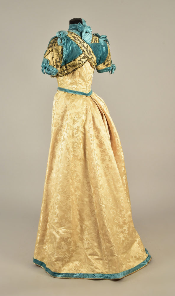
This 1890s evening dress could do with a good steam and fluff, but with a bit of imagination you can envision it as it was originally.

Helen Larson Private Collection, Whitaker Auctions
This dress is dated to 1890 in the auction catalogue, but the cut of the skirt and the bolero effect of the bodice suggests a date at the end of the decade: more 1899 than 1890.
Helen Larson Private Collection, Whitaker Auctions
The skirt cut is almost identical to the Scroop Patterns Fantail Skirt, which always attracts me to a dress, but the main reason I found this one so worthy of featuring was the striking turquoise velvet, and the fascinating patterning on the ivory fabric.
Helen Larson Private Collection, Whitaker Auctions
It’s little puzzle pieces! (Or seaweed. Or just abstract shapes…)

Helen Larson Private Collection, Whitaker Auctions
It doesn’t affect the aesthetic rating, but I do like that the auction included an interior view, with the maker’s label:

Helen Larson Private Collection, Whitaker Auctions
So, imagine the velvet all plush and uncrushed, the bows all plump and perky, the pleats and precise as they were the first day it was worn. How do you feel about this dress?
Rate the Dress on a Scale of 1 to 10
A reminder about rating — feel free to be critical if you don’t like a thing, but make sure that your comments aren’t actually insulting to those who do like a garment. Phrase criticism as your opinion, rather than a flat fact. Our different tastes are what make Rate the Dress so interesting. It’s no fun when a comment implies that anyone who doesn’t agree with it, or who would wear a garment, is totally lacking in taste.
(as usual, nothing more complicated than a .5. I also hugely appreciate it if you only do one rating, and set it on a line at the very end of your comment, so I can find it! And 0 is not on a scale of 1 to 10. Thanks in advance!)
Although I like the colors and am fascinated by the puzzle-piece pattern, this is a garment I do not like.
I do not think I would be more favorably impressed even if the presentation were better because all the elements strike me as too weighty, and it leaves me with the feeling that if I wore it it would take me twice as long to traverse a room, let alone anything more vigorous, like dancing.
Sadly, 4 of 10
The beaded embroidery on the yellow bodice pieces is beautifully executed, the color scheme is lovely, the fabrics are exquisite, and the overall silhouette is attractive. But the odd strapped-up effect of the bodice design is clunky and un-attractive. The turquoise pieces going over the bodice undoes a lot of the good the positive features did for the dress, in my opinion.
5 out of 10.
BTW, I think the striping on the overrobe of last week’s dress is blue. I think the sash was originally blue also, but it looks so purple on my monitor now that I think it may have faded with time.
Maybe I’m a succor for the underdog, or maybe I have a very vivid imagination, but I can see this dress better than what it was photographed and ready for some young lady to wear to a special occasion. Maybe a spring or early summer event at the Biltmore Estates! I really like this dress. She speaks to me. Crushed velvet and all I am giving this one a 10-for the dress I know it could be!
I love the fabrics and the overall shape of the dress, but the upper bodice is confusing me. It reminds me of a crazy quilt of the period, and not in the best way. Also, there are too many of the velvet bows sprouting off of it–I would cull them down to the one on the left breast and the ones on the sleeve edges. The upper bodice does seem to be looking forward to the draping and wrapping of the early 20th century.
Those colors work very well together, in my opinion.
I think it would look pretty fair steamed out and modeled by a lady with a contemporary coiffure.
7/10
The thick velvet choker makes me feel like I am being strangled just looking at it, and I don’t like how a wedge of the velvet obscures the criss-cross trim in back. Otherwise, it just needs some steaming and plumping up to look magnificent. I am particularly partial to the velvet hem trim and all the sparkles on the bodice.
8/10
I can’t get past the gold bodice sections overlapping. That neckline looks like it would strangle the wear! I think I would be claustrophobic after a couple minutes. That’s really too bad, because the fabrics are lovely, the silhouette graceful, and the beading beautiful.
4/10
It looks like someone decided they hated something about the neckline, and the dressmaker had to DO SOMETHING in a hurry. I like the details of the embroidery, the jewel at the waistline is pretty, but even allowing for the fact that it needs to be steamed and fluffed, that top is a hot mess. I’ll give it a generous 5.
I love the colours and jewelled details but the bodice is the very definition of “trussed up” and the plain skirt does not balance this out.
I like the fabric and silhouette and I love the beadwork, but for me the bodice is way too busy. 4
I like it, and can imagine it would show to more advantage on a live model. Yes, there’s a lot of fuss going on at the top, but then there’s that lovely sweep of cream silk, which is heavy enough to cope with the velvet. I’m not normally a big fan of turquoise as a colour, but it looks splendid with the cream. The beading is beautiful, and the way it is used is rather like a classical Greek gown.
Lovely work, Mrs Cuttle!
9 out of 10.
(Radio silence from uni exams, but have been looking forward to this all week.)
Like most people I’m thinking the bodice is a little too busy, but this is an almost-Edwardian dress I would actually wear (S-curve horrifies me most of the time). The saving graces are the beautiful gold-patterned silk, the nice skirt shape (I really should get that Fantail Skirt pattern, but I currently have projects coming out of my ears), and colour contrast between the gold and turquoise (I actually have a mustard yellow/turquoise thing going on with a winter coat and scarf in real life so maybe this isn’t too much of a leap for me). Also rather liking the bolero effect – if only it wasn’t so layered! So I think I finish with a medium sort of 6.5/10
I would remake the bolero , keeping it turquoise, with the gold beaded fabric as a trim and lose the bows, maybe make the sleeves a bit longer with the fabric, and the choker could go too then again it could look good on the right person. Apart from the top needing some tidying and a serious steaming ,the dress is a beauty. Great to see the inside too, the seam finishing deserves full marks
The dress, as it is 7.5 as beautiful but needs work done
Some of the asymmetrical design of this time period gets a little too much for me, but I enjoy this piece a lot. I like the color contrast and the simplicity of the skirt. I would totally wear this!
10/10
I like it! And not just because it has a favorite color. I think with a good steam, the crossover top would have drawn me in more, because I like unusual style lines a lot.
9/10
I love all the details going on here, and the colour combo is interesting, but something about the design seems so top-heavy; it’s probably how all the in-your-face elements are so centered around the shoulders/bust area… Still, the details still entice me!
7/10
I really like the shape of the skirt, and the belt. Very sleek and elegant. The beading is really pretty and I weirdly love the blue velvet bows?! The bolero shape is cute and probably flattering, and I think even though it’s really busy up there, the shape carries all that stuff pretty well… But I really don’t like the pattern on the ivory fabric, it gives me bad 1980s vibes.
6/10
The velvet is fabulous, it has a lovely colour and it works well with the cream and the beading. I just don’t think it was the best way to put these together and it doesn’t matter how many times I try to like it, I just don’t. Even allowing for steaming and fluffing, beyond the colours and textures I don’t think this is ever going to be the best example.
Sorry Mrs Cuttle it’s a 4/10 from me.
The good:
The color scheme is excellent. Creamy yellow and turquoise
The “seaweed” damask effect is subtle and attractive.
The beaded trim is exquisite!
The cut of skirt is great – gored skirts with fantails work so well as you exit with an enticing swish.
The not so good:
The ribbon on the hem looks like it was added to conceal an altered hem. It’s too thin for the visual weight of the skirt. A wider ribbon, or several narrow ones would be more balanced. A band of the beading would have been stunning.
The ugly:
The bodice, especially the draped armpits, is a dogs breakfast. I’ve seen the draped armscye in tulle or chiffon and they look fine. But it’s awkward in velvet because what is ethereal draping in tulle is bulky in velvet. It looks like the start of the bandaging for a broken collarbone.
5
The damask pattern makes me think of oak leaves, not seaweed or puzzle pieces. We don’t know what the pattern designer intended, but I think the damask fabric is lovely.
Um….Ima go with no. All I can think of when I look at it is that it’s been badly cobbled together from three different garments (realizing that the maker’s label makes that unlikely, I still can’t get it out of my head)–the yellow of the trim clashes with the yellow of the damask, the beading is just too dark to be harmonious, and the velvet makes me queasy paired with both. Add to that the crazy-quilt feeling of the bodice, and the too narrow hem trim…. I do love the colour of the velvet, and the perfect trumpet shape of the skirt. Oh, and the photo of the insides is my favourite part.
3/10 harsh, I realize
Love love love the colors together. The skirt and that turquoise belt! That is how to accessorize. The puzzle piece fabric is a different kind of brocade than I’ve seen before. I think I like it. Keeps the dress from being too stuffy and proper. I love the beading on the top wrap piece as well as the sky blue velvet, but I don’t understand it. What is going on there? It’s a weird deconstructed look. It’s too much to focus on one thing, so my eyes just see a mess. Less is more with embellishments. Let’s keep the skirt and belt. I’ll ask Mrs. Cuttle to remove the bows and wrap-around bits. Save them for another dress. Or 3? I like the (daring) short sleeves.
7/10 because of the lovely co!ors!
The bodice is an absolute mess. No amount of steaming can correct this pile of embellishments. Festooned armpits?
2/10
Yep, the upper bodice / neckline is weird, confusing, looks uncomfortable…
With slight tweeks, it would be a gorgeous dress, but as actually exucuted, leaves me lukewarm.
7/10
Gee, what a handsome dress it could be. Well steamed, I think the bodice design would make more sense, and the colors together are gorgeous. The sweep of the silhouette is lovely.
The dress checks most of the 1890s boxes (even if it is 1889): bodice decor, strong color contrasts, neck bow, plain skirts, belt, mid to heavy weight fabrics.
Like it a lot. 8 of 10
I LOVE this dress ! I am a sucker for turquoise and for velvet, I adore the 1890s, the shape of the skirt is perfection and I love the puzzle pieces at the top. I have to take one point out for the weird collar over the decolletage – it feels like they didn’t know whether to have an open or buttoned up dress. 0 out of 10.
I assume that was meant to be 9 out of 10? 😉
2/10
Bah! This is how good material goes bad. Love the beading, but with little going on in the skirt, and the bodice looking like a gilded hog-tying or straitjacket exercise, I am squirming to escape just looking at it. Especially that choker!