

After last week’s lush excess of trim and embellishment, the garment I’ve chosen for this week is simple and restrained, relying on the cut and layout of the fabric for interest.
Last Week: a natural form era dress in red silk with rosettes and roses
Some of you thought last week’s dress was holiday perfection. Others thought it looked like an over-dressed Christmas tree, and not in a good way.
Interestingly, one of the things that came in for a lot of criticism was the way the skirt flared out from the hips. That’s a classic dressmaking trick to create the illusion of a small waist.
The Total: 8 out of 10
(I personally thought the dress was just the thing for my favourite Christmas movie. Santa’s everywhere at once, and some of him landed on the dress…)
This week: an 1840s dress in striped silk
The Metropolitan Museum of Art identifies this dress as a ‘visiting dress’, but I think a more correct description would be a formal day or dinner dress. Perfectly appropriate for visiting, but also for having guests over in your own house, or going to church. Just the thing for the season!
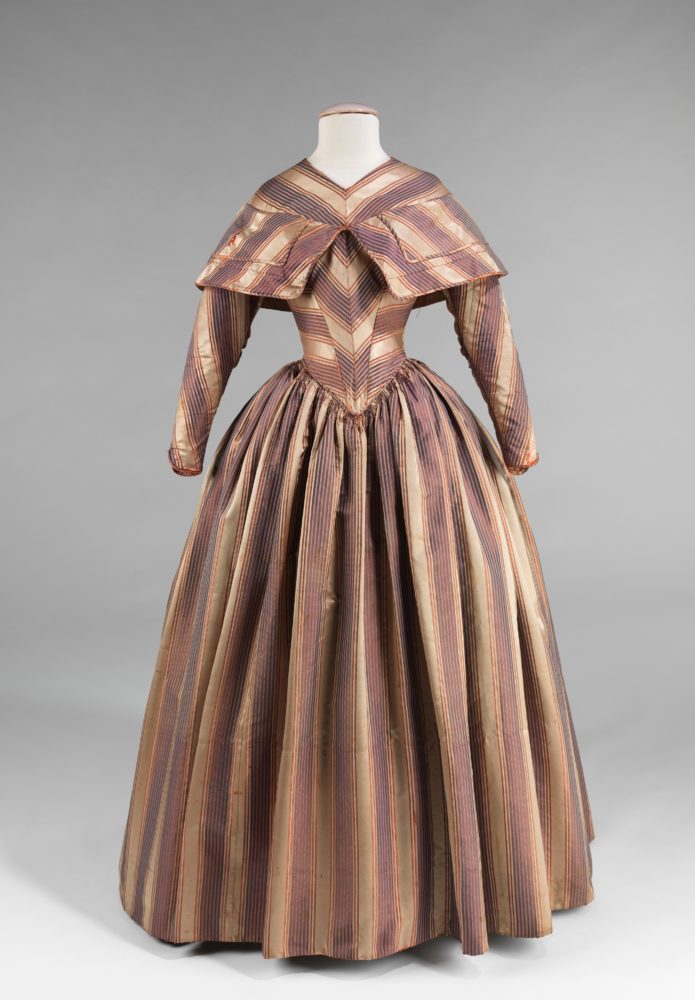
With no additional embellishment or trim, the dress relies on the inventive uses the stripes for visual interest, creating an interplay of angles and lines.
Note the piping that finishes many of the seams & edges: a double row of delicate lines at the waist, a single row of equally delicate piping running down the sleeve seam, and wider piping (or flat piping) framing the berthe.
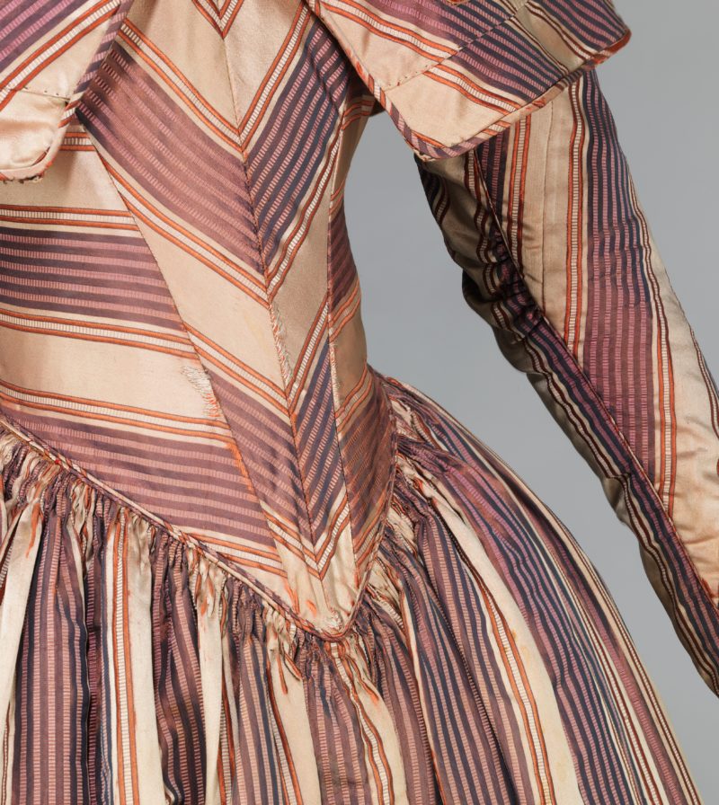
Note also the very careful use of fabric and piecing in the dress. There’s a subtle seam in one cream stripe of the sleeve, and a slightly less expertly placed join at running around the bottom of the berthe, and a suggestion of a selvedge or end-bolt mark in the berthe as well. The maker was clearly determined to make the absolute most of their length of fabric.

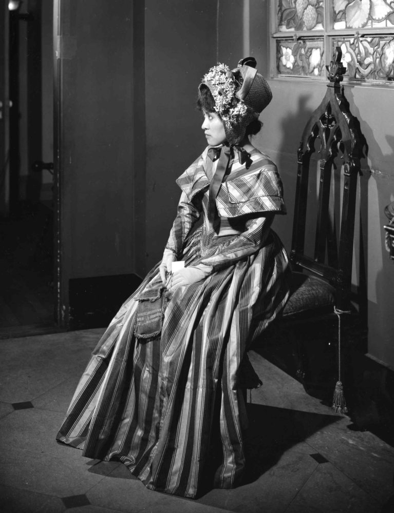
The museum record includes a couple of images from the Met’s (thankfully long-since abandoned) practice of posing the dresses on live models. I’m not convinced the hat that was chosen to go with the dress does anything to elevate its aesthetic.
While last week’s dress was a shoe-in for a ‘Christmas’ pick, this week’s choice is a little less obvious, but does remind me of wrapping paper and ribbons. There is something glossy and holiday-ish and festive about it, just in a more subdued way. What do you think? A lovely thing to wear for a visit? Or far too boring and severe compared to last week’s dress? Or is this one just as weird as last week’s pick, only in a specifically 1840s way, instead of an 1870s-80s way?
Rate the Dress on a Scale of 1 to 10
A reminder about rating — feel free to be critical if you don’t like a thing, but make sure that your comments aren’t actually insulting to those who do like a garment. Phrase criticism as your opinion, rather than a flat fact. Our different tastes are what make Rate the Dress so interesting. It’s no fun when a comment implies that anyone who doesn’t agree with it, or who would wear a garment, is totally lacking in taste.
(as usual, nothing more complicated than a .5. I also hugely appreciate it if you only do one rating, and set it on a line at the very end of your comment, so I can find it! And 0 is not on a scale of 1 to 10. Thanks in advance!)
Although I know that wearing historical museum costumes is now bad practice, I was so glad to see the photo of the dress being worn. The one thing I didn’t like when the dress was on the mannequin–the placement of the bertha so low on the shoulders–didn’t seem a problem on the actual person. When filled out by a real body, the bodice seems perfect. I’m not particularly in love with the colors, but think the determined creativity shown in this piece is fantastic and the pattern and shape is quite flattering on the model. 9 / 10
I agree with all your points and couldn’t say it any better! Thank you, LisaK!
The dress is beautiful, muted colors, but fantastic use of the fabric; beautifully executed.
1 point off for the berthe that looks more like a straight-jacket than anything else on the mannequin.
9/10
You know me, I love 1840’s, and when they play with stripes like this… Piecing also get extra points in my book, so 10/10, despite the imperfections.
You were the first person I thought of when I saw this dress!
I love the design of the dress; the simple bertha, the clever use of piecing, the plain sleeves, trimmed only with piping. My only complaint is that the colors chosen for the stripes (mauve, light purple and light orange on a cream-colored ground) from even a small distance merge in a way that makes the gown look drab.
I think that this dress is one that requires well-chosen accessories in order to truly shine. Perhaps a silk bow in orange, or lavender? Or a shawl or bonnet in one of those colors? At any rate, I don’t see this as a perfect 10 though I’m not sure how much to dock it.
Let’s say 7.5 out of 10.
Not my colours but full marks for the piecing….8/10
This dress is definitely giving me a wrapping paper vibe. I don’t love the colours but as someone who loves to sew my own clothes I fully appreciate the stripe matching and pattern placement that had taken place to achieve this look. 8/10
I really am glad to see the dress on the real person, as at first glance I really did not like it! But once shown on a body it looks much prettier and less awkward to my eyes.
Points added for the beautiful piping and careful piecing but the colours are quite dull.
5/10
Props for matching all of those seams, but the overall effect does not strike me as pleasing. Perhaps if the neckline had more of a connection to the cape area, it would seem more cohesive. 4/10
I have to give credit to the seamstress for such exacting work. I wonder why she had to settle for a slightly off piecing of the Bertha. It must have been frustrating for her! I believe the colors would compliment someone with peach complexion an light brown or strawberry blonde hair. It would be lovely as a modest church dress or visiting gown. It’s simplicity and practicality are appealing. I give it a 9/10.
I really like the colors but the variety of angles of the stripes is a bit dizzying. It’s both charming and somewhat odd.
7.5/10
Once again, I appreciate the effort and forethought on the piecing of this dress. But the first thing I thought when I saw it was “insect”. I don’t know why but it kind of gives me the creeps. 3/10
It’s the vee shape to the stripes centre front, I think. I had an ‘oops! Alien!’ moment. too.
The more I look at this dress the more I like it. The placement of the stripes adds just the best amount of interest, visually entertaining without being overwrought or fussy. I adore the colours too; yes, as people above have stated, the colours to blend into something a bit drab from a distance, but isn’t that just ideal for a visiting dress? The shifting of colours makes the dress respectable in a crowd or outdoors (that is it; it does not stick out like a sore thumb in a time where subdued colours were both moral and fashionable) whilst being surprisingly bold and colorful upon closer inspection. The stripes really pull your eye in and invite you to notice all those lovely little details in construction, which so often go unnoticed on plainer dresses.
I wouldn’t be a historical costumer if I wasn’t thrilled by the fabric economy exhibited in this dress, which includes all those beautiful little bits of piecing, but… the bertha. THE BERTHA. Oooh, that’s infuriating to look at, especially when the rest of the dress is so beautifully matched and pieced. I assume, by the way some stripes match better than others some warping of the fabric must have left the dressmaker with no choice, otherwise she wouldn’t have pieced it so badly, but if that was the case, the design of the bertha could have been reconsidered to better conceal the ill-matched stripes. For that fault, I must subtract a half of a point, with the dress being perfect in every other way. Hence:
9.5/10
whilst i admire greatly the care and patience that went into piecing and stitching this dress, it doesn’t result in a frock i would wish to wear. i quite often like dresses from the 1830s-40s, but this one isn’t the most engaging exemplar of the period i have seen. i would like to see it on a real person, in a colour photo, however; sometimes things simply look much better on than they do draped upon a mannequin. for sheer tenacity of working with those stripes, and a certain mad easter egg-y charm, i give it a 6/10.
I love the piecing particularly around the waist. I like the muted colours, they lend the bold print more softness. But I’m not too sure about the Bertha, I can’t decide how well it would sit and the way the pattern doesn’t match properly is really irritating. Especially when it’s matched so well in the rest of the dress.
8/10
It’s beautiful. I love the elegant restraint of the 1840s, relying on gorgeous fabric and clever cutting for effect. The bertha works so well on a real human body, as evidenced by the photograph, less so on the display mannequin.
10/10.
I find the colours not to my taste, but the overall outline is pleasant. With the bertha exception (it irritates my neatness tendencies) I am otherwise very impressed with the stripe matching (I have avoided any and every pattern matching to date).
7
Simple design accented with bias fabric for a truly elegant result.
Love this about the 1840’s!!
One of my inspiration dresses.
Planning on making something similar!
10/10
I like it, What pretty shape, colours and patterning/stripe placement! 9/10.
Simple. Elegant. Beautiful detailed piping. 7/10.
I just found “the dreamstress.com” – Fabulous site. Look forward to more more more.
What a wonderful dress. So clever. Only thing I can fault it on is the mismatch of the stripes on the left hand side of the bertha. 9/10