
I’m out of posting inspiration for the time (or, more accurately, I’ve got lots of inspiration, but I’m out of the mindset that allows me to sit down and pursue an involved research idea), so I’m turning to the catalogue stash for blogging material again.
Up today: two pages from the Standard Mail Order Co ‘Spring Styles for 1915’ catalogue.
The Standard Mail Order Co was an American mail order company that operated in the 1900s-1910s. They sold men’s, women’s and children’s clothes, hats and shoes, as well as a range of toiletries, trimmings for hats and clothes, and a few other small personal items.
As far as I can tell, it had no relationship the Standard Pattern Company, which put out the Designer Magazine at the same time.
Based on other mail order catalogues in my collection, Standard was low-midrange. Their pricing is slightly higher than Sears (the ultimate budget mail order catalogue), but significantly lower than Bella Hesse & Co, the creme de la creme of mail order fashion magazines.
The priciest frock in the Standard Catalogue is the silk number in the lower right corner of the front cover at $11.50. There is also has a whole page of $1 wash frocks (dresses that could be washed at home without the dyes bleeding), which are only about US$25 in modern money. In comparison, my Autumn/Winter 1914/15 Belle Hesse has at least three frocks costing over $20 (about $500 in 2020!), and none less than $5.
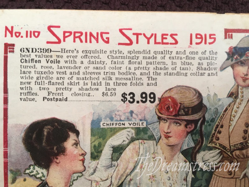
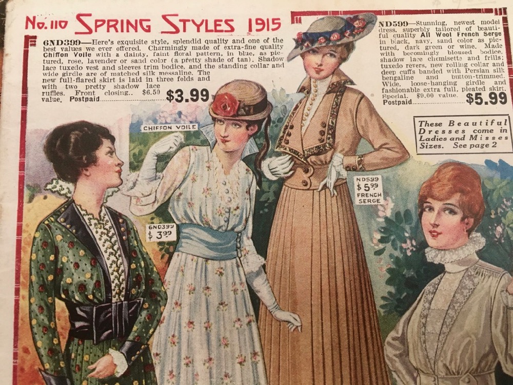
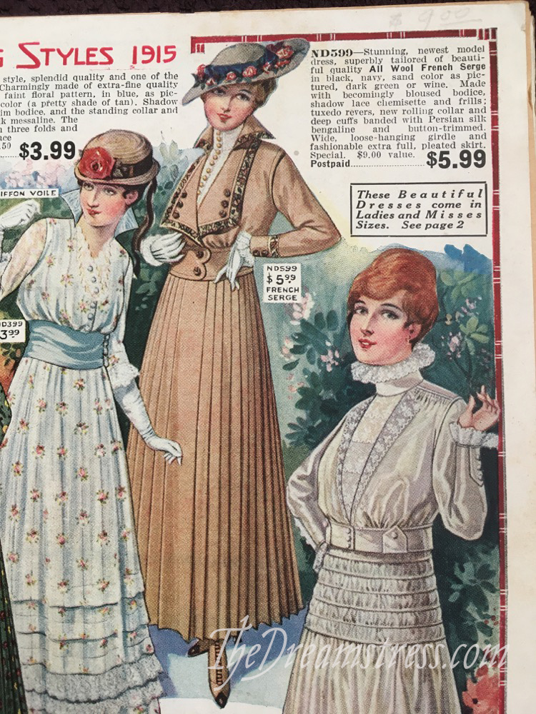
Because Standard was a small low-midrange catalogue, they couldn’t afford fancy artwork for their front cover, and their front page doubles a sale page, featuring four of their most tempting frocks.
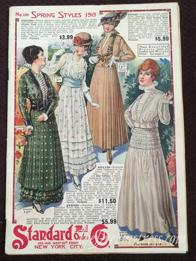
I always play “which garment from this page would I buy” when I go through catalogues (fess up, who else does this?!) and my choice for this page is easy: I’d definitely go for the wool serge dress in the top right corner.
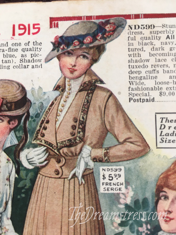
I love the tailored look, tuxedo revers and the standing collar. The only tricky bit would be choosing the colour. I love the sand its shown in, but I’m already sand coloured: I can’t wear it all over. I look great in black, but it’s so boring, I always end up buying blue, so I try to avoid that. Dark green, or wine are awfully tempting! What do you think?
One thing of interesting things in this catalogue are the amount of designs that are described as being based on another era.
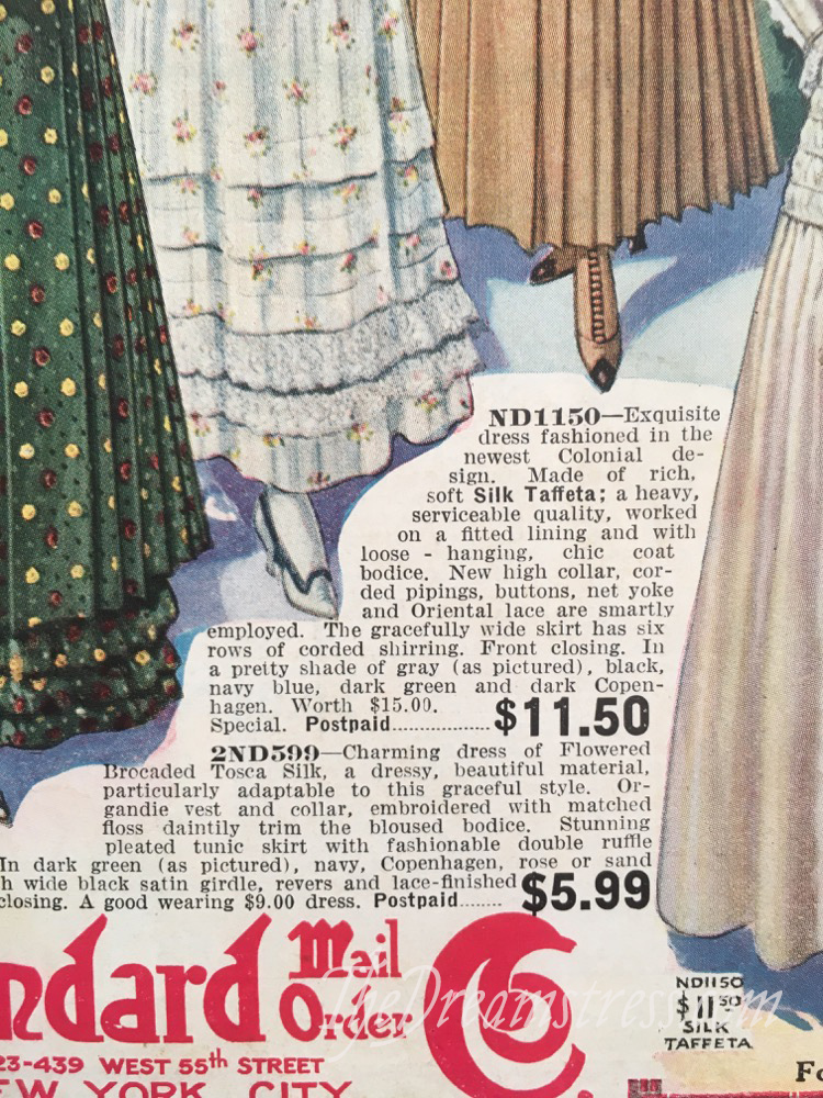
The pricey silk taffeta number shown in palest grey (also available in black, navy blue, dark green, and dark Copenhagen [blue]) is described as a ‘Colonial’ design. I presume the colonial element is the standing ruff collar, which evokes a Regency/1820s ruff (they are only off by 30-50 years…).
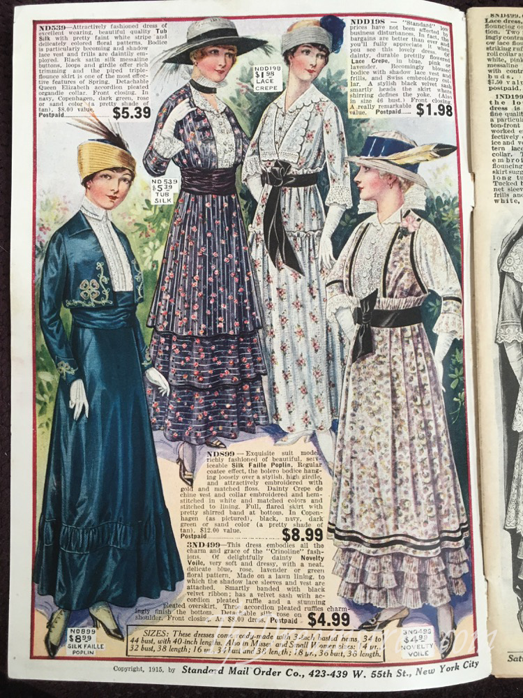
The next page features the lavender voile floral frock in the lower right corner, which ’embodies all the charm and grace of the “Crinoline” fashions.’
I struggled to pick my favourite from this page. I love the pink floral (very affordably priced at $1.98!), but I’ve never quite reconciled myself to the mid-hip design-line on so many 1915 dresses. In fact, 1915 is the only year in the 1910s I don’t love: I just feel that so many styles are an awkward transition between the sleeker lines of 1914, and the fullness of 1916.
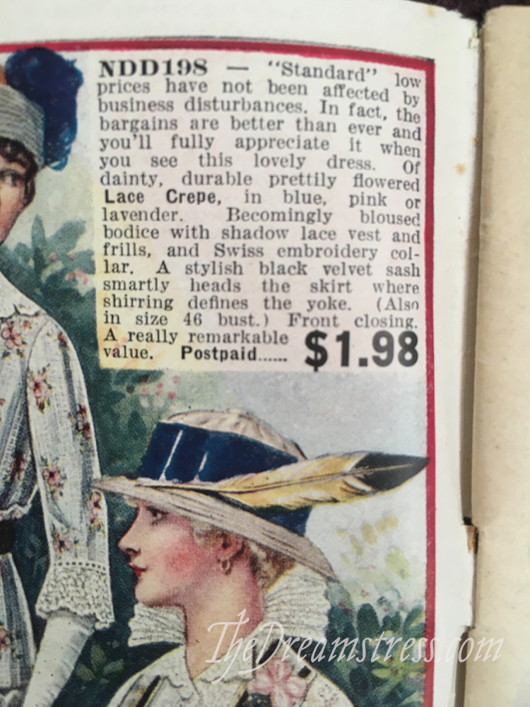
Note the reference to ‘business disturbances’ – this is due to WWI. Although America wouldn’t enter the war for another 2 and a bit years, they were economic repercussions, and access to some goods was limited, which drove up the prices.

The tub silk (‘tub’ means it’s washable at home) dress in black floral is rather lovely. Three layers of tiers with horizontal and then vertical stripes is a lot, and the ruched sash and Elizabethan collar (note that historicism!) are…not to my taste. But at least the collar is detachable! And I’m rather fond of the hat and shoes.
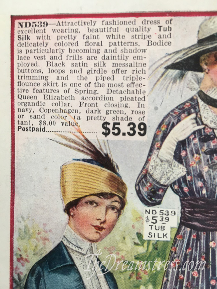
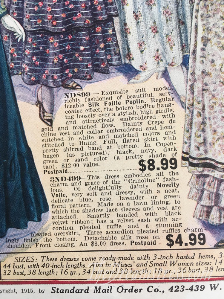
Here’s a close up of the fabrics on the two top dresses. The florals over stripes motif of the black is SO typical of the mid teens. It’s a type of pattern I wish we saw more of in modern silks and cottons.

I’m very torn on the silk faille poplin dress. It’s so close to elegant, but yet there’s something really off about it to me. Is it the cummerbund waistband? The embroidery? The ruched panel on the lower skirt? It feels like it should be beautiful, but just isn’t. What do you think?
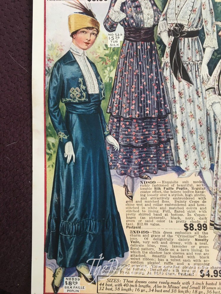
The hat is tres chic though, and I bet it would look smashing on me.
Which are your favourites?
Well, if we could play mix and match…
I’ll take the blue silk skirt and add the bodice of the center-left dress, and the vestee and collar of the right-hand dress.
I find a lot to like in the ’15-’16 years, and love to look through the catalogues too. 😀
I really like the stand up collars/ruffs from this era, and the 3/4 sleeves.
No. 899 for me. Swoon! I love navy but with the gold/mustard coloured hat I would wear it all in a heartbeat. Oh how lucky you are to have such a wonderful catalogue.
The tan suit, but in wine.
Would these dresses have same inticate linings and closures of higher end styles? While I enjoy making the complicated inner structures, for me it affects modern functionality for casual wear. Would it be historically accurate to simplify foundations? Thanks.
i share your choice of the top-right frock in wool serge—that was my pick, too. i’d want it in black, because it’s just so serviceable, and i love black anyway. but dark green sounds tempting, or wine…
as for the silk faille dress at the bottom, i really like it, but i agree that there is something about it that could be improved. i like the embroidery very much, and i’m even ok with the shirred insert on the skirt…i think the problem element is the too-wide cummerbund-y waist. i covered the top almost half of it with my fingertip and squinted at the image, and suddenly all was well. in fact, i love it now. i’ll take it in black or navy blue, please, and throw in the chic little hat whilst you’re at it. 🙂
I also think it’s the cummerbund. I like the raised waist, but it woukd work better with a raised corselet waist. That cummerbund adds bulk exactly where you want the little jacket’s hem to hang elegantly.
I like the voile ones–because it is already growing warm, here. I don’t like all the rouching at the waist or the skirt ruffles, because it throws off the proportions. But I bet that the added weight helped with walking.
So, if Sears is the “budget option”, what were the other ones?
I’m with you on the wool serge. And though I like the “sand” color shown, I’d probably go for the dark green, if I could see whether it’s a bluish green or a yellower, true green.
I think the “Copenhagen” blue dress (ND899) looks a bit off because it’s doing the whole jacket over blouse and skirt thing, but the high waist/cummerbund and bolero combine to confuse the question of where the waist is. It’s like the colour is Empire line but the cut isn’t.
Personally, I’d suggest carrying the blue up to above the bust line, or lowering the cummerbund a couple of inches.
The hat caught my eye, too – very snazzy!
On the first page, I can’t decide between the wool suit (in dark green or wine) and the silk taffeta in dark green. But I’m pretty sure a ruff like the latter’s would make me look like someone was getting my head on a plate, so maybe not.
I’m giving serious consideration to making the sand colored suit, but modernizing it by making the skirt mid-calf length. I’m not quite sure how to duplicate the collar – maybe a stiffener was sewn into the front edge to make it stand out like that?
I’ll take the wool serge in wine, please. I have good experience with dark wine-y reds on me. 🙂
I like that embroidered silk a lot, too. With the change I suggested above, I am beginning to think the basic silhouette in a less fussy fabric might actually be a great choice of a “responsible adult” look for me. Higher waists work to my advantage. That open jacket would most likely work over both historical and modern undergarments. Will definitely have to keep that in mind as a possibility. (Because if I can get my way, I will absolutely do my responsible adulting in what I know to be historical costume… 😀 )