
This week’s Rate the Dress stays in the same general time-period as last week’s tea gown, but goes from silliness and swoosh to severity, straight lines and tailoring.
Last Week: an almost-certainly-a-tea-gown in warm yellow
Sometimes the ratings for a Rate the Dress are all over the place. Sometimes there are a few clear blocks of opinions and ratings. And every once in a while there is an almost unanimous agreement – or at least a substantially cohesive verdict. A few of you did really like last week’s dress. And an even smaller few (well, single, not even few) of you didn’t. But more than 2/3rds of you fell into the 6-7.5 range and thought that the dress just had too much trim, but not enough of it in some places, and would have looked much better shorn of its fringe and beading and lace.
The Total: 7 out of 10
The total for last week was so obvious I didn’t need a calculator!
This week: a tailored walking dress
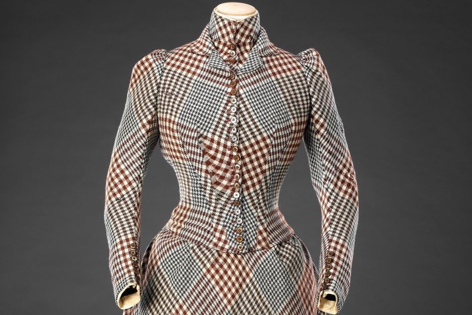
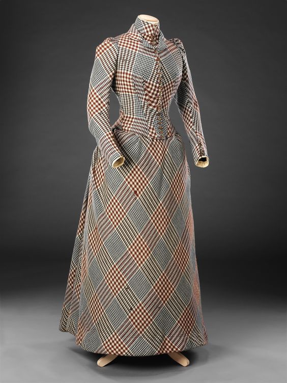
This week’s Rate the Dress is a severely tailored walking dress in large scale check from the John Bright Collection.
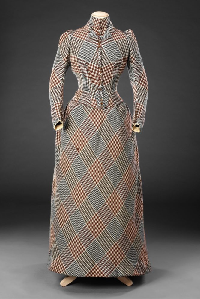
It features a streamlined bodice with many, many, many buttons on the overbodice, false underbodice with standing collar, and slim sleeves.

The skirt is un-ornamented except for the many gathers that add fullness in back, and were cut to fall over a small bustle.
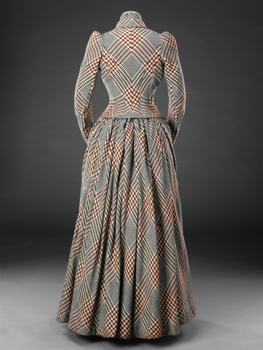
The skirt, sleeves, and bodice back are cut on the bias, creating the impression that the dress wraps around the wearer, enclosing her in a web of worsted wool.
If it weren’t that this dress were later, you could poetically say that this dress is almost the chrysalis from which last week’s butterfly emerged. Is this a case of the cocoon being preferable to the hatchling?
What do you think?
Rate the Dress on a Scale of 1 to 10
A reminder about rating — feel free to be critical if you don’t like a thing, but make sure that your comments aren’t actually insulting to those who do like a garment. Phrase criticism as your opinion, rather than a flat fact. Our different tastes are what make Rate the Dress so interesting. It’s no fun when a comment implies that anyone who doesn’t agree with it, or who would wear a garment, is totally lacking in taste.
(as usual, nothing more complicated than a .5. I also hugely appreciate it if you only do one rating, and set it on a line at the very end of your comment
I’d love to get a look at the innards of this one
I generally don’t like it (I really don’t like it) but there is a sense of quality and construction that requires me to go with 8.5
My first thought on seeing this was, “Whoa, that’s obnoxious!”. Then I looked at it more. I like everything except the front bodice. The bias cut pattern matching beautiful on the back. It looks great from the side. The skirt is lovely, I even like the plaid. I just can’t get past the busy almost optical illusion quality of the front of the bodice.
I give it an 8.5
I love the silhouette of this–it is perfectly tailored. I also rather like the plaid. And the way the line of the plaid dips across the bodice–heavenly!
My only criticism of the dress–but it’s a significant one–is that it badly needs some kind of ornamentation. Restrained ornamentation, but ornamentation nonetheless. Perhaps adding a velvet band around each wrist, and replacing the under collar (not the stand collar) with a velvet one. Alternatively, replacing the stand collar with a velvet one (or a crisp white one) would also improve the look. The velvet could be black, or navy, or dark red–any of those colors would be splendid. And perhaps replacing the buttons down the bodice with matching velvet covered buttons.
As it is, however, the dress is boring, which is a pity given the care taken with its tailoring. 6.5 out of 10.
I love the velvet idea!
I also appreciate the skilled tailoring and the general silhouette, but I find the front bodice almost dizzying to look at.
7.5 of 10
It’s so stark it almost feels far more modern than it is… it almost has a sort of tailored 1960s sensibility to it, in my eyes?
It’s striking for sure, and while yes, it’s also very simple, I generally don’t mind simple at all. 🙂 I’d also place this somewhere in the 8/10 area.
holy mother of thimbles…
huh-uh. NO. i’m sorry, i just cannot. i probably wouldn’t have batted an eyelash if this were in tartan. or in a crazy floral, or polka dots, even. giant stripes. diamonds or chequers. but there is something so eye-assaulting, so garish, so DEAR GODDESS WHAT IS THIS TRAIN WRECK, that even the mad perfection of the tailoring and pattern matching that went into its making cannot offset for me the funhouse-mirror bodice and giant Pattern That Ate the World scale.
although…i confess, i am very curious about the woman who wore this thing. perhaps she had a narrow escape as a child from being run over by a carriage, and selected a garment even the weariest, fog-blindest, most blinkered horse could not fail to see as her safeguard. golly.
rating: 2/10
I don’t think it’s quite that bad. But I love your comment. I literally laughed out loud at the last part!
The bodice hurts my eyes, literally. It needs a quiet place for the eye to rest. The black velvet mentioned above would be perfect. I like the lines, the skirt and the back. But, I really can’t get past the painful bodice. 5/10
I love it. I’m thinking Lady Detective. 8/10.
I love the skirt, but it really hurts my eyes to look at the bodice front. The bodice back is OK. I agree with others that it could use some trim.
6/10
I agree with another comment – the lines are excellent. The tailoring is superb. However, my eyeballs just plain grow fatigued on the never-ending plaid. Can you imagine the moire effect it would have on camera?
The outfit could be improved a good deal by perhaps changing the false under-bodice to plain white, the revers collar to black velvet, and adding black velvet cuffs.
Oh crap, I forgot to rate! 7.5/10.
I love the graphic crispness of the fabric layout and the colours in the plaid and the fabulous cross cutting, and the extreme simplicity of silhouette. It’s very pleasing.
I do not love the lack of accents, the absent collar and cuffs, and the fact that it is almost completely untrimmed. I want to see a beautiful brown contrast cuff/lapel, something very understated but enough to break the overall plaid up, I want a crisp white starched masculine collar, and I want to see it accessorised.
8/10.
I love it! Even the front bodice. It feels like a librarian with a secret sleuthing career. It’s a cozy mystery dress if I’ve ever seen one. Beautifully tailored and practical to boot. The pattern matching alone made me give it extra points. LOVE!
10 out of 10.
Although I admire the construction and the quality of the workmanship of this and the fact that all of the stripes are matched up on the bias which is a hard hard thing to do because of my astigmatism it hurts my eyes but I’m going to give it a nine out of 10 because of all the hard work somebody put into it.
I read the comments before commenting and was somewhat glad to see that I’m not alone…I like the overall shape, and the skirt and bodice back are fine but…all those seams just made a mess out of the plaid on the bodice front. Not sure if it’s just the way it was displayed, but the front closure looks twisted to the side at the bottom; perhaps all it needed was a tug in the right place to line the buttons up with the diamonds of plaid on the skirt and make everything fall into place but…as it is…it doesn’t work. 6.5, because the rest is lovely.
Me: Look at this dress.
Boyfriend: I think I see the sailboat!
7
The skirt and bodice back are pleasing enough. The bodice front spoils the whole thing for me. I agree that breaking up the plaid on the collar and cuffs would have provided a little interest, but for me nothing would be enough to make up for the bodice front. I recognize that it took skill, but if it doesn’t look attractive to me, the skill involved is pointless. 5/10
This is the type of dress that I imagine the average woman would go walking in. So many times dresses are showcased and highlighted that are obviously from someone who was wealthy but this one seems like it could be the town librarians walking dress. I appreciate the matching and the piecing together of the plaid. Someone put some thought and work into this gown. Is it my favorite? Mmmmmm No! Lol! I give it a solid 6:)
Hurts the eyeballs but love the overall shape…7/10
I’m in agreement with most of the comments. I like the pleating and the pattern match of the back, but it’s just too much plaid. And an ugly plaid! A used-car-salesman of a plaid. 6/10
I laughed at your salesman comment. So true. I agree totally.
The longer I look at this dress the more I like it. It’s so beautifully tailored and I love the back. The front is too busy but I don’t think it needs any trim.
8.5/10
WOW! Look at that pattern matching! It is perfection! The simplicity of the lines and lack of adornments make let the pattern sing out. I love the bias cut, the gathering at the back for a small bustle. It makes me think of Vivienne Westwood, only better. My jaw is on the floor in awe.
10 out of 10 from me
This may be a first!
Front view is a 10 on top, 5 on the bottom. Some tucks, gores, anything to break up the monotony on the skirt front. The back though…brought tears to my eyes. So much love from me to the designer. Except for the plain skirt.
9 of 10
The fabric kind of gives me a headache but the dress is so beautifully made and designed that I can’t help but like it.
8/10
I appreciate the tailoring and the pattern matching, this dress was obviously made with a lot of care and attention. I like how the buttons change colour to better blend into the bodice. However, I don’t like the fabric choice. Something about this dress just rankles me.
6/10
I am not a fan of “trim”, so the lack of trim doesn’t bother me.
The heavy, high-necked inner bodice gives me claustrophobia and why on earth is it plaid?
I would prefer a fluffy little white inner bodice to lighten the look.
I would like to see normal spacing on the buttons. They have an awkward, amateurish look.
7.5/10
I love plainer dresses that show case the fabric. 9.5
If only it were in my size….Agree that maybe a bit of contrast could look good, but l frankly love it as it is. Plaid is a nightmare to get right,but to me it looks smart and businesslike with the plain lines, letting the fabric doing the talking
A 10 from me
The side and back views of this are nice but the front looks like an unsuccessful optical illusion. I’m not quite sure what I’m supposed to be seeing and it makes my head hurt a bit. The sewing and tailoring is clearly phenomenal, but it can’t save that strange pattern matching.
6/10
It is gorgeous in every perspective except dead-straight-on, which is unfortunate. Whilst the pattern-matching on the front of the bodice is impressive, for me at least it just looks like a busy, eye-hurting mess.
However, the skirt is gorgeous and the bodice from the side-view and back-view is gorgeous, the severe silhouette combined with the bold (yet not boldly coloured) plaid is gorgeous, so…
8/10
The front of the bodice bothers me a bit. But otherwise…
9.5/10
Oh, dear. This is a hard one to rate.
I love, love I say the lines of this, when looking at the side view its so gorgeous in its clean lines and the simplicity that is so hard to make. From the back it’s so beautifully tailored, perfection!
But the front view, I look at it and so appreciate the craftmanship, but it makes me fell seasick. On a photo I can look at it and get the dizzieness and the nausea to stop. but if it was worn and moved I’d have to look away. It is such a pity that I have to deduct the rating number because of my eyes as it is so well made.
I give the dress an 8/10
The restraint emphasizes the tailoring decisions that were made, which in turn take a simple fabric and make it interesting. In my opinion, perfection.
9/10.
I generally like this one, and it strikes me more as I look at it. At first I thought the plaid was totally off, but now I really appreciate it. And the lines!
8.5/10
Love the shape and the tailoring and that it’s devoid of trimming, and although the fabric is so well matched I don’t like the plaid, in fact I don’t like plaids full stop. I would think it was very expensive, not for librarians. I too think that a another fabric at the neck was needed. However because its shape is so elegant and the tailoring is superb and I’m imagining it in another fabric I give it
8
4/10. The pattern matching and tailoring are masterful, but that plaid turned on the bias (coupled with the shaping of the bodice) results in a Sherlock-Holmes-assaulted-by-a-Magic-Eye-book effect.
I truly had to decrease my screen brightness purely because this dress was giving me a headache. The pattern matching is stunning, the use of bias is beautiful, the shape is one of my favorite eras – but fabric a little less blinding please!
Can’t go above 7/10
WOW! I’m a plaid fan — altho’ I’m not a fan of the colors, the plaid is both balanced and interesting enough and matches the simple lines of the dress, and I love that the plaid is on the bias. Those pleats and modest bustle create a lovely line and I wish I could see how the skirt moves while walking. I’m not a fan of the false under bodice collar; It’d be nice if that was an actual blouse or a contrast/complimentary color.
*However* — I know it’s not the gowns fault, but whoever styled this was not a detail oriented person! Either the mannequin is not symmetrical, or the skirt is placed crooked. Either way, I can’t believe they didn’t center align the bodice over the crossed plaid of the skirt, especially for a picture. It makes me itchy just to look at it! LOL!
9.5 with a half point off for the collar detail and styling.
I think it’s fun! It somehow manages to be at once demure and a statement.
10/10
Oh yes! Beautiful garment, I love the severity of the style and it’s beautifully made. A small amount of black velvet trim may have worked, but I don’t think it’s that necessary as it would have been worn with boots, a cape, hat, gloves, handbag, and parasol and these accessories would have provided decoration and contrast.
10/10
Wow! The pattern matching – even in the multiple, slim, fitted pieces on the back – is amazing! The bias draping also creates a very elegant line. I imagine the original wearer was a red-head! Or auburn haired! Or brunette. Stunning, though, on anyone. 9 out of 10 for technical achievement and panache!
The side view is great, the back view stunning, the plaid is a classic, the shape and tailoring is excellent.
But the front gives me vertigo. The double darts and the front closure chop that plaid up into op-art madness.
8.5
I love the shape of this dress, restrained & beautifully tailored.
I often find checked patterns look a bit psychedelic on computer screens so I’m going to give the pattern on the bodice the benefit of the doubt & imagine it looking better in person.
9/10
My first thought when I saw this was “weirdly sexy.” I think it’s got that librarian sort of appeal to it. I’d definitely wear it, even though I’m not sure it’d suit me.
9/10
Blech, what an ugly dress. The darts on the front distort the check in a way that makes me a bit sea sick. I like the back though. The simple matching down the centre back of the bodice is lovely and the skirt is nice too. I really feel for the seamstress who made all those button holes. This dress reminds me of dresses that we made for the Father Lacombe Chapel when I worked as an historic costuming reproductions technician. They had tightly spaced button holes, like this week’s dress, except they went all the way down the front of the skirt too. And we worked them all by hand. The best things about it was that two of the three dresses were for very short women. It reminds me of when Laura Engles (of The Little House on the Prairies books) goes to work making buttonholes for men’s shirts. As I recall, she hates it, but is very quick and neat. So what score do I give the dress, 4 for the front and 8 for the back and 9 for the memories. I’ll give it a 6/10, because the front still makes me queasy.
It’s lovely. So trim and neat. But, I hate the way the darts make the front look. It seems messy.
Actually after looking a bit more there are other bits that I don’t love. Slightly puffy sleeves makes it less elegant, the double collar looks strange to me too. But then I wonder if I’m looking at things through my own personal lens to much? Or is it modern sensibilities? How to give a fair rating?!
Ahem. I guess I can only do my best (or worst) 7/10
I like how severely pattern matched it is, but it does lead to some odd shapes (bust cp waist patterning). The chevron-like effect is rather pleasant. As others have noted it can be a bit drab in the limited colours.
7.5/10
The lines are excellent, the tailoring superb, the plaid matching is beyond amazing.
But that plaid, or check, or whatever it is hurts my eyes to look at it too long.
I’ll also agree with another commenter that it needs just a bit of ornamentation, maybe a collar or cuffs, or maybe a belt, but right now it’s too severe.
7/10 for sheer skill, it’d be higher in another fabric
I’m shocked I don’t like it more; the tailoring & the lines are exquisite, & I love plaid. But this actually hurts my eyes, & I would very much prefer to see a blouse/shirt/dickie under the collar than yet more wool. It would improve the dress immensely. 7.5/10