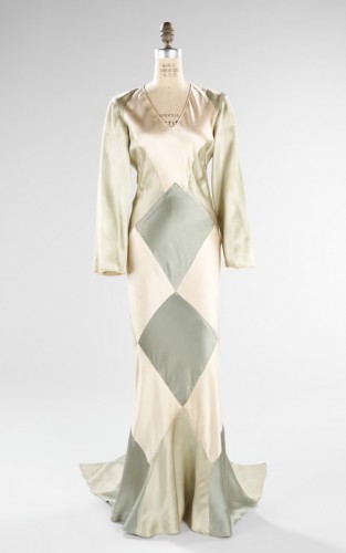
Last week you found the yellow and pink 1780s ensemble just a bit…uninteresting. It rated a lackluster 6.6 out of 10. This week is my 100th Rate the Dress, and I definitely want to give you something that isn’t boring and uninteresting.
Because I’ve been working on the PorcelainToy White Zombie 1932 inspired frock and music video I thought it would be nice to do a 1932 rate the dress. And then I went looking for 1932 dresses to show you, and you know what? Most of them are pretty, but really boring. But I finally found one that I think is really interesting. I hope you will think so too!
Is this harlequin inspired frock from the Met interesting? What about pretty? Does it rock your world as as example of art deco fashion design, or leave you unamused?
Rate the Dress on a Scale of 1 to 10


Pretty, yes, very much.
Interesting…well…maybe compared to other 1932 dresses.
I very much like the shaped train and the color scheme, but it’s a bit dowdy and dull above the waist. Particularly the sleeves.
It’s ‘nice’ – which I think should mean a middle score in a place like this.
5/10
I hate diamond patterns, and the sleeves look like the work experience guy designed them. 4/10.
I happen to like the 1930’s style of “boring.” (Unfortunately, I still need to lose about 10 pounds before it might work on me!)
The neckline is a bit conservative for the period, but otherwise I like the dress a lot. 9 of 10.
I like the 1930s boring too, but it’s no fun to rate because every dress would come out at the same rating!
Now come on, they wouldn’t all be the same…I’m sure some of them are downright hideous. 🙂
It’s hard to be hideous when the overwhelming effect is boring! Or no-one saved the hideous ones!
I absolutely love the back view with the train! It took a while to adjust to the diamond pattern, but I kind of like it, I guess…it just needed to continue to the top half of the dress. Overall, though, I think it could be a bit cute–a statuesque woman holding a glass of champagne, laughing at a joke told by one of her friends at a party? Yeah, I could see it.
Nine out of ten for oddly plain upper half.
I’m sorry, Dreamstress, but I think this is pretty boring even for the 30’s. Maybe if the colors were a bit more vibrant… Also, it looks like it was originally a sleeveless dress that some very conservative person tacked a pair of hideous sleeves onto. 3/10
If you can find me a more interesting dress from 1932 please do! I spent over an hour looking!
flickr.comflickr.comI quite like this one from the film “Letty Lynton”
http://www.flickr.com/photos/gatochy/179512788/
http://www.flickr.com/photos/likeabalalaika/3618879595/
I love that dress too! I actually considered it for this Rate the Dress, but passed up on it because it is sooooo famous , and because I did an Adrian not that long ago.
That makes one of us. I hate the Letty Lynton dress–it looks as though they took a jersey dress that was too big for Crawford and knotted it until it hugged her body. Ugh. I think it looks too stupid.
Catherine might be glad to hear that I’m not super crazy about the knots; my favorite part is the ruffliness (which is now a word…) at the bottom – I know, a lot of 30’s dresses have it, and I love all of them. Also, I’m a sucker for black and white.
This is definitely “interesting.” I loathe the front of this dress. Loathe. I cannot stand the topmost blue diamond patch. Just no. The mannequin looks like it is three months along. While separately the fabrics could have been nice and subtle, together the colors are drab. The sleeves are uninspired. Overall the whole effect is just gross.
On the flip side (pun intended), I actually like the back of the skirt. I mean, the colors are still drab, but the design is interesting and I love how it continues to the train. The effect is shapely in a good way.
So overall… Interesting? Yes. Good? No.
2/10
Well, it’s certainly interesting, but I don’t know about attractive or wearable. I really doubt it would be flattering on most figures and overall I just don’t think “harlequin” is a good idea for eveningwear inspiration. For me, it crosses the line between avant garde and silly. 3/10.
I like the colors, but I for one would not look my best with a giant diamond shape across my hips. In my head I’m changing the colors around so the mint green replaces the grey, the green replaces the cream, and the grey replaces the cream. The construction is exquisite though, and I’m not minding those fuller sleeves. This dress was made for somebody, but I’m having a hard time imaginging who. 4 out of 10.
Like Sadie, I find the diamond pattern over the hips misplaced, and the diamond ditto, squared! That back view almost invites you to give the wearer a playful pat.
The bodice isn’t bad but it’s not inspired, either.
That said, the right woman might have carried this off very nicely. This might be one of those that needs to be seen on to be appreciated.
Congratulations on the 100th Rate the Dress: lots of us look forward to it each week.
Very best,
Natalie
It looks INCREDIBLY faded to me, I’m afraid. Really, really seriously faded. There simply isn’t enough colour contrast in it to work. From what little I’ve seen of the designer’s work, she seems to have really favoured colour and/or much stronger contrasts, so I think the dress is pretty badly compromised. My feeling is that the pinks and blues were much stronger originally, and I also suspect that it hasn’t been properly mounted.
Having said that, I ADORE Harlequin/Commedia dell’Arte inspiration and I love the concept behind this dress. The construction is exciting and really interesting. And I find JFT very interesting anyway – Elizabeth Hawes declared her to be the only “true American designer” (namely, the only American designer who actually designed her own gowns and had an original vision, instead of slavishly imitating Paris modes.)
So for this dress I’d say: 6/10 – probably more if the colours were originally a lot stronger and more vivid – because even though it’s not entirely successful, I absolutely love the influence and thinking behind it.
manchestergalleries.orgOh, and 1932 dresses? Part of the problem is finding gowns dated EXACTLY to 1932, but here are a couple I found that I don’t think are “boring”. I do LOVE this period because so many of the dresses have subtle details and are really cleverly constructed, which can excite me more than obvious tricks.
http://artdecoblog.blogspot.com/2006/08/joan-crawford-dress-by-adrian-1932.html
The colours in this one are pretty incredible and would love to see it with the hood up…
http://www.manchestergalleries.org/the-collections/search-the-collection/display.php?EMUSESSID=09814b54645117d730a42755d6993166&irn=13426
Haha! You, me and Libby and that Letty Lynton dress: Great minds think alike!
The other dress is striking, but I don’t use MCG for ‘Rate the Dress’ because they don’t have an open image policy, and their images are so small. It would have been a fabulous pick otherwise!
I think the shape is pretty cute, normal 30’s style, but the sleeves are weird, and the colors and diamonds are terrible.
It rates 3/10 (because I like 30’s dresses, but this one, no.)
Very interesting! I love the diamonds. The colors not so much. I’m not a fan of the sleeves. They look so boring and sloppy with the rest of the dress. If the diamonds were different colors…. maybe yellows and golds I think I’d like it better.
Oh but the train! That gets points!!!
6/10
I like a quarter of this dress, specifically the back from the waist down, so that gives us 2.5/10
The colours are pretty insipid, but any brighter and they’d be too clownish. I also suspect that they haven’t photographed to their bes advantage – I wonder what they’d be like under a warmer light.
I don’t think the mannequin used is at all fair to the dress. It simply doesn’t fit. The dress is all about drawing attention to the body by flowing over it, and the mannequin is the wrong size for it!
The folds over the shoulders look all wrong, and the bust, while it’s almost too tight over the hips.
It might be a great dress. It might suck. But I really can’t tell.
This is an Elise dress. I would wear it: minus the sleeves. 8/10
I think the idea is interesting, but the execution isn’t up to par. 4/10
The colors are wrong. On the front, the darkest doesn’t bother me much, but on the back, it screams “stare at my butt”. But that shade just doesn’t fit with the others.
I also dislike the sleeves. The neckline on the front is modest, but not horrible, but the upper back is this giant swath of one color that disrupts the shape, to me.
The train saves it from an even lower score.
I really love the diamond pattern and the skirt. Beautiful! But I think the top half of the bodice and the sleeves are all wrong. I could see this working with narrow straps and a more dramatic v-neckline, or maybe with tiny flutter sleeves? I don’t like the long plain sleeves at all. I also agree that it might be a bit faded, but I like the subtleness of it – less obviously harlequin than a more dramatic palate might be.
7/10 – because I really love the skirt, especially the back view, but I think the sleeves were a poor choice!
After reading the comments, it seems that I’m in the minority on the colors. I absolutely love the muted colors themselves… The dress though, ew. I really don’t like the diamond pattern in the front, though the back is nice. It does seem a little bit boring and odd, but I think if the front were altogether done differently most would like the gown.
3/10
I like the muted colours themselves, but not in this combination…
I feel like this dress could have been great, but as it is, it is just “ehh.” It drapes beautifully, and I love the 30’s, but I hate the sleeves and color. I would like to see it made out of just one color (maybe the mint green?) and without sleeves, it might be great. Or it could be just “ehh.”
I’ll give it a 5/10, because of the aforementioned 30’s and beautiful draping.
Just… no. It’s drab, and the diamons patterns are silly, and they stretch out unevenly (they look more like kites than diamonds, see?)over the body of the manequin with rather unflattering effects.
I wanted to like it, but I don’t. I much prefer “boring” but pretty 30s fashion over “interesting”, apparently. It looks like something I would have drawn as a small child; as a child’s drawing it has its saving graces, but as a real life dress it mostly does not.
Some points for the very bottom with the train that’s not only interesting but also quite pretty. Otherwise this dress somehow does not justify its existence at all to me. 2/10
I love it! 10 from me!