
WOW! Such consistent ratings for the red-velvet-and-chains 1880s dress last week! 8-10 across the board! I don’t think we’ve EVER had a Rate the Dress before (exempting, of course, the one and only 10/10) where everyone concurred so wholeheartedly on a frock. The final tally was 9.3/10, for being unusual, striking, and restrained in the face of overwhelming temptation to just be…overwhelming.
It’s feeling very spring-y here in Wellington. The kowhai are in full flame of glowing golden yellow, my freesias and irises are blooming, and the promise of summer is in the air. It’s also been a few Rate-the-Dresses since I’ve posted a Dress-Off, where you compare two garments on a similar theme, and rate each of them. So this week’s Rate the Dress will be a spring-themed Dress-OFF.
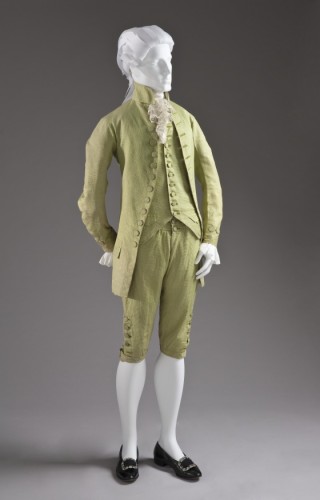
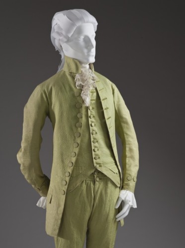
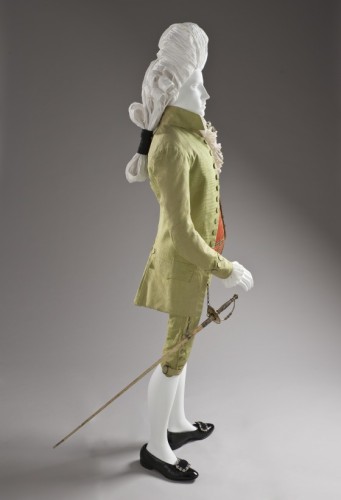
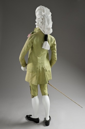
For your sartorial judgement, I present a spring-green gentleman’s suit from the end of the 18th century.
The Los Angeles County Museum of Art gives us two views of this ensemble. First, an elegantly sober variant, with matching pale green coat, waistcoat and breeches:

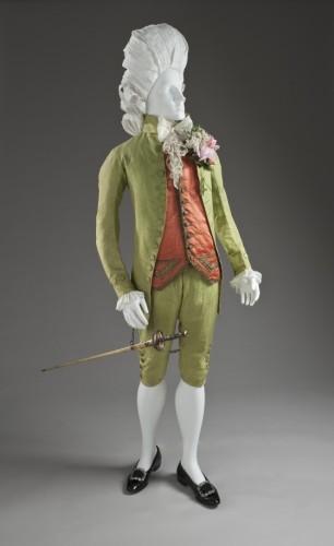
Version number two shows it with a vivid coral waistcoat and a bouffant hairdo: the last gasp of the 18th century macaroni.

What do you think? Do you prefer the more restrained, sober variant with the matching waistcoat, or the more daring take on it, with the coral waistcoat?
Rate EACH version (with a different rating) on a scale of 1 to 10
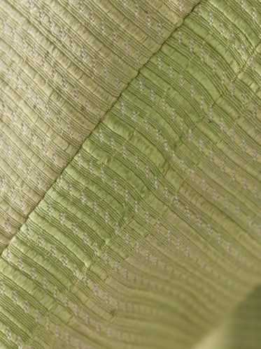
Wow. Look at how the subtle stripes match up perfectly. I’m instantly reminded, just by looking at the first version, of the American Revolution. Lovely covered buttons, beautifully hand-stitched buttonholes. I’d say about a 9/10 simply because I’m not sure I like the color. 😉
And the second take transports me to the French Revolution almost. Perhaps escorting someone to Madam Guillotine. The contrast makes one look less like a leaf, and I like that the buttons contrast with the vest. The colors rather clash a bit to my eyes, so 8/10.
The first one looks like any man in the 18th century could have worn it, while the second one looks like a piece only the scarlet pimpernel could pull off!!! No offense to Mr. Pimpernel, but it looks like a pumpkin with too much green! Maybe if they got rid of the outrageous boutonniere I would like it better.
Therefore, my score for the first one is 7 out of 10, just because it’s verging ever so slightly on boring.
Second one; 6 out of 10, only because I think it has potential without the boutonniere.
Surprisingly, I’m rating the first one higher, even thought it lacks the sartorial punch of the second. Perhaps the subtlety, wins me over. 8/10
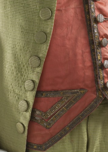
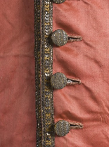
God I wish I had seen the second ensemble on another mannequin; that hair is too much! But even if I scroll down to hide the head, I find the colour a bit too jarring after seeing the first ensemble. The detail photos of the buttonholes and sequin trims are great though. I’d like to see that waistcoat with a different ensemble! 6/10
I really like this – it is a lovely color.
The first one is great, but it is almost a bit too boring just because it is so monotone, you can’t see the details at a distance. But it does have a nice cut, so I still like it on the whole.
8/10
I prefer the second one with the contrasting vest – everything stands out. The details on the vest are awesome too – nice, but not too much. The giant bow tie and large flowers are the only thing preventing it from getting a perfect score. Without these it would have been amazing.
9/10
Gonna give both versions an 8. I think they’re both great, they just say different things. The first one is more subdued and less showy, so it would be great for an older man, while the second version is much more punchy and dynamic.
The hair on that second one is really silly, though.
Also, the first picture of ensemble #2 looks like the mannequin’s all, “say whaaat?” and the second picture dude’s like, “uh-huh”
So true! I’m glad I’m not the only one who had this reaction to the mannequins 😉
Right: It’s like judging apples and oranges. Thanks for bringing this up. I adored them so much. 10/10 for both and for the different things they say.
I really like the way the first version shows that once you could have an elegant and restrained suit in a colour other than midnight blue/black (Beau Brummell, I’m looking at you!) Indeed I kept thinking how nice Mr Dreamy would look in it too, it would really set off his lighter colouring and slim figure. And I love the fabric, which I would call ottoman these days, heavens know what it was called then.
So, a 7 for the little green suit.
As for the alternative, I rather like the versatility of the look, that it can be turned into something so much m0re flamboyant so easily.
18thC men’s capsule wardrobe anyone? But it is still fairly restrained, with only a metallic trim that I guess would have been shinier then, but I’d have preferred some embroidered birds or flowers. Because if it’s worth doing, it’s worth overdoing, right? 😉 So 6.5/10 for Master Macaroni!
First one – elegant, tasteful, restrained, beautifully cut and (though it pains me to say it of anything with a Venetian connection) just a teensy bit boring.
7.5 /10
Second one – that pop of brightness really improves things (so long as you can ignore the mad hair and the small florist’s shop attached to the lapel). Fortunately it’s not “Rate the Accessories”, so I will ignore them.
8 /10
The first feels so simple–elegant, understated, you probably could empty a thesaurus on it. It’s nothing that really stands out, though I do love how those tiny stripes are perfectly lined up. But the second one…I feel like it went from fairly unobvious to eyesore. But if you cover up the hair and the boutonniere with your thumb (which, of course, I did), it actually improves. I like the bright coral against the pale almost celery green.
7.5 for the first, 5 for the second (it would have been higher if it really did exist with something covering up the crazy!)
Yes, the cut and colour of the first is lovely with elegant, subtle detailing, but the subtle on subtle drags the overall effect down to dull and safe. Have added an extra point for the beautiful stripe matching at the seams 7/10
The second – more is more! The coral and trimmings on the vest do so much more to emphasise the pretty spring green and the sleek lines of the rest of the outfit. The subtlety of the pants and jacket truly stands out now that it has something to act as a foil. And who doesn’t love sequined brocade trim?!! 9/10
keaconservation.co.nzThe first look is so elegant and so… wearable! And it’s green. I love green, but I would never have thought a suit in such a lovely spring green would look so normal, so suitable. I really like this version. 9 out of 10.
The version with the red waistcoat makes me smile – it looks like a kea! (A wonderful cheeky NZ mountain parrot… http://www.keaconservation.co.nz/keaphotogallery.html) A much more dashing look. Not one that could be so widely worn, though. 8 out of 10.
It’s a wonderful suit!
Well, I wouldn’t kick either out of my bed for eating crackers! Version 1 is the Mr. Darcy; version 2 is the Scarlet Pimpernell, smart and HAWT in playing the farce. I can only imagine some kind of revolutionary Hugh Jackman rocking both those looks. 8/10 for Mr. Darcy (slow burn), 9/10 for Sir Percy (I have hidden depth), and I’m going away for a cold drink.
Oh but I love it styled both ways! The plainer style reminds me a lot of my Dad. He wears that colour really well, because it matches his eyes exactly. If he were an 18th century gentleman, I bet he would wear something just like that.
But the other style… I have friends who are the modern-day equivalent of the macaroni, and could see pretty much all of them strutting around in that coral vest and bouffant thinking very well of themselves indeed – and looking it too. I love the pop of the coral against the green.
Am I allowed to rate them the same? Oh, maybe I’ll just make it half a point difference. 7.5 for the first and 8 for the second.
The sober version; 10 of 10. Simple, elegantly tailored, beautiful.
The more dramatic version. Still elegant. The waistcoat is a bold contrast, but not an inappropriate one given the color of the suit. It even works with the macaroni hair as an 18th century “fashion forward” look. The pink boutonnière is a mistake, however. It clashes with all the garments and is large enough to look more absurd than striking. Thus, 8 of 10.
Big fan of both of these! The workmanship on this suit is amazing.
Version 1: Love the subtle work of this monochromatic version. I give it 8.5/10
Version 2: Favourite of the two. The over-the-top boutonniere is perfect with the coral waistcoat and wig. Perfect example of Italy during the timeperiod. 9/10
The first one is beautiful – subtle, understated (if you can be subtle and understated in head-to-toe pale green…) The details are fabulous. Those buttonholes! Gorgeous. 9/10 for me and only because that is a LOT of green…
But the second one… oh, I love the coral waistcoat! It is fabulous! I love that simply changing the waistcoat makes the entire ensemble look very different. I wonder if the gentleman had a whole closet full of brightly coloured waistcoats to pair with the rest of the suit? 9.5/10 (it loses half a point for the really silly flower arrangement pinned to the lapel.)
I like the first version, but it’s a bit boring. 7/10
I love the second; that coral just makes it pop. Pity about the hair though, but I can ignore that. 9/10
I vastly prefer the Dandy to the Maccaroni, so to me, the answer is obvious.
This dandy is a bit boring though, only at a close range is there any visual interest created by the clever use of grainlines. I think the Maccaroni styling does this suit more justice than the relativly austere dandification. Which really does not suit the suit 🙂
The Maccaroni: Ugh… Nuff said.
Dandy-version: 8/10
Maccaroni version: 5/10
First one: Nice, subtle, elegant. 8/10.
Second one: HNYEEERGH! MY EYES! Augh! I would normally love that coral colour, but NOT in combination with the quiet green! 5.5/10
I would definitely have worn these had I been a wealthy guy in the late 18th century! I love the green color, and the versatility of the suit is really neat. It’s nice to have something you can wear different ways. I can’t choose between the two!
Both go down as tens in my book!
I definitely prefer the second variation on the suit. While I love the green color, the first more restrained “business” variation is too boring and monotone. The coral waistcoat on second, “party” variation gives the outfit life and pizazz. What I don’t like in this outfit, however, are the huge bow and the corsage, nor do I like the bouffant hairdo (but not rating the mannequin, are we? ;-)).
“Business” 7/10
“Party” 8/10
Truth be told, I’m not jumping up and down over either. I like, but I’m not enthused. A bit too close to lime green, which I don’t care for overmuch. The first picture is classy, understated, and worthy-but-just-a-tad-dull. So that’s a barely enthused, mildly approving 6 out of 10. The second – hm. 5 out of 10 – I still think it’s not macaroni enough, looks like someone trying too hard to make that boring green suit of theirs look hip and trendy and dangerous, but no matter how pink the waistcoat and how big the flowers, it’s still the same vaguely boring green suit. I just get an image of someone insisting that a matronly 60s poly-crepe shift dress is a trendy 60s mini because it’s been lopped off at the crotch, but darling, it’s still a matronly dress even though it now barely covers your knickers.
Love both versions. However, the second wig has to go!!!! I really wish I could get my husband into 18th century reenacting.
I find myself liking the second version better (though I am wondering what they are smoking down at the mannequin factory that led to that hair). The first is just a little too quiet and subtle and I like the trim on the coral vest better than the plainness of the first one. Still, the first one remains elegant. 8/10 for the first one, 10/10 for the second, and I’d be quite happy to see my husband wear either one, assuming he could arrange a suitable opportunity.
I’ll give ’em both an 8. The first version is excellent for those occasions where one must dance attendance upon one’s great-aunt, from whom one has Expectations, because the old bat is more likely to keep one in the Will if she sees one as a reliable, stable, steady sort of man–one with some sensibility to be sure, but not too much. The second version is for those moments when one’s self-expression need not be hampered by the preferences of an older generation…
I recently watched (thanks to Netflix) an old production of School for Scandal–Sir Benjamin Backbite was dressed a Macaroni–and a far more extreme one than this take on the style. This is really a little close to their Joseph Surface.
all green outfit… 7/10 classy, but a bit boring
green and coral… 8/10 that hair is dated and intimidating, but the color combo is fresh! Love it.
The first one is nice but I don’t like the fact that the waistcoat matches. Without trim it makes the whole thing look rather boring.
The colour is a bit too pea-soup looking, but it appears that the backs of the sleeves have been let out and the original colour was a brighter, happier green. (Is that why this is was posted during the re-make, re-use, & re-fashion fortnight?)
It’s nice that the second version has a contrasting waistcoat, but it doesn’t work very well with the green. I think it would look nicer in gold or cream or perhaps pale pink.
I actually like the enormous shrubbery growing out of the buttonholes, why couldn’t the waistcoat match those roses? I like the sword and the bow tie. The hair is just awful.
I love the cut. I love the shoes. This is one of my favorite periods for mens clothing.
7.5 for both of them.
I totally cannot make up my mind. I am afraid regular 18th century men’s clothing is what leaves me the most indifferent in terms of historical clothing, ever… most of the time, it just looks like “historical clothing” to me. (There are exceptions, of course. There are always exceptions.)
That said, I like the colours, and the subtlety of the first one; but despite all that, I just can’t settle on a score.
Maybe I should give the first one 10/10 for being a perfect, eye-pleasing and not in the least eye-insulting example of clothing from its time. I cannot rate the second. I guess this means the first wins hands-down.
And as I read my comment once more, I guess it means I’m rating the second 5,5/10.
Also, I’m rating the “happier” green. My mind automatically adjusts.
portraittimeline.comI don’t know if anyone will see this comment, but look!
http://www.portraittimeline.com/1780s%20Portraits%20-%20f_files/image026.jpg
It’s a portrait of dude #1!
A remarkable likeness, isn’t it?