
Poor Lanvin! Apparently fancy dress isn’t her thing. Despite the beautiful gold lace and luscious orange silk (I can’t believe some of you didn’t like the fabric!) her Byzantine/Stuart/Turkish Elizabethan/Restoration/What the Heck is It fancy dress frock rated a dismal 5.2 out of 10.
This fortnights HSF theme is Gratitude, which isn’t very helpful as guide to picking Rate the Dresses.
When I was looking for inspiration for the HSF Pink Challenge I came across this dress, which has been in my ‘Rate the Dress’ inspiration folder for ages. Right now I’m just grateful for such an easy pick: it’s been a full-on few weeks for me!

Dress, ca 1875, Bunka Gakuen Costume Museum
It’s really a pity that there aren’t more images of this dress – the close ups are fascinating, and there are so many hints of amazing details in the overall image, but this is all we see:
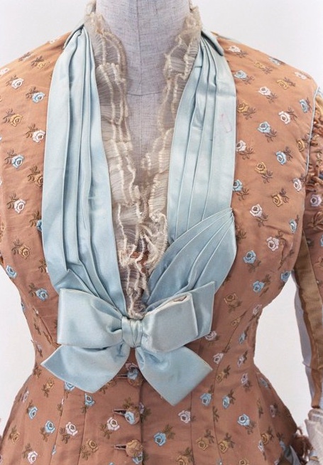
Detail of dress bodice, ca 1875, Bunka Gakuen Costume Museum
What do you think? Do you like the unusual-but-obsessively matched fabrics? The stripes and florals and bows?
Rate the Dress on a Scale of 1 to 10
I looked at it and instantly thought femme 10th doctor from the bustle era.
9/10 for me. I like it.
But there are more pictures of this dress! Ten, in fact. You can see 5 of them here:
http://ornamentedbeing.tumblr.com/post/53134636503#notes
And with a lot of confused clicking around you can see all of them here.
http://digmus.bunka.ac.jp/fmi/iwp/cgi?-db=001_BunkaMuseum_m&-loadframes
I just click random buttons until I get to a page with a picture of a textile fragment and 4 buttons near the bottom of the screen. I click the far right button and it goes to a burgundy 1890’s dress. I then click the centre left button repeatedly and each time a new garment shows up with a bunch of different pictures down the side which you can click for a closeup. Thee garments appear in the same order every time. Clicking any of the other 3 buttons just takes me back to the 1890s dress or the textile fragment.
It’s very annoying because all these pages look different but the address doesn’t change, so you can’t bookmark any specific garments. I did spend one day going through several hundred pages and taking a ton of screen shots.
I have all 10 pictures of this dress on my computer. Is there any way I could send them to you? The box on your contact page doesn’t seem to allow pictures.
As for what I think of the dress, I don’t like the colours or the tiny rose pattern, but I love the rest. The stripes are the perfect width and the little laced together plate things down the sleeves are awesome. The tassels make it look a bit too fuzzy, but overall I think the design is well put together.
8/10
I’m kind of glad you didn’t post these links to other photos before I voted–I don’t like the direct frontal view, with all the weird pleated trim, very much. But the back and side views are still grand.
I love the shape of the dress, I love the bows and the lacy-ness, and I really like the combination of pink and light blue (kind of reminds me of my ’50s(?) pink-tiled bathroom with a blue tub and toilet!–but I digress). But on the whole it just seems a bit too…busy. The dress should have concentrated on either the stripes or the embroidered flowers, but not both (honestly, just the stripes would have been better). It’s not perfect, but it’s not bad either.
8/10
I like it a lot too. That muddy pink isn’t a absolute favourite shade, but I really like the way the blue satin picks up on the pattern in the fabric, I love the stripes (it reminds me a lot of the Pingat gown in the Philadelphia Museum) Very elegant and gracious. 8/10 as the pink is just a touch too murky for my liking but otherwise I like.
I like the pink print, and I think it harmonizes well with the broth-and-ivory stripe of the back panels. I also like the neckline, but I’m not at all sure I like the effect of the pleated blue trim alongside of it. Overall, I think it’s fresh and charming, and it’s a dress I might wear myself. 8 of 10.
Nice dress– tasteful, pretty. Not a drop-dead grand entrance gown, but pleasing. I’m not fond of the blue bow on the side of the skirt; that feels like one thing too many. 8/10
I love it, and I’ve like one! I hate modern fashion. It’s so ugly.
I find the color scheme visually pleasing, even though it is not at all what suits me, and the attention to detail quite beautiful.
However, I am dumbfounded by the split personality effect, because one would look like an entirely different person going than coming (perhaps a clever disguise?).
And of course I was so dumbfounded I forgot to assign a numeric grade:
7 of 10
Oh dear, I don’t like this one any more than last week’s Lanvin outfit. I do like the cut, especially the trin around the neckline. However, I don’t like the fabrics at all. Something about the colours just does not do it for me. 3/10
In its matchy-matchiness, it reminds me of quilting fabric collections. I’ll take some time to decide whether that’s a good or a bad thing…
(At the moment, it makes me dream of having bedding/upholstery in those patterns and colours. It would work perfectly; but I’m thinking, maybe it’s actually better as a dress.
And a Japanese museum? Could there possibly be some connection to the style of certain Japanese fabrics in said quilting cottons collections???)
I’m also noticing how whoever made this dress made full use of the fabric width, with that unpatterned strip at the side of the skirt. Sooo… maybe even in all its lavish prettiness, the wearer of this dress actually had to be tight with her fabric? I can relate.
I can relate to that “murky pink”, too. At one time, it used to be one of my favourite colours, and apparently I still react warmly to it.
9/10, because it’s got a lot of character, and the more I look at it, the more I love that character . It’s not a ten, because it just does not feel like one…
bunka.ac.jpAlso, there’s another side view of it here: http://www.bunka.ac.jp/museum/text/syozou_e.html – but too smal, and I cannot find out if there’s a larger view somewhere.
I love the embroidered flower bud fabric. That’s about it. Thanks Hana for that extra pic, that’s decided me – so, so fussy! 3/10.
I rather like the pinkish-brown and the blue. And I don’t object to the small floral front and the striped back, either. In fact, without the striped back and sleeves, the floral would have seriously lacked impact. Good form, good lines.
But it’s like when an author makes a glaring error of fact in a novel – the suspension of disbelief lands with a clunk. Those bows. And I am pretty sure that is a really big blue bow under the top bow on the bustle! A big blue bow on one’s beam? No way. Not even for babies. The bows at the side are also a bit much.
A good thing, on the whole, but… 7 out of 10.
I love this! I’m even going to completely ignore the fact that pale blue and brown together remind of my Brownie Girl Scouts (of course the one with the culottes). The trim is just so elegant and I really like how it all fits together. I just unequivocally love this.
10 out of 10. A perfect Comaneci score, even if those don’t exist any more.
I like the silhouette, colors (though I would like it better with ivory instead of the blue) and most of the details ( those side bows look awkwardly placed). My only complaint with this dress is the half and half look with the choice of fabric. It would’ve been nice if one or the other were used throughout.
I’d rate it 7/10.
For, 1875 this dress is rather restrainedly trimmed, which to me is a point in its favor, for the trimmings used show taste. Those side bows and the back bow were The Thing then, and when worn would have added pleasing movement to the silhouette.
Can’t say as I love the rosebud print. It’s fussy, but the print-stripe combo is very clever. Plain off-pink and the blue stripe would have been perhaps slicker, but more boring. Had there been a more abstract or Japonesque pattern, say, peach blossoms, the dress would have been drop-dead gorgeous. I can see a lady wearing this in an Eastlake interior. The colors, the juxtapositions…
The neckline is actually rather daring, and so this must have been a reception dress or dinner dress.
9 of 10 for the fussy rosebuds,
Natalie
9/10!
For first impressions: love at first sight! Somehow muted and spritely at the same time. The best part is the mix of the floral and the stripes.
The floral fabric looks too upholstery-like up close, and what is that funny trim running down the sleeve in the first pic? but love it so much, I want to copy those colors on something for myself.
Well, that’s a dress of two halves. It’s as though they had enough of each fabric for half of a dress, so because they were the same colourway they thought “near enough’s good enough” and slapped ’em together vertically rather than horizontally.
It’s a bold idea, and I’m going to give it a 7/10 for that, although I am unconvinced that it has worked. I wish there was a proper back view.
I love this dress…. mostly. I think the striped fabric is delicious, and the bustle is draped beautifully. The blue bows are adorable, and are a nice contrast, and I love the pleated bodice decoration. I have a few critiques, though. I am really not a fan of the rose pattern fabric. It’s dull in comparison, and rather boring as far as fabric goes. I want the whole dress to be made out of the stripe, so that it really shines. You could do some awesome pattern-matching with the seams on the bodice. Also, I really want that bodice pleating to be symmetrical. 7/10
8.5. I don’t like the colour very much but I love the flower, stripe and ribbon combination.
10/10 – sweet, lovely colors; sweet, lovely details; harmonious pattern and stripes. I love how it all comes together. It speaks to the side of me that loves fluffy sheep.
Take off the bows and it’s so much classier. The colour combination is interesting and the fabrics are really, really lovely. The layers of chiffon trim at the neckline are beautiful, as is the blue pleating. I also like the blue trim around the hem. The bows, though…..I find bows on the clothing of grown women to be really infantalizing-I can’t unsee that quality in bows, and thus I dislike them deeply. So, I’m sorry to say, 5/10. My lowest rating yet.
I liked it more on first view than I do upon thinking about it– and that side seam where the two fabrics meet has a suspiciously selvedge-y look! But I do still like it well enough, and the blue accents are lovely. 7.5/10.
I do not really like the flower print fabric, and I also really want to rip the huge bows off the side of the dress. But the cut of the dress is lovely. The details at the neck are beautiful. In different fabric it would be perfect.
8/10
I first thought I didn’t like the blue bows on the side, but after looking at it again I think they’re necessary to provide a visual break from all that rose-brown. I actually surprisingly like it! 9/10
Although I adore the silhouette and bodice front, especially the delicate ruffles around the throat, the bows at the sides look like clumsy afterthoughts and the striped fabric is too reminiscent of ticking for me to be comfortable with – it’s as if the dress was intended to be viewed from the front only, with the back being less scenic (although if the striped fabric had been used for the whole area it would also have been preferable). So although I do like this dress very much, it’s against my better judgement. 6.5/10.
These are the exact colors of a kitchen during my teen years. So I just can’t rate the dress for itself because I can’t get the image out of my head.
Isn’t it funny how we fixate on things to the point we can’t enjoy fun things?
Except for the big bows on the hips that make me think of a bow on a baby shower gift, I like it. 8/10
Well, the blue butt bow looks a bit flaccid & unflattering to me.
And just what is going on with the pale blue neckline bow on one side?
Why is it folded on one side?
Looks too deliberate to be an artifact of poor storage.
Anyhoooo….
I love the stripes with the floral! Love the color scheme!
And when I was a brunette I think it would have looked absolutely divine on me, even with my rather formidable Amazonian figure-
5’10”, 50-28- 36.
Oh well now I’m a platinum blonde punk granny,- it was either that or go salt n’ pepper grey.
I give it an 8/10 because it is not a showstopper but it’d certainly make you take a 2nd or 3rd look.