
Last week I was away and couldn’t follow the comments on the 1890s purple satin & velvet ensemble as they came in. I thoroughly enjoyed catching up on them, and wonder if everyone who wrote ” _ out of 10, for sheer gumption/outrageousness/grumba/brio (etc.)” noticed that more than half the comments ended with a variant of that phrase! Generally you approved of it for its richness and detail and for the character who would wear it, though you invariably disliked the front buttons (for the record, I’m 90% sure that they are turquoise, which was extremely fashionable at the time, and as far as I am concerned they rescue the entire outfit. Without them the suit is direly overdone and stuffy and predictable – but clearly I’m in the minority, because it managed an 8.3 out of 10)
Continuing on the rich, velvety, and sumptuous theme, let’s look at Élisabeth de Valois, in her full glory as a French princess married to a Spanish king. Élisabeth, the eldest daughter of Henry II of France and Catherine d’Medici, was only 14 when she became the third wife of the 32 year old Phillip II of Spain. However, the normally cold and reserved Phillip was besotted with his young bride, and Élisabeth found her husband charming, and had a unusually happy marriage. She even formed a warm and loving relationship with her insane stepson (lucky for her that he became her stepson rather than her husband, as had originally been intended)
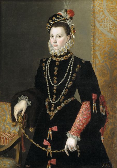
Élisabeth de Valois, by Juan Pantoja de la Cruz, 1565
This painting shows the 20 year old Élisabeth as a young and beautiful Queen. While 16th century fashion and Spanish fashions haven’t always been the most popular themes in Rate the Dresses, Élisabeth’s costume may represent the high point of the two: grand and extravagant, before the weirder excesses of the later 17th century, and before Spanish fashions solidified into tradition over elegance.
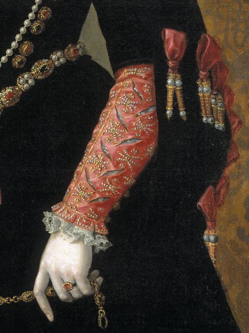
What do you think? Do you like the slim slashed sleeves in rich carnation pink, their detailing contrasting with the luxurious severity of her black velvet gown? Do the matching pink ribbon knots with their decorative aiglets round the sleeves and down the skirt add an appropriate levity to the dress, or are they too whimsical for a queen?
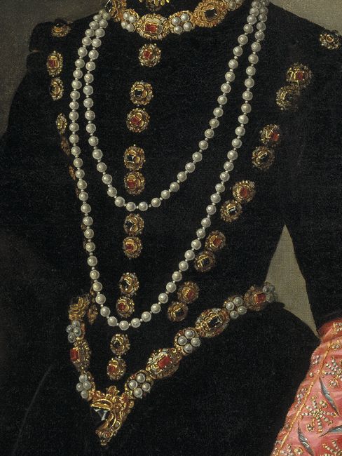
The black of the bodice is relieved by a decadence of pearls and jewels set in gold, flaunting Spain’s wealth and highlighting Élisabeth’s narrow waist. Too much? Especially when you notice the rather…unusual…ornament at the point of her bodice.
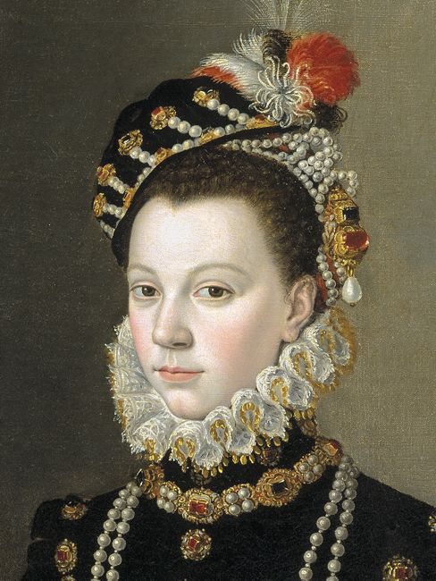
Élisabeth’s porcelain complexion and fashionably crimped hair ar set off with a gold-trimmed ruff and a cap of soft velvet further bedecked with jewels. Looking at it, I can’t help thinking of Maria Christina and her diamond and feather headdress. Élisabeth’s is almost as extravagant, but much trendier, and somehow despite all the jewels, lacking in authority and grandeur.
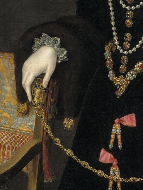
Élisabeth has accessorised her outfit with one final fashionable detail: a jewelled fur zibellino with a bejewelled chain.
Time to have your say: has Élisabeth balanced status and grandeur with youth, fashion and a bit of wit, or is she trying too hard on both ends?
Rate the Dress on a Scale of 1 to 10.
Ooh, I love transitional stuff. It’s so fascinating. And unlike the earlier pink and black dress (the masquerade ball dress) this combination works so much better. The pink ribbon half-bows (love how they go in alternating directions) and their decorative pearl and gilt aglets are really pretty, I like the undersleeves, the restrained splash of lace at wrists and in the ruff, and the jewellery is also just as restrained but still opulent. It feels very harmonious from the eyes down. What slightly bugs me is the pearl half-diadem/tiara thing as I can’t quite reconcile that with the velvet hat , but overall, I think she’s lovely. I’ll give her a 8.5/10.
I would have liked it better without the pink sleeves and bows. In this case I would have preferred just the black and then have the pearls and jewels contrast against that. 6 out of 10 from me.
I actually love the pink sleeves. They were very chic in 16th century fashion and provided the inspiration for my “Pink” challenge project. I like the whimsy they provide in the sea of black and the way they repeat the pink in the feather on her jaunty cap. 8 out of 10.
Another dress I’d love to have! Elisabeth has indeed hit a nice balance of grandeur with those lovely jewels and rich fabrics and fashion/youth with the pink/coral sleeves and bows as well as with her hat worn playfully tilted slightly to the side. I agree with Daniel that her pearl caul (?)/tiara(?) poofs up oddly and so, is a little distracting.
Overall Elisabeth is pure elegance in this outfit.
10/10
For me, she succeeds. No matter how ridiculous the various details look (especially the aforementioned pearl headdress), the overall impression is favourable. Without the pink, she would probably look way too prim for her youth. And the black dress is very basic, with no fussy details, which makes all the bling on top of it very effective – sort of like a Little Black Dress!
Somehow I can’t help but think there’s something strangely androgynous about this outfit. It puzzles me and fascinates me.
8/10
Awesome. Severity and colour are excellently balanced. I love the black velvet against the pearls. 10/10.
I think it’s beautiful. 10/10. Pink and black is one of my all time favourite colour combinations, especially if it’s a carnation pink like that (yesterday I broke my rule of never wearing pink and bought a top in that exact shade of pink, because I like the colour so much).
I’m also a big fan of the cut, and the way she’s used the pink ties to mark out the curve of her sleeves.
Love this look. The pink works well enough, but I think I’d have preferred something else for the sleeve just to make it all a bit darker. She’s just stunning. 9/10 for me.
Not a fan of the dangly bits. Especially the one directly below the point of her bodice. 7
I actually really like this one! I think the juxtaposition of the rich, elegant black with the bright and youthful pink is divine. I actually like the slashed sleeves, the jewels, and, surprisingly, her hat. The only thing I don’t like are the pink ribbons on the sleeves and skirt. They feel very random and tacked on. Otherwise it is lovely.
9/10
This is quite nice.
Despite all the heavy fabric and chunky jewelry, she doesn’t look the slightest bit stuffy or awkward.
I don’t really like the bows with the dangly things, but they do balance out the pink of the sleeves, which I quite like. That’s the trouble with those little details that aren’t quite right. I wouldn’t put them on a dress, but remove them and they throw off the whole design.
The only other part I would change is the gnarly lump of pearls and gold on the left side of her head. The hat is ornamentation enough, it just looks cluttered with all that extra stuff.
8.5/10
Though not my preferred era of dress, I do like the slashing on the cuffs and all the bling. I will give it a 7 out of 10
I like the outfit. I suspect it looked much finer in person than it does in the portrait (since the black velvet probably wouldn’t make her seem to fade into the background with only her points and jewels standing out).
My only objections are quibbles. I think the pearl net, worn under the pearl beret, is excessive–the net looks like a sloppy runover from the hat, somehow. I also think that the pearl strands she wears around her neck and the chain she is holding are superfluous from a fashion standpoint, though perhaps not from a public display standpoint. With the jewelry trimmed a bit, I’d give it a 9; 7.5 as is.
I think it’s the perfect balance of light and dark and although the aiglets look silly close up; they actually balance the outfit nicely from the wider view.
I wish I had the figure to wear it; almost enough to make me want to change era.
9/10
I like it, although the style with the black could be very severe, there is something youthful in her outfit. Maybe it’s the pink details. I generally love black velvet and pearls, and I really like the combination here. 8.5/10
On the whole, I love it. The pink of the undersleeves is one of the least insipid pinks I’ve seen.
The only thing that I don’t care for is what previous commenters have referred to as the “dangly bits” — they look like someone threw a lot of fancy lace-bobbins at her, and they stuck.
8.5 of 10
The dress serves as a great backdrop for the jewels. the pearls are wonderfully painted.
I just can’t figure out what is on her head. Is it a hat? Is it a net and a hat? Is it a wreath and a hat? What is the knobby gold lump set with a ruby with a huge dangling pearl growing out of the side of her head? What was her hairdresser thinking? Was this actually a fantasy conceived by the artist and with no basis in reality? I’ve stared at it way too long.
Because of the wonderful dress and because of a fascinating puzzle presented by the head hat/piece – 8.5 out of 10.
I. Love. It. I do have trouble with historical Spanish fashion, but this works.
Given her age and the era, I agree that she has the perfect balance between color and somber. Without the pink, pearls and jewels the black would have swallowed her up or, even worse for royalty, made her appear ill.
For me, it all manages to work together: the huge pearls, the pink ribbon knots and aiglets (I really like the way they alternate down the front of the skirt), lumps of jewel-studded gold, even the what-ever-it-is on her head. The dress must have weighed a ton, let alone the headgear.
Even though I gave it a high rating based on sheer guts alone, Maria Christina’s dress said “I’m in your face.”
Élisabeth’s says “I am your Queen.”
I give it a 10/10 for regal majesty done well with just enough “levity” for a queen of her age.
I love it! 10/10