
Last week I showed you an 1820s riding habit, and though late Regency is often a difficult period, you loved the riding habit and it rated a 9.5 out of 10. It might have been even higher if it weren’t for the creepy mannequin!
This week’s ensemble is sort-of the 20th century equivalent of last weeks riding habit. In the 19th century riding and walking became more common as leisure activities for women, and riding habits (though they had existed in the 18th century) became more practical, though last week’s habit was more restrictive than relaxed. In the 20th century all sorts of outdoor activities were encouraged for women, and sportswear as we know it today emerged.
This sportswear ensemble from the Museum at FIT reflects the new emphasis on athleticism and simple, casual, outdoorsy outfits.
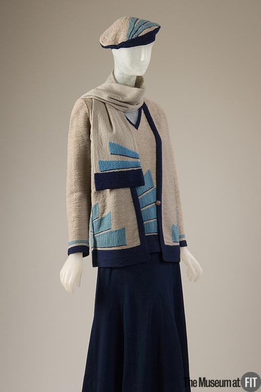
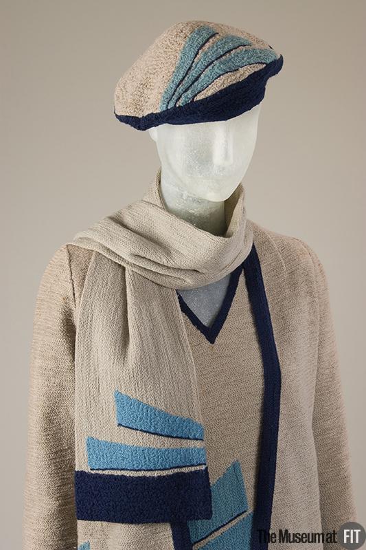
What do you think of the skirt of navy wool crepe, and matching top, cardigan, scarf and beret of grey wool with navy bindings and modernist inspired navy and turquoise machine embroidery? Do you like the simple ease of it, or is it too plain and boring? The 1920s have been one of the most divisive decades on Rate the Dress, so I await your verdict on this one with some anticipation.
I love the simple elegance of this ensemble, I say 10.
I see a thousand grannies wearing this on the street. Except maybe the hat. 2/10.
I love the French style. 10 out of 10 totally!
I LOVE it!!! 10/10 I would wear that to rags!!!
It is odd and blocky and I dislike it.
2.5/10
A bit too matchy-matchy for me. Also I don’t understand why the designer went with imitation wool jersey and applique. Why not just use wool jersey? The hat especially suffers from the mixed bag of techniques used to embellish. And, the end result is a bit strange, and neither here nor there to my eyes. Not my fave.
2/10
I adore it–but like you, I wish it had been real wool jersey, and it despite the stylish, it ends up looking a little cheap.
8/10
thin you’ve both misread the details. The applique was chain stitched onto net to imitate the look of the wool jersey. The garment is pure wool.
Thanks for the correction! I still think it looks like cheap acrylic, though. Maybe the aging.
But I love everything else.
I still don’t understand why they went with applique instead of just doing an intarsia detail. It looks like such an afterthought.
I love it unconditionally. 10/10
I love, love LOVE it 10/10
I think I like it, though I probably wouldn’t wear it. The appliques are a nice touch, and of course the matching beret finishes it off nicely. The flare of the skirt is just right to complement the straightness of the jacket and blouse.
9 out of 10 (only because the 20’s aren’t “exactly” my favorite era, and I can’t give it a 10 out of 10)
Count me as another with a strong positive reaction. Even though I’m not fond of blue for myself, the use of several different shades and strongly-defined shapes works for me as a contrast to the softness of the fabrics.
Besides, it looks comfortable, which is a rarity in historic clothing.
10 of 10
I love the deco styling and have found to my surprise that the 20s straight cut actually looks OK on me despite being curvy so I would totally wear this. 9/10
I give this an 10/10?
The lines, the textures, the colors; they just work together. This is my absolute favorite of any RtD you’ve ever posted, and I’m not usually fan of late 20s/early 30s fashion.
I like the skirt, and the cut of the top, cardigan, and hat (the scarf is too matchy-matchy), but the turquoise trapezoids toss this into treacherous territory (Sorry, couldn’t help myself). They turn what could have been a very nice beige and navy outfit into an eyesore.
3/10
I love it. Great color scheme, fabrics, and textures. A perfect example of its type (i.e., 20s sportswear). A 10 from me.
10 out of 10. Simple, clean, elegant lines. Subtle, very pleasing colours, including the decorative elements. The darker skirt just makes it.
Wow!
A bit too match with the hat having the same motif as the other pieces. Aside from that it’s ok, for being 20s. 7/10.
Quinn
It looks awkward and dumpy to me. I can maybe see it having some style on the right figure IF it were in a different colorway, but as is I’m afraid I’m with Jenny Wren and find it very grandma-ish.
Oh I had such high expectations when I read the heading, because this is a period / style that I really like. However, I feel a little underwhelmed by the photos. can only give it 6/10, and it hurts me to do so! Perhaps if it had been in a different colourway, or different hat? That beret really doesn’t add to the outfit.
I think it is terribly sophisticated and would be happy to wear this ensemble to work! Also, turquoise is one of my favorite colors and goes so beautifully with almost any other color, but especially navy. I will give it a 10.
10 out of 10 from me. I love the colours, the modernist embroidery and the style. Very nice indeed.
surely any modern 1920’s girl would be so much more comfortable in this outfit than the clothes her grandmother would of worn.
I wouldnt wear it myself now in 2014 as it does look a bit dowdy but I do like it.
8/10
10+ its simple elegant and screams deco darling! I love it
At first look I liked it a lot. Then when I looked closer I have to agree with Karneb that it looks a bit dowdy. It’s almost as if you could go and buy it today in one of the stores that mainly have an elderly clientel.
It’s getting a lukewarm 4 from me. Sad, as I really do like the 20s.
I can’t decide if it’s awesomely put together or a prime example of a certain kind of hideousness.
It could easily be both 10/10 and 3/10 from me, and I can’t decide.
6/10
….the horror……the horror..
1/10
I give this outfit a 9 out of 10. I love the streamlined deco design, but I take a point off for the embroidery –I agree with the others who have mentioned that it could have all been jersey. I love that this is 20s but feels so late 60s/early 70s! I honestly would not have dated it correctly if I had just seen it out and about!
pinterest.compinterest.comThis seems to be a love it or hate it outfit! I love it! The textures, the shapes, the colors (although I wish it were beige instead of gray, for my complexion). I like the nubblyness, rather than a smooth jersey. One could easily wear it today. I give it a 10/10.
http://www.pinterest.com/pin/410038741045856393/
I love the modern influence of the light blue embroidery, even though the light blue in and of itself isn’t quite enough to take away the drabness of the gray wool. It could have benefited from the addition of another, brighter color. I also don’t like the beret (maybe it’s the way it looks on the mannequin). However, I usually love the shapes/silhouettes of 20s styles and this outfit looks quite comfy, yet fashionable, so I am giving it more points. So: love the colors, but the gray wool keeps it drab overall. LOVE the design.
9/10
This is the reason I despise the 20’s. I can’t stand shapeless frumpy clothing.
2/10 (cuz I would maybe wear the skirt)
I’m not in love but that could be because the idea of woolen casual wear seems antithetic…and because I find this style unflattering to most women. 3/10.
For the time, it is tres chic! I’m very conflicted about this outfit. I find it quite lovely, but so dowdy. The colour palette is gorgeous. I don’t know. I don’t dislike it, I don’t like it. I have no strong feelings either way about it. I give it 6/10
I’m in the love it camp. Would wear it tomorrow! 10/10
I love it. Easy to wear, relaxed, stylish, effortless, so wearable, and although the style can be boring, the detail makes it special. Can’t fault it. 10/10.
I can see Lord Peter Wimsey’s sister Mary in this outfit, possibly before her fiance killed himself and they had that dreadful business with the trial and all that. Although it’s practical enough she could
have kept it when she married that nice police inspector.
7/10. It’s pleasant (I am not a navy blue person myself, although I recognize its modern role as one of the Great Neutrals) but not thrilling. Just distinctive enough not to be bland, but not so much so as to be memorable.
Lady Mary – spot on!
Just the thing in its day, no doubt, but I wouldn’t wear it myself – you’d have to be a very 20s shape (and tall!) for those lines to be flattering.
The matchiness doesn’t bother me, as it isn’t monochrome; and I do like the hat.
5/10.