
Last week’s 1820s mourning dress received a rather unanimous opinion: you really, really liked the overall effect, but that trim was just a wee bit off…or a lot off. So, for gorgeous use of fabrics, but badly applied trim, the dress came in at 8.2 out of 10.
Personally, I rather liked the peculiar hem trim, simply because it was so weird and imperfect. It made it interesting, and accessible: I found the lack of perfection and refinement, without the least bit of overt vulgarity, quite refreshing.
This week, with the Historical Sew Fortnightly Shape & Support challenge, I present a garment that would require a lot of shaping from a corset, and support from a bustle:
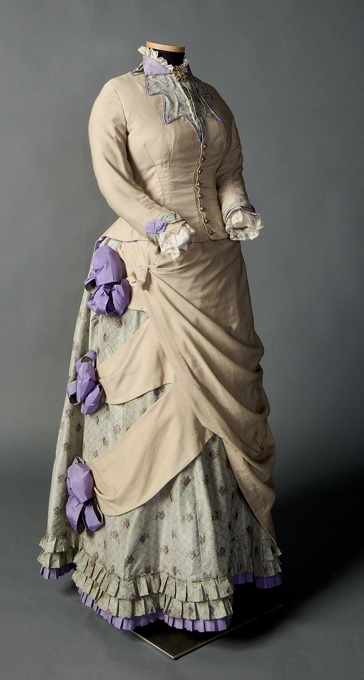
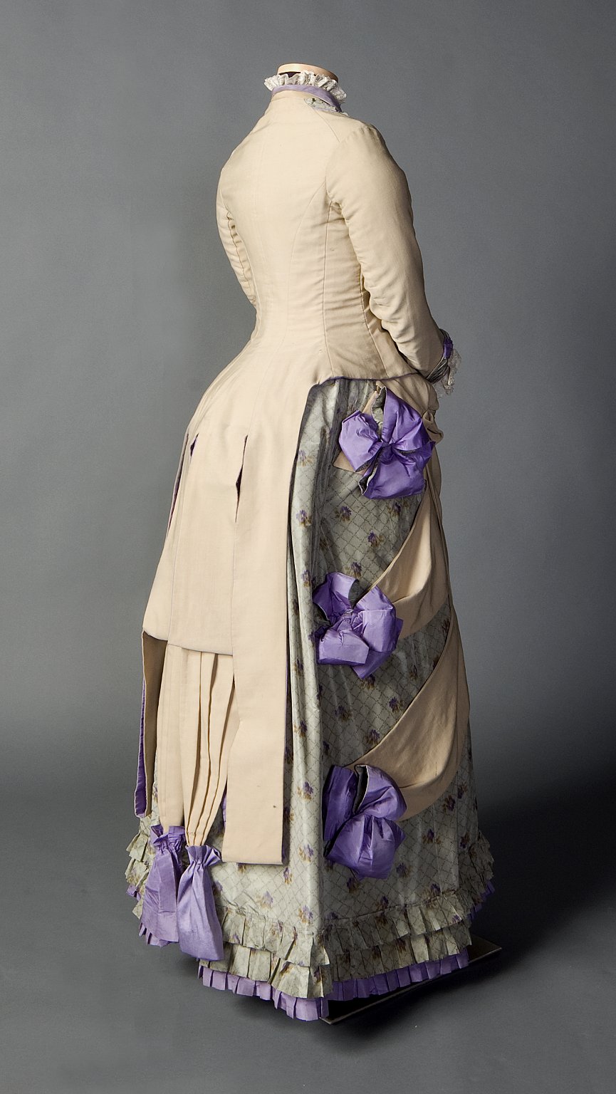
Two piece day ensemble in beige, pale green, and purple, ca. 1882-1885, Smith College Historic Clothing Collection, 2008.6.1
This early 1880s asymmetrical day ensemble was worn by a student in the first graduating class of Smoth College. It’s an interesting balance of aesthetic, fabric, and colour. The tailored, masculine bodice, with its flat, almost aggressive, appliqued embellishment gives way to an intensely feminine lower half, all bows, swags and pleating, with the sensible beige wool peeling back to reveal delicate floral silks.
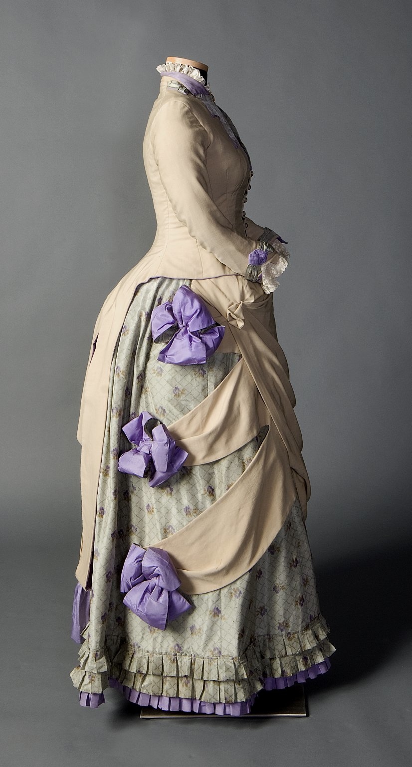
Two piece day ensemble in beige, pale green, and purple, ca. 1882-1885, Smith College Historic Clothing Collection, 2008.6.1
What do you think? Too peculiar and disjointed? Or an fascinating blend of shapes, textures and colours?
Rate the Dress on a Scale of 1 to 10.
The use of color is beautifully serene, and the the intricacy of the design lines are well handled.
I suspect, though, that I am so positively affected because my eyes immediately go out of focus and I see it as the subject of a Renoir or Seurat painting.
9 of 10
I like it overall! The beige isn’t very exciting, but it’s a nice shade and I love the buttons, neckline, and cuffs. I think I could like the swags more (the parts that connect the main overskirt with those three purple bows?) if the dress was a different color… I just am not a fan of that floral silk underneath! Yikes. At least, that color beige plus that color floral pattern. I like the purple shade. 🙂 And I’m happy the purple bows are still fluffy!
It’s an 8.5 for me.
(But oh my god, I just saw the back picture, I missed it the first time — those tails with the little bags are HORRID! What the heck is up with those looping rectangular bits above/to the side of those purple bags?! Who does that?! I still love the jacket though.)
I *know*. They remind me of those velvet bags that men put their ponytails in during the 18th century!
Yes! You’re so right — I totally forgot about that. So awful!
I think it’s absolutely adorable. It remains feminine without being too froufy. 10/10
My initial impression was bewilderment and skepticism, but after a few looks, I’m warming up to some of the elements.
Pros: I like the pairing of sedate beige with lavender, especially those big punchy flowers and the small purple collar. It’s businesslike, but there’s also a fun attitude. Also I like the contrast of the overskirt and underskirt. And that final purple ruffle on the hem.
You can see the back of the dress on the original site, and while I’m not sure I like it, I like looking at it. It reminds me of a grown up, ornamental take on the bow on the back of a little girl’s dress. It has severe beige angles, it’s grand and complex and kind of looks like a theater curtain, but it’s also playful.
Cons: The draping looks awkward on the right hip. (Is that maybe some pinning done by the exhibit?) Also sorry for flashbacking to my comment last week, but I’m seeing flattened fingers on that skirt, and this time they’re really really big. I feel like the designer had a good idea there, but didn’t manage to make it work.
So taking the time to study the dress did make me like it more, but it didn’t win me over. 5/10
I like elements, but dislike the whole. I like the color scheme, how the back references a gentleman’s jacket, and how the pointed swags reference the pointed color. But I really dislike the purple bags at the bottom of the back and the shape of the skirt.
6/10
I actually don’t hate the shape of the skirt, even the purple bows don’t put me off too badly. But I hate the overskirt, and the little tails with the purple bags at the back. Actually none too fond of any of the tails on the jacket at the back.
If I could just have the jacket, even all the way around, and in another color, I could deal with the skirt and bows the color they are (as long as the overskirt went away.) I really hate that overskirt.
So I guess
5/10
Usually, I rave about the color of a dress and gripe about its ornamentation or silhouette. This time, it’s the reverse. I love the shape of the bodice, the front lapel-like bodice decoration, the weskit-like peplum in the back, the tabs on the side of the skirt with the round bows, everything. But the color scheme (and the feeble print for the underskirt) are so pale and drab, the wearer would vanish into the background and all of that elaborate effort on the crafting and shaping would be for naught! Only an 8 from me, because of that filing.
I don’t particularly like it, but it is interesting and almost tasteful. 7/10.
Quinn
I don’t like it. There’s nothing that ties it all together – the colours don’t meld, and the here-there-and-everywhere structure doesn’t give a cohesive look either. 4/10 because it manages to not be hideous.
I like the idea of the swags with their purple bows, but I think the execution is a bit clumsy. It’s the same with the rest of the dress. The colours are nice overall, but the printed underskirt fabric is horrible. The oddly shaped collar is interesting, but it doesn’t seem to tie in with the rest of the dress. And what on earth are those two weird tail things at the back? It’s all too fussy and clunky to be artistic, and it gets a 4/10 from me.
Oh deary me! Minus points for the side bunting & tails (??), the starburst at the front bodice, plus points for the pleating trim to the skirt.
3/10
If everything beige were the same lavender as the trim, how much prettier and more visually consistent this would be!
I like the lavender (color). I like the silk print. I do not like the drab beige (color), though the lines of the beige bodice and other bits are acceptable (if not particularly exciting).
What on earth are those lavender bags, though?? (that makes them sound as if they are filled with lavender…).
5/10. But if the beige elements were changed to a matching lavender, I’d up it to 7.5/10.
(I also wonder if the beige parts were always beige, or if they have faded to that particularly bland, drab color. Has any one checked the thread color?).
I love the bodice, especially the mass of tails at the back, and I like how the floral fabric contrasts with the wool without overpowering it, but I don’t know what to think of those big purple bows. I can’t decide whether I think they’re fun or stupid. I really like the details at the collar, particularly that jagged applique shape, and I think I would like the dress better if they’d run with that more on the skirt rather than the odd swagging and bursting effect. I’d give the bodice a 10, but the skirt a 4… so that averages out at 7/10.
As I scrolled down, I was swooning over the bodice front. Love love love. The purple cuffs that match the piping on the bodice neck area…sigh. Big purple puff on the hip and nice over skirt swag…Wait! What IS THAT! Is that under skirt made from a horrible night gown from the 1980’s? Ick. And the purple bag things hanging from the tail? It started out so nicely and ended so badly. 5/10. It got such a high rating because I still love that bodice!
I admit I didn’t notice the bags (they might just be long tailed bows, it’s not clear) when I first looked at the dress. Even so, I still like the structure overall and I don’t intend to change my rating.
I love this outfit! It is striking – I pinned it a while back because it leapt out at me. It’s a perfect springtime confection. I think in person the under skirt pattern would be perfect and the tailored bodice is just right for its time. I love the little cuff and collar details that bring all the colors in the skirt into the outfit. I do agree about the odd tabs hanging down in the back with the purple bags(?) attached. And I think it needs a slightly larger bustle – I think it would help with that tab business a bit.
I love most of it, really don’t like the pleated things on the back with the bags hanging off them though. I suspect the skirt colour was probably a bit more vibrant originally which would work better with the lilac bows and bits.
7.5/10
The dress has things I like – the color scheme, the false lapel idea, the swag idea; but it has things I don’t like, too – the colors seem very muted for something as important as a graduation, the lapel looks like a melted starfish, the underskirt makes me think the wearer couldn’t afford an entire dress and had to substitute an old calico skirt, and the swags… Hmm, I would like the side swags if there wasn’t that jarring contrast of color and texture and they swooped all the way back (what [i]is[/i] that tuck just before the top rosette?)
The asymmetry doesn’t bother me the way it usually does, I can get past the weird (to me) line of the jacket going back to the bustle, and the tails do look good from the back. But with the poor dead starfish on the chest, the swags stopping on the underskirt leaving that odd no-man’s land, and the way the tails look so awkward from the side, I’m going with a 3
I really like it. The colours are subtle, but harmonious, the general cut is really nice. The only thing I don’t like is the lavender bags/bows. Since bows are one of the things I can’t seeem to get right when trying I’m really happy to see that people had trouble with that back in the days as well, but it still takes away from the whole outfit. 8/10 from me.
I absolutely love this dress. I’m a fan of color palettes and this one is just lovely! I love the sashes and purple details… the back tails aren’t the most attractive, but the combination of the small print, the beige, and the lilac are what win me over.
8/10
This is one of those periods where I just have to approach it as if it were designed by and for space aliens; the aesthetics of the bustle has large areas which make no sense to me at all.
Taken as such, it’s nicely-trimmed for one of these examples–decorated, but not over the top. The bustle isn’t so large as to impede ordinary navigation, and it looks like you could sit in the thing without too much trouble. The cut of the bodice and skirt are both good–tailored, but not so fitted as to look as if the wearer would nearly be immobilized. The whole thing is a nice combination of ladylike and businesslike–it’s not too severe and not too froufrou; the decorations aren’t in the way, so to speak.
Like everyone else, I’m a little confused about the little bags at the ends of the jacket tails–were these very oddly-placed pockets (there are some vey odd pockets indeed in this period!) or were bows deemed too frivolous for a Smithie, educated to take her place is shaping the modern world (always in a woman’s proper sphere, of course!)? Were bows not heavy enough to make these long tails hang properly? Did tassels seem not in keeping with the rest of the dress? I suspect we can be sure she did not keeep a cat, though…
I suspect it was intended for a woman with pale coloring–maybe not blonde, but light brown hair, fair skin, light-colored eyes, or maybe even one of the lighter shades of red hair. It’s not intended for brunettes, that’s for sure! (I just finished reading a late 19th-century etiquette book for ladies–the writer took some trouble to discuss appropriate dress, and not just from a this-outfit-for-this-occasion angle; she spent a lot of time covering how to choose flattering colors and styles. So these colors were surely chosen with intent.)
Getting back to the whole designed by-and-for-aliens thing, I’ll give it a 9/10, because of those little bags.
I love the cut of the gown and the draping on the skirt, even with the asymmetry. I particularly like the back–puts me in mind of men’s tailoring, a look I very much like on ladies’ clothes from this period. My issue is the color….blaaaaah. The bone colored bodice and overskirt needed either a color scheme closer to it or far away from it for contrast, in my opinion. The sage green and lavender just looks….blaaaaah. And then the purple bows look out of place trying to liven it up. (Imagine this in bone and deep blue, or bone and darker ivory, and suddenly I’m in love.)
7/10
I find myself instantly liking the girl who wore this dress. In my mind, she had a quirky, almost bad-but-not-bad fashion sense, and she wore this dress happily a little different. Maybe a bit of a kindred spirit there. I think the best word for the dress itself is “interesting.” I’m not sure that it all works together, but I think my characterization of the wearer has sold the outfit for me.
9 out of 10.
My first thought was ‘just because you can does not mean you should…’. Then I gave it some further thought and imagined who would have worn it and her age.
I picture a bright, engaging and confident young lady happily wearing this dress. 8/10
I love how the beige is contrasted with the lively (but not too loud) light green and purple. I also like the contrast between the masculine bodice and the feminine skirt. However, I don’t like the placement of the big poufy purple bows. Maybe along the hem or the bustle would have looked better. Then again, those purple bows DO give the dress its drama. Also, I don’t like the beige strips of fabric on one side of the skirt. On the one hand, it gives the dress a modern touch but on the other hand, it makes the dress too showy, and I just don’t like the look of it. I also am ambivalent about the star-shaped embellishment on the bodice…I don’t know, maybe it’s not so bad.
8.5/10
What a potpourri of an outfit! Can almost smell the lavender from her. The softness of the colours is very pretty. Suitable for a lady from the Red and Nearly Ginger Association.
6/10
I went away to have a think about this, but I’m afraid it didn’t make it any better. The overall impression is of an icing Easter egg! The top is dull, and the bottom half demented! The rosettes down the side are bad enough, at the ends of those sturdy swags, but then we come to those lavender bags tied to the inner set of ‘coat-tails’ at the back! Two sets of tails? Really?
4 out of 10. Because I quite like the greeny print, and the pleated trim at the bottom. Just not on this dress.
*icing Easter Egg*
I’m voting this for the Most Apt Description..
Fascinating! I’ve never seen the like (the details and asymmetry on the skirt are really striking!). I can’t say I personally love it, but I appreciate it for its uniqueness and the personality of the wearer coming through.
7/10
-Rebecca
Idealism never goes out of fashion
http://mn2nz.wordpress.com
Too peculiar and disjointed – best description!
2/10
Hmm. This is an odd one, Been musing on it for a while. There are bits that just make me happy. Those fabulously puffy, poofy, bouffant bows down the side are just so much fun, and the fresh, vivid purple is so refreshing. Lovely pops of colour. The underskirt is charming too, though looks a bit faded/wishy washy alongside the bows and ruffles. And I even don’t object to the taupe/beige linen-coloured main body, but somehow, not sure it all “goes” together.
The overskirt is strange. Something kind of Lovecraftian about the tentacles/random talons/long tabs stretching across the skirt, like gripping long fingers of some kind of sand beast emerging from beneath the asymmetric draping. The side view is cute, though seems like it should have just a little more bustle. Those bows are ADORABLE, all bouncy and poofy.
The back view? Um. Those bows and pleated tails at the very back are just really bizarre and actually look rather distractingly odd. They’re not perky and bouncy like the side bows, but just hanging down all squashed flat. The very tailored, very plain back view with the geometric tails kind of disagrees with the bouncy bows and cute ruffles. And I’m not sold on the colour combination. Lots of individual bits I love, and a nice dress, but… the whole doesn’t quite tally. I kinda want to see a little bouncy bow perched at the nape of the neck and lilac piping on the back bodice seams to tie it all together.
So. Rating. 6.5/10, as it’s not quite working.
I love it!
The cut is okay, though not as good from the back as it is in front. I find the colours terribly boring and dull.
7.5/10
I really like it–colors, shapes and all. I think the bag things are a bit strange and I would not be able to wear this dress because it does not suit my complexion–so minus one point for each of those. 8/10
Is it just me or does it look like the outer tails are tucked up to create the inner tails?
This gets bonus points for being worn by one of the first female students, but it seems she had to prove too much that she was still a girly girl underneath it all. The jacket is elegant and understated, I think, beautiful neckline, but then it all goes wrong. The lower part of the jacket (in the back) – what happened? It’s far too long! And then those playful lavender bows at the back that look like a car’s rear lights. What about those?
And the side part of the skirt with all those bows and ruffles and criss-cross swatches going on, plus the rather tame pattern of the lavender fabric…it’s weird. as in so much late-nineteenth fashion, too much happening all at once…
4/10
To start, I’ll readily admit that this dress lives under the Favorites tab in my brain. There’s very little that I don’t love about it. I love the color combination (Yay purple!), and the fact there’s a print thrown in but it doesn’t overwhelm the dress.
Then there’s all those lovely hem pleats and asymmetrical swags and bows. Yes, I’m a frills girl, the more the better. The only problem is since it’s asymmetrical and the left side doesn’t appear to have much on it, the dress does not photograph well since you can only see all the goods from one side of the dress.
9/10
6/10, because it just looks too bland to me, and trying too hard on top of that. But it’s nice from the front.