
Last week I showed you an 1890s Worth dress, to mixed reviews. Some of you saw Worth, and looked no further, some thought it was quite an off day. But you’ll have to wait for an add up, as I need to finish a dress, a swimsuit, and a jacket in the next three days!
It’s all go with Katherine Mansfield fashions this week, and I was almost too busy to do a Rate the Dress.
So here is a quick Mansfield inspired one: something 1910s and avant garde, and (as she always overran her clothing allowance), probably quite pricey:
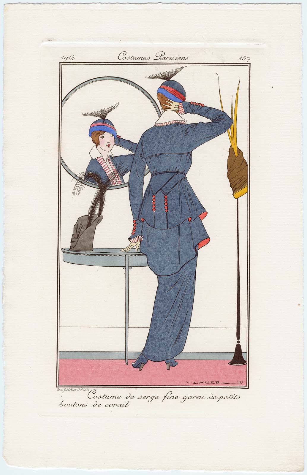
Costume de serge fine garni de petits boutons de corail, plate 157 from Journal des Dames et des Modes, 1914
What do you think of the hobble-skirt and the layered jacket? The touch of cobalt in the hat?
Rate the Dress on a Scale of 1 to 10
hmm, I adore evening dresses from that period but everything else… nope.
first of all I hate cap with this feather(?) I don’t like layers (I do when we talk about evening dresses, but here it look bizzare)
what I like is those red buttons on sleeves and on that triangels hanging from waist. and colours – blue with red and white accents. classic.
6/10
The pattern would look stunning on someone slim and tall. Love the hat but not the feather, but I am sure it would have been much admired at the time.
7/10
9/10. Classy, elegant, and yummy zings of coral – love the linings and the buttons and the striped accents. Elegant and understated. Not so keen on any of the hats, but the costume is fabulous.
I love it. It’s one of my all time favorite times for fashion etc, it just speaks to me. The feather might look better if it were more of a plume instead of a fan, but I think its peachy.
This time really speaks to me, too. Go team!
I LOVE the hat – it looks likes a whale’s tail in the ocean.
The cobalt blue is great. The hobble skirt not so much. The long jacket does go well with the long skirt, tho.
I really like all the bits of red – the jacket lining, all the buttons, stripes on the blouse and in the hat. They keep the blue from being boring & overwhelming.
an 8
You’d need the right figure to pull it off, and I suppose if you did it would look quite stylish. I rather like the skirt with the layers, but I’m less keen on the top half. I don’t exactly dislike it, it just doesn’t do much for me. And I think the hat looks a bit silly with that plume. 8/10
very overworked. 5/10
I think this era was highly creative, while still honoring the female shape. This dress has so many wonderful elements: the sculptured layers on the derrière double triangles with button detail to repeat the sleeve detail, the band of brighter blue on the hat draws attention to the head and face. I love the whimsy of the feather. A 10!
Even though I have absolutely the wrong figure for the dress, I like it. The hats, not so much. I particularly don’t like the blue in the one she’s wearing – it might be very nice with another outfit, but I don’t think it works with this one. 9/10
I love the touch of cobalt on the hat; that part’s lovely, and I like the cloche-like shape. It’s the weird broom-like thing on the TOP of the hat I can’t stand. 🙂
My complaint about the suit is a bit different. I love the color scheme; navy is classic, and the red highlights set off the soberness of the rest of the costume well. But I’ve never liked the odd silhouette of the suits of the early 1910s–the hobble skirts, the long peplums, the droopiness of the jackets. The lovely button accents and graceful high collars aren’t enough to make the clothes look well on anyone except the most tall and thin of women.
So, a 6.5 once again.
They have somehow managed to combine the worst features of both full and fitted skirts: her hips look enormous and she can’t hardly walk.
The layering is fun and interesting, but you’d have to be about nine feet tall to look good in it. 5/10 because it’s a fun picture, even if it would be unflattering as an actual garment.
I don’t like the fashion of the WWI at all 🙁 So this dress doesn’t effect me at all, sorry. 5/10
I love this dress! I love the button details, the flares, everything. I especially love the straight skirt to finish out such a wide hem at the hips. LOVE!!!!!!!!!
Yes to the red, layering, stripes, and hat. But no to the hat’s fan and the hobble skirt. It looks like her torso and legs belong to two different people. Maybe two different species. The artist’s style may be to blame, but the outfit has to take some credit.
But those touches of red are wonderful.
6/10
Fabulous.
Whilst wearing heels like that hobbling is about all you’re going to accomplish anyway.
9/10
This is lovely and graceful, in a way it is almost neo-classical. I love the hat. 9/10
I love this time period, and I’m sure it affects my score. I think the proportions are so balanced but put together in interesting ways. I love the colors! That neckline is one of the most beautiful of any time period.
10/10
Seriously? I am going to give it a 10. Look at it! So very fashion forward! It was styles like this, worn by gutsy women, who made possible fashion moving into interesting places. Look how 1920’s it is, and understand how someone 10 years later found the style important enough to bring back to a decade in which it really took off.
Yep! I absolutely love this one … a LOT!!!
I don’t like this era at all (the hat looks like a mixing bowl). But I do like the collar, buttons and sleeves so I will give it 4/10.
I love it! The layers, the shape, accents coral and blue, and the whimsy and abstraction of the feather’s shape. I think that the textures of the various fabrics, especially the cobalt and other accents could make a huge difference to the type of balance achieved. I like the way the feather is an inversion of the points at the back of the coat.
9.5
I love the double collar and the red highlights in the blue gown, but ick: hobble skirts.
6/10
I think it’s a beautiful ensemble sans the hat. I like the hat on the right better than the one she chose. The feather on it is so horizontal, and I think either of the other hats would have been better. I’m pretty sure these are hand colored after printing, so I’m looking at purely the line drawing and not the end colors chosen.
forgot to rate 7/10
Well I love the blue bits, even if I’m not sure what is top, peplum or skirt. I love those layery things. I’d wear it! (with a slit to enable walking). I don’t think much of the red stripes though. The other red, ye.
I think the hat needs a much jauntier angle – and attitude – to be pulled off.
7/10
1) Overall, I like it very much. Especially the touches of coral/rosy red.
2) I do not like the under-layer in the jacket. It looks like an interruption and breaks up what would otherwise have been a nice contrast between the flared hem of the jacket and the slim hobble skirt.
3) The fan on top of this particular hat is a little silly. While I like the cobalt and red on this hat, I hope she decides it’s just a little too twee and picks the hat on the table instead.
Assuming the hat decision is still up in the air…
7/10 for a very pretty, smart outfit.
I love the little red buttons, and the cut is nice, but some of the colours clash.
The cobalt and the red & white stripey bits look out of place. If the only colours on the outfit were the lovely dark blue-grey and the bright red, with a little bit of black it would be fine. I would also change that weird fan thingy to a swirling plume.
8/10, because red ball buttons are one of the most delightful garment closures in existence.