
This week’s Rate the Dress is going to be slightly truncated, because I’m away on a long overdue holiday, and (as per usual) I had a million things to do in the run-up to leaving, and didn’t get everything sorted. And I have very limited internet while away.
So no add-up of last week’s Rate the Dress for now.
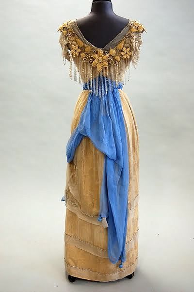
This week, I’m showing you a dress that takes a romantic classic: white dresses with blue sashes, and gives it a twist in white & ecru, with a bright ocean blue sash, and fringed neck ornamentation that reminds me of a flower lei. The sea and sand colours and garland of flowers seems quite appropriate given my holiday (can’t tell you where yet, but there are going to be lots of exciting photos to show you!)!

Evening dress, ca. 1910, via Kerry Taylor Auctions
Evening dress, ca. 1910, via Kerry Taylor Auctions
Evening dress, ca. 1910, via Kerry Taylor Auctions
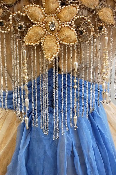
The beaded fringe amuses me, because it’s such a (mostly misplaced) cliche of ’20s fashion, but here we see it a decade earlier. What do you think? Would it sway and sparkle and add a bit of difference to gown? Or is it just a bit ridiculous?
Rate the Dress on a Scale of 1 to 10
I think it’s lovely! Though the beaded trim is a bit much, especially under the large flower trim. I could definitely see myself recreating this one… when I have time. And without the fringe.
Definitely a 9/10 for me!
Not crazy about the blue (maybe the shade?) but the drape in front on the overskirt is delightful!
I take a point off for the drape, which is looking tired, and I don’t think the dress would be any less without it. I would have loved a close up pic of the embroidery/beading on the right side of the skirt.
Imagine being corseted in to a waist that slight!
9/10
Holly, I saw this dress in an exhibition a couple of years ago, and I’ve just put a couple of photos of it, including a rather blurry one of the beading on the skirt, on my blog.
http://blacktulipsewing.blogspot.co.uk/2014/09/a-rate-dress-with-difference.html
I adore the fringe! The sash color is interesting…I think I might have gone with the darker color you see inside of the flowers. 9/10
Why is part of the blue sash dragged around to the front? very odd.
I can forgive the extra beading tho since if you can’t go over the top in a party dress, when can you? I do have visions of the beads slapping her in the face as she does a fast twirl.
The ecru is just drab.
4/10
I love this dress. Simply beautiful.
10/10
The bead and sequin trim at the neck is insanely over the top and I love it. I think I would love it much less if it weren’t in the same monochrome as the dress itself because then it would be beyond the beyonds, but as it is I find it delightful.
The dusty old gold color of the dress, with the filmy overlay (if only it could be as fresh as it was 100 years ago–it’s a miracle it’s not more dragged & droopy than it is) is that much livelier for the blue. 9/10. I could live without the beaded doodad on the skirt, though. Sometimes repetition is wonderful. Sometimes it’s goofy-looking.
This dress is beautiful! I can’t decide if I like the fringe or not. I couldn’t tell that it was beaded in the first couple of photos but liked it more when I realized that the fring was indeed teeny, tiny beads. I’d give it a 9/10
I enjoy the dress with the embroidered and beaded flowers, including the design at the hip. I am not a fan of the fringe, however. Again a danger for any hustle on the dance floor. But without it is dinner to dancing. Colors are lovely.
8/10
Like the bodice, with its floral trim and beads, and the sash. Don’t like the sheer, asymmetrical overdrape much. A 7.
Oh my goodness, I love everything about this. The glorious beading which would look wonderful twinkling on the dance floor, the asymmetry of the skirt draping, the wee bobbly things at the corners of the the blue sash, the rich, soft gold of the figured silk skirt. I’m not an historical reprodution person, but this is a dress I’d happily recreate, down to the last beady tassel. 10/10 and would give it more if I could!
The front of the dress is beautiful. The extravagant beading over the tiny waist, the subtle sand and cream colours and the bright blue sash. Love it.
The back looks a little messy. The wonderful asymmetry and sash just kind of hang there awkwardly and don’t look that flattering.
I’ll give it a 7/10
I think it’s perfect! 10/10
It’s beautiful. I wouldn’t change a thing. 10/10
Beautiful! Must had been bright back then, I can imagine a lady walking into Waldorf-Astoria for a soiree with her secret lover 😛 😀 10/10
I love this, especially the beading. The only thing I’d change is the rather dull ecru. As well as preferring more colour (I like the blue) this shade makes old dresses look old and tired, though of course that would not have been the case when they were new. Teens era style is my latest favourite, so I have to give this 9.5 and nearly perfect.
I like the fringe and those embroidered flowers….Gives it something exotic. I see a wealthy woman wearing it but with darker skin and not so much the bourgeoise in a northern European way type. Not because of the colour ( which I find looks a little faded) but the kinda sorta feel It has. The sash looks all right, it looks like it’s nicely finished at the side .8
Love the beaded/embroidered flower trim, and the long swingy flapper-before-her-time beads would be great on the right person. Who wouldn’t be me. Someone young, spunky, and possibly related to both Clara Bow and Audrey Hepburn. The cut of the dress is wonderful, because of the era, which can basically do no wrong. But unfortunately it’s not white, it’s gold (or ecru or something), and I cringe at gold except in small amounts (or in beading/sequin/trim.) I keep seeing the basic material of the lower part of the dress as upholstery or flocked wallpaper at grandma’s house. And color is kind of major in an overall impression … so I’ll make it 8.5.
Oh I love trims! The more glitz the better! I love the color combination because the hues work so well together. The only thing I’ve noticed with dresses like these – trims in places that accentuate certain areas – is the wearer must have just the right body shape for everything to “work” as the wearer goes about. Given my stature – and super paleness – I know I would never be able to wear THAT dress. 9/10
Love! 10/10 (especially the blue)
It’s stunning! 9/10 – and have a great holiday!
Love the colors, especially the bright blue, and the “lei” effect. Fringe… if I’d been designing it myself, I might have said “yes fringe”, but I’m not sure I ever would have thought “It needs THIS MUCH FRINGE.” So it’s not to my own taste. But that said, it’s an evening gown, it wants to be noticed, and even if it’s excessive, it doesn’t look bad.
The sash is awkward – I like that it drapes round to the front, though not how it’s managed to do it, and the very back is just strange. So major love for the colors and floral effects, but feeling confused about the skirt. 7/10
Also, hope you have a wonderful holiday!
It made it to my Instant “oohs” board on Pinterest, so of course it’s a 10!
Hmm. Not doing anything for me much really. The colours are very literally sand and sky. There’s something a bit crashing about that blue that just seems a bit punchy/pushy/obnoxious and I can’t quite pinpoint why. Hard to imagine who’d look good in this – perhaps a very pale, VERY red-haired redhead. For me, that bodice demands an earlier skirt, a more sweeping Edwardian frou frou skirt to balance out the sway and swing of the fringe, as it seems a little top heavy on a slender (but not quite slender enough) skirt.
There’s actually something kinda dorky about this, and I never thought I’d ever think that about a dress of this period. I’m going to give it an uncharacteristically low rating of 3/10 as there’s a lot of borderline fail, but worse, there’s a lot of boring where it oughtn’t be boring.
I agree. It’s out of balance and awkward. I do like the material and the basic dress, but someone lost sight of the end product. The trim is bulky and graceless.
4/10
Funny enough, I have nothing to say about this dress. Not even to rate. But wanted to pop on and see what others said. (am I missing something?)
Happy Holidaying!
The drape looks a bit like an afterthought, though it might just be hung strangely on the mannequin for the photo. I love the beaded fringe, but those flowers on top are HUGE and a bit disproportionate somehow.
However, I absolutely love the blue sash and the colour of the dress itself, so I guess this all lands at 8/10.
You know how there’s that person at a large party who gets a little goofy and ends up wearing part of the decorations? That’s what the flowers&fringe put me in mind of.
I like the general shape and drape, and the shot of blue, and especially love the sheer detailing on the skirt, but the fringe is just awkward and, I think, would be even more awkward on a human body. I even think the fringe makes the pale color look drabber than it ought to because it looks old and faded on the flowers.
A 5/10, all points deducted for various infractions committed by the fringe.
Usually I prefer more subtle decoration, but this fringe is very charming for some reason. I especially love the effect on the back neck “v” shape. I only wish that the rest of the dress was more whimsical to match! 7/10
I saw this dress in an exhibition a couple of years ago and loved it, so it’s a 10 from me.
Love it, 10/10
NO.
Someone needs to seriously edit.
What the heck is that blue sash doing down the back of the dress?
A little restraint on the beads & baubles around the bust too please, I don’t care how flat chested you are it’s so much it’s clumsy.
The color combination of dingy gold & bright blue just looks bizarre rather than harkening images of sea, sky & sand.
3/10
Because I suppose it could have been worse?
Overall, it’s gorgeous. And the fringe doesn’t look ridiculous at all. It seems very…of the times. It would look silly today but it looks just right for the time it was worn in.
I do have some complaints however. While I LOVE the color of the sash and how it goes with the ecru, I don’t like how it’s strewn asymmetrically over the back of the dress. It looks so sloppy. Also, the top skirt layer would look nice except that the rest of the skirt is sort of bunched up underneath, which makes it look sloppy. Also, I would get rid of that weird bit of netting/lace on the neckline (perhaps it was added for extra modesty?)
But overall I love the shape and the color combination. If I had lived in the 1900’s, I would have chosen this dress (with a few adjustments to the sash and skirt) to wear to a ball.
7.5/10
I get the impression this was a take on Native American clothing.
Something about the cut of the neckline and sleeves, plus the colors and decorations seem to suggest some traditional deer skin clothing I’ve seen photos of, though I don’t remember what tribe they were from.
The dress is gorgeous. I love the workmanship especially in the back where the neckline dips down and the fringe goes over the blue sash.