
Whether you liked last week’s Rate the Dress depended entirely on whether you are OK with ultra-perky, ultra-feminine 18th c shepherdess looks, and whether you found that the non-matchy (in a 21st century sense – a lot of our ideas of coordination and matching are pretty modern) trim clashed with the dress, or gave it the right amount of interest (though, if you look closely, the trim was exactly the same colour as the flowers in the floral pattern of the dress), and whether it reminded you of wallpaper (yes, I’m in that camp, but the trim totally saved it for me).
Though many of you adored the dress, there were enough of you who saw only wallpaper and clash for it to come down to 8.4 out of 10.
This week I’m sticking with a time honoured and accepted colour match combination, and a significantly more regal and restrained silhouette.

This evening dress in red velvet features gold bobbin lace trim around the neck and sleeves, gold detailing on the bodice, a perky bow at the centre front, and peacock feather embroidery on the skirt.
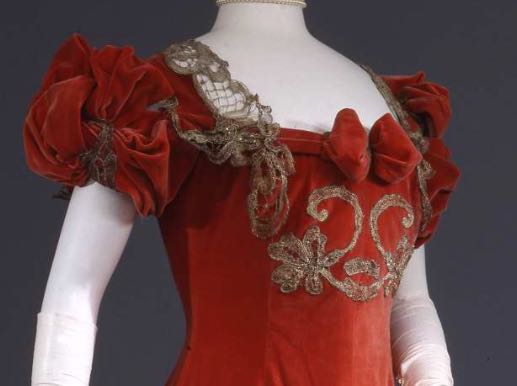
Evening dress in red silk velvet with metal bobbin lace trim, ca. 1902, Galleria del Costume di Palazzo Pitti, 00000192
There is a slight hint of historicism in the sleeves, evoking 1810s-does-Renaissance detailing, but the overall silhouette, with the lack of waist seam, and the beginnings of the S-curve, is pure turn-of-the century.
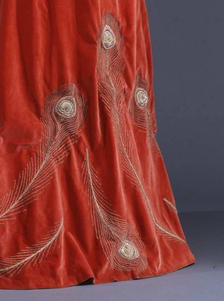
Evening dress in red silk velvet with metal bobbin lace trim, ca. 1902, Galleria del Costume di Palazzo Pitti, 00000192
So, classic colours, classic silhouette, a bit of velvet, a bit of sparkle. Do you like it?
Rate the Dress on a Scale of 1 to 10
love love love it! 10
Oh my goodness it’s so so much like the dress Callas wore as Tosca! I’m less than keen on the weird little bow at the bust, and it’s not a dress I would personally go for, but once I picture Callas in it singing vissi d’arte, it suddenly seems a lot more appealing in a tragic, over-the-top operatic way. But I’ll give it an 8 because I detest that weird mushy bow so much.
I’d rate this a 9 out of 10 . beautiful
Love the colour, love the line, love the peacock feathers on the skirt. Simple but strong. The only thing holding me back from a ten is the upper bodice and sleeves combination. At first, I thought it was just that gratuitous velvet bow sticking out the front like a really soft fender, but the more I looked, the more the sleeves/lace/bow/embroidery combination reminded me of a royal box in a Victorian theatre!
8 out of 10.
I’m fascinated: What were the concepts of matching before the modern era? I’m too concerned about that fact to think about a dress–a cool dress, but colorways and historicism is so much more interesting.
Whoever thought the bow was a good idea needs help. The rest of the dress is lovely, and I too can see it on stage. It must have been beautiful when new, and the metal trims still had their original shine. I’m not overly taken with the sleeves, but they work well as part of the whole, and I really can’t think what I would do to change them. So 9.5 because that awful bow keeps poking me in the eye every time I look at the dress.
I *love* the silhouette; so majestic, so elegant. I like the sleeves–just a bit quirky. And the color makes the ultimate statement–it’s not a color I like to wear, but fire engine red is powerful and splendid. But I detest the ornamentation. The color is fine, but what’s with the lace drapes over the shoulders? The random gold peacock feather motifs? The silly, poufy bow on the center of the bodice? And the scroll work on the bodice looks so out of place, it feels to me more like doodling. It would look much better plain (and without the bow). I’m so disappointed at what a wonderful gown this could have been that I can barely bring myself to give it a 7.
The texture, lines of the skirt and color are wonderful. The pert symmetry of the upper decorations seems at odds with the fluid and slightly assymetrical lower decorations. I could like each scheme carried through but there is no real conversation between them. I am glad it exists but it also bothers me as being beauty incompletely realized. 7.5
I am curious what it would look like with less tarnish. Would it be as shiny as ‘beforetheautomobile’s silver embroidered regency gown? What is metal bobbin lace usually made of? The shine might carry it for me.
If last week’s dress was extraordinary, then this is simply boring… :/ 6/10
LOVE IT! Everything from fabric to colour to… to… to… every last thing about it.
10/10 from me 🙂
Not too keen on the bow either… not bad, but I’d give it a 6/10 also.
Still my beating heart – red velvet, gold, peacock feathers? Who was this ancestor soulmate who wore this beauty over 100 years ago? 10/10
I wonder if this is an aesthetic dress? Although the figure looks VERY erect and flat-fronted, the dress actually looks like it was quite relaxed and whilst fitted, not corseted. It looks very comfortable by the usual standards of dress of this period, with the flowing Princess line, and of course, peacock feathers are VERY much an aesthetic motif.
I don’t really like the gold braid/lace applique on the bodice front which looks a bit scrappy and bunged on – not really in harmony with the exquisite embroidery on the skirt. The gold lace at the neckline seems like it might have been a bit scratchy. I do like the puffed sleeves, but I think the braiding and lace up top don’t really harmonise with the flowing hem, and the bow actually looks a bit comedic, like turkey wattles or something. I want the sleeves to be flowing more – there’s an odd balance here, like it can’t decide whether it’s a matronly, imposing stately dress (the velvet, the regal lines, the gold lacing, the quite deep saturated colour) or a perky little girly dress (the puff sleeves, the lightness of the peacock feathers.)
I’m going to say 7.5/10 as there’s too much internal conflict – I don’t think this dress quite knows what it’s supposed to be, but the embroidery and overall line is gorgeous. But that gold braiding on the chest is really not good.
While the dress is nice, it looks like it’s missing something. Maybe it originally had a lace belt? It just looks off with those highly scrunched up and decorated sleeves, the details on the upper bodice and then nothing until the hem. 6 out of 10
I’m not sure how to feel about the lace at the neckline so 9.75/10
I quite like this one. I have appreciation for what went into making this gown, it wasn’t difficult to do but nonetheless, looks like someone had a story attached to it. I would wear this and that is saying a lot. 8.5 outta the 10!
On the whole, stunning. Silhouette and color marvellous. I quite like the scale and placement of the peacock feather ornamentation on the skirt.
Only cons are the bow and shoulder lace, as have been mentioned before.
9 of 10
Just lovely — except for that horrible little bow in the middle of her chest. I’m not sure how the peacock feather motifs could have been brought up to the bodice? It may have been too much and the other motif a nice contrast. I would rate this dress: 9/10
This dress wants to be stunning but just misses. The bow is a sad mistake and I agree that the bodice embellishment would be more engaging if it echoed the peacock theme from the skirt. As with many of the dresses we have seen, I keep thinking that this dress would look much better on a live model. On a curvaceous young lady, with just a bit of cleavage (gasp) exposed,this would move into another realm. 8/10 for the potential it displays and for that lovely embroidery.
While I love the colour, sleeves, bow, and peacock feathers, the embroidery on the chest just reminds me of the cheap, scratchy gold trim they put on school play costumes (does anyone know what I’m talking about).
So, for me, it has to be around 7/10
Perfection, I wish I had the figure for it, but that left some years ago
10/10
Now that I’ve stared at this dress for a few days I’ve finally have an opinion. I think that the highly contentious front bow works well with the elaborate sleeves. They both have lots of body and pouf to them. It seems to me that this dress is made up of zones. These bits work well in their own world- like the bow, and bodice decoration all together- but fail in over all coherency. The peacock feathers, though not to my taste, are fabulously placed around the hem and give a sophisticated air. The upper portion of the dress does young princess, and as others have commented, they do not go together well. The thing that really catches my eye is that the dress does not look like it fits on the mannequin well. Perhaps this dress was made for a woman of larger proportions, or it may just be the cut of the bodice and neck line, but it really looks to me like a girl playing dress up in her mother’s gown. Which is what the gown itself feels like, lamb dressed as mutton!
7.5/10
Some things I like (bold red, long swoopy skirt, peacock) and some thing I don’t like (swirly bodice design, the lace at the neckline). But I just really don’t like that neckline. The awkward swirls and floppy lace. The fat tongue-y bow. Even the complicated sleeves, which I want to like, don’t quite work for me – they just add to the visual confusion. Much as I like some elements, I don’t like them enough to overcome the embellishments.
6.5/10
I feel a bit sad because I want to like this dress more than I do. I love the gold embroidery on the velvet – red velvet with gold embroidery is a favorite combo. The peacock feathers, often a very bad mistake, really work with the skirt in both placement and execution. From the high waistline down I do love it. But the bodice ruins it for me. The bow is horribly distracting and the swirls of gold braid look cheap. The sleeves are a bit…different, but I’m willing to overlook that. The gold lace that runs up and over the shoulders isn’t the best choice, but I think it would be more acceptable for me if that bit of braid that dribbles off the end had been left off. None of that tatty-looking braid should be there. And I agree with others that it doesn’t look well-fitted on the mannequin, which also does it no favors…makes it look a bit limp and lifeless.
Poor baby, so close and yet so far. 6/10.
I love the peacock feathers and the shape in general. I’m less enthusiastic about the bodice ornamentation – the lace and little bow don’t quite work for me with the rest of the dress, but overall I like it. As Belinda suggested, I like it more when I picture Maria Callas wearing it as Tosca. 8/10
I love this – the colour is so regal, and perfect with the velvet. Like many commenters above, I’m not a fan of the bow at the front, but the silver and red works very nicely. 9/10
Not a fan, 6/10
It gets automatic points for metallic bobbin lace!
8,5/10, because the placement of the trim feels a bit random when I mentally compare it to other dresses of the era, and that bow at the bust is also kind of random in the whole, and it doesn’t just feel quite as impressive. But half a point plus, because it’s graceful and makes a very good use of its era’s sensibilities. And it would have been more impressive when the metal was still sparkly.