
Last week I showed you Joanna of Castille in full turn of the 16th century traditional Spanish royal attire – traditional in the sense that even within her own time, it was a historical costume. Though the pseudo-pregnant look wasn’t popular in a modern sense, you gave the dress points for being exactly what a Queen’s ensemble should be: striking, regal, and elegant, so it came in at a very impressive 8.8 out of 10.
While last week’s dress looked to the past and tradition for its inspiration, and was full of subtle meaning and allusions, this week’s dress is all about the latest technology, and relies on simple, bold, almost blunt design for its impact.
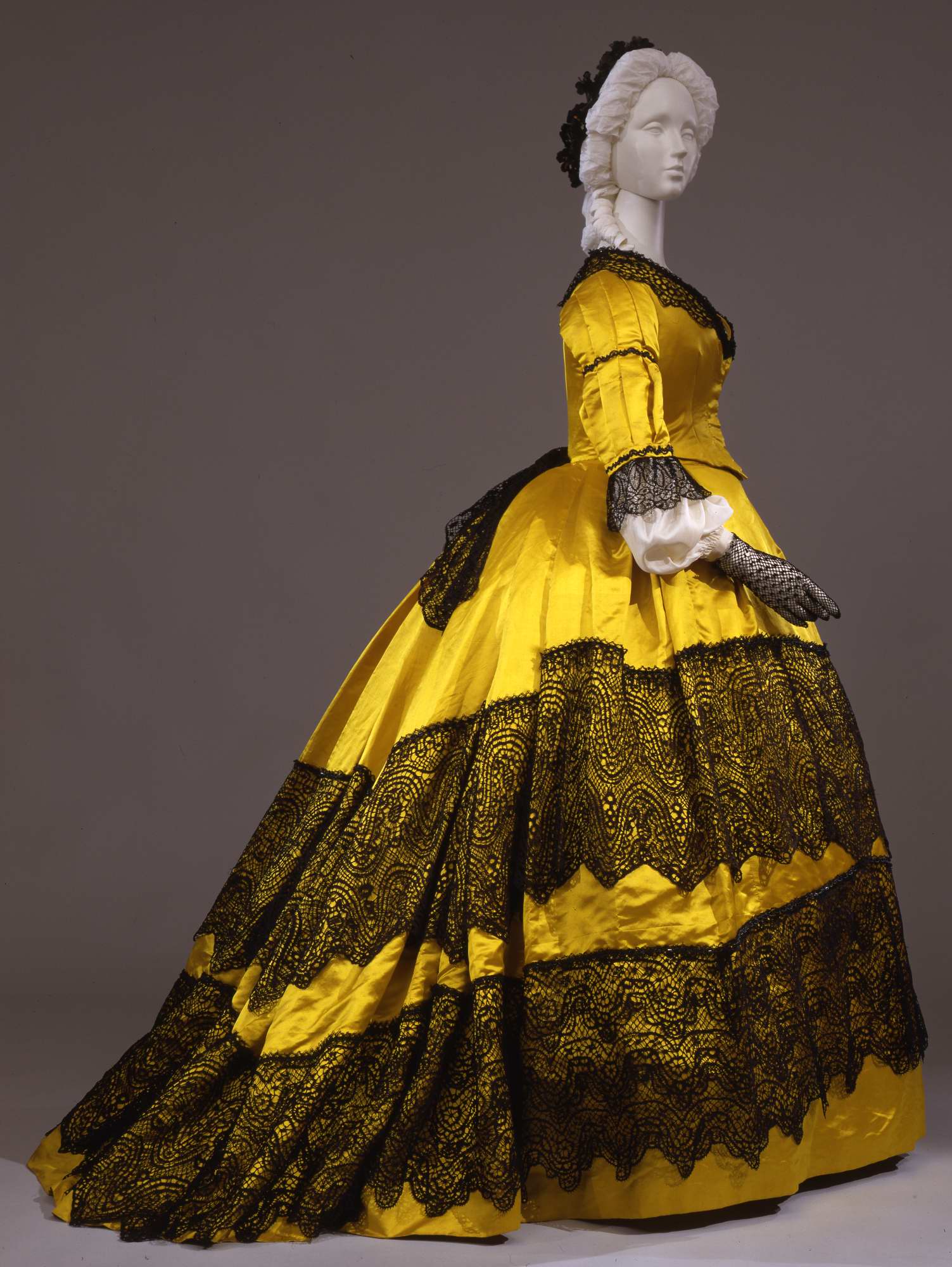
This mid 1860s dress from the Galleria del Costume di Palazzo Pitti is made from lavish amounts of silk satin dyed in the latest shade of aniline yellow. The bold yellow hue is further highlighted by the use of contrasting black lace trim. The lace is quite modern in design, and was possibly machine-made, further highlighting the dresses modernity.
Unfortunately there are no alternative views of the dress, so you’ll have to rate it on what you can see. What do you think of it? The widest extent of the bell crinoline, just moving towards the back emphasis that would become the bustle, the smooth bodice, pleated sleeves, and the hint of a lace bow at back.
Rate the Dress on a Scale of 1 to 10
Gauche
There is nothing fashionable about flaunting technology for technology’s sake. Whether that technology is Google glass, spandex, or aniline dye. This is jarring and unattractive.
4/10 for the general cut and fabric. (colors excepted )
Funny, I was thinking about the ubiquity (in the States) of yoga pants and “athleisure”, showing the newest compression/butt-enhancing/breathability of athletic clothing. I also really don’t like it. Nowadays, however, we show off brands that embrace this high-tech athletic gear ethos: Lululemon, North Face, Columbia, Patagonia, et al. I guess this high-yellow was that version of branding: Here I am! New! New! I can afford NEW!
Very much a dress of it’s time. Not startlingly ‘fashionable’ in style, but very fashionable in the colour choice – everyone wanted these new colours. Just think how well it would show against the less vibrant colours available until the discovery of aniline dyes. I’m interested in the seaming on the sleeves – cut in strips and sewn together, or pintucks, or what? They give some interest to what would otherwise be a fairly plain sleeve apart from the two rows of narrow lace or braid. And that’s quite an appreciable yardage of very wide lace – must have cost a pretty penny! I would guess that the lace is machine made – you don’t have to see many Victorian garments to realise that they outstripped modern day trim makers in what they could produce with machines. We seem to have lost the ability to create fine trims by machine, today’s trims are frequently quite coarse by comparison. I think this dress is a 7/10 – not very exciting style -wise, but an excellent display of colour for effect.
Gorgeous! I admit, I’m a sucker for 1860s gowns in general. This one is bold and daring, and it took a confident woman to wear it, I’m sure. I’m willing to bet the black lace had a lovely movement when worn, too, since it looks like it’s only sewn down on the top. And by gaslight or candlelight at a dinner, I bet it had a gorgeous contrast between the lace and the silk satin. 9 out of 10 for me. I’d wear it myself!
And imagine that black lace on black Italian hair! (Since it’s from the Pitti musuem)
Yes! It’s all about the right complexion! There’s a tendency to imagine these sorts of gowns on willowy, pale English roses, and certainly that yellow would wear a woman like that. But on an Italian woman with warm colouring and dark hair? Outstanding, especially in candlelight in the evening. The sheen and the contrast would give the wearer such warmth.
Hmmm, I’m with the first two responders here. Guessing that the adage “less is more” applies here, it makes me wonder exactly where this dress comes from. Awfully mundane for European tastes. The machine-made lace is indeed glamorous, but hardly valued much in the courts of Europe. (Think Empress Josephine, etc.) There are SO many things wrong with this dress! The sleeves are a disaster; if they wanted a flat silhouette, then why not cut them that way? The two rows of trim on the sleeve are BOR-ING!!! The silk sleeve protector is is so old-fashioned, especially without color. Not a pleasing contrast to be seen anywhere! Finally, the lace flounce sewn on at the top; well, a small trim & some shiny jet beads might have given this dress more excitement.
All told, when I see a dress like this, it makes me think of something “made for America” at the time. Americans did not have the taste of the Europeans nor access to the lovely fabrics & trims found on the continent. Why ship fabric & have a dress made when you can buy it from Europe? (So much more prestige!). I am an American, & in my studies of fashion history, I’ve yet to see anything coming from America that could hold a candle to European design & style, at least not until the 1920s-30s. It’s a pooh-pooh for me; I give it a 5 out of 10.
It’s funny, because I, personally, have found some American things from about 1800 onwards that I love. It’s always a question of personal taste, and mine tends to simpler things, so sometimes the American simplicity manages to hit a note of balance that harmonises with me. (Whew, I’m being metaphorical up to the attic, as we say in Czech.)
Hmm, this dress is in an Italian museum so it’s not likely to be American. And I can definitely see an Italian woman in this dress!
That shade of yellow would make my complexion look sallow, but on a woman with the right coloring (dark haired and olive skinned–maybe Joanna of Castile would have looked great in it, if it had existed c. 1500!) it would be superb. The silhouette is graceful, and the black lace, though forming a dramatic contrast with the yellow silk, is used in a relatively restrained way. An 8.
Well, Joanna, like her sister Catherine, was famous for being a pale skinned with dark red-blonde hair (I suspect they were both very similar to me in colouring), so probably not! But there would have been others who would have!
Oh no! This one has not stood the test of time. Back to the bordello with you! 1/10
Ick, the colour is not something I like, it’s one that wears the woman rather than the woman wearing the colour, the lace trim is not applied in a pleasing manner, the distance between the edge of one and the top of the second layer varies too much which says to me they applied it without thinking about how the skirt would drape.
2/10
She looks like a bee. A very elegant bee, but still a bee. Or maybe a wasp. The colour is just Too Much, and I don’t think it would look very fetching in low light, either. 4/10
Wow–how interesting, a WASP!
Well I think it is gorgeous. 10/10.
The lace is without a doubt not high class but maybe the dress is more remarkable for it. I don’t think the lace means that this was sold to people who didn’t know better, as some have speculated, but maybe that whoever bought it couldn’t afford the more expensive lace but wanted the look anyway.
Then we are looking at a semi-equivalent of a fake Hermes bag here, or an H&M rip-off of a designer dress. It’s fairly rare to see something like this preserved.
And I have to defend the silk lace in general. It is one of the loveliest laces to touch, not even spider-web fine 18th Century linen lace is as nice. Even though the pattern is so large, it might as well be knit. There is a slight chance that the look might even be intentional.
The color combination reminds me of a semi-recent Alexander McQueen dress which I loved and the shape is pretty much my favorite 19th Century silhouette… so 9/10.
I absolutely love this. I cannot begin to form proper words to even to describe how much I love it. The colour is so bright and the lace is so lovely, its just amazing to me. The only thing I don’t like is the lace gloves, but for the sake of my love for the dress I’m gonna say they are not part of the dress, and just gloves. The white puffs at the sleeves is a bit random, and the black lace band on the upper arm is one of few things I don’t like.
9/10
Wonderful use of colour and contrast, and the play of light on the folded silk is lovely. Striking and graceful. 8/10
Good Lord, that is BRIGHT. Quite a brash contrast but very effective at highlighting the black lace. I find the sleeves don’t quite work, the undersleeve seems a little awkward and the pleating/paning or whatever is going on there isn’t quite right. As a dress, it is kind of basically a dress – a VERY yellow dress with VERY black lace. Quite spectacular but ultimately not much to it beyond lush fabric and lovely lace, and the sleeves aren’t doing it, so 6.5/10
Ohhh! I’ve never commented here before, but now I must! This is exactly my shade of yellow, and I’m also in love with the black lace (and the shape of 1860’s dresses in general). I’m already thinking hard how to translate the overall feel of the dress to something compatible with my narrow-door-frames-public-transport life. (And I need to crochet a pair of gloves like that for myself.)
10/10
Ohhhh, what about a yellow peplum jacket and black gloves and scarf?
Ugly color, ugly lace (did anyone else discover that the upper lace volant’s motifs don’t match with the lower lace volant’s motifs???!!!WTF!), ugly sleeves, ugly pouffy under-sleeves (why not rather sleeve ruffles from black or white lace? WHY???), ugly shaggy-looking lace bow at the back, did I mention ugly color? 🙁 A big hate to this dress, sorry 1/10
Wowzers my eyes!!! Colour is definitely too garish for me, and like others I can’t help but feel the wearer would look like a bee… No, can’t feel anything positive about this really- 2/10
As it stands? The color is garish and the dress doesn’t really “use” it well. The lace is brash against that bright fabric. 3/10
If, however, the wearer ran around waving her arms and yelling ‘BZZZZ! I’M A BEE! BZZZ!” this would earn a 10. (Seriously, just imagine that for a moment–preferably in the middle of some formal event.)
For such a bright color, I find the use of it excessive and almost painful, and the black lace just feels excessive, as well.
When I saw the thumbnail in my feed reader, my immediate reaction was “Belle Watling,” and although seeing the full post ameliorates that impression somewhat, I’m still left with an impression of vulgarity, so 5 o 10.
I think in our colour saturated, Pantone society we forget what an astounding revelation the new chemical dyes were to Victorian eyes. Because of Victoria’s endless mourning we tend to think of the era as shrouded in black when in reality people went colour mad. The sheer intensity and depth of the colour would have been half or more of the attraction. Yes, it’s a difficult colour to wear but on the right person it would have looked fantastic – my mother, for instance, would have totally rocked it. I have the same reservations as others about the sleeves and a little about the lace but overall for sheer impact 8/10.
I think about my native Arizona, or my current New Mexico, and how such colors would have been worn during the colonial era (albeit muted), then again during the 19th and early 20th centuries. (See Frida Kahlo to see what I mean).
This dress reminds me of the postcards that my Nana sent to me. It’s almost Mexican in color and silhouette, and reminds me of all of the Mexican dresses that my dad would buy for me (but my anglo mum hated hated hated!)
8/10, with extra points for nostalgia.
This reminds me a little of Biene Maja, a beloved German cartoon figure. So much yellow and black on one body. However, it might look impressive on a dark-haired woman with a tan.
The cut is nice, I also like the sleeves, but the color contrast is a bit harsh, and that much yellow…
so, 6/10
I like yellow, but this is too vast and yellow. The black is jarring, and the laces’ patterns are wobbly and woozy. Whatever the dress is doing right, it can’t compete with the lace and yellowness.
If I was the heroine of “The Yellow Wallpaper”, I would not want this dress anywhere near me.
3/10
I feel like this might have been for some costume ball (as a bee) but the owner wanted to wear it all year round. I’m a sucker for the 1860s and would’ve totally worn it had it been green and not had those awful sleeves with the pleats and lace and weird white under puffs. 7/10 for the potential.
I like it. 8/10.
Could this have been intended for the stage?? I can see some stately brunette contralto, hands clutched before her, warbling away in this. Stage lighting would do wonders for the bright color, while the black lace’s size and scale would be dramatic, not overwhelming as they might be in the parlor or elsewhere.
So – as performance attire, a solid 8. For other use – 6, perhaps?? Other than for the brilliance of that yellow, the fabric seems to have a nice weight and sheen, and the lines of the dress are reasonably pretty (though the sleeves would have benefitted by more consideration prior to construction). The contrast of the black lace over the bright golden yellow is rather nice, though not too imaginative.
Average rating: 7. If it was intended solely for stage use, 8.
I once had a beautiful yellow silk cocktail dress: just yellow (a bit less bright than this by a number of grades but still a nice clear yellow). However, this is not doing it for me. Even Black and White as a contrast on the right dress is not a total no-no. However, this is out of the Kardashians’ closet. Tacky to the Nth degree. Rating: 2/10
Goodness, I love that. I feel like I shouldn’t, and I do. There’s just the right amount of just the right type of lace to offset it…
10/10
Love the shape. Love the lace. Hate yellow. Personal preference. I’d feel like a gigantic squash in it. 5/10
I love anything 1860s, and I think the colours are great! It’s evidently caused some controversy, and it goes look like a giant bee, but you’d definitely bee a Queen Bee in this dress! All eyes would be on you, without a doubt, and hopefully for the right reasons! I love the shape and the colours work well together. I only think that the sleeves should be less poofy, but I love it and because lots of scores are so low (HOW could you give this work of art a 1??!!!) I feel like, to help it get some of its dignity back, I’m going to give it an 11/10.
Can’t do 11? Okay, 11.5/10. Happy?
Another thought: I wonder if those clashing-in-style under sleeves are original to the dress, or if it originally was worn without them, in which case it would look far better!
Love it! I love the yellow, but it would be even better in a cobalt blue. 8/10
I think of game day at the football stadium when I see these colors. It seems like a statement piece – either of loyalty or political sentiment. From what I can find on wikipedia, in 1859 Italy was in a war for independence against the Austrian Empire. In 1866 Italy was again at war with the Austrian Empire ending with unified Italy getting Venetia back from Austria. The colors of the Austrian Empire and their commanders were yellow and black. For sheer gall of wearing the opposing teams colors during that time period in Italy, 8/10.
I usually hate yellow, but this strangely appealed to me. 9/10
I will give it a ten. I think it’s beautiful. Didn’t expect to see such a bright yellow. Not use to seeing black and yellow together.