I rather expected that last week’s 1810s Rate the Dress wouldn’t be hugely popular, not in the sense that people wouldn’t like it, but in the sense that it wouldn’t attract lots of comments. It’s not the type of outfit that’s usually super popular in terms of commenting, and it’s a portrait. But, even without a lot of comments we had a lively (if small) discussion anyway.
In general the shawl and coral got high marks, the colour scheme got the overall nod of approval, and people were torn on the ruff. But good parts do not necessarily make a good whole, and while many of you enjoyed its understated elegance (to paraphrase Daniel), not everybody was onboard with the full ensemble, so the outfit managed a 7.8 out of 10.
(I think it might amuse you to know that I picked the painting because I was thinking of the Bonaparte family as being the Kardashians of the 1800s (powerful, divisive, and in the eyes of some, rather vulgar), and that if this was Caroline, it was her trying to separate herself both politically, and, through the portrait, aesthetically. Btw, go back and look at her. She could be a Kardashian!)
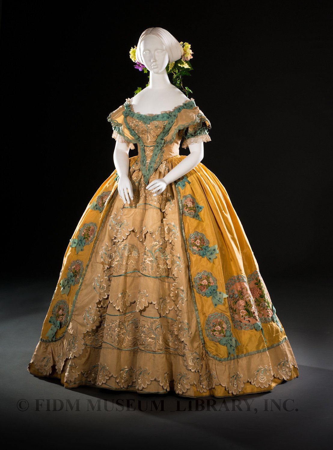
This week’s Historicism themed Rate the Dress (because there is so much variety in historicism, how could I not use it as a theme all month!) is an 1850s ball gown from the Helen Larson historic costume collection which very obviously references the 18th century.
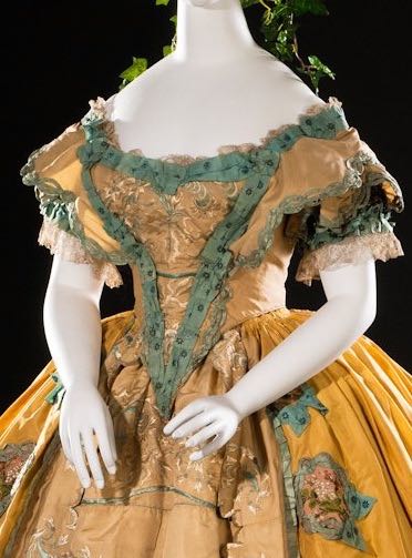
While classically 1850s in its silhouette, the dress is replete with Rococo detailing, from the ‘stomacher’ effect of the bodice front, to the overskirt which opens over a petticoat with scalloped ruffles. Unlike their 18th century counterparts, which would have been left with raw pinked edges, these scallops are almost certainly machine made: the product of industrial revolution advances.
In addition to looking back to the 18th century, the gown foreshadows its own historicism-ization: when mid 1910s and early 1920s fashions looked to the mid-19th century crinoline era for inspiration. The wreath decorations of the skirt are so typical of the type of ornamentation that was borrowed and utilised in the late teens and 20s that they look almost anachronistic in their own era on this dress.
What do you think of this mid-19th century reinterpretation of the fashions of a century before? Are you a fan of early Rococo revival?
Rate the Dress on a Scale of 1 to 10


The main color I like, and the petticoat and the stomacher lines, but I find the floofy trim on the bodice just unpleasant, like misapplied crepe paper. Perhaps the problem is the ravages of age, but I truly don’t think I’d care for it even in pristine new condition.
7 of 10
I very much like the color combination, and the silhouette is one of my favorites. The flowers look like odd crêpe paper to me, as well, but the real turn-off is the green trim, especially on the bodice. It looks almost like an afterthought to me, as though someone said “wait, I have some trim left! Let me tack it on the front here!”
All that said, I would definitely wear this dress (and the flower and ivy hairpiece), and I think I’d give it a 9/10 overall.
The color of this gown is very cheerful, and very 18th century. Unfortunately, the other 18th century types of details–the ruffles, the green ribbon trim–tend to make this dress ugly, despite the graceful, if large, 1850s silhouette. 6.5 for this one, mostly because of what the dress could have been without the awkward attempt to incorporate details from an earlier era. Yes, I think an 18th century homage done in the 1850s could have been lovely, but this one just isn’t.
My rating is completely influenced by having seen this gown at the FIDM museum. It was lovely in person, and the photos really don’t do it justice. The decorations look rather overdone in the photos.
The floral embroidery and woven ribbon wreaths were so pretty. My overall impression of the gown was very pretty, cheerful, and exuberant. I can certainly imagine the lady who wore it having a lot of fun at a ball.
Seeing it in person, it was about an 8.5.
Whoops. Sorry about the double post. I missed my .5 and thought I’d stopped it in time.
The colours! Love at first sight. Don’t like the skin-coloured front panel. 9/10
I love everything about it. Especially all the detailing. 10/10 🙂
I think it’s wonderful – and I rarely care for yellow – until you see that awful green polka-dot ribbon. It’s not so much that the ribbon is inherently ugly as it is almost comically out of place. If it were on a different dress, like perhaps something springy in white, I’d probably be quite fond of it.
Other than that, the colours are very nice, and I think the historicism is done pretty well. Perhaps it’s just the angle of the first photograph, but the dress somehow gives the impression of the flatter, more rectangular shape you get from panniers while still being very obviously of its own era. It reminds me very much of the portrait of Empress Eugenie as Marie Antionette.
9/10.
The comment that it almost looks like a 1920s fantasy version of its own era is spot on – and I do really like that. I like the boldness of the yellow and the contrast of the chunky embellishments in blue and embroidery. This gown has a really strong presence. In a way, it’s almost difficult to imagine it as a wearable, because it has so much presence in its own right, that it dominates the photos. The presentation is excellent here – the mannequin is so well styled, yet doesn’t distract or demand attention, which perhaps emphasises the gown’s own strong presence.
And yet, I don’t absolutely love it. I can’t quite say why not because it’s amazing, but there’s something not quite stealing my heart about it. I’m gonna say 8/10, I think it’s just that I’m not wild about the underdress colour against the lovely yellow.
It’s just so pretty!!!! And that ribbon embroidery! I can only imagine that took AGES!! I give it a 10/10, and would soooooo wear this one too!
I like it! I think the colour and details make it look like a ceiling or picture frame. Very stationary looking, somehow, which is weird to think of a dress, which would have been in motion. I find that the trim around the “stomacher” looks pasted on, which I don’t like, but I love those flowers arrangements around the hem.
8/10
I think this dress is very pretty. It comes together well and looks very feminine. I’m not sure about the green lettuce looking trim though. I think it detracts a bit from the overall look.
I give it 8 out of 10.
I think it is beyond adorable. Those posy appliques are lovely, and I love the petticoat. I love th shape, it is so romantic. But not insipid. and I trust that it is even better in person. 9/10.
sewcharacteristicallyyou.comOnly considering the historicism, I think this dress is pretty neat. There are some things like the color of the green trim on the bodice that I would change, but all in all this is a neat piece. 9/10
Sarah
http://www.sewcharacteristicallyyou.com/blog
At first glance, I really liked this gown. The colors are happy. But on second glance, I really couldn’t figure out if I cared for the embroidery and decoration on the ruffled petticoat. I almost wish they were more contrasted instead of muted. Not sure if that’s an age thing or intentional considering the entire ruffle decoration seems to fall flat in color compared to the main yellow fabric. Hmm…
7/10
I like the shape and basic layout of the dress – nothing exaggerated to ridiculous levels, everything flowing, graceful lines – and there’s something so gorgeous about an overskirt with an intricate underskirt. But the colors and scale of the decorations feel too chunky and heavy to me. Inserting the pink rose fabric doesn’t really solve it either. It looks equally jarring – too soft and delicate against the skirt’s bold edges.
On the other hand, the yellow and blue look do look really good together, and the dress does sort of grow on you.
7/10
This is the sort of dress I would expect to see at the World Fair showcasing, as
you say, industrial advances with sewing machines and the like. A promotional
gown…very pretty and cheery, for Spring. I could imagine a daughter of the
American Revolution wearing that.
9/10
Clearly differences in video screen color renderings are affecting our perceptions of the gown. I don’t see any blue in the decorations at all. Mostly I see greens, and pinks.
I see a shade of teal-y green blue, that I’ve noticed some people see very much as green, and some people see very much as blue, in real life, and on screen. Screen differences are probably causing a lot of the difference, but I think there is some personal perception too.
You’ve got a point; my husband have actually quarreled about whether the color labeled “aqua” is green or blue.
I agree about both the screen differences and personal perception of color. The photos on my screen, show that teal-y green blue. In person the ribbon looked much more blue than green. All the colors looked a bit different, and harmonized better than they seem to in these photos. Also, I think that the ribbons may have had spangles sewn on them, rather than polka dots. I’m trying very hard to remember, and looking for my photos.
Another thing to keep in mind. Depending on how the green color on the decorations was achieved, they may have faded in such a way as to make them look more blue than they were originally.
Orange-yellow, green, and nude; polka dots, scallops, ruffles, colored floral embrodery, monochrome embroidery, wreaths… My significant other has an expression that I think is apt for this dress: “too much much-iness”. Also, the shade of yellow makes me think of cheez-whiz. The silhouette is graceful, and the various embellishments would probably be very pretty individually. But no. This is a hot mess. 3/10, because it doesn’t quite rise to the level of being heinous.
It has a costume party look to me – “Daffy Down Dilly has come to town, with a yellow petticoat and a green gown…”
Hmm, turns out Nathaniel Hawthorne is said to have written that. Who knew?? I suspect it’s lots older, however. Hawthorne died in 1864, around the era of this dress, so it could be possible. Just.
English cloth doll maker Norah Wellings also created Daffy Down Dilly dolls (and pajama bag dolls; I have one) which were dressed rather like this.
I’m not fond of yellow for myself, but love green. This dress is a bit cluttered with all that green trim – but thinking of it as a Daffy-Down-Dilly costume brings a vision of the original wearer as the belle of the spring ball, with a matching wreath of newly-blossomed daffodils in her hair.
8.5/10
This is a dress that needs the right wearer, and could be quite stunning on the right woman. Mostly I like the overall style and the way it integrates historical elements into 1850s fashion. I don’t dislike the colour combination and I think it might look quite good on someone with the right kind of complexion, but I don’t really like it either. 7/10
The color of the greenish trim looks a bit moldy, or decaying. Such a shame, because if it had been a nice ivory, the dress would have been improved vastly. As it is? 4/10.
I’m not a fan of the dress, but the poor mannequin’s anatomy is dreadful. Either the original owner had no clavicle or artistic licenses were taken 😮