
Last week’s Rate the Dress was an 1880s ensemble worn by Empress Maria Feodoronvna.
Some of you really it (Cyranetta compared it to a Renoir, which got me thinking about it being like an impressionist painting, which looks completely different broken down into details, or viewed as a whole picture), but most of you felt that while one element might work, there were too many disparate pieces. What I found really interesting is what pieces people did or didn’t like – certainly no agreement there! The dress came in at 6.7 out of 10.
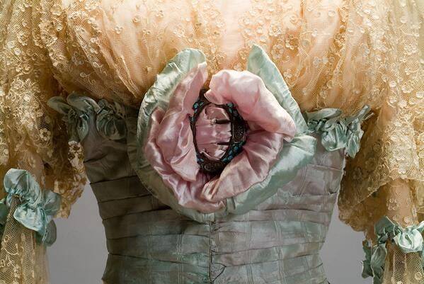
This week we’re staying sweet and lacy, with a Doucet gown from 1905 which features the Swiss-waist revival look popular at the turn of the century (historicism!), as well as the very fashionable elbow-length sleeves with engageantes (more historicism!), and the extremely detailed and feminine embellishments so typical of the first years of the 20th century.

Evening dress, Jacques Doucet, silk and cotton, 1905, Museo de Historia Mexicana, via their tumblr
It’s hard to tell if the unusual colour of the main fabric of the gown is original, created by layering sheer, changeable fabrics, or has faded with time. The elaborate floral-esque bow in lilac and aqua, and the aqua trimmings, still appear to be clear and bright.
Evening dress, Jacques Doucet, silk and cotton, 1905, Museo de Historia Mexicana, via their tumblr.
Last time I showed a swiss waist on Rate the Dress (in almost the same colours no less) , some of you did not approve, and thought it a bit scandalous. Will this one, which gives the illusion of an upper body veiled only by lace, fare better?
Rate the Dress on a Scale of 1 to 10
I do like the gentle feel of the two main colors, the overall shape, and the pleasing contrast between the textures of the lace and silk.
Do not care for that enormous bow ornament at the center bodice, nor the scale of the bows on the sleeves.
8 of 10
It really is quite pretty! So feminine, and I would love to lounge in the boudoir with a cap on my head and call the servants for coffee and a snack.
The top is what happens at that time in history, and I can give or take it. But that skirt! Oh I love the skirt treatment with the pleats with hidden lace inserts etc etc GORGEOUS!
Even though the color’s not my favorite, it is still, a perfect example of its time. I wouldn’t change a thing.
10/10
What is that brooch/bodice decoration supposed to be? Up close it looks weirdly, atavistically repulsive like a tumor or a flesh-eating plant. There is also another association this gives me, one that’s even worse.
No score because that thing is a 0 on its lonesome and that is unfair to the rest of the dress which is actually nice aside from being attached to that.
The flower looks like an external female genital. ugh!
1/10
I really love the waist, the lace, the colors, the contrast between the lace and the fabric…..but those bows…….kind of looks like a Georgia O’Keeffe painting. lol
Anyway, I am just going to pretend there are no bows and give the dress a 9/10.
Lovely color, pretty soft style, the front ornament is a bit to graphically anatomical for my taste.
So 8 of 10, since we can’t take pieces off.
ceci
I could see that originally being a shade of lavender. I’d give it a ten!
I like it very much! The colors are so beautiful together and it is very feminine and flowy.
9/10
I’m going right against the general concensus here – I love the front bow, it didn’t make me think of anything other than a bow, and the colours and shape remind me of a gorgeous anemone. 9/10.
I would SO wear this!!! 10/10!!
Love this! Perfection! The colors are perfect for the dress, which is beautifully balanced with a slender silhouette flaring just enough at the base to anchor it. Yes, the flower and bows are a teensy bit more bold than we’re accustomed to, but they’re right for the dress and the period. If I were to make this, I’d probably scale those elements down a bit. Since this is not a dress made for me,I’m still going to give this a 10/10.
Note to s: you’d better avoid Georgia O’Keeffe paintings. And you know, anything feminine.
Still not my cup of tea.
The rose at the solar plexus is too big and looks out of place and ugly. I don’t like the colors either, but I’m assuming that they have faded with time and may have been charming, harmonizing pastels when new. Even so, I don’t think this particular combination of a mostly lace bodice and a solid silk skirt work well together.
I’m feeling generous (and I can’t really estimate what the original colors must have been) so I’ll say 6 out of 10.
I like the skirt, and the Swiss waist. And the lacy bodice isn’t too bad, but the big puffy ugly bows are very big. And puffy. And ugly. Like someone tried to make flowers out of wads of chewing gum. Bleh!
6/10
7/10 for me. I don’t like the swiss waist – I think it throws the proportions off somehow – and I’m not fond of that thing at centre front, either. But I can imagine it as a very sweet dress if those details were changed, and I love the skirt.
It’s lovely. Allowing for the lace having darkened with age and the silk having faded a little, I can imagine it looking fresh and springlike. I love the crazy flower on the bodice, why the heck not, and the pretty 3d trim along the top of the Swiss waist and sleeves softens the firm lines. Delicious, 9/10
I really don’t like these colours – they clash in a way I don’t like. Grey and pink is gorgeous, but not that lace.
Also, that flower thing on the front looks like it’s going to have something butst out of it and is too big and clumsy for the delicate fabrics. The bows are also big and ugly and the whole thing looks like someone took 3 dresses and tried to make 1.
5/10 for me.
Delcious! I love it.
“Darling, the cabbages in the garden are coming along beautifully this year!”
“Indeed–it seems a shame we shall only eat them and they won’t be able to be admired beyond their inclusion in sauerkraut, doesn’t it?”
*Considers this predicament*
“Hold on just a tic, I need to add a little something to my evening gown before we leave…”
6/10 for effective use of cabbage but unflattering color combination and rather awkward lace-splosion of an upper bodice.
Many aspects are quite lovely and well balanced, including the color and proportions. The central flower/bow is a bit big and wants for smaller bows or inclusion of the skirt color to make it blend better. Maybe at one point the aquas were the same.
9/10
Must chime in as I love the flower decoration – a large pink peony or oriental poppy to my eyes. Perhaps the sleeve bows go one step too far, too wide; otherwise, it’s superb.
9.5/10
The colours are beautiful, and I like poppies so I don’t have any issue with the bows. What I don’t like is the use of lace inserts in the skirt. For me it’s just a bit too much on a dress that already has a lot going on. If the skirt was solid silk I’d be inclined to give it the full 10/10, but as it is I’m going with 8/10.
I like the main dress, it’s delicate and feminine. It looks cool and fresh and would fit any time of the year. Unfortunately on the way out the wearer wanted something more and reached for something to embellish the dress with, and the only thing she had at hand were a couple of big pin cushions. Without them it would have been a 9/10 now I can only give it 6/10.
Strangly enough, I like the dress overall apprearance. If I look at the details individually, it doesn’t work at all, but together I can imagine this on a very airy sort of person. I do have the impression the colours have changed over time, so I am ignoring the colour-clash a bit. 🙂 So for me the whole dress is a 9/10 🙂
Love. Grandmother would have loved this, too. 10/10
I’m a great fan of the first ‘Alien’ film. I have to say though that it is not something I want to be thinking about when looking at evening dresses.
Love the skirt – just beautiful, and the Swiss waist. Whether original or faded, that watered grey/rose/aqua fabric is just lovely, and the wide gold trim near the hem sets it off beautifully.
Apart from the scary trim, the dress is lovely, but because I cannot unsee what I have seen, 7 out of 10.
The styling of the dress leads the viewer to jump to some- unfortunate conclusions.
2/10 for that, although the grey is a nice shade.
Well I do like the skirt. It seems a fairly restrained handling of an attractive fabric. There’s a pleasing linearity to the pleats, vertical and horizontal lace insertions, the pleated trim that edges those and to the geometric pattern of the lace itself. I think it all works well aesthetically. But that bodice! It seems confused to me and as if it was designed by a different person and to go with a different skirt. The lace used for the upper part of the bodice is so different to that used in the skirt and, whilst a very nice fabric, it just seems to be hanging there looking a bit bedraggled and disorganised. I don’t think either that the rather severe ‘waist’ effect works very well with the rest of the bodice. And whereas the skirt is all restrained geometry the bodice is having a mad eruption of flowers. I can’t help thinking that the big flowery buckle thing has been a bit too fluffed up for display – if it were flattened out a bit that rather attractive buckle would be more visible. And the first thing I saw when I looked at this dress was those handy-dandy pin cushions attached to each sleeve! I’d like to be kind and think that the bodice might look a lot nicer with a different skirt, but I’m going to be mean and take points away because I think that it spoils the one it’s with. 5
I think that’s lovely; beautiful flow between the two colors and showcasing the lace of the bodice and the trim on the skirt.
I like the skirt shape and Swiss waist,. But they are typical of the period, which I am generally fond of. There are a lot of things about this dress that I don’t like. Having the entire bodice above the Swiss waist in lace seems like too much. The neckline looks kind of ragged and unfinished, as though the dressmaker couldn’t decide how to finish the neckline and so just trimmed it down to a sort of oval shape and left the raw edge unfinished. The sleeves again seem too lacy and frilly, the bows too large. I’m somewhat surprised at myself for thinking there’s too much lace; I love lace, and very seldom see a dress I think has too much of it. The lace inset near the hem is ok, though don’t care for the type of lace. It looks cheap to me. Actually, I think the lace on the bodice looks kind of cheap too.
Looking at the fabric, it looks like a semi-sheer pale blue fabric over pale pink fabric. There are places where you can see the pink through the blue. Can anyone else see that? I bet the underlying fabric is the same pink stuff on the bow. If I’m right about that, it’s an interesting effect, but I still don’t like it. The color just looks washed out. That could be due to fading though.
As for the bow/ornament thingie on the center of the Swiss waist, the less said the better.
Since the overall silhouette is fairly nice, I’ll give it a 4/10.
Love the dress, but am not a fan of the bows and the flower. So I’ll split the difference and give it a 6.
style and color are both astounding….BUT the orifice of a “flower” is creepy. 5/10