Last week’s rate the dress was an 1817 paisley-on-paisley pelisse and not-quite-poke bonnet, as depicted in a period fashion plate that was re-coloured in the 1940s. Paisley on paisley was more popular than I had presumed, though there was a pill in the pudding: the ‘perplexing purple purse’ (as Tracy dubbed it), which, as Daniel showed us by finding the original, un-re-coloured fashion plate, wasn’t intended to be violent violet!
The other thing that didn’t tickle everyone’s fancy was the plethora of ruffles, but since you’d be hard pressed to find something from the late 1810s that wasn’t abundantly frilled, that can’t be helped. All in all, the outfit came in at 8.3 out of 10, which is pretty fabulous for a not-so-popular late Regency look.
Since vivid purple didn’t work for you last week, but black might have, I’ve gone with a purple and black ensemble this week (it made sense in my mind!).
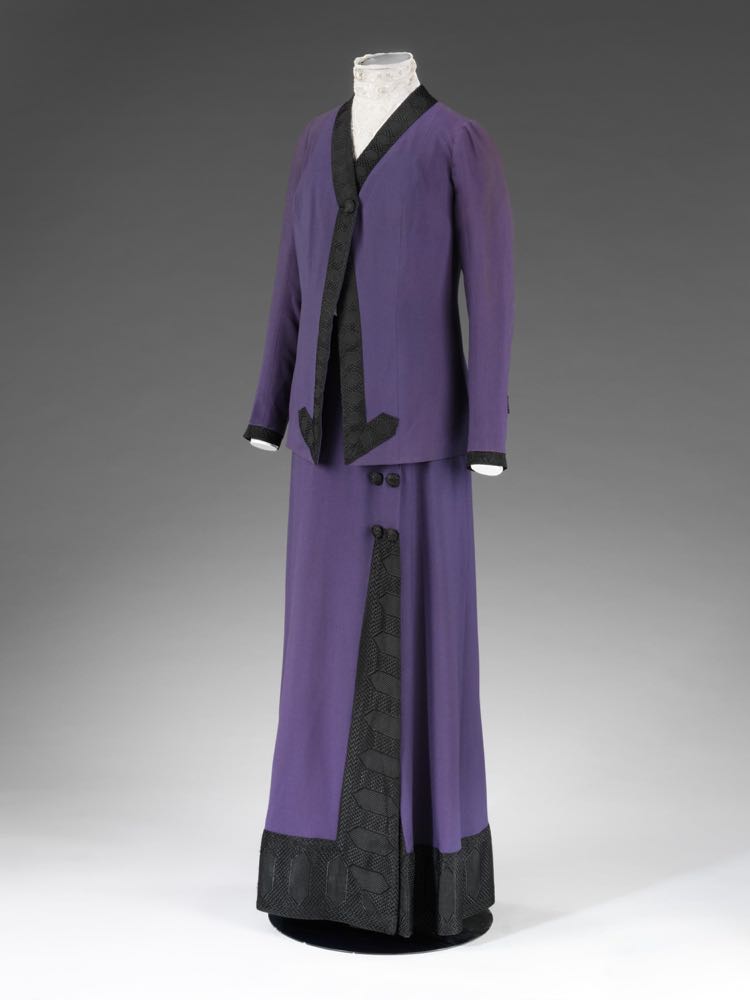
The obvious place to go looking for purple clothes was in the wardrobe of Heather Firbank, whose closet has featured on Rate the Dress at least twice before. Heather chose outfits to go with her name, as seen in this bold purple and black walking costume (‘costume’ being the term used for a multi-part outfit for dressy out-and-about wear in the early 20th century), circa 1912:
Miss Firbank’s wardrobe features garments by the top British couturiers of her era, and while Mascotte, the design house of society woman Mrs Cecil Drummond is not as well known as its contemporary, Lucile, a suit or dress by Mascotte would have been a status garment.
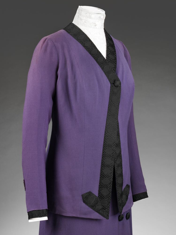
This ensemble is typical of Mascotte’s styles of the 1910s, with a clean, streamlined, almost austere silhouette, ornamented with flat trimming and the lavish use of buttons as design elements.
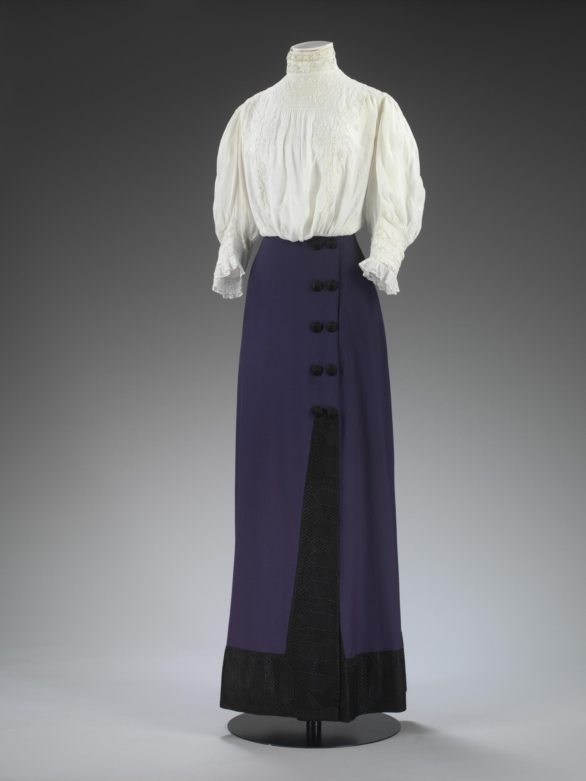
The skirt of the ensemble features buttons which are hidden when the jacket is worn, indicating that the skirt would also be worn with a blouse for indoors wear – even society women could be practical!
The V&A have kindly paired it with a blouse for us, though I feel the style of blouse is about 4-5 years out of date for the costume – the very full just-below-the-elbow length sleeves are very typical of 1907.
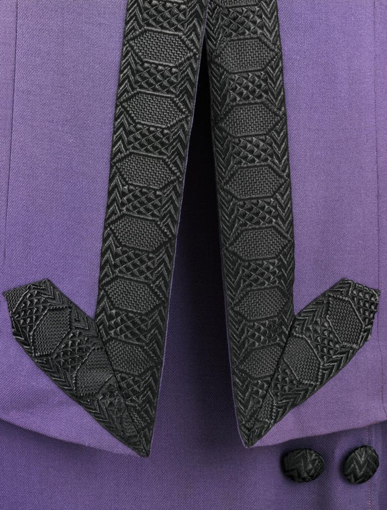
Also very kindly, and less controversially, they have provided excellent close-ups of the geometric trim:
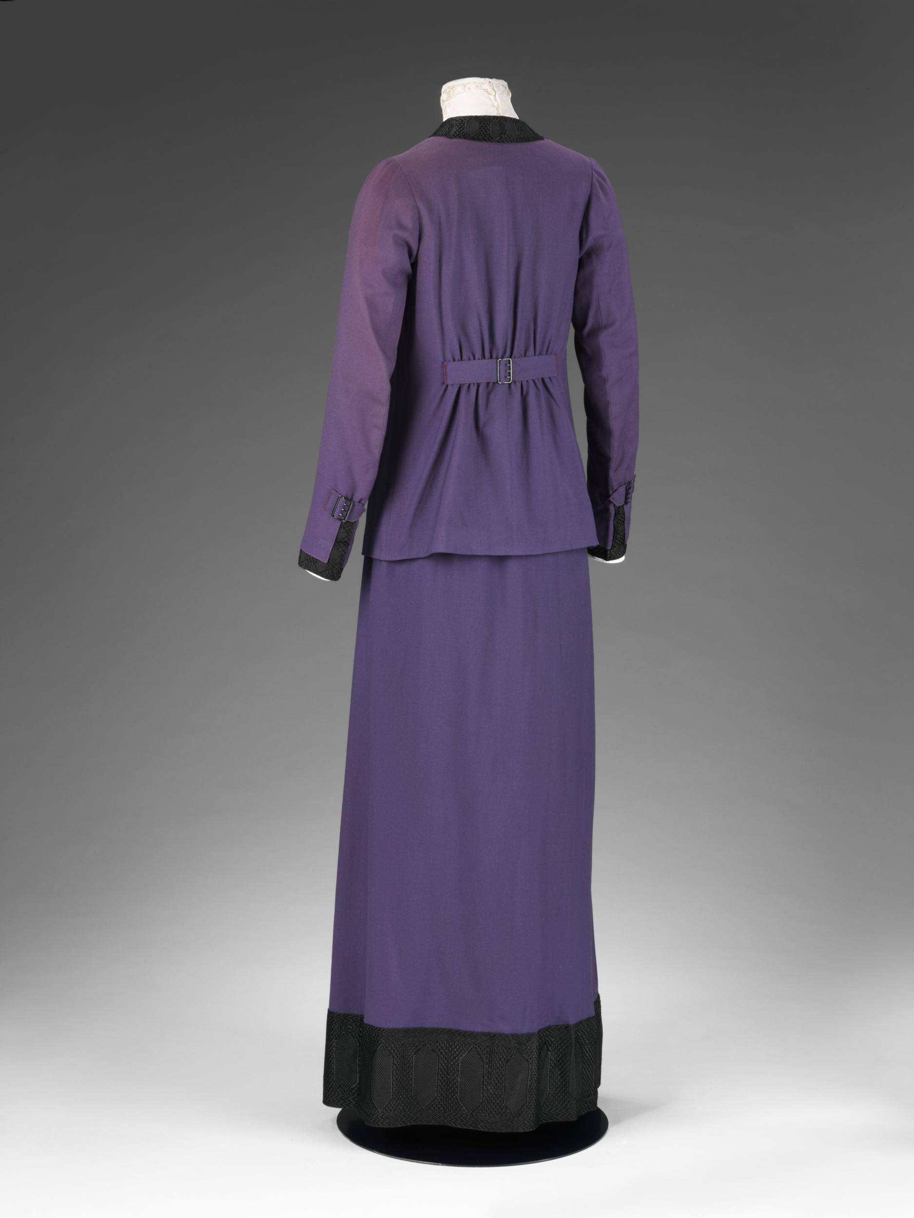
And great views of the costume from all angles:
And if you click through the link, there are even interior and construction images!
But we are concerned not with construction, but with aesthetic. What do you make of this outfit, and its bold colour scheme? Do you like the choice of blouse, or would you go with something else? And what sort of hat would you pair it with? (I do think it would look rather smashing with this one, in black and white, which it may very well have been worn with)

I love purple not so hot on the blouse but the jacket & skirt are
Beautiful to me 9/10
I love the color, and the black-on-purple contrast. I love the geometric texture of the black trim–it’s a pity that the texture could only be appreciated close-up. I love the quirky placement of the trim, too–the arrowheads at the bottom of the jacket opening, and the odd doubling and discontinuity of the trim up the front of the skirt. And I don’t mind the blouse the VA added here, and I like the fact that they chose a white one.
What I don’t like is the straight up-and-down silhouette. The cinching of the back of the jacket isn’t enough to eliminate the odd, unfinished look the straight silhouette gives. To be sure, the silhouette transcends the period, and makes this suit look rather unlike a garment of the 1910s, but the effect is still offputting. Not so offputting, though, as to deserve an entirely negative rating.
8.5 out of 10.
I actually love the silhouette, and the color, and trim, and treatment thereof.
My first thought, though, was “What an elegant way to come out of full mourning!” although I don’t know if this era maintained the convention of full- and half-mourning.
I don’t mind the blouse at all, since so very little of it shows with the jacket on. I don’t care for the option of an ecru blouse, and black wouldn’t show the trim to such advantage.
10 of 10
10 of 10
I love the trim, even if it does make me want to pause and play piano on it. And I love the color.
And I love how it’s pulled together and knife-sharp, but still has a relaxed swingy-ness to it.
The frilly blouse does feel off, but it’s still a gorgeous ensemble with a lot of personality.
9.5/10
I ADORE the skirt. The jacket is nice enough. Blouse ditto. The entire ensemble works nicely together. If I were rating the skirt alone, it would be a 10. The shape, the trim, the *perfect* buttons! Alas, I must rate the entire outfit. The jacket and blouse are just… Well, a little boring. I give it an 8.
I’m not usually a fan of purple, but I love this! In fact, I’d wear this jacket today. Paired with a black pencil skirt – how fantastic would that be? At any rate, the trim is beautiful, three designs lovely.
9.5/10
I like the simplicity of the silhouette, the restraint, and the unusual upwards ticks of the banding on the bodice. I don’t really like the small, slightly mean metal buckle in the back, even if it matches the equally small, mean buckles on the sleeve cuffs. I’m slightly unsure how I feel about the centre front jacket with single button fastening, and then the off-centred double-breasted buttoning on the skirt top – that doesn’t quite cohere for me when you see the suit as a whole. The two garments are individually very chic and elegant, but together, they are both a pair and yet not cohesive.
The blouse is also from Heather’s wardrobe so could quite plausibly have been worn with the skirt were Heather so inclined.
I rate this a 6.5 out of 10 – points deducted for the little mean buckles, for the single/double breasted mismatch, and for the symmetrical/asymmetrical mismatch.
I don’t like those buckles because they look like the sort of buckles you’d see hidden away on a man’s waistcoat back or trouser stay. Not really attractive as a decorative detail at all, and they’re nasty little sharp-looking metallic glints against the soft fabric that aren’t echoed anywhere else in the skirt or on the front of the bodice. I would have preferred to see black japanned metal or even silk-covered buckles that toned in with the trimming, which I do love.
10/10. This is just so striking, and that geometrical trim is gorgeous! It strikes me as just the sort of thing Amelia Peabody would wear…though she would likely have it in crimson, rather than purple. Which would also be amazing.
I love the pattern within the trim, and this shade of purple is one of my favorite colors! Im a huge fan of this era, and particularly this silhouette. However, I’m with Daniel on the “mean” buckles, so minus one for them (particularly the sleeve ones…)
9/10 for this outfit, which I would very much wear with the suggested hat!
I love walking suits from this era. I can totally see myself in one! I love purple, but struggle with purple and black as to me it is eternally bogun colour scheme. But that trim is delicious!!!
9/10 because I really can only reserve a full 10 for the trim being the same colour or a deeper shade of hte same purple. I know, ME marking something down for being too contrasty!!!
There is so much of this ensemble I want to like, unfortunately, I just can’t. I can’t get passed the black and purple (not one of my favourite colour combinations), the swing-like jacket (which I have never really been a fan of) and the mean little buckles (as Daniel so aptly called them).
Love the buttons on the skirt when you can see them and with the blouse it harks back to what I like most about a late nineteen naughties outfit. I also don’t mind the trim on the skirt – it shows off the split in the skirt and is made of a whole lot of awesome.
6/10 from me, only because of the skirt, the buttons and an out-of-date blouse.
The first thing I make of it is, Heather was a slim and tall lady.
I like many of the details, and then I look at the whole again and am underwhelmed. It really is mis-matched.
6/10
It’s positively stunning! I’d make it, if I could find a pattern!
I’m with Tracey on this one – the skirt is gorgeous but the jacket doesn’t inspire as much admiration (although the back view is more impressive.) 8/10
I would wear it. I’d wear it with the black and white hat
I love the purple/black and the black trim. YUM I adore the skirt. I have a lot of problems with the jacket. I usually really like long jackets like this; however, I think there should either be no buttons (still needs a re-style), or it should be double breasted, which would mean an entire re-cutting and styling. In my eyes the single button looks rather silly, and in a way the entire jacket looks frumpy. 7/10
I love this ensemble. The streamlined look and rather dramatic colours pull off making a statement without being too garish. I also love the blouse. Even if it’s outdated compared to the rest of the outfit, the softness of both the fabric and the colour perfectly contrast and set off the rather austere skirt. Also, the black trim on the skirt just suggests movement to me.
However, I’m not sure if it’s just me, but the angular shape of the embroidery, the little flicked ends of the black trim on the bodice just seems to remind me of the Art Deco period which didn’t really become popular until after WW1. And by the way, I love the mean little buckles, which I think are awesome because they tie in with the austere and understated air of the whole thing. Also, the plainness, even severity of the dress, although perfectly plausible for its time, also reminds me of the styles in WW1. It may be that I’m just imagining links where there aren’t any but it sure does remind me of later styles.
I’d give it a 10/10, and I’m now off to see if I have any dark purple and black fabric in my fabric stash…
Done. Simplicity, colors, trim, line, construction, elegance, the aesthetic. I’m all in.
10/10
9/10 – Love the purple, that black trim is divine, but the jacket is just a little shapeless to be a full 10. Very cool stuff though!
It’s got a very simple, clean, precise look to it. I love the use of broad, geometric trim in black against that purple. The only thing I’d change is getting rid of the pleats in the back – It just looks badly fitted, like it was made for a larger wearer, but the rest of it looks fine and the belted piece implies that it wasn’t. 9.5/10
While the jacket leaves me a little cold, I adore the skirt and blouse look. I think I need to add it to my project list. The black and purple go well together and I like the detail in the black trim. My main issue with the jacket is the angled pieces of trim at the bottom front, which seem to form an arrow pointing right to her, erm, womanly credentials.
The skirt gets a 10, but the jacket loses points. Still a lovely costume, however, so 8.5 overall.
I really like the skirt, but with the jacket on it looks a bit too frumpy. The lovely buttons being all covered up for the addition of something altogether quite boring. The only little quirkyness in the shape of the trim looking a bit to suggestive of the shape hiding somewhere underneath. The colour is one that I enjoy, but it would be more suitable as a splash, and only looks blocky in this amount. I would prefer this in a less bright shade and without the jacket but I’m not even sure I would care for it much then. 4/10
Perfect! Bar one pedantic detail. The trim on the skirt… I feel it could be pattern matched in a slightly more gentle way.
9.8
Positives first: this is my favourite era, I love the colours (had a similarly black trimmed shirt in that exact colour in the ‘80s), the braid is lovely, the paired buttons are rather attractive, the collarless, lapel-less jacket seems daringly different and simple, the angled front edges and single button fastening are eye-catching, the softly gathered back waist is unexpected, the cuff trimming is well proportioned and neat, it’s nicely sewn, the silhouette is simple and unfussy, it looks comfortable, and it appears easy to wear and move in.
But then the negatives: the jacket and skirt look as if they were designed in isolation from each other or for two different suits, the centre front opening jacket and the mock side overlap on the skirt seem too much of a mismatch, ending the trim at the jacket hem with the arrowhead effect is unusual but seems odd and out of place and isn’t repeated anywhere else, the trim at the skirt hem seems too deep and visually too heavy, the trim up the skirt front tapers and gets cut off rather awkwardly as its pattern disappears into the folded edge, the gap between the top of the skirt trim and the hem of the jacket seems awkward and isn’t helped by having one pair of buttons peeping out, the buckles are indeed mean and look like the type that would normally be out of sight, the gathered jacket back seems out of place on such a smoothly tailored suit, the half belt seems a bit meagre.
I wonder if this suit looked better ‘on paper? Or did it undergo one too many ‘perhaps if we’ changes during fitting and construction? I often look at these garments which have survived in such good condition and wonder if that’s because the owner disliked it and avoided wearing it? A better designer could have made this a ten, but too many negatives for me to give more than 5.
The first thing which hits me from this dress/suit is The Colour. Was is a mourning suit, or a very brisk-and-businesslike nod towards the suffragettes’ colours of green, white and Purple?
After that, there is a lot to like in this, but somehow it doesn’t quite sing in the way one might expect. Maybe a bit early for its time or something? I’m not sure. A good point by Kit that perhaps very well preserved outfits of a striking nature weren’t quite to the owner’s satisfaction either.
I’ll give it 7/10, because it ought to be brilliant and somehow isn’t.
It’s neither a mourning suit, nor anything to do with the suffragette movement. Heather Firbank was simply extremely fond of purple! In any case, extreme mourning fell out of fashion after the death of Queen Victoria, and all shades of lilac/purple/mauve were in style in the first 15 years of the 20th century, so there was nothing exceptional about a purple garment.
As for the suffragette link: contemporary evidence suggests the association between green/white/violet and the suffragette movement wasn’t as well known/widespread/ubiquitous in-period as it is today. It certainly seems to have been entirely possible for a woman in the UK to wear exactly those colours (which were a popular combination well before the movement) to an event in 1910ish without it being assumed she was supporting the WSPU, just as, for example, Melania Trump could wear a pale blue (blue being the colour associated with Democratic Party) to the US inauguration without it starting a rumour that she was secretly trying to undermine her husband’s party. The green/white/violet was only explicitly suffragette-y as a ribbon or rosette: even the suffragette jewellery usually has other imagery & motifs to make it clear what it was supporting (though modern antiques dealers often try to pass off anything in remotely the right colour scheme as ‘suffragette’ jewellery to hike up the price).
Overall I like this suit, though I do like the skirt more than the jacket. I even think it looks okay with the earlier blouse. Hat-wise I’d be inclined to go for something with a wide brim, but certainly in black and white and probably very similar to the one you linked. 9/10
I’m a bit late to this thread (how did I miss it?), so I won’t bother with a rating since you’ve already tallied them all! But I have to say that I’m inspired by the jacket. I think it’s one thing to look at the general aesthetic of a dress on a manikin, and another to think, like a dressmaker, about the dress on a certain body type. This jacket is just perfect for a broad-shouldered full-bosom’d woman. The dark color, vertical details, and even the way it’s double-breasted at the bust but flares open below all work together to minimize top-heaviness and provide balance to that body type. One of the commenters above even said that it was clear the wearer was a tall, slim woman, and what I was thinking was that it was the perfect dress to create that illusion.