Sorry that posts have been a bit delayed and spotty. We’re having internet connectivity issues, and the internet suppliers in NZ leave a bit to be desired in terms of customer service (why does it take them 5-7 business days to deliver a new modem, when I can have a zip or a load of manure delivered the next day, even on a Saturday?!?).
Angela Burdett-Coutts, 1st Baroness Coutts, received generally rave reviews last week, with nothing below a 7, and over half of her ratings a perfect 10, with the general consensus being that her dress suited her personality perfectly, and was striking without detracting from her face. 9.3 out of 10, because while it suited the person to a T, it wasn’t a showstopper.
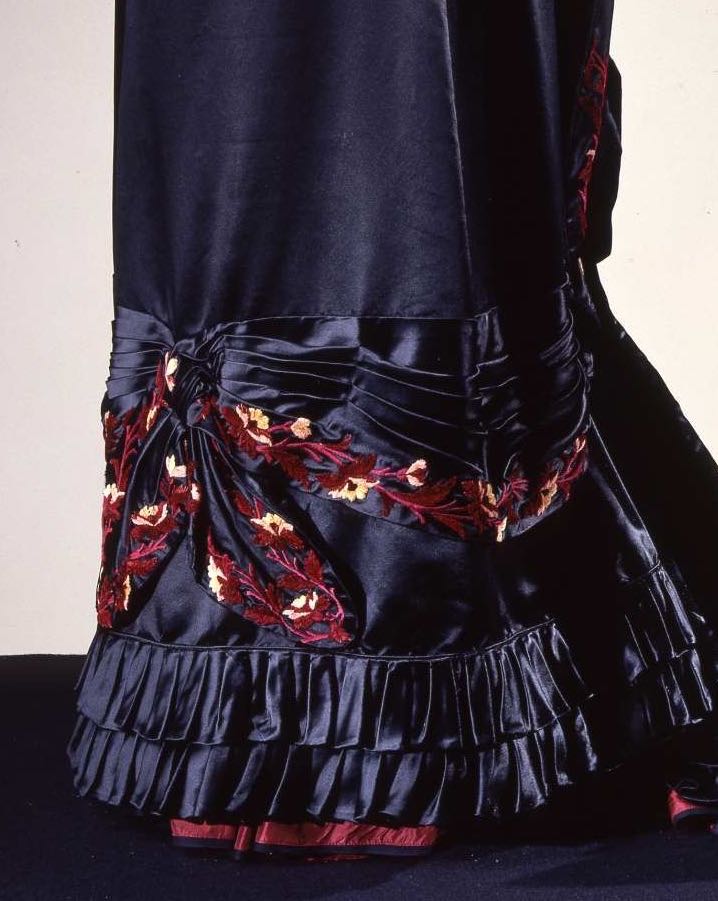
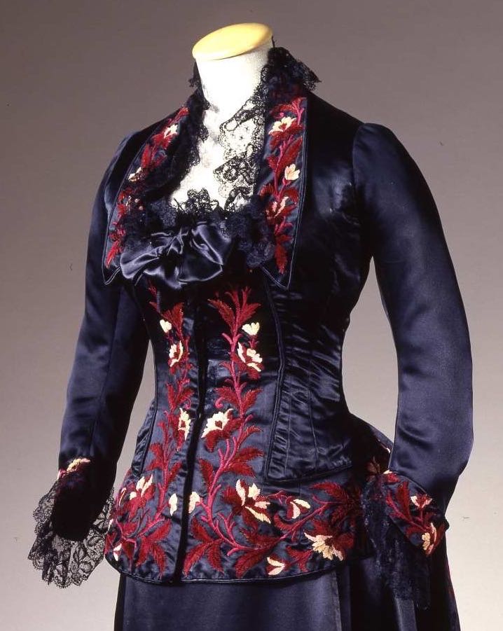
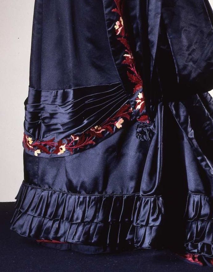
This week, a black (yes, it is black, not navy) silk reception gown decorated with a garland of embroidery in shades of maroon and amethyst, with cream flowers:
What do you think? Is the textural mix of slick satin and fluffy chenille working? What about the muted reds on black?
Rate the Dress on a Scale of 1 to 10


I want to like this more than I actually do. I’m not sure what it is, but my teenage love of goth is in love – and that’s it.
6/10 for beautiful execution that leaves me meh
OMG I LOVE IT 10/10 !!!!!
I think this gown is lovely. I like the deep blue-black, and the red-toned embroidery.
But the gown is not without its design flaws. The lace bits stuck around the collar seem more like stray cobwebs than a striking design element. The bow at the bottom of the neckline (matching the dress fabric) adds an unnecessary puffiness–it should have been eliminated. (The bow at the back of the dress, on the other hand–perfection!) And the swag + embroidery near the bottom of the skirt has an almost bondage-like look to it (which the bustle style tends to enhance, unfortunately).
Overall, it looks best from the side, and removing the black lace and bodice bow would improve it immensely. As it is, a 6.5. With the lace and extra bow removed, a 7.5 (something should be done about the skirt embroidery but I’m not quite sure what).
Simply sublime.
There is nothing on this dress that detracts. I personally would NOT want a bow centered upon my bosom but on the mannequin’s modest bust it looks fine. I’m picturing a fair complected, willowy, & waif-like brunette wearing this- think Winona Ryder, Anne Hathaway, or Helena Bonham-Carter.
10/10
Due to the Form it is not my favorite, it is not Natural and not Bustle, something in between.. But I love the color and beautiful embroidery, its amazing. And a lovely red eyecatcher at the bottom.
For me its a 8/10
9 out of 10 from me. I love the colour, the silhouette, the embroidery, the fabric and the neckline. It would have been 10 out of 10 but I deducted a point for the lace and ruffles. I’m not a fan of lace and ruffles, however much they were adored in the early 1880’s.
I like the colour, the embroidery and the lace. I think you could definitely strut around in this dress feeling very pleased with yourself. I’m giving it 8/10. Taking off 2 points for the hem which reminds me of a bedspread.
The embroidery is fantastic, but I dislike the placement, and the black lace. 7.
The embroidery is fabulous!
I would remove the bow at the neckline and the large embroidered ribbon-tail-thingies in the lower half of the skirt front.
9/10
I too would remove the awful bow on the front & the pelmet from around the hem, otherwise quite a lovely dress if you like that era. but must have been very restrictive to wear.
The colours however are tasteful, but because of the bow, pelmet & flimsy lace, & I only like plain things I only give it 7/10.
8/10. I like it. If I were to copy it I would make some changes-like colors. I’m a fan of plum purple, black not so much. I also would remove the bust bow but not because I don’t like it, but because I don’t need any enhancers there. I might keep the swag at the bottom of the skirt but I’d flip the folds down. I would simply hate trying to fish food and dirt out of the up turned folds. I’d keep the lace on the neck line and sleeves. I think they look odd because of the lighting and age may have made them look a bit ratty.
What a great “I’m a social power in this town” statement that dress must have made for the wearer. It’s the sort of thing the wife of a Bishop or politician would wear to the Countess’s reception.
The touch of the Artistic Movement influence in the floral embroidery says she’s au courant with the arts. The conservative, rich fabric and colors says she’s secure enough to not have to chase fashion.
I like the balance between slick satin and the way the pleated and shirred satin almost glitters. The flat chenille shows up well against the shiny satin, and the draped part of the skirt front balances the bodice nicely.
The black lace bits are too frail for the rest of the dress and the trim dies a bit awkwardly near the train … but for its purpose the dress does well.
9/10
It’s so magnificent and structural – this is a dress that looks as though it’s happiest being displayed by itself, with no human inside to fight it. The narrow skirt, geometric pleats, and the controlled fall of the train seem almost more sculptural than sartorial. It’s really kind of daunting.
But it’s so pretty!
The only thing I dislike is the lace – it looks scratchy, jumbled, and just put there because people always put lace there.
9.5
(I’ve fallen off commenting lately, but I’ve still been following the blog. There’s just so much to learn here.)
The floral elements are striking, and I like the combination of the colors against black.
However, I find there are just too many elements which leads to visual confusion for me. Do not like the lace at all, nor the satin neck element, and while I like the satin pleating as a rule, I don’t care for it added to the floral elements. Perhaps if the floral elements were less high contrasst I would find the pleated elements more cohesive.
8 of 10
This looks like a movie costume. It’s like someone’s highly stylish and somewhat stylised idea of 1880s fashions… Or maybe a fashion plate come to life. That sort of thing.
10/10, because it’s so… very much IT. I find nothing I would take away and nothing I would add, because either would spoil the effect; and if that’s not a 10 I don’t know what is.
Not navy? Oh, that’s disappointing; the cream and burgundy and navy that shows up on my monitor is exquisite. But on black I think it would lose something. Of course, I can’t tell for sure, because in all the pictures I see it is rendered a deep rich navy blue. So I have to imagine black.
And because I have to imagine black, I’m going to rate the imaginary dress as if it were the blue I see…and I love everything except, like others, the bustline bow and crinkly lace. Not sure what would look better there, but it seems to be a distraction from the fabulous embroidery.
9/10 for the blue dress. If I have to rate it as a black dress…8/10. 🙂
9.5 I love it. It’s as if it is a mourning gown but it’s not really sincere about it. I like the texture contrast of satin and chenille because the chenille is restrained in application, not too much and under control. It would be lovely in a film, vampire, gothic, etc.
LOVE 10/10
Reminds me of Arwen’s ‘dying dress’ from LOTR – the intensity
of the colours.
My favourite era..
10/10
In your opinion, did this take nine yards?
Love it.
That would depend entirely on how wide the fabric was, and what size this dress actually is. I could imagine a scenario where it would!
Oh my goodness, I want to see Anjelica Houston in this doing a Victorian Morticia Adams. 10/10
Hmm. I’m not a fan of the big puffy bow in front, and it looks like something’s gone a little wrong with the lace at the collar (Does it need to be starched? Some of it’s drooping and other bits are sticking straight up and it’s hard to tell what it’s actually supposed to be doing there), but I love the colors and the trim.
The combination of that wide, detailed embroidery and the simple lines of the gown is really nice, and that subtle pop of red under the hem of the skirt is just yummy.
8.5/10
Aw, I missed Angela Burdett-Coutts – although I’m sure I rated her the last time you posted her picture and she was 10/10 then.
This dress – I feel like I’ve seen it before too, I think it’s quite lovely but I’m not really feeling wildly inspired by it so I’ll say 8/10 – the draping is lovely and I prefer it as a purplish-plummy kind of dark, rather than black, which feels like it could be a bit extreme. To me, it almost looks more like a film costume than a fashionable dress. Great dress, just not driving me mad with joy.
Have I posted her before!?! I don’t think I’ve posted her before, at least not as a RTD… She’s been in inspiration posts though. If I have it’s the beginning of the end. Once I start repeating it’s time to end Rate the Dress!
I think it was more an informal rating, not a RTD! Her picture popped up the same week as a rather uninspiring RTD, I think….
Ah, that explains it! I’m not completely slipping then 😉
Oh dear. I’ve read through the comments. And it seems I really am the only person who saw this dress and thought “Oh, it’s SO UGLY…”
Er, whoops?
Hmmm, 7/10. The colors are rich and authoritative, she means business in a most delightful way. But that bunting swag at the shins? Looks like a mobile podium. Women’s suffrage? Here here! But looking like stage furnishings? Not so good.