
There was a really fascinating range of reactions to Madame Houbigant’s all-white (excepting her vivid red shawl) 1810s ensemble last week. Some of you felt it flattered her more in the portrait than in real life, and some of you felt the combination of fashionably relaxed lounging didn’t pair with the heavy silk, and just made it look like she had poor posture, and that in real life, standing up straight, she would have looked much nicer. You were fairly universally not in favour of her extremely ruffled chemisette. All those ruffles are just one of those aspects of this era’s fashions that are hard to love with modern eyes!
Madame Houbigant came in at 7 out of 10, and while not a winner in the sartorial sense, the topics of discussion that came out of the post definitely make it a winner in my books!
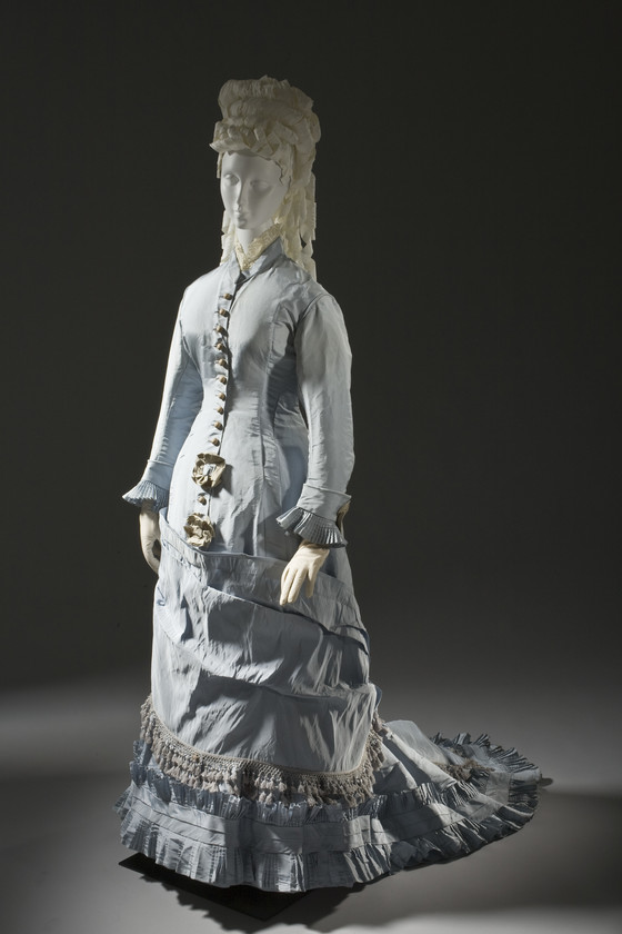
This week’s 1880s natural form dress reminds me of last week’s, in the expanses of smooth silk, and the way it plays with proportions, only with the ruffles and interest inverted: last week they were up around the neck, this week they are down around the hem. (There is another element that reminds me of a different, recent rate the dress, but I dare not mention it…)
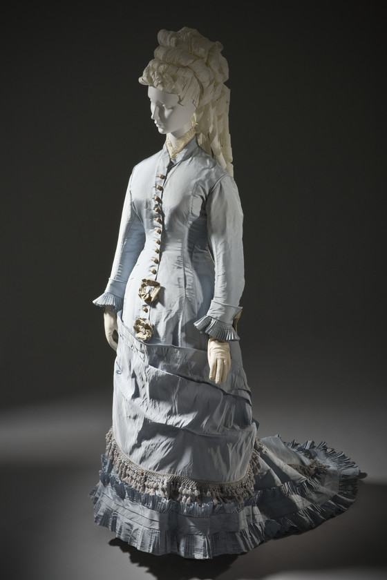
With its extremely fitted bodice and slim upper skirt, with draping and ornamentation that seems to tie around the skirt, confining its fullness, only to explode in a plethora of pleats at the hem, this dress is classic natural form.
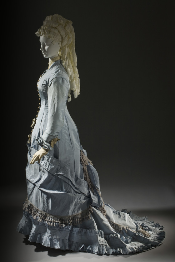
The pale colours, while not necessarily characteristic of the natural form era, keep the focus of the dress on the drapery and ornamentation. The material itself becomes a background to the way in which it is manipulated and shaped.
(We’re going to ignore the hairstyle. The wigmaker had clearly just perfected their paper spiral technique the week they did this one, and got a little carried away showing it off…)
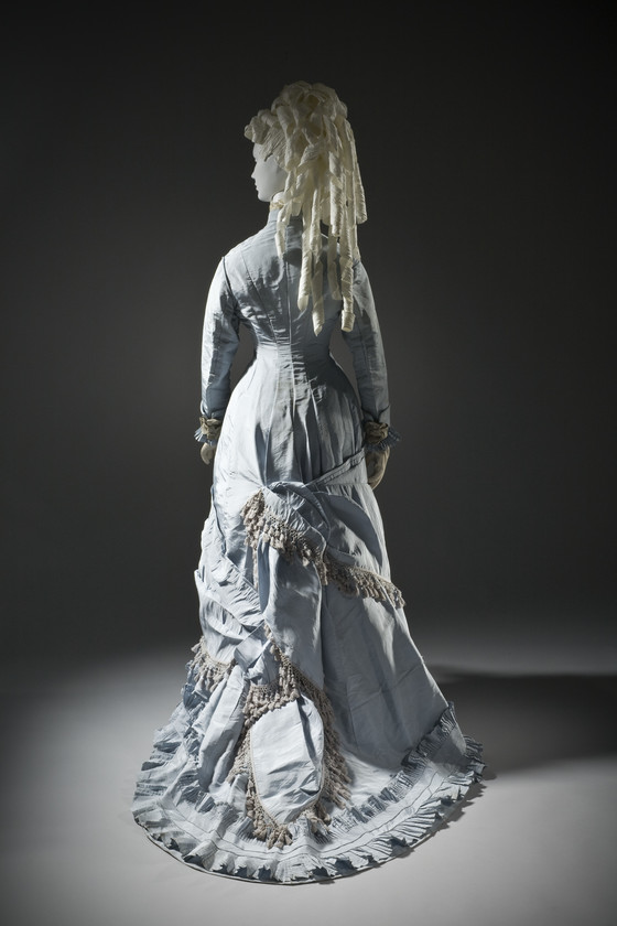
I think this dress does a particularly interesting job of balancing the very simple, streamlined upper body shaping, with the abundance of trims, textures, and detailing around the hem.
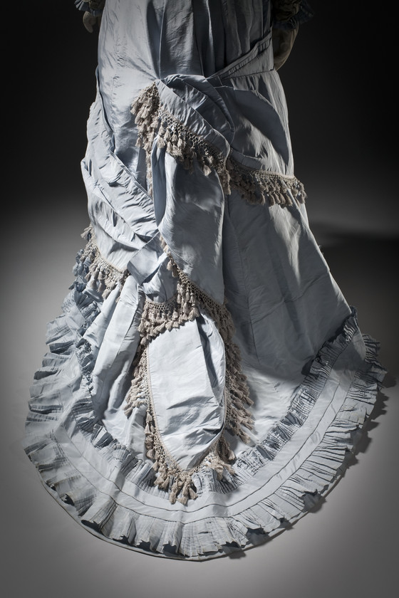
The way the drapery spirals around the lower body is also quite fascinating. Notice how the the drapery is intended to give the effect of being knotted around the dress, and the swags slip through loops of other fabric, fringe and all.
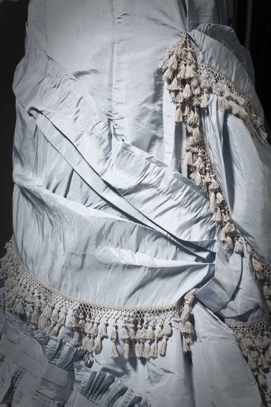
It’s almost as if is meant to give the illusion of folds of fabric artfully swagged around the wearer at the last minute. The overall effect is a conceit of carelessness, in carefully planned folds of meticulously trimmed taffeta.
What do you think? Does the faux-casual drapery effect work? Is this the epitome of elegance, circa 1880s, or a bit too contrived and contrast-y?
Rate the Dress on a Scale of 1 to 10
Two bows there now?
Everything else I could say about those bows aside, why two? Why not three? Two just makes it look like you can’t commit yourself.
While part of me is wierdly digging the over-the-top hair, I’ve needed a few passes to warm to those swags. In some ways, it’s Whirlpool: The Dress. Or maybe Glacial Migration: The Dress.
But there is something about how a dress can look like it’s emerging from itself – or going through metamorphosis – that I often like. And your remark about how the dress, despite being so controlled, also looks as if it was carelessly pinned together, makes me look at it more favorably.
Thinking of it in motion – all those bobbling, jangling tassels would really add to the watery feel of the dress, creating a sort of spindrift effect. I’m not sure whether that would add to the dress though or make it look a little silly.
7
The center front bows – just no. Even if the placement were more graceful, they would still look like an afterthought of what to do with remaining scraps of expensive fabric.
Except for that, I find the front view admirably graceful, but the rear view confused in the extreme. The pleating, ruching and even the tasseled trim are restrained by the monotone approach, but my eyes are confused by the swoops and wads of how the yardage of fabric has been handled.
The fabrics are appropriately luxurious, and I’ve always loved the natural form silhouette, And the train is nice–not too long, but long enough to be an attention-getter. The collar is interesting–I wish I could see it better in the photos.
Unfortunately, those details aren’t enough to lift this dress out of the “meh” category for me. My biggest problems with the design:
* The pale blue fabric and pale gray trim make this costume look as though it belongs to a ghost–it’s all hard to distinguish from ectoplasm.
* I’m glad, Leimomi, that you explained about the spiral “faux casual” draping; otherwise I would have misread what I’m seeing. The result, though, looks more as though a carefully planned effect had come undone than as though the designer aimed at artful disarray.
* The two bows on the abdomen area seem pointless, but at least they’re not big enough to be a glaring problem.
6.5 out of 10.
It reminds me of one of those birthday cakes with the dolls poking out the top of the cake. I think it’s the pastel. But also, usually when I see this silhouette most of the skirt is at the back whilst this one is quite rounded (the train notwithstanding). It’s rather odd. You’d think it’d make it look more balanced but it doesn’t somehow.
I’m not fond of the bows, I think they look stuck on as an afterthought. The colour is okay but I think it needs a contrast colour or something. Unfortunately, to me, the whole thing comes across as a little bit bland.
4/10
I really like it minus the two bows in the front which to me just don’t belong there. Otherwise it is beautifully draped and I love all the trim.
I am giving it 8/10
I love it! Of course, I love natural form to the moon, anyway. The only thing I would change it to take off the ecru rosettes on the front. 9.5
Oh dear. Those bows. Beyond the lack of delicacy in placement, they also look like they are trying to hide a tear or a stain, rather than being deliberately placed. I do really like the swag though – usually I find it hard to like them because of my modern ideas of balance, but i like the draped knotted effect on this, it makes it more balanced and deliberate rather than just a honking great strip of fabric. I don’t love the colourscheme but I can see it looking magical on the right wearer with the right complexion.
I’m going to pretend/assume that the bows were not an original part of the design (maybe the original owner insisted they be added? I can’t imagine the designer of that drape also plonking those on, but that might be historical revisionism) so that’s an 8/10 for me.
I like the form, but the overall effect this gives me is of a sculpture, not a dress. Like one of those plaster of Paris deals. Could we have some colour? Anything other than this dreary grey?
THe bows didn’t bother me too much before I read other comments, so I can’t in conscience take off much for that, but still regardless of how good the drape is, I can’t give it more than 6.5
I’ll let my bias show – I hate natural form. Hate it. With a passion. And this dress is very natural form.
It is the false perspective messing up the proportions of the wearer’s body, shortening the legs and lengthening the torso – something that I, with my already large upper/lower body ratio am extremely conscious of.
It is the lack of a good place for the draperies and trimmings to sit pretty.
It is the unbalanced method of trimming that makes it look as if the dress is collapsing under its own weight and all the fancy (and expensive!) finery is falling of it and into the mud.
In short, there is nothing about the silhouette of the era that I can really stand.
This dress in particular is a bit of a mess, as it seems the decorator couldn’t even keep to a consistent theme (fringe! drapings! self trim pleats! awkward bow thingies! so much to chose from, I better throw on everything and see where they’ll stick!) at least the colour theme is boringly inoffensive. The only good thing I can say about it is that if you cover everything below the dress’ waist what’s left looks fine.
Grudgingly, 1.5/10
Well, they started at the top and when they got below the waist they started to get bored…
First it was one bow, then it was another…
Then a fold, and then a pleat…
THEN STUFF IT JUST SEW EVERYTHING ON!!
Erm, it’s sort of pretty at a quick glance. Apart from the two little bows to hide the coffee stains. Let’s say I hope the wearer liked it.
6/10, because there’s nothing dreadfully /wrong/ with it. Just nothing dreadfully right, either.
Not feeling this one. I do like the clever drapery, but it is sitting too low on the front of the skirt to be flattering, and the tassels bordering it are mushed up to the pleated trim along the hem! That’s driving me crazy!
Bows, pleats, swags, tassels – there’s just way too much going on, and none of it works harmoniously together. I especially dislike the tassel trim. With taffeta in such a icy colour it would have been better to stick with structural trimming – the tassels loo far too soft and ruin the glacial goddess potential.
The back view is nicer than the front, but not by enough to save this dress from a 4/10
I like the greyish blue color, the shape isn’t bad. The two rosette bows? I have to disagree with an earlier commenter, they’re not to hide coffee stains. They’re a very clever nod to her humanity, her birth. One highlights her naval, and the other highlights… no? Yeah, probably coffee stains.
I guess the curtain fringe was on clearance too.
5/10
The swirl is a problem. It’s not swirly enough to look intentional and so it looks like “oh no I screwed this up! Uh… maybe fold it? No one will know”
I like the passementerie, the pleating is so delightfully frothy, and the smoothness of the bodice is great. But that swirl. I don’t even mind the bows or the color.
7/10 for the swirl
I really like this. I can cope with OTT decoration/ruffles etc better around the hem than I can around the neck. Strangled by decoration, that poor nice woman, last week. This is sleek and very smart.
9 out of 10.
I love it, the color, the fringes, the straight front and the overwhelming skirt with all pleats and ruffels. I found only the bows a bit missplaced. Either none or 3 bows would be nicer.
9 of 10
Ok, so the 2 bows on the tummy need to go. I wonder if they’d look better placed higher towards the neck?
I think us Moderns are so used the the supermodel ideal of ridiculously long legs and long waisted torso that this ‘natural form’ of an actual human with an average figure looks a bit foreshortened & stump to us..
I’d have preferred more ruffles (as used as trim around the bottom of the dress) to the tassels but perhaps they serve a purpose to weight the fabric down? But that might just be my modern minimalistic tastes too. The tassels make it look as if she’s yanked the dining room curtains down & swathed them about her.
7/10
I love it. It’s cleverly made, artful and graceful and well balanced, and the bows on the front are neither here nor there to me as they cold be cut off so easily. SO much amazing showig off of the dressmaker’s art in this. Yum! The colour is so good at showing off the details too – I dislike light blue quite passionately, but when it is used so well I forgive it its usual passive agressive blandness.
9/10 from me.
Meanwhile, being the sort of petson who likes interesting seamlines and construction, I love pale blue most of the time…
Sadly, this one did not convince me as it did you. I guess it’s because I tend to go for a different sort of interesting construction…
Take away the awkward two bows on the front (when decorating, items should be in odd numbers otherwise the eye is drawn to the space between the items) and I LOVE EVERYTHING about this dress.
I think the draping is utter genius and flows beautifully. And despite what others have said about ‘marble statue’ effect of the pale colours and OTT hair, I think the comparison to a marble statue with the exquisite frothy draping is nice, and that the OTT hair balances out the busy bottom trim.
9/10
the dress is, all right. it does look as though a trimming store vomited on it and the bows on the tummy look like they are advertising “strong child bearing hips here!” the color is so very bland and insignificant, like the wearer is in 1/2 mourning. so I find the dress a 4. it’s not dreadful, but not interesting either. inoffensive is the best it can hope for from me.
I love that icy blue, and it would look striking on a raven haired woman.
The dress itself…… Well it’s not too bad, not thrilling, but not a complete washout either.
Ageed. Nix the bows. I don’t think they’re hiding coffee stains, there’s one on each cuff, but maybe they put them on the cuffs to balance the bows hiding the coffee stains? Their safest bet would’ve been to put one at the throat to balance out the two on the cuffs….but then, what would they’ve done about the coffee stains?
One detail that makes my skin crawl when I see it on any piece of clothing is tassle trim! Just rip it off! Take the scissors and get rid of it! Why the Victorian fixation with tassles, tassles on everything?! The “look” reminds me of “the surrey with the fringe on the top” To the modern eye they’re ghastly and to me, cheap looking. But, that’s the modern eye, so the client and her dressmaker can’t be blamed for using it. However, in this case, it interferes with the asymmetric draping of the dress, I can’t figure out where it’s going and the asymmetry of the drape is the only redeeming detail of the natural form. Those are the only two things that bother me. The bows are a poor choice and the tassles can’t be helped. The pleated ruffles are pretty, and the train, fluffed up and without the tassles would be lovely. The dress maker’s skills are impressive.
I’ll bet all that beautiful taffeta made a luxurious swish!
8/10
I like the concept of this dress. I even like most of the execution. The fabric is lovely, I can get over the tassel/fringe trim (not my favourite) and it’s beautifully constructed. The collar is nice and those frilly pleated cuffs make me happy. BUT all I can think of as I look at it is that top pleat of the skirt swirl, and how it points UP, and how it would catch every crumb and scrap of anything that would be dropped. It’s like those pocket bibs for babies, but on an elegant skirt.
Also – I’d remove the double crotch bows, nobody needs that.
7/10 because it’s beautifully made and has so much potential, but doesn’t *quite* meet the mark.
I agree with a previous poster who said this had a ghostly look – it strikes me as something an 1880s Gray Lady would wear. A bit too shadowy…though it would probably look great on a pale-skinned redhead.
That said, the line of the dress itself is lovely and reminds me of Laura Ingalls Wilder’s lengthy and loving description of her sister Mary’s beautifully fitted dress which she wore for her arrival at the college for the blind – it dated to about the same period.
But, oh, the trim! Those ill-placed bows gotta go. As for the rest – swirly bits, tassels, and all – I really would like to see this dress in real life to figure out just what the actual effect is. Not sure I am clear about the dressmaker’s intentions…perhaps this is just what was intended…or perhaps not.
In any case, it adds to the nightmarish, ghostly, haunted, rather Gothic quality.
Timely at present – this dress should be modeled by above-mentioned redhead and should be photographed on the front steps of an 1880s Italianate-Gothic house with a tower, with a couple of Jack o’ lanterns nearby, for full effect.
So: basic dress: 8.5.
Dress with all the bows, tassels, drapes, and probably bells and whistles hidden somewhere: 6.
Average: 7.25.
But! Dress with all the bows, tassels, etc. – plus jack o’ lanterns, Italianate Gothic house – and slightly witchy redhead : 9. Just for the spooky drama!
Oh no more bows! Looks like she didn’t like her curtains but hey I’ll use them as a dress.
Sorry I just hate the fussiness of it all although I like the colour. So 4/10
Ooh I am such a sucker for this time period. Honestly, natural form is my favorite historical fashion era, with 1770-80s being second. This is a dress where I if I look at the overall silhouette and effect, I love it(especially from the back), but if I look at the particulars, I find lots to criticize. I wonder if the fabric or the fringe trim have faded oddly, because I don’t think they go well together. I’m not a huge fan of the fabric color at all, it looks washed out to me(which is why I wondered if it’s faded). If I imagine it being a few shades darker/brighter, then I think it would be lovely.
I love the narrow pleated trim around the hem(classic Natural Form trim), but am ambivalent about the fringe(and I am not a fringe hater like some seem to be). I am also not a bow hater, but I don’t see the point of those two bows on the front. I feel like that motif needed to either be repeated more times to give some coherence, or left off entirely.
I really do like the drapery. Give me a sewing pattern of this dress and I would totally make it. In different fabrics, colors, and trims this could be a showstopper. As is I think I would still wear it, but with a lot of reservations. I really have to wonder if the fabric is faded because the color is really the biggest flaw to me. If that blue just had a bit more life to it… Oh well.
Rating: 7.0
So beautiful, elaborate skirt, fine bodice, sleeves that don’t seem to quite fit with the rest of it somehow (imo), and afterthought bow/flower things.
I’ll say 7 overall
It would definitely sit better with me without the row of buttons… I try to overlook that, knowing that’s my particular rather irrational bias, but the bows don’t help with the look of the front.
And the back mostly looks messy.
I like the fabric, though, and I do like the dynamics of the thing, so if I take the outlines if it and try to fill in different details…
… well, obviously, that’s not how this works.
6/10
I like the gathered up “faux casual” skirt, but it has far too many tassels. The bow/flower decorations on the front aren’t so bad as a concept, but these in particular look like a rushed, “I need to add more interest to the bodice and only have five minutes until she comes to pick up the dress” type of thing. They’re lumpy flowers. I also don’t like the sleeves, though I don’t have much explanation except that they look boring (though I’m sure if they had more trim or any tassels, I’d call them over-decorated…)
6/10 because I’m feeling picky this morning.