We’ve been on a great run of high scores for Rate the Dress. Last week’s dinner dress elicited lots of words like ‘smart’ and ‘restrained’ and ‘elegant’. I feel pretty confident predicting that this week’s 1910s day dress won’t be getting quite those words – but there are other ways to compliment a frock! Let’s see if it is compliments, or criticism.
Last week: A ca. 1820 dinner dress in chine silk
As mentioned, very positive reactions.
The Total: 9.2 out of 10
Another winner!
This week:
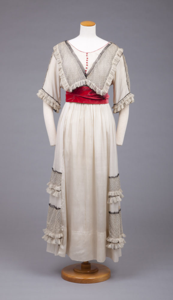
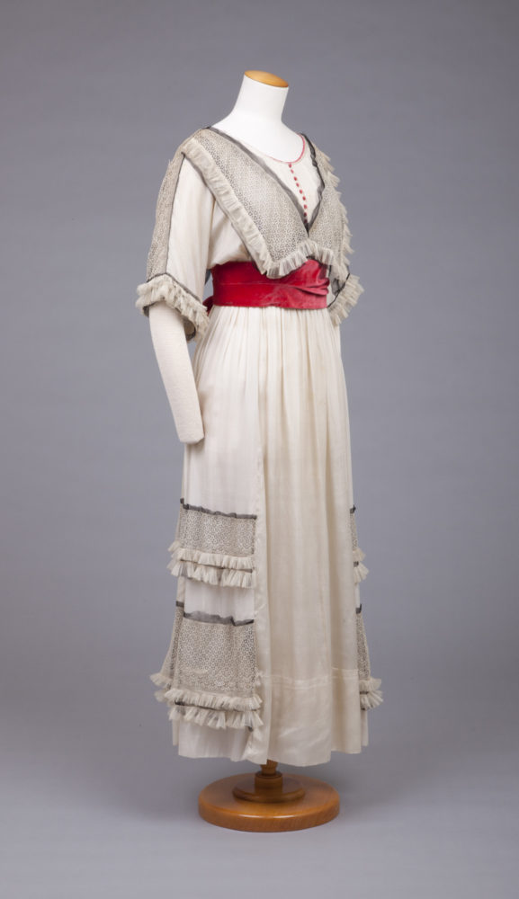
This week I’m going from dark to light, but to a garment and era that actually repeats many of the same shapes and design lines seen ca. 1820, just not in an immediately obvious way. Start looking, and you’ll see how many are there, from the V-shaped upper bodice interest, to the horizontal hem embellishments.
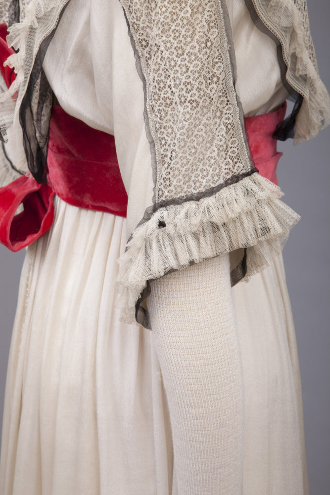
The long sleeves and general design of the dress mark it as daywear. However, the layering of luxe silk and lace fabrics, and inclusion of the bold rose-red velvet sash are elements more typical of evening fashions. This suggests the dress was worn for quite a formal daytime event.
It’s definitely a youthful garment: something for a girl’s high-school or college graduation perhaps.
The inclusion of the bright rose-red, and the black tulle, do give it a definite sense of aspiring maturity peeking out from the sweet girlhood overtones of the white ruffles.
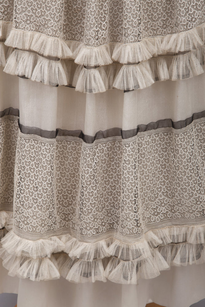
Though the silhouette is still relatively long and slim, the gathered skirt, and nod towards side and back gathering in the trim that covers the sides and back of the skirt hint towards the growing volume of 1910s skirts. The volume would peak in 1916 with the brief vogue for the bell-shaped crinoline-revival silhouette.
What do you think? Does this balance youth and innocence with its aspirations to be a bit daring and avant garde? Does the mix of textures and colours add depth and interest, or just make it not-one-thing or the other?

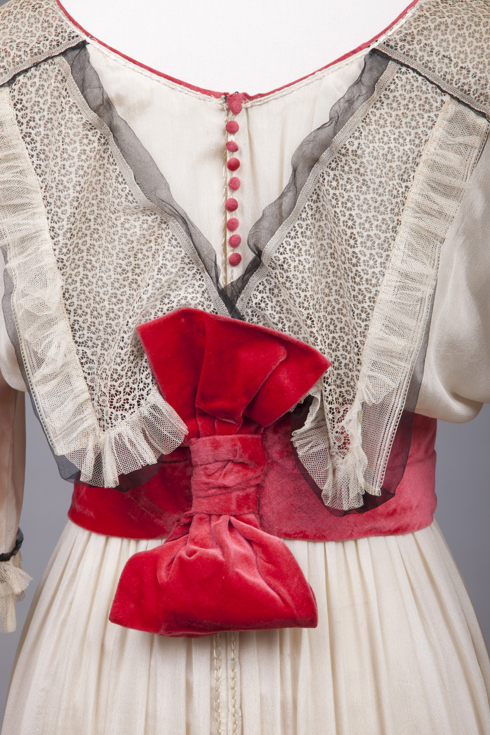

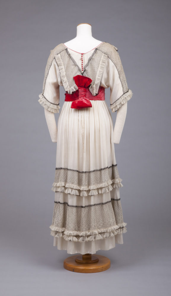
The bow on the back seems like the finale of an overly complicated construction that painted itself into the corner. It looks bad the way it is oriented. But I get the feeling that if thedressmaker could just plant the bow on to cover the end of the sash, they could just call this project completed.
This dress took some risks, and I like that. The hem is nicely unexpected. I even like the sleeves. The proportions on the bodice don’t appeal to me, however. The pop of red is fun, and livens up something that could have easily taken a turn for the dreary. No wait. I’m changing my thoughts on the hem. It seems a little odd in the front. Like The Tailor of Gloucester ran out of twist.
7/10
With last week’s dress, I loved all the detail and the design–it was just the colorway of the fabric I couldn’t stand.
This week, the colors are fine (I’m assuming the grayish tinge to the white in the dress is due to age) but the details just look dorky. Too many little details that don’t really go with each other (the tulle ruffles, the tiny red buttons, the big inset areas of lace), all highlighted, not drawn together, by a big red bow!
A 6 out of 10.
When I saw the preview picture, I assumed that was the gown’s front and braced myself. But I was pleasantly surprised when I saw the actual dress. It’s breezy and girlish, but has some elegance. I like the lace panels, especially up the sleeves, and the little flounces. The basic kimono-ish silhouette is appealing, and the more I look at it, the more I like the vertical bow. I’m not a fan of big floppy collars in general, but this one works well with the dress itself, and I’m not going to say no to a row of little red buttons.
8.5
I had much the same reactions as Catherine Raymond – fine with the color, but put off by some of the details – for me the most offensive was the excess of net ruffles (maybe the designer was thinking of light-housekeeping, since those ruffles would probably be wonderful for dusting).
The bow is tragic.
7 of 10
“That bow is tragic” was exactly what I was thinking but could not quite find the words for!
I really wanted to like this dress! I feel like someone should take this as a proof-of-concept, you know, a slender and airy white dress with red accents, and make something that didn’t get so bogged down in problematic details.
Gosh this is tricky. I rather like it in many ways but the black tulle under the lace details reads dirty and grey. I can imagine the dressmaker being dissatisfied that the details weren’t showing up enough, so tried a few things and this seemed to work. It makes me strongly wonder whether the primary intention was to have it show up well in a photograph, as the extra contrast would be perfect for that. And the red would read well in black and white. And those odd shadowy bits of tulle along the borders that look like they need trimming back too.
For that reason I give it an 8 because I think that is very clever.
8.
It might have been pretty and girlish when new but now it just looks dreary. I’ve been trying to make my mind see it new, but I just can’t. Do like the pop of red, though.
6/10
Overall silhouette is lovely, but I’m not a fan of the colors — it looks both dingy and garish (that bow contrast). I’m also not a fan that the skirt ruffles stop in front (I’d rather they continued). I do like the button detail!
7.5/10
This is hideous. I hate the mash-up of different textures, I hate each texture on its own, and I hate the color scheme.
Also, I hate the sleeves.
2/10.
The general silhouette appeals to me, but the rest of it… Doesn’t. I like the combination of colours well enough, but that sideways bow looks misplaced and awkward, and the rest of the adornments just don’t do it for me.
5/10
I like it! It might be considered overly fussy, perhaps, but I enjoy the layers of detail upon detail – the more you look, the more you see – and marvel at the endless inventiveness of the seamstress. The sash and bow are my favourite portion. (When I saw the first picture of that, I’ll confess to a little squeak of delight)! What a colour and such a sumptuous contrast to the rest of the garment. This is what raises it above the level of an ordinary Edwardian day dress, at least in my eyes. 10/10
I really like it… The layers, colir, and understated lacieness… But the sideways bow I can download without, or flip it.
9/10
Blech! I like the colors and contrast well enough, and the lace panels backed with a darker organza are a neat trick, but I violently reject that sideways bow on the back of the sash. Also, there is no earthly reason to put collar wings on the back if they are also on the front; I don’t care if it is only symbolically a collar! Rage rage rage, and if you want to make part of a skirt look like an overskirt, let it be it’s own layer!
(Inhale…exhale)
Sorry, dress, it’s not you, it’s me.
Well, maybe a little me, but mostly you.
3/10
What saves the dress from the depths of fussiness is the limited palette of materials – unfigured white crepe with one kind of white tape-lace and the white hexagonal net ruffled and the plain unruffled black chiffon like a shadow outlining the bands and neckline. Subtle and monochromatic, stylish and tasteful.
A touch of color, perhaps a hint that a young lady is coming out of mourning and ready to entertain and be entertained? Or just summer whites with a sophisticated “pop”of colour?
The bow drives me nuts because it messes up the line of the collars – I think it was a bad addition, a bad repair, or something is missing. If I were going to wear the dress, I would turn it 90 degrees and make it look like a BOW !!!!
(because my grandmother would have been the right age to wear this at a summer lawn party at Mary Pickford’s, and she would have been lovely in it, but I can’t get past the bow … )
9.5
There are some things I really like about this dress. The colours and the use of lace are nice. I’m fully on board with the skirt decoration because it reminds me of Minoan kilts, which may not be a coincidence considering the date of the Knossos excavations and the extent to which Minoan iconography resonated with early 20th century aesthetics. I’m not entirely sure if I like the collar, but I do appreciate the way it reflects Minoan necklines. All up, it’s a fine example of early 20th century does late Bronze Age. It’s just, that bow… If only we could remove that bow.
9/10
I would love to wear this dress…with a few tweaks. First, I would turn that poor bow 90 degrees so it would look more like a bow and less like a sheaf of grain stuck to the back of the dress. Then, I’d change the collar in the back so you can tell the front and back apart better…I was so confused by that aspect at first! Finally, I would continue the skirt ruffles all the way around. Stopping them in the front just looks awkward and cheap, like they’re trying to use less fabric (or ran out!). But the colors? The frills? The laciness? The tiny accents of red that really make this dress pop? The sleeves? YES! Love those!
Overall rating: 7/10. They did a lot of things right, but what they didn’t get right is too jarring and obvious to ignore.
Clearly intended to be worn by a young lady in her late teens at a matinee piano recital!
Hence, the vertical red bow, back collar details, elbow length ruffled sleeves…all designed to make the pianist look as good as she sounded.
Way back when the fabrics and trims were their crisp, pristine best, of course…
9. But only if worn for a matinee piano recital!
Posted just above before I could note that the Edwardian matinee recital’s piano clearly faced the audience, while the piano students sat facing the piano.
So like some wedding gowns, the rear detail of the recital dresses were more important that the front. If my theory is correct, I’d like to see what the other young ladies wore!
Um. Not quite. And that bow?
Forgot to rate and didn’t catch it quick enough.
3/10
This poor dress looks like a desperate remake. That’s the only explanation for that plain ivory panel down the front that interrupts the horizontal rows of lace fabric that should have gone all the way around. I truly despise the V-shaped insert front and back with the buttons. I would possibly have hated it less if that feature were only on the back of the dress. The sleeves either need to be gathered close to the arm at the bottom, or had a nice long undersleeve. Then there’s the bow. Oh, dear. The color is a nice contrast to the rest of the dress, but the velvet seems too heavy for the gauzy/filmy texture of the other materials. Also, the bow itself looks like it was hastily tacked together at the last minute by someone who wasn’t actually a dressmaker (same as that dreadful panel of plain ivory running down the front, which looks like an addition to either make the skirt larger or replace a damaged section).
I don’t hate everything, though. Unlike some others, I actually like the gathered tulle. I also especially love the narrow insert of black chiffon or tulle (I couldn’t quite tell which) breaking up all the ivory. I also like the lace fabric.
I feel like this dress had potential, but the dressmaker wasn’t creative or experienced enough to make a success of it (and then what looks to me like a desperate overhaul to me occurred).
4 out of 10.