
My Rate the Dress choices have been all mixed up when it comes to themes lately: we had a ball, and than an evening in in a dressing gown, and now we’re having dinner, with an 1820s dress that is subdued from a distance, but interesting up close. Can it keep up the string of 9+ ratings? Let’s find out!
Last week: An 1880s dressing gown
While you loved the embroidery and the overall review was extremely positive, the dressing gown’s silhouette came in for a bit of criticism, as did the cord belt.
Unfortunately for those who didn’t like it, I’m 90% sure the style of belt is accurate (and think there is a good chance the one shown is the original), based on images of similar robes in catalogues of the period. I’ll have to do a bit of research and see if I can find the images I’m thinking of.
The Total: 9.4 out of 10
It’s nice to know a dressing gown can impress almost as much as a lovely ballgown!
(and I suspect many of us are more good-book-&-dressing-gown people than ballgown people most nights, so that’s quite fitting 😉 )
This week: A ca. 1820 dinner dress in chine silk
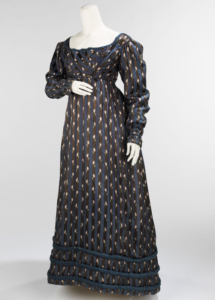
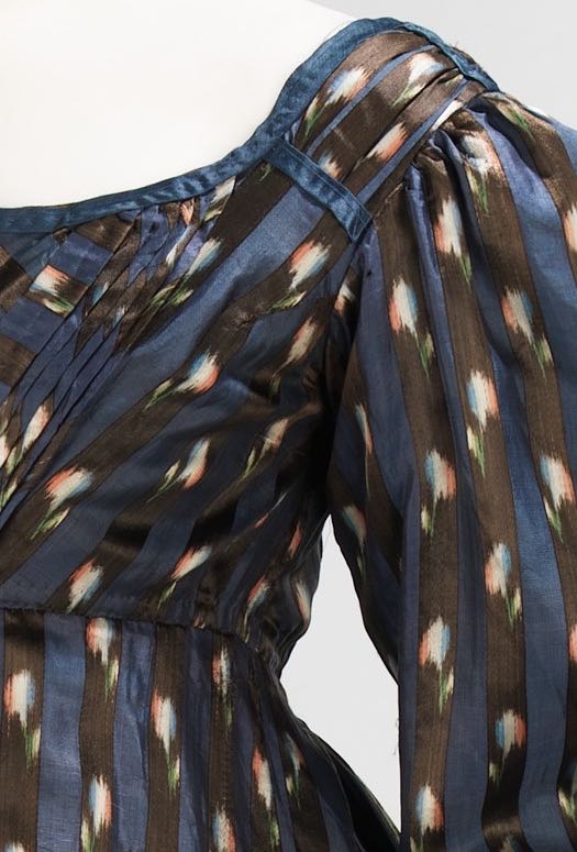
This ca. 1820 dinner dress seems quite subdued and dark when you see the overall image:
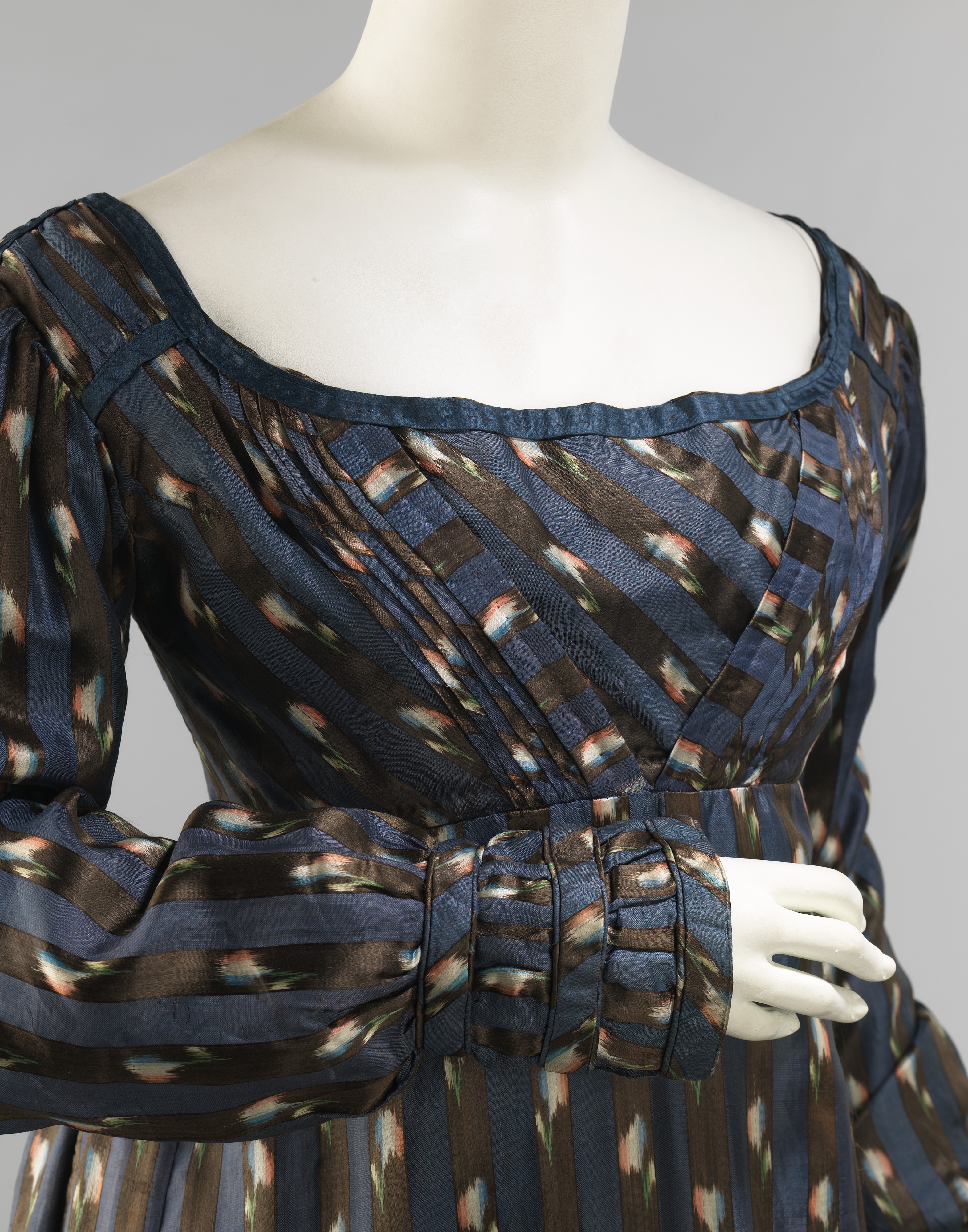
Up close, there is a lot of visual interest. The fabric is a mix of plain weave taffeta in blue, and satin weave chine in black with white, pink and green flowers:

Dinner dress, ca. 1820, British, silk, cotton, Metropolitan Museum of Art, 2009.300.3370
The design details, while subtle and restrained in the dark fabric, make full use of the striped pattern, and keep the focus on the hands and torso: areas that would have been most in view at dinner.
Dinner dress, ca. 1820, British, silk, cotton, Metropolitan Museum of Art, 2009.300.3370
Everything in the dress is equal parts fashion & practicality, from the padded hem, which would help keep the wearer from tangling it when she walked:
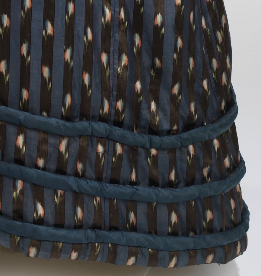
Dinner dress, ca. 1820, British, silk, cotton, Metropolitan Museum of Art, 2009.300.3370
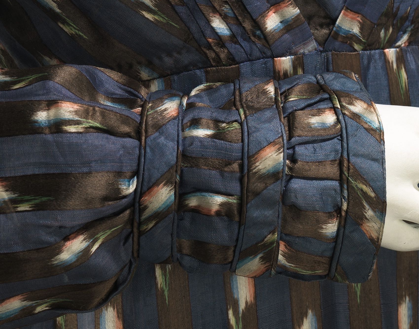
To the cuff trimmings, which would keep the trendy extra-long late 1810s sleeves from dragging in the dinner:

Dinner dress, ca. 1820, British, silk, cotton, Metropolitan Museum of Art, 2009.300.3370
It definitely wasn’t intended to be a showstopper dress, but a quietly elegant staple that would see a woman happily through a few seasons of suppers.
Dinner dress, ca. 1820, British, silk, cotton, Metropolitan Museum of Art, 2009.300.3370
As an example of this, what do you think? The perfect late Regency little black dress? Or still a bit blah?
Rate the Dress on a Scale of 1 to 10
A reminder about rating — feel free to be critical if you don’t like a thing, but make sure that your comments aren’t actually insulting to those who do like a garment. Our different tastes are what make Rate the Dress so interesting. However it’s no fun when a comment implies that anyone who doesn’t agree with it, or who would wear a garment, is totally lacking in taste.
(as usual, nothing more complicated than a .5. I also hugely appreciate it if you only do one rating, and set it on a line at the very end of your comment, so I can find it! Thanks in advance!)
I’m of two minds. I adore the way they’ve taken advantage of the stripe. The details are elegant and restrained. I love dark blues, and I could get behind dark blue and black stripes but I strongly dislike the flower-splotches! They remind me of a ’90s popsicle wrapper, with a kind of smear of red, white, and blue. Maybe it would look nicer in candlelight, but I find it a big jarring here.
8/10
I am in love with the gorgeous piping and pleating and striping! Even the dark brown hasn’t thrown me off as much as it usually does. 9/10
“Smart” is the word that comes to mind. I would love to see a red head wear it. 9/10, only because the right person need to wear it. I took to it immediately.
While the colorway bums me out, I love how they use the pattern to its utmost advantage. The construction is divine. The stripes are figure flattering, the sleeves and piping are impressive.
9/10
It’s a showstopper in my eyes. I love the deep, lustrous colours, the chine print, the pleating, and the way the striped fabric has been used to accentuate both the overall silhouette and the decorative elements. There’s a lot going on here, and a lot of texture, but the overall effect is still harmonious and tasteful.
10/10
I’ve always loved Regency, but something about the stripes on the dress seem a little off. Still a lovely silhouette!
9/10
I’m really conflicted about this one.
I like the silhouette here, and the subtle arrangement of pleats and piecing of the chine print and the blue fabric on the front of the torso and the sleeve ends. The blue accents down the skirt are also lovely, and the silk itself still has a wonderful sheen.
On the other hand, the chine fabric itself is drab, and the padded bands at the bottom of the skirt (yes, I know they’re a period feature) somehow look as though they were tacked on as an afterthought. Crookedly.
In summary, the design is superlative (except for those skirt bands), but the DARK brown and pale bits of the chine still add up to dull and drab despite the excellent design. I’m sad to say this, because the design work is impressive, but the color scheme kills a lot of the impact that the gown could have had.
7 out of 10.
This looks exactly like what a pre-aniline black dye looks like when it has faded slightly to dark brown, so I’m pretty sure it was originally black, if that makes any difference to how you see it 🙂
If anything, the current dark brownness of the fabric is a slight improvement. My problem is the combination of the two dark colors with the white-tinged with multi-color splotches, as Meira mentioned.
I agree about the brown being an improvement on the black. For me, the starker contrast would make the gown look a little confused, though I’d probably still like it.
I like this dress! The stripe and blurred flower print keep it from looking too bland, while the deep blue is easy to match accessories to. Dark colors generally don’t look good on me (I have pale skin and brown hair, so wearing dark colors makes me look drab) but just because it wouldn’t work for me does not mean it can’t look good on someone else. I agree with Sue that a redhead would look amazing in this dress!
Overall verdict: 9 out of 10. That point off is for the padded rolls around the hem. They may well be period accurate, but they look like draft stoppers for under doors, and there were many, more appealing ways to trim the hem of a dress in this period.
Love! Chine is one of my favourites and I love how atypical this dress is. All the elegance of the era in a striking darker fabric but with gorgeous blues and the beautiful sprigs to relieve it. I think it’s an absolute winner. I also can’t believe I didn’t realise the purpose of hem rouleaux.
Having said that, it’s not a 10 from me because there’s something kind of missing, I wish I could see it with the accessories it would originally have had. I’m going to say 8.5/10
10/10 from me. I love it, and I would love to wear it.
To me this dress is exquisite in every way. I love ikat and think that’s mostly what makes the fabric so interesting but then to have the stripes in between makes it doubly so. The fabric could not have been better, the construction of the dress is also very much to my liking, I like restrained, taking advantage of what the fabric offers. I am less keen on the padded hemline but the dress has to “work” when on so I won’t let it count negatively. Love the detail on the torso, that is what I sometimes do on my own Regency dresses. For me there is no doubt: 10/10
10/10 for me too. I just love everything about this dress.
This is not my favorite era for clothing because of the usual frou-frou, but this is elegantly conservative while being totally fashionable.
Whoever made this was one heck of a seamstress! The stripes impeccably enhance the shape of the dress. The floral motif is matched on the center bodice pleat, which is tacked flat with teensy pick stitches. The bodice is evenly pleated. The bodice edging is the same width as the solid stripe. There are FIVE piped bands in the cuff (three bias, two straight). The piping is tiny and uniform. The skirt stripes are seamed together almost invisibly.
Not keen on the hem rolls, but it was the fashion, and practical as well. At least they didn’t tart them up with shirring between the bands. Or contrast piping.
I like the fabric. From a distance it looks like a common dotted with stripes print, and up close you see the floral motif. Allowing for dye color shifts with age, I assume this would have been black with the satin-weave floral in colors.
9.5
I volunteer to be the red head who wears this lovely gown! It is beautiful to my eyes, and I can’t add anything to all the compliments already given.
10/10
I like the combination of simplicity of form and complexity of ornament held in check by a sober colorway.
The hem rolls are problematic. I think for me they would be better at a slightly smaller scale, perhaps the width of the vertical bars. I suspect the impression of crookedness comes from the way it hangs on the mannequin, and that the photograph was taken on an oblique angle.
9 of 10
I’m not fond of the print of the chine, but I love the design. 7.5
I love this dress. The color scheme is so subtle and sophisticated, which goes perfectly with all of the ingenious piecing/pleating/piping. I also enjoy the wacky skirt-business. It’s just so delightfully 1820s.
10/10
I’m a complete sucker for anything chine! I’m assuming the brownish color used to be properly black, but I honestly don’t mind it even in its current faded shade.
Regency isn’t usually my favorite period, but I’m trying to leave my personal feelings about the period in general out of the rating for this gown in particular.
I adore the padded hem treatment. The clever use of the stripes is very becoming. I like the lovely diagonal pleats on the bodice. I think my favorite part (other than the stunning chine fabric) is the trimming capturing the sleeve hems close to the wrists.
There’s no dazzling embroidery or beading, but I really quite like this dress.
8.5 out of 10
Lovely. I would wear it without any changes.
10/10
I’m not as familiar with this period as I would like, but this seems like the right kind of everything to me. The chine is adorable, and the seamstress has my utmost respect for the quality of layout, construction, and those tiny, tiny stitches! It’s also nice to see a regency dress in a darker color that doesn’t look funereal.
9/10 only because it had to follow two of my most favorite gowns you have ever shown us.
I think this dress is pure delight. It looks comfy and homey but also extremely elegant. I love the pairing of the deep cocoa with the deep blue and the maze of patterns, creating both impressions of structure and flowing movement. The white flecks make me think of snow seen in dark windows. It’s subdued but assured.
I feel a little cheesy saying it has a “timeless” quality, but there’s something about it that would allow for adjustments here and there and make it seem nicely at home in later decades.
10
Love it! Normally the pattern matching (of lack thereof) on older dresses gives me agita, but this was done beautifully.
9/10
Though it’s not my favorite, I am really drawn to the c. 1820 silhouette, with it’s high waistline, small waist, and gentle A line skirt with padded hem. It seems a shame that we historical dress enthusiasts tend to neglect this fashion era. Really, nothing between the Regency and the 1860s seems to get much love.
This is a great dress. Like other reviewers, I have to give it props for the elegant and figure flattering use of stripes. I love the way the lines of the padded rolls at the hem, and the bands of trim on the cuffs intersect with the stripes. The pleating on the front of the bodice is well handled. It’s tricky to get those pleated front bodices of the 1820s-30s to work with prints, all too often they end up looking muddled(like that boisterous c. 1830 harlequin dress from April).
Like others here, I am not a fan of the red, white, & blue splotches. I never like those fabrics, they look like an intriguing floral print from a distance, and then when you zoom in close, it’s just blurry splotches like you forgot to wear your glasses 🙁 However, while I would never choose this fabric myself, the overall dress still looks so good to me that I’m not going to dock points for it. Much as I don’t like the splotches, I feel they work in the overall design.
I really like that, besides the long cuffs, this really feels like a fairly “practical” gown. No trim to snag on things, no train. It’s simple enough that it won’t overwhelm the wearer(its a dress that won’t “wear you”), but elegant and flattering. It’s easy to imagine an intelligent, rather bookish young woman wearing this, someone who speaks their mind. While it’s close on a decade late, it’s easy to imagine Elizabeth Bennet wearing this to dinner. It just seems a dress that would be worn by a person of substance, nothing fussy or frivolous for her! While I myself enjoy at least my fair share of frivolity, I would wear this in a heartbeat.
10/10
Oh regarding the cord and tassel sash of last week’s RTD, there is a fashion plate(and pattern) of a robe with a similar sash in Frances Grimble’s “Fashions of The Guilded Age” vol. 1, if you own it. It’s on page 127, “Loose Watteau Wrapper”. The robe is pretty similar in cut to the RTD, although it is a few years earlier. Amusingly, in the fashion plate, the tassels on the ends of the cord are HUGE. But anyway, there’s a bit of pictorial evidence proving the cord sash is accurate, and also if anyone who loved the purple robe wanted to do their own version, there’s a pattern