
Last week’s Rate the Dress was made up in an extremely classic blue and white stripe – a timeless colour combination and pattern. This week I’ve gone for something decidedly more daring, with a tomato red and fuchsia pairing that few decades would presume to attempt.
Last week: an 1860s day dress (part of a robe a transformation) in blue and white stripes.
The blue and white stripe of last week’s Rate the Dress was so classic I was pretty sure no one would actually hate it – and as I predicted, the the ratings were more focused on the few things that weren’t perfect, or the fact that it was lovely but couldn’t really be counted as memorable or spectacular, than on the [amusing but] terrible comparisons that some dresses attract.
The Total: 8.8 out of 10
It really pleases me that last week was 7.9 and this week is 8.8. It just feels like balance has been achieved in the universe…
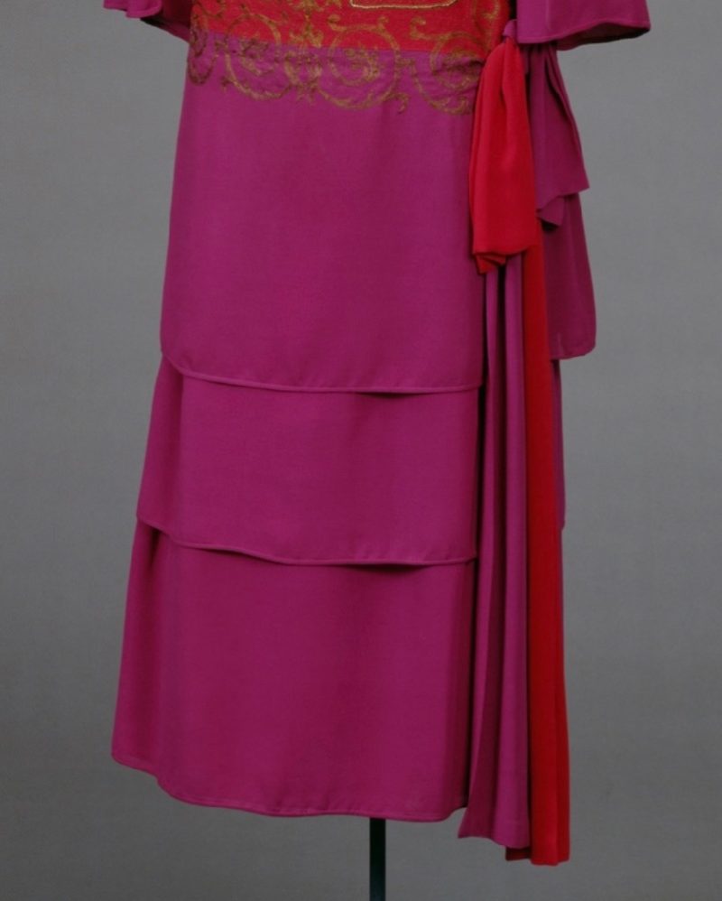
This week: a 1920s number in tomato red and fuchsia with gold
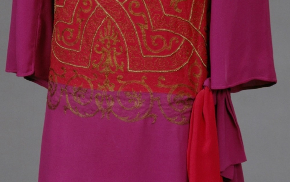
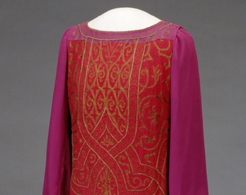
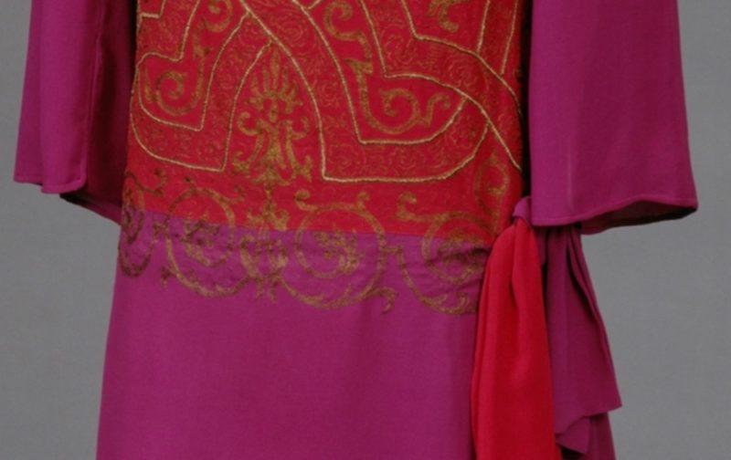
The 1920s were a daring era for fashion, carrying the style innovations of the 1910s to bold extremes, including the bright colours and improbable hue pairings that started with early 1910s Ballet Russes and ‘exotic’ inspired designs. This dress, which ties tomato red and fuchsia purple together with gold designs that look like they were taken from the margins of illuminated manuscripts, is one such example:
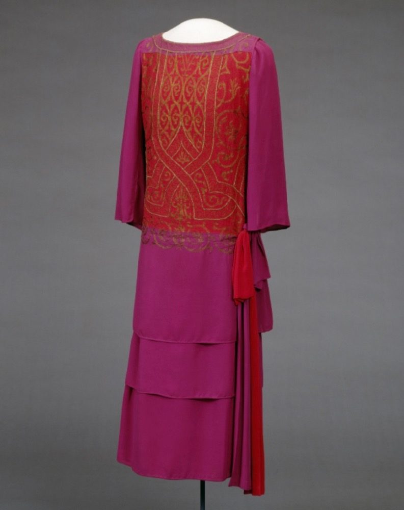
The gold patterning is not the only medieval inspired element to this dress. There is something distinctly tabard or surcote-y about the bold shoulder seam, and the wide sleeves give a nod to the costumes of angels in early Renaissance art:
The gold motifs are very interesting. The flat designs almost appear to be painted or screenprinted on.
There is something quite theatrical, almost costume-y about the dress, but at the same time nothing to specifically suggest it’s not exactly what the museum identifies it as: an evening dress
What do you make of the unusual colour combination and equally unusual motif treatment?
Rate the Dress on a Scale of 1 to 10
A reminder about rating — feel free to be critical if you don’t like a thing, but make sure that your comments aren’t actually insulting to those who do like a garment. Our different tastes are what make Rate the Dress so interesting. It’s no fun when a comment implies that anyone who doesn’t agree with it, or who would wear a garment, is totally lacking in taste.
(as usual, nothing more complicated than a .5. I also hugely appreciate it if you only do one rating, and set it on a line at the very end of your comment, so I can find it! And 0 is not on a scale of 1 to 10. Thanks in advance!)
Wow, what a color combination. Reminds me of a doll’s dress I had back in the seventies, a psychedelic combination hot pink, bright red and lemon yellow.
Incidentally, my daughter just peeked in and told me that the bodice with it’s gold pattern reminded her of typical wizard robes found in RPG games.
Either way, very costume-ish. 6.5
This dress is better in theory than in reality – fuchsia, red, gold, it all sounds so exotic.
The colors are the best part, everything else is just let down. The cut, the proportions, the skirt-on-top-of-skirt, the painted gold…
No, just no.
3/10
I think someone with a tiny frame and a lot of presence could look good and natural in this dress, but on the mannequin it does seem unpleasantly costumey. I do love a good medieval throwback… but not like this.
5/10.
I’m in two minds about this one.
I love the layering effect of the skirt, and the simplicity of the design–straight bodice, sash at the dropped waist, three-quarter-length sleeves. I rather like the pattern on the bodice–sort of Celtic, sort of high Medieval, but not quite either.
On the other hand, the red and fuschia combination doesn’t quite work for me, and the dress looks somehow unfinished, as though the goldwork on the bodice is somehow a pattern or rough sketch for the real goldwork.
8 out of 10.
I see that some of the commenters already have said that they don’t care for this dress because it looks too “costumey.” That’s not the way I perceive it. I just perceive it as unfinished, somehow.
9/10 I have a difficult time, because the range of styles here is so vast, I start to compare a dress against another periods aesthetics a which just confuses me. I adore this dress and would have worn it in a heartbeat. The fabric is luscious, the gold design complex without being fussy. While the fuchsia and red is not something I would naturally think of combining, it is lovely here. Cocktail time!
My first impression is that it looks like a costume from a deleted fancy dress party scene from the original 1968 Planet of the Apes movie. Bizarre, boxy, stiff. I see others have already made comments that it seems like a costume. It does feel 70s flavored, despite it being constructed decades earlier. So costume-like, mildly otherworldly, severe lined retro, in my mind references the original Planet of the Apes film.
4
While it is definitely not something I would wear, the red/fuschia combination is not all bad. It doesn’t clash hideously, but kind of harmonizes in a strange way with the gold design. It does have a very Renaissance feel. Like a feminine herald’s costume. It just needs a silver trumpet to go with it.
I say 8.5
Hmmmm…..this dress provokes thoughts of Madame Arcati, it needs a nice turban to go with it. 7/10
cocktail time! I like the odd features, and the bold colors, but only someone with a strong personality could carry this off. I’d wear it if it were black and blue and silver.
I have always loved the fashions from this era but, being short and squat, can only admire from afar. The puzzle-piece construction and the embroidery are a dream. Totally a dress belonging to a young filly kicking over the traces( I read too many Victorian novels). Love it–9/10.
I don’t like the red and fuchsia combination. If it was all red I’d love it. Th gold design is great. The different layers add a lot of interest. Because of the color combination I rate it 7.
Red and fuchsia is not my favorite color combination, but it looks well here. Most everything is working well here. I’m going to assume the puckering around the decoration is an age/storage issue and ignore it. The gold decoration isn’t overly flashy, (in regard to color & shine) which often ruins things for me. And the design of the decoration is very pleasing. I like the look of the shoulder and sleeve head. The dual-color trailing bow draws the eye down and prevents everything looking blocky. This is an interesting dress, and the silk seems to have such a nice weight to it. I like this more than I expected to.
8.5
The skirt tiers looks slightly off, proportionally. Otherwise, element works well together, and I love the obnoxious color combo-I probably wouldn’t wear it myself, but it works!
9/10
I love the colours. I like the design, not too plain, I’d like to see it worn and how it was accessorised. 9/10
I love this and would love to have an occasion suitable for wearing it. It would make me feel like Auntie Mame. I’m really impressed with the adaptation of the medieval to early 20th century. Although if one were to say, “I’ve got a red and fuchsia dress to show you,” it would not sound appealing, but seeing the execution makes a difference, and the decoration is gorgeous.
9 of 10
I love it. It is so sleek and dramatic, I love the layered skirt and wide sleeves and it looks like it has been cared for and possibly pressed for display which is unusual in a museum piece, as it doesn’t have that wrinkly look old silk usually has.
I adore the colour scheme! I’ve made a few evening gowns for other people) in red and pink over the decades, it was very thing in the early 90s.
Love the gold – love the vibe of mediaevalism to it all.
And the cherry on the hip, I l love the two tone bow. It softens this otherwise quite severe style.
10 – to me it’s an absolute banger!!!
I’m not terribly partial to the red/fuchsia combo–it reminds me of a bag of foil-wrapped Valentine’s Day candies. Otherwise, I like the dress well enough, especially the gold design and the trailing bow. The overall design is solid.
6/10
no no no no no. 1/10 This hurts my eyes.
Absolutely gorgeous, to me it’s not over the top, I would wear it. I’ve always loved dropped waists and rich jewel tones. It’s also has a simplicity and cleanness of lines that really appeals to me.
10/10
I love this! But then, I am a sucker for rich colors, especially Pink!
10/10
I find this dress a little off-putting. The way the embellishments continue beyond the edges of the red panel, the way the tiers in the skirt seem arbitrarily spaced, the stiff, shapeless, possibly too-short sleeves – it’s kind of like the Uncanny Valley of a 20s dress to me.
On the other hand, it’s bold. After some thought, I like the red and the purple together. The side-bow is probably my favorite part in how it plays off the simple, blunt layers in the skirt. The gold embellishments are lovely.
But still, there’s something stiff and artificial about this dress that doesn’t get along with me.
6.5
I can’t wrap my head around where this dress fits in. Where might it be worn? It’s somehow too plain for a formal affair, but too bold for a day look. I don’t mind the color combo. I like the tiered silk skirt. The top would be better on a short flapper sheath dress. Too many different styles mixed in here.
7.5/10
I’m trying very hard to hate this … but I can’t.
The color combo is jarring, the tiered skirt is oddly proportioned, the gold is tarnished .. but if I were a “Bright Young Thing” in early 1920s Europe, I would be wearing this.
9.0
I love it! 10
i think it’s stunning. The colour combo is fab, and i really like the stenciled designs, a bit Fortunyesque (his coats, not the delphi stuff). Also it’s not too overdone – the simplicity of the style shows off the colours and the gold trim/stencilling. Not so keen on the tiered skirt, I think two tiers would have worked better proportionally. I really like the cut of the shoulders and the way the sleeves a set-in, but the ends of the sleeves are a bit boring shape-wise. Minor nitpick – the stencilling matches perfectly at the hip where the two colors meet, but at the shoulder yoke the purple’s pattern doesn’t match the red. 🙁 Love the two-tone bow!
9/10
I’m going to echo an earlier commenter and go with, “No, just no.” I can 100% imagine a dress in these colours that would work, but it’s not this one. There’s so much I don’t like about it it’s easier just to give it a mercy point for the one nice thing I can say, which is, “The gold patterns would be great on another dress.”
2/10