
Today’s Rate the Dress pick was chosen because it’s a garment that has fascinated me for years. There are so many mid-century gowns that museums claim were maternity dresses, where I really don’t see it. It’s just a wrapper, or a dress in a larger size, or… The Met doesn’t claim that this dress dress was a maternity dress, but gosh, that waistline is high…
Last week: an 1780s gown with an embroidered hem
Wow! I thought last week’s dress was very pretty indeed, but I didn’t expect the outpouring of adoration that it received! You loved every detail, from the not-quite symmetrical embroidery, to the vandyked bodice trim. You just wanted to see it fully styled, with fichu and bows.
The Total: 9.7
In Rate the Dress, anything about a 9.5 is as close to perfection as you can get!
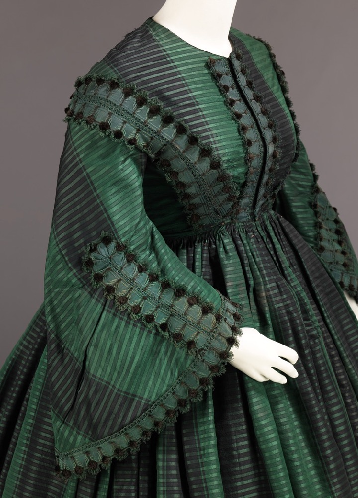
This week: a very short-waisted ca. 1855 afternoon dress
The Met’s description of this afternoon dress is very simple and generic, and makes no mention of how unusually high the waist of this dress is. Was the wearer just very short waisted? Was it a personal preference for some reason? Or was this worn by a pregnant woman? Unless the Met has further provenance information, we’ll probably never know.

Even beyond the maybe-maternity-mystery, I think the dress is aesthetically interesting and well worth considering.

The layered horizontal and vertical stripes were a very fashionable fabric in the late 1840s and throughout the 1850s, reflecting improvements in the jacquard loom, and the Victorian love of all things plaid and plaid-adjacent.

The layered stripes give the fabric a shot effect, and the black stripes create the illusion of even more folds and fullness in the skirt. Note the wool hem tape running around the hem of the skirt, protecting the silk from touching the ground and becoming soiled and worn.

The stripes are cut in a diagonal across the sleeves, revealing the width of the pagoda sleeves, and the pleating and tucks used to shape them.

The dress is trimmed with perfectly coordinated black and green trim, with motifs which looks like peacock feathers up close:

The dress fastens up the front (another feature that would make it quite practical for a pregnant or nursing mother, though it’s definitely not a conclusive feature). In a choice that I suspect might be a bit controversial amongst you rater, the designer decided to have the stripe patterning continue across the front as it does across the width of the fabric, rather than being mirrored.

What do you think of this dress? Is it the perfect thing for a modish mid-century mother-to-be (or just a woman who likes a high waistline) to wear? Or is it a mystery and a miss?
Rate the Dress on a Scale of 1 to 10
A reminder about rating — feel free to be critical if you don’t like a thing, but make sure that your comments aren’t actually insulting to those who do like a garment. Phrase criticism as your opinion, rather than a flat fact. Our different tastes are what make Rate the Dress so interesting. It’s no fun when a comment implies that anyone who doesn’t agree with it, or who would wear a garment, is totally lacking in taste.
(as usual, nothing more complicated than a .5. I also hugely appreciate it if you only do one rating, and set it on a line at the very end of your comment, so I can find it! And 0 is not on a scale of 1 to 10. Thanks in advance!)
Lovely with some depth and mystery to it because of the shades of green and black. Do any of you think that the front opening is slightly off-center? I thought at first it was the way the mannequin was dressed, but then I wondered if was intentional to balance the off-center stripe. The V- angle formed where the front trim meets the shoulder trim seems to be less acute on the right side than the left. ? Either way, sophisticated color scheme and trim. 8
Maternity or no, I find this garment beautiful in its well-construced restraint.
I love the color and texture of the fabric, and the trim is tone-on-tone perfection. I suspect if it were in a color of higher contrast, it would be jarring.
10 of 10
I love the trim, but think it the way it ends over the shoulders is a teeny awkward. I would have liked the print on the bodice to be mirrored, but you are already expecting to hear that comment. The right side of the garment seems wider than the left. Maybe it was stretched, so I won’t hold that against this maternity-probably dress. As with all of dresses we review, I wish there were photos of the gown alone, plus some with all period expected trimmings.
The Jacquard stripes-upon-stripes pattern is both bold and restrained at the same time.
9
I love the fabric and trim, so much that I wanted to say so. The black stripe across the front strikes me as mildly odd. However, I intensely dislike almost all Victorian styles, and most especially 1850’s, 1860’s. I couldn’t give this a score that reflects the dress instead of my personal taste. Therefore no score.
Sounds like you should sit by me! I once read a sentence that said something like, “[the bonkers 1830s] was the last gasp of display before the Victorian era really hit and everything started to droop.” The image of “Victorian = everything drooping” is perfect. And I cannot unsee it! Why do you dislike Victorian?
The hypocrisy of the Victorian era also infects my opinion, so I have a hard time truthfully rating a dress… 🙁
I just hate the way the person was swathed and overwhelmed by piles/heaps of fabric. It would take a lot for the woman to wear the dress instead of the other way around. And as you say, for much of the period things just drooped, including hair. Bustles/hoops/crinolines make a silhouette that just doesn’t appeal to me. I’m not crazy about the 18th century, either, but the silhouette was often much crisper and therefore more appealing to me.
I love the Edwardian era in spite of the silly S-bend, and thanks to Leimomi I now realize I love the 1910’s as well.
Right?! So glad that we are sitting side-by-side and eating popcorn.
I think what I like best about the Edwardian era is how the silhouette was experimenting–S bend and all. While I am happy to be proven wrong, and I know that the natural movement pre-saged many changes, the Edwardian and Teens just seemed so fracking different than anything before–bustles included.
So…..what is your favorite era? (Can we still be friends???)
I really like the 1840s; then until the 1880s hit I more or less agree with you. I have a soft spot for the 1880s, although there’s still a lot I’m not crazy about there. But 1880s are the crisper version of the bustle.
I’m not into big-sleeve 1890s but the more restrained styles of that time plus around 1900 I like quite a bit; it’s a bit like the 1840s in that it’s a more restrained version of the over-the-top, keeping the good bits and dropping the ridiculous ones, in my eyes (similarly 1840s between the more over-the-top 30s & 50s). Then Edwardian styles hit and I’m like “I’m sure it’s swoonworthy to someone but it’s just too much and too droopy”. And then 1910s hit and I’m in love again. (Some late 1900s styles are already aiming there, too, to be fair.)
But I totally agree with you that 18th century did some of the styles more crisply.
😀
(Because, despite my professed liking of the 1880s, my mind basically goes “who needs bustles when you can have mantuas.”)
I like the silhouette, and like last week’s gown, this one would naturally be worn with accessories–a white collar, possibly with lace or crocheted, and undersleeves. A sash or belt is possible, and would cover the visible gathers at the waist.
What I don’t like is the fabric. The green is nice, but there’s something blocky about the trim motif and the way the stripes are layered. The layered stripes also dilute the green and give the dress a grayish and ugly overtone, in my opinion.
7 out of 10.
The fabric is exquisite, and the cut of the sleeve is interesting. I’ve seen mid to late 1860s gowns with high waists, but this one is a puzzle. A beautiful puzzle!
10
I like the style of this dress but I think the fabric choice is wrong. There is something reminiscent of “let’s pull down the curtains and make a dress” about it. The choice of trim does not help. The colour of the fabric is lovely but I think the fabric itself looks too stiff and cheap. I do love the sleeves though. 6/10
Here is a snug wintertime dress. The trim would look more balanced with the sizeable collars of the 1850s. 7/10
I’m not sure if it was the intention, but to me this reads as a clever interpretation of an evergreen forest. It’s just exactly the right shade of green, and the black stripes remind me of tall bare fir or spruce trunks. (Bare because when they’re all crowded together in a forest the needles are mostly at the top) The smaller stripes are like the branches, which are quite thin and usually grow out more or less perpendicularly.
If it weren’t for the large black dots on the ends, the motifs on the trim would look exactly like the tips of spruce twigs.
I wish they could have listed which part of the states it came from. It would be nice to know if it was somewhere suitably forest-y.
I was going to complain about the lack of trim around the neck, but then remembered that it’d be worn with a separate collar. The join between the bodice and the skirt looks quite messy, but that could be easily covered by a belt.
9/10 for the evergreen forest dress!
Are people here familiar with the term ‘headcanon’? It’s a fandom thing that basically boils down to, “The original creator didn’t specify this about a character, but in my universe, they [whatever].”
I have a headcanon for this dress that involves none of the theories suggested already. It belongs to the mother of a young lady who aspires to be a seamstress, and who has lovely taste but hasn’t quite gotten the hang of putting things together properly yet. This is her macaroni necklace – she’s handed it to her mother with great pride, and her mother, ever the indulgent gentlewoman, doesn’t have the heart to do more than smile and praise what she can; all the while never, ever mentioning the waist. XD
On a trying-to-rate-more-seriously note, I do think it’s an appealing dress – to my super-picky and also super-OCD brain, it does have a few minor issues (the illusion effect looks good from farther away, but up close the stripes are little odd, and the asymmetry of the bodice fabric is making me make some tiny unhappy bird sounds), but it’s much more a, “Someone tried quite hard to make this both interesting and attractive,” dress than a, “Dear God, what was the designer thinking?” dress. I will give it an
8/10!
This is great! That fabric has such depth, the trim is perfectly matched and used with restraint. Simple but intense color scheme
While the seamstress did not mirror the pattern on the bodice, the sleeves are perfectly mirrored.
9.0
It really does look like a maternity dress! If so, I think it is a very attractive one. The fabric and trim are beautiful and in a beautiful color. I also really like this style of sleeve.
I do agree that there seems to be something awkward about the construction, although the asymmetry of the bodice-front stripes doesn’t bother me as much as I expected. The un-centered opening is much more offensive.
I will give it a solid 7, although I think it could have been executed far better.
7
I love this dress. The color combination and pattern are sophisticated and elegant. It has just the right amount of trim, not too much, not too little. I even like the contrast of wool hem tape!
When I like a dress this much, I try to figure out how it could be re-purposed to wear in a modern context, and I think this fabric would work beautifully for a 1940’s style skirt suit with much smaller bell sleeves.
Also, I agree about the colors/pattern being like an ‘evergreen forest’.
9/10
It does look like a maternity dress, a fabulous, fancy, well executed one.
I love it.
I give it a full 10.
Whomever this dress was originally intended for it is lovely and I bet she got a lot of compliments on it. I can see why you think it could be a maternity dress, but also for someone short-waisted. I really like this dress also. If my hubby and I were still doing 1800’s Living History I would certainly copy this beauty!
So. for 2 weeks in a row,I am giving your entry a 10/10.
Love the fabric, the colour, even the weirdly high waisted shape (not weird if it is a pregnancy dress ) but the off set bands on the bodice upset me a fair bit. so
7/10
Simple lines but very smart! I love the fabric. I am particularly fond of this shade of green, and striped with black so subtly, I think it is outstanding. And the trim works – I don’t mind that it doesn’t head off over the shoulders. The non-centering of the stripes on the front bodice is an interesting choice – I think it works. A double black would be too dark, a double green too light. I wouldn’t have done it (compulsive balancer!) but I applaud their choice.
Maternity or not. I can see it could work either way which has to be an advantage. I rather like the slightly high waist line.
If I am going to be really picky, I could wish that they’d used black wool braid on the hem instead of the mustardy colour, but hey!
Love it.
9.5 out of 10.
I wondered if the hem tape color was chosen to match the color of dirt? The tape is frayed, so this was someone’s go-to dress. It may have even started with more decorative trim, which was picked off and replaced with the tape when it showed wear. But I agree with you, Lynne Black trim would look better.
I think the silhouette and details are lovely, especially the perfectly coordinated trim and the “foresty” fabric. A few people mentioned the assymetry of the bodice opening and trim. While i see a very slight difference between each side, I rather suspect it’s because a dress that was custom made for an assymetrical body is being forced to conform to a symmetrical manikin. If it is a maternity gown, it is a very nice one that would have allowed the wearer to retain some sense of dignity, unlike so many modern ones (for various reasons).
9/10
The pagoda sleeves are beautiful, the fabric is amazing. It is, however, as pointed out when introduced, unfortunate that the bodice is not properly cut to mirror. The lack of mirroring gives the bodice an uneven appearance. While it may well have been a maternity gown, there is still no reason, other than lack of fabric, to do the cut of the bodice in this way.
Rate: 6
I love it. Yes, it needs a collar or neck piece, a sash/belt, and sleeve endings, but it would have had those to soften or accessorize it. Yes, I might prefer a mirrored bodice. The shape, fabric and trim, though, are gorgeous. Hopevit was worn by a brunette. 9.5/10 for me.
I think it is a maternity dress. The pose with one hand near the belly draws my attention. I think the museum suspects it…
I like the dark colors and the stripes. I just can’t decide if I like the scalloped detail. From some angles it is garish, from others it is gorgeous. Overall a lovely, functional dress for a mom-to-be.
7.5/10
As to the maternity question – to me, the fact that the front waist is noticeably higher than the back definitely suggests maternity wear. I suppose we can’t know for sure, but it certainly seems like it!
I like the fabric – it really encapsulates the Victorian aesthetic of More Things without leaning into the Land of A Million Trims. The mirroring issue doesn’t really bother me – it would be much more annoying if the stripes weren’t about the same size on each side. Overall, I quite like this dress!
8.5/10
I like the mid-century Victorian look (as stated before on RTD), and the rich colours always appeal. I agree that in detail, it’s not the most symmetrical or perhaps constructed with the most forethought, but it seems to work overall.
My two cents on the maybe-maternity – interesting to note that the waistline, not only being higher than the natural waist, appears to slope down to be lower in the back than the front. While I know little enough to suppose this detail to be conclusive proof of maternity/not, it may be a contributing factor, along with the front closure, in the determination of the original purpose of the dress.
8/10
I really like this one. If it is a maternity dress it’s far nicer than any of the ones I had!
10/10
I think the combination of a high waist + hoops is a fairly notoriously unattractive one -think of Regency English court gowns featuring the then-fashionable high waistline paired with mandated-for-court panniers! However, this look isn’t nearly so egregious. It helps that the waistline is only slightly high(as opposed to right under the breasts). As maternity wear, I think it’s cute. A waistline around(or just slightly below) the natural waist seems to be the most flattering with large crinolines(whenever I see modern prom/not historically accurate costumes/formal dresses with large hoop skirts combined with a bodice that goes all the way down to the hips, I cringe. Spoils the wasp waist effect which is the whole point of crinolines, plus makes for a deeply unattractive silhouette). Still, this isn’t bad. The higher waistline reminds me a bit of the silhouette of the late 1860s, which I am fond of. While the color isn’t my favorite(although do I have any right to complain since I gave a high rating to Empress Eugenie’s “raw sewage green” dress?), the fabric is undeniably nice. The trim looks like a caterpillar, especially from the side view where you can see the rounded end of the trim crawling up over the shoulder. Not saying I dislike the trim or anything. It just looks like the wearer had giant caterpillars crawling over her body, and that need not be a bad thing.
Overall though, this feels like a rather conservative gown. Despite the color, this is more a Melanie Wilkes gown than a Scarlett gown, you know? And it sure isn’t a Luna-Lovegood-but-in-the-Victorian-era gown(aka my personal aesthetic).
I feel like I am always lowering scores for dresses being typical of their era, or not unusual enough, or experimental/eccentric enough. Maybe that isn’t fair. But if it isn’t a flawlessly stunning creation like last week’s, I like a dress that takes risks. I prefer memorable to tasteful. There’s nothing that offends me about this dress. But there’s not much that stands out about it either.
6/10
Oh, one more thought. The cartridge pleating at the waistline of the skirt is lovely work.
Great fabric, very decent dress?
9/10
… phew, it posted. I didn’t want to write anything too long in case Spamhaus interfered again.
I really like the trim with this fabric. Geometric enough to be a “match”, different enough to break it up and make it interesting.