
Thank you to everyone who comment on my post on climate change and mental health. I really appreciate your support, suggestions, and empathy. I’m still working through them, and allowing myself to do just a little bit every day to cope, and even though I haven’t managed to respond yet, I really appreciate that you took the time to comment.
One thing that does generally help me is having a schedule, so, although it’s a day late, here’s Rate the Dress.
Last Week: an 1890s evening dress by Mrs Cuttle
Here in NZ things that people either really like, or really don’t like, are sometimes described as ‘the vegemite option’ (or, ‘the marmite option’, because using either immediately triggers a vehement argument about which is the better/true extremely weird tasting yeast spread).
Vegemite is either something you like, or…isn’t (unless you’re me, and you think it’s revolting as you eat it, and then immediately want another piece of vegemite toast)
Last week’s dress was vegemite. And, carrying on the analogy, only a few of you are from the few countries that like the stuff, because most of you DID NOT like the dress. But some loved it!
The Total: 6.4 out of 10
And Veronica was right on the money with her rating! (there is no award for that, because then everyone would start doing middle of the road ratings, and that would be terribly boring 😉 )
This week: an 1850s afternoon dress in chine a la branch silk
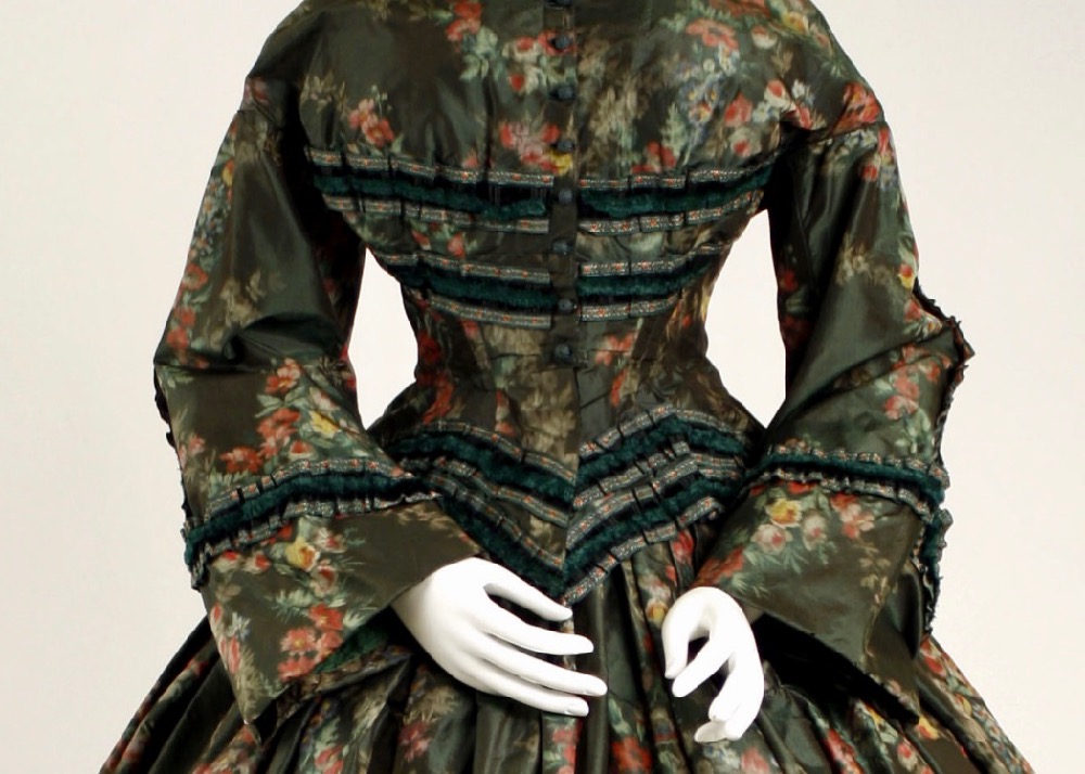
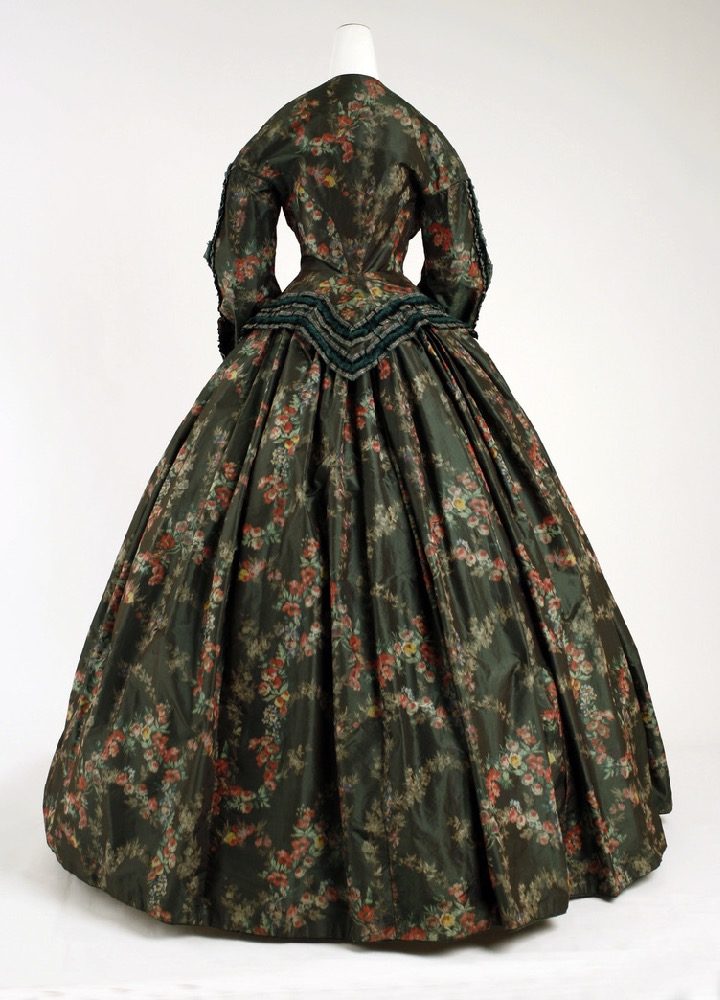
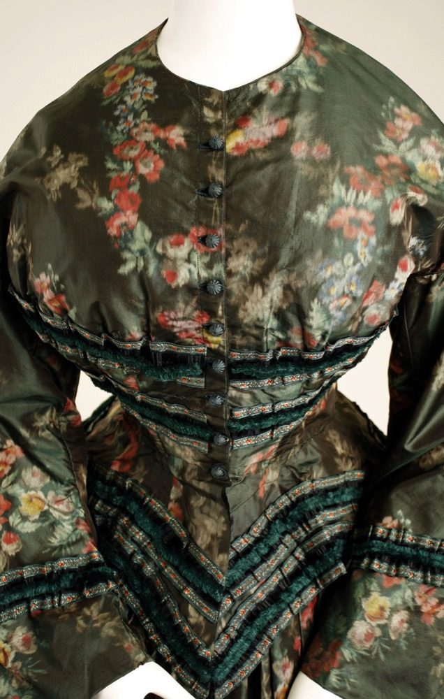
This 1850s afternoon dress is made from a floral warp printed silk: chine a la branche silk, or, as it might have been called in the 1850s, pompadour silk.

The characteristic blurred effect of the weave softens the harsh contrast that the bright tones and dark ground of the fabric might have otherwise had, while the floral print keeps the dress from severity or sombreness.
The dress would have originally been worn with a white collar, and white engageantes (undersleeves) which would have further brightened it.

The blurred lines and irregular patterning of the print are matched and balanced by lines of trim which are both angularly geometric, and softened with gathers, adding to the overall aesthetic tension between crisp contrasts and muted borders.
Like last week’s dress, it’s suffering slightly from presentation. Sloping shoulders may have been the 1850s beauty ideal, but the lines around the neck and collapsed fabric at the side of the bust and around the armhole make it clear this was meant to be worn by someone shaped a little less like a wine-bottle.
Imagine in the right accessories and body, and what do you make of it? Does the pairing of fabric and cut work for you? Is this chine crinoline a win?
Rate the Dress on a Scale of 1 to 10
A reminder about rating — feel free to be critical if you don’t like a thing, but make sure that your comments aren’t actually insulting to those who do like a garment. Phrase criticism as your opinion, rather than a flat fact. Our different tastes are what make Rate the Dress so interesting. It’s no fun when a comment implies that anyone who doesn’t agree with it, or who would wear a garment, is totally lacking in taste.
(as usual, nothing more complicated than a .5. I also hugely appreciate it if you only do one rating, and set it on a line at the very end of your comment, so I can find it! And 0 is not on a scale of 1 to 10. Thanks in advance!)
Oh I love it, I think it’s a delight and even the maddening not matching of the stripes in the front because they finish at the edges instead makes me sort of happy as it’s such an easy mistake to make and I love things that make me feel related to our sewing forebears.
I love the fabric it really is the perfect colour contrasts with the blurring of the print, and the softened stripes and the simple lines but dramatic silhouette. I can imagine it with its collar and engageates looking so smart but also so approachable. Like my living room curtains! (A Carol Burnett moment there!)
10/10 from me!
I like this dress very much! The bright colors of the floral print provide a richness when contrasted with the dark background. If it were a wine, it would be a complex Malbec, with a bright finish.
I give it an 8.
I want to like the print, but I don’t quite. Bright flowers on a dark ground is usually my thing, but the weave combined with the contrast makes it feel like someone left it out in the rain. What I do like is the gorgeous green trim at the waist – the boob-stripes may be too much of a good thing though! Having said that, the overall effect of them is actually ok.
It needs a collar to lift the drabness of the bodice, but we can forgive it they.
Overall I call 7/10
Long time lurker but I have never rated a dress before! But you had me at Vegemite (or Marmite, I like both!) so I thought I would finally participate! A pity about the mismatched trim, I tried to think it was deliberate but all other trim matches beautifully, and it doesn’t look like its just because of the photo’s perspective, so…
8/10 🙂
I love this fabric and wish I owned it so I could garden my eyes just looking at it. Can see it with the white contrasts but I think the trim too dark and heavy. 9/10
I like everything about this dress….except the misaligned trim (OCD TRIGGER!!!). The colors work well together. 8/10
i like everything except the uneven trim in the front. Your eyes are drawn to that. I am not sure if this was intentional on the dressmaker’s part, but it looks bad. 7/10
I like the shades of green in this dress, and the use of the velvet trim on the bodice. (The misalignment in the front doesn’t bother me much. I can’t tell for sure, but the wrinkles just above the trim line on that side suggest to me that a good pressing might fix the alignment issue. Note that the trim is perfectly aligned in the back.).
What does bother me is the blurred flower pattern of the dress. It makes me think of wallpaper. Not an appealing look, at least not to me. Not even with a crisp white lace collar and engageantes (though I agree that those would help a lot).
6.5 out of 10.
I very much like the fabric, both print and colors, but I have an immediate aversion to the trim. The trim colors are fine, but I find it quite bulky overall, and the placement on upper bodice just strikes me as wrong (I’m not talking misalignment, since that may be due merely to presentation).
5/10
It’s too dark, for me. I wish the trim were a bit brighter or had more of a contrast somehow. Also, the blurry fabric is killing me, I keep blinking to clear my eyes, though it did prompt me to clean my glasses.
7/10
This type of fabric is second only to cloth of gold/silver for me, and I think this particular fabric is a stunning example of its type. The dark, muted floral is absolutely dreamy!
I also love the combination of trims; the ruched green velvet is such a rich addition to the muted fabric. BTW, I personally believe when this dress was new the trim matched up perfectly in front. I think it’s just the poor fit on the manikin and wrinkling, so I simply see past it.
Even though this era/style of dress is my dead last for my favorites, I can’t hold the time period against the perfection that is this spectacular creation! Thank you for showing this; I’ve never seen it anywhere before.
10/10
Oh that’s interesting about last week! Thank you! (Marmite is definitely superior to Vegemite, even after the Great Shortage post-quakes. And Linda, yes, I was a lurker for quite some time before I worked up the courage to actually comment on anything!)
About this dress – I’m getting the sense of dejà vu from last week. My first impression is not great (the fabric isn’t really my style) but there are all these little details that I like. 1850s is definitely up my alley, and with the suggested shoulder shaping changes you’ve raised, I think the bodice would look rather fetching properly displayed. The white embellishments as it would have been worn, as you’ve mentioned, would also help make it look a bit less muddy. I find your commentary on these really helpful in forming my own opinions, as you may have guessed, and I love seeing a new (and interesting and different) dress each week to have a good think about! So like last week, I’m going to start on the low side, but then all the little things seem to raise it in my estimation – and a bit more so than last week!
7
I hate the trim. That mis-matched front point! Shudder. And the trim itself is just wrong. They should have had the courage of that very nice fabric (you know I have no problems with looking like curtains!) and made ruffle trim of that to give a textural richness without dragging in something else complicated.
7 out off 10. Because it’s a perfectly nice dress that could be fixed with a quick-unpick and some plain trim!
I love that shade of green which is particularly maddening to see on a dress that looks like an out of focus sofa! I really like the back detailing, but it needed more judicious fabric and trim choices. I don’t know how much of it is just fading, but the velvet trim and the base fabric clash really poorly to my eye. 2.5/10
I quite like this one. The bodice is rather odd but I think that’s because it doesn’t quite fit the model. I don’t like the trim but I do like everything else. Especially the fabric which I adore.
8/10
Green is my favourite colour, so this should be lovely, but I can’t bring myself to like the print, it’s like an oil painting, slightly blurry. The trim (aside from the mismatch on the front which I’m assuming is bad display, as no dressmaker could get it that badly wrong on a finished product) is fine, but once again I’m surprised there is nothing to tie in the skirt. In an era where embellishment seemed to be more is better this is a surprising omission.
Overall the shape and style are good, but I don’t like it.
6/10
The dark fabric and soft watercolor florals are beautiful. I want to wear this. I’m bothered by the asymmetrical border, though. Doesn’t make the overall look. This makes me think of a teacher on the prairie wearing her best dress. Because I’m weird like that.
8/10
This is a very poetic graceful dress. The presentation may be static yet there is a fluidity
and aliveness in the print; like water flowing over mossy rocks under fall foliage.
I can a woman such as Emily Dickinson wearing this.
9/10
As others say the dress would look much better on a more suitable model, looking at the photos it looks like some are not in focus giving the impression that the print is fuzzy and maybe the bodice is a bit faded. I like the dark background and the print even though it reminds me of a cushion cover that I once had. Shapes lovely but the trim across the bust I don’t like and overall the trim is rather heavy however I like it so give it 8/10
A Vegemite question? Does Vegemite toast include butter? My SO claims that the trick for a Vegemite sandwich is to have a microns-thin layer of the salty icky stuff with lots of butter, for maximum umame.
As for the dress … the negative factor for me is that totally horizontal railroad track trim across the bosom. If it had reflected the V of the waistline and the slant of the sleeves it would have been way better.
The fabric is a lovely chine on a dark ground, the styling is very fashionable 1850s … but the railroad tracks are … bad. Really bad.
7.5
Ick, it hurts my eyes, probably because of that slightly blurry feeling from the print. It feels like the fabric should be on my Grandma’s sofa or something.
The cut is interesting, but the fabric is so much a no.
3/10
Old lady fabric and deeply unflattering stripes, yikes! But the shape is pretty. 5/10
That’s an interesting comment about the ‘railroad tracks’ – I wonder if ladies who were
part of the Underground Railroad (a network of secret routes and safe houses established in the United States
during the early to mid-1800s, and used by African-American slaves to escape into free states, Canada and Nova Scotia
with the aid of abolitionists and allies who were sympathetic to their cause)……
….wore “coded” clothing?
It looks like there are weird gathers in the back. But it is probably because this is a larger dress, and it is tucked up in the back for a better fit on a smaller dress form. I understand that different eras had different silhouettes, and getting multiple sizes, for multiple eras is a storage and cost concern. But I still wish collections would keep a variety of mannequins so items can be properly displayed.
This dress could have had some fun color play with the trim. I like the fabric, and like the overall effect. The mismached trim is just a visual illusion, I think, due to a poor dress form match.
8/10
beautifully proportioned dress. As someone who has intermittent blurred vision in one eye, the blurry fabric does my head in. I am sure the misaligned trim in the front is a presentation issue and that originally it matched up, so no points off for that. It definitely needs the lace collar and engageantes to finish it though. 7/10