
This week Rate the Dress goes from very literal trompe l’oeil ruffles, to a dress with an abstract pattern that becomes a textile Rorschach test: what do you see in the ripples and blobs?
Last Week: a first-bustle-era morning dress in border-print cotton
How you rated last week’s dress really hinged on how you felt about the border print and the trompe l’oeil ruffle. Some of you really enjoyed the print, and thought it was inventive and witty. Others found it fussy, saccharine, and mismatched. And then there was a third segment who liked elements of the dress, but didn’t feel it pulled off the overall look.
The Total: 7 out of 10
An unresolved rating for an unresolved dress.
This week: an 1890s day dress with all the trimmings
This week’s Rate the Dress is an 1890s day dress that might have been worn by the daughter of last week’s dresses owner: it’s equally decadent, impractical, and inventive in its design and use of fabric.
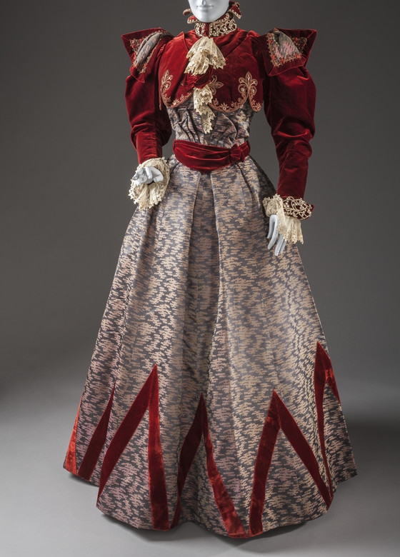
Pingat was a top tier Parisian couturier in the 1890s: commanding prices and status comparable to the House of Worth. Whoever wore this dress had the money to invest in a garment that had every bell and whistle of 1897’s fashion whim. From quirky geometric skirt trim, to bolero effect bodices, full sleeves with extra eccentric epaulette overlays, pointed collars, and lace jabots, it has everything and the fashion kitchen sink.

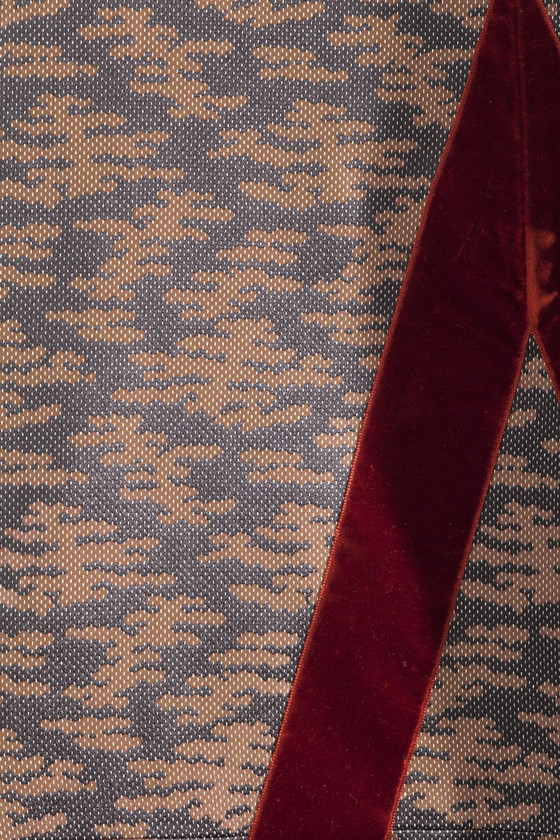
Not even the skirt fabric gives your eye a place to rest: it features a fashionable weave, probably Japanese inspired, with a cloud pattern in shades that change from pastel to grey and gold, depending on the angle and distance you view it from.

What do you think of this frock. Is it fashion forward, or simply ascribing to all the fashion fads, and not in a good way?
Rate the Dress on a Scale of 1 to 10
A reminder about rating — feel free to be critical if you don’t like a thing, but make sure that your comments aren’t actually insulting to those who do like a garment. Phrase criticism as your opinion, rather than a flat fact. Our different tastes are what make Rate the Dress so interesting. It’s no fun when a comment implies that anyone who doesn’t agree with it, or who would wear a garment, is totally lacking in taste.
(as usual, nothing more complicated than a .5. I also hugely appreciate it if you only do one rating, and set it on a line at the very end of your com
Oooh. Too many bells and whistles for me. My eyes want to go away and have a lie down. It scores better if I think of it as a theatrical costume, which I suppose it is, sort of. In this, you would be a one-woman production! And center stage!
6 out of 10. For sheer chutzpah.
Much too much going on for my taste. The red is too vibrant for the pale-ish silk skirt. Then there is the embroidery, the beads, the cording, the lace. I can only give it a 5/10, I’m afraid.
I like the velvet geometric on the skirt and while it would not be my choice of color combo, it sort of goes
However, as you get further up
Those Shoulder wings/epaulets/whatevers ruin it all
I was initially repulsed by the entire bodice/bolero but then I realized that if you removed the wing things-and the metallic (?) lace at the neck, it would be much much better
But as it
4 out of 10
Perhaps I may have liked it in its day, but really don’t like it now! The fullness in the bodice stands out – what’s with all that extra fabric? Too much of everything. I like the geometric skirt trim, but not the colours. All I can give it is 3/10.
I like most of this dress. What really is hard for me to deal with is the main fabric! Reminds me of modern camouflage that has been “girlised”. I wish I liked it more…6/10 for the embellishments, the workmanship and the red velvet.
I have a soft spot for the ridiculous. I love it!
8/10
I don’t even no where to start on why I find this dress extremely distasteful. To be fair the red is gorgeous. And maybe the fabric just looks pinkish on my screen. The embroidery on the cuffs is quite pretty but…
I can just imagine Mrs. Evalina Knowitall coming in with her long list of ghastly requests:
“I want it made out of rich red velvet and insipid pre camouflage pink and grey.”
Seamstress smiles in agreement.
“It has to have points decorating the skirt but they can’t be centered.”
Seamstress’s smile becomes slightly strained.
“And I want the upper bodice to have large scallops and end at the most awkward place possible.”
Seamstress tries to nod approvingly but finds it difficult.
“I also want a jester collar and random tufts of lace.”
Seamstress develops a slight eye twitch.
“OH! And don’t forget gigantic sleeves with sharp points on them. They are very important for poking people I disagree with in the eye.”
Mrs. Knowitall sweeps out, leaving the seamstress questioning her choice of career.
Actually I shouldn’t blame Mrs. Knowitall. I should blame Mr. Pingat and his appalling taste in female apparel. But maybe it WAS a dress for Mrs. Knowitall and he really didn’t like her.
Seeing as it has a few nice touches amidst all the awfulness it doesn’t quite merit a 1. 2/10
This is a hilarious review!
In other words, the customer from hell 🙂
I actually love it. There’s something bold and full of chutzpah about it that I really enjoy. The red is gorgeous and the main shot-silk patterned fabric is intriguing and actually quite enjoyable to look at. It makes me think a bit of corals and underwater things. And then the braiding is actual coral red-pink-orange, which underlines the effect. It’s busy, but also strangely restful to gaze at, like the corals are beneath the surface of the water flowing back and forth over them.
It’s not the easiest dress to wear, but you know whoever wore it had the most amazing personality and presence and I get really good energy and vibes from it. I’m going to give it 8 out of 10. It’s not a beautiful dress, but it is delightfully and very likeably ugly.
I don’t love the dress but I love your description of how the fabric looks like coral underwater. Very poetic.
The only thing I like about this is the diagonal trim on the skirt edge. The inkblot fabric is hideous, and I don’t like the bodice at all. 2/10.
I think it’s stunning. The velvet accentuates the Victorian silhouette perfectly. We must remember that the lady’s objective was to stand out while showing her best features under cloth.
Didn’t I see this gown in “The Fifth Element” with Bruce Willis and that alien opera singer? I do admire the embroidery on the bodice, but that’s about it.2/10.
I thought it had a strangely extraterrestrial feel to it as well, even though I suspect it is aiming for a Gothic look. I imagine the multi-coloured weave of the skirt would make it seem even more alien as the colours shifted when moved around. It is a very out there dress with way too much going on but I do rather like the theatre of it.
7/10
The shape of the skirt with the sash is beautiful, and I like the zig-zag hem detail, but that is all. I don’t care for the wild print nor the shark-tooth-looking shoulders.
2/10
I love the colour of the upper bodice, it’s trim and the general shape but the whole scribbly pattern of the print just turns me off. It’s a 4/10 from me.
I actually really like the bodice of this dress, with all its many details. I also like the geometric skirt trim. Yet, it feels like there is too much of the grey fabric visible in the skirt, making it an awkward accompaniment to the nicely balanced bodice. I’ve seen fashion plates from this era that show color blocked skirts with a horizontal seam between the colors falling just below the knee, and had the skirt of this dress been done similarly, with the red velvet as the lower portion, trimmed like the bodice, I think it would be more successful. Nonetheless, it seems perfectly of its time!
7/10
Lovely and wonderfully dramatic! A kick in the face of all insipid so-called good taste.
I would have liked to know the woman who wore this.
The two fabrics clash. There is the odd high point but mostly I want it to evaporate into something else. 4/10
I’ve lurked here forever and never commented, but I’m coming out of hiding because I, for one, love this dress and I’ll gladly do my little part to bring its rating up a bit! This is one of my favorite eras, and I’m a sucker for red velvet. I think the visual textures are a marvelous contrast and I adore the eccentric pointy epaulettes. If it were 1897 and I could afford to wear Pingat I would wear it!
10/10
Brava! I concur.
This looks like one of those CoCo costumes where someone is doing “1890s Dinosaur” or some such. I love the close ups, the embroidery and cording(?) work is exquisite. If the camo print was a red silk, or more red velvet or even a brocade with the red in it, I think it would work better. This is because I just can’t see how the two fabrics go together. To me they don’t just not quite gel, they actively wish to be put into separate rooms. Or maybe if the velvet were dove grey?
I can almost live with the shoulder fin things, in the name of Dinofashion, and I love the aggressive toblerone landscape skirt trim, and the van dyking up under the chin. It’s all so playful and fun and a bit Commedia del’Arte. SO many gorgeous moments, most of which play very nicely together.
So, I’m giving it a score that optimistically ignores the fabric mismatch Elephant in the room.
8/10
I love this period even when it goes over the top, so the closeup was pretty intriguing, and even if I wasn’t sure about the “camo” fabric, it had potential used as an accent.
But the whole skirt in that fabric is way too much and I think it breaks the balance of the dress, with the light bottom and the dark heavy top.
It had potential, I can imagine the skirt in red velvet and camo trim and I think it would be much nicer, but as is…
5/10
Just for the magnificent embroidery, I wish to give it an 11. For the red velvet and smashing, flattering balero line of hte over-bodice, a 10 at least. This is not Lulumon, the slubbed pattern would have been probably innovative or unusual still, unlike today’s printed crazy patterns and stadnin out. I wish to give it a 10 still due to its period example,fine workmanship, and, well, that embroidery.
Dear heavens, can I edit the spelling? My fingers were rebellious, I see.
I like the velvet and the trimming. The camo-ish pattern could be the responsible for the chaotic look. All the overlappings and different shapes- though usual for this era- don’t give their best. The overall look is a bit messy. It’s like the “wow” is almost there, but not there. It’sa a miss.
I really like this dress. It’s cleverly put together, and a lot of fun. The embroidery is beautiful. 10/10
It’s so damn farshun it’s not funny. Not a full score because I don’t feel ill after seeing it
9/10
I love this dress. I also admit that it does not conform to ‘good taste’ and that it looks sort of ‘costume-y’, which is probably why I love it. Also, Julie’s negative review was hilarious!
8/10 for being delightful, if not beautiful.
I like the overall shape and style. The red velvet trimmings and embellishments are fabulous, but it just needs a deep red, or a rich brown plain fabric to show it all of. The main “clouds” fabric just kills the rest of the dress for me.
3/10
Ok, its crazy, over the top, a real marmite dress , you either love it or hate it. I personally love it, the crazy sleeves, the detail in the skirt, the embellishments. Yes, I could see myself in this, quite easily, or in my own version, what an advertisment !!!!
Now where do I find a pair of earrings bold enough to go with it ?
Its a solid 10.
I love it! The bold pointed trim at the hem & the shoulder silhouette make me feel just gleeful. 8.5/10
I have to agree with Daniel. This dress is really superb. The women who commissioned it was no wall flower. I bet it was mesmerizing to see as she walked in a room with gas light glowing on that watery silk. Some outfits lose so much on a static display, I think that is the case with this example. It was meant to be seen on a living human and reflect her personality. Oh to have seen it when it was new…..**sigh**
10/10
Mind officially boggled. the mishmash of elements just paralyzed my critical faculties, so I can’t render a numeric judgment.
I feel the same way. I don’t know how I feel about and unable to give it a number. I love parts of it. But it as a whole? It is like times when I start speaking in one language and end up going through two more before the sentence is complete, and I have no idea if what I just said makes sense to anyone else.
I love the red velvet, and the quirky red velvet skirt trim. The rest, … not so much.
I like contrast effects, but the cloud-print fabric just struck me as ugly; washed-out looking despite the obvious designer value of the dress. The embroidery and the heavy cord trim, even, was fine. But the pointed sleeve-head flaps, with the cloud-print window, struck me as both ugly and ridiculous.
It is not quite as ugly to me as the dress to which I gave my low score of all time, but it is close.
4 out of 10.
I’m speechless and can’t figure out how to vote, so going to hide in Christine’s corner and just watch all the other hysterical comments go back and forth. But I do love those shoulders. This week was worth it just for those little wings….
The more I look at this dress the more awkward it gets. Does no one else think the round chest scallops are kind of inappropriately placed?
Oh gosh, this is awful. I do like the red velvet, but literally nothing else. The sleeves are designed for poking your short friend in the eye, the fabric leaves nowhere for your eye to rest, and the neck? The bolero? Where do I even start? The scallops on the bottom of the bolero feel like a “we just gotta cover the boobs” situation although I can’t for the life of me think why they would feel that way.
2/10 (one point for the red velvet, even if it was not used at all well)
no. what. aargh. eyes bleeding. None of that is a good idea! Particularly not all at once!
I suppose the red velvet and the cloudy silk are both pretty fabrics… just not together! And I suppose the skirt shape and the triangles on the skirt could be fun, if they were in fabrics that didn’t swear at each other?
Why does the bolero end at that level?
Maybe there’s a correct time for shoulder spikes, but this definitely isn’t it!
no.
1/10.
It’s totally barmy, but I like it, especially that corded and embroidered trim. I usually prefer something simpler, but the sheer exuberance of this dress makes me smile.
9/10
um, i like the soutache work and the colour of the velvet…but overall, to me it’s a hot mess at best. i try to explain certain aspects by referring to the aesthetics and interests of its day; there are hints of an “exotic” quality, and glimmers of (perhaps?) a nod to historic attire. but mostly it’s just puzzling, as in i look at it and ask myself *why* would this element or that part have been designed thusly? par exemple, *why* would the overlay at the yoke/bodice end where it does? it’s not really a bolero effect, and it’s, er, unflattering. *why* combine that red velvet with the pinkish-and-muted-blue coloured skirt fabric? *why* the under-and-over fichu thing-gummy at the front neck? *why* the mad zig-zag trim on the skirt? *why, oh WHY* the inexplicable bat-ears at the shoulders?
ugh—so disturbed (LOL) i failed to rate it! well, 2/10 for me. 🙂
By the way, is it just me, or does the “Rorschach blob” motif of the pale fabric look like stylized Chinese clouds to anyone else? Usually imported Asian cloth or motifs work pretty well with Western garb, but not this time!
Oh boy how I love how divided the opinions are, and good god do I love this dress? Why yes, yes I do. Like someone else above I’ve been lurking but never posting for a long time, but this pulled me out. It’s amazing. I love the wacky shoulders, the gorgeous red velvet, the scallops, the high neck design, the patterns AND lace on the sleeves. Subtracting a little for the rorschach fabric because I can’t really make up my mind about it. But still. Love this!
9,5
The more I looked at it, the less I liked it.
I’d ditch the giant shoulder spikes, and the super high collar.
7/10
Such a difficult dress- and not entirely in a bad way, I think that’s reflected in the comments. There are some dresses that are so lackluster they really need a person in them to give them life- this has the opposite problem. Taken at face value it’s a lot… just a lot. It almost looks like someone really liked two different dress designs and took all the “extra” from each dress to make one over the top frock.
However, as others have mentioned, I can’t help but wonder at the personality of the person who would make such bold decisions. They’d be the person I’d want to be seated next to at dinner!
On a purely objective side- those shoulder flaps remind me of e a man eating jungle plant, and the mid section with the floating weft fabric looks super out of place to me- almost like it has been squished into place.
6/10.
Well, I totally respect the detail of the weaving in the skirt fabric, but it looks a little too much like camo print for me to really like it, and I feel like it clashes with the both the colour and the texture of the velvet.
6/10
I find it fascinating! However, it looks like the skirt is separate from the bodice and improperly mounted on the mannequin, resulting in a disturbingly off centered appearance.
9/10
I feel a bit like this is forcing leftover Christmas decorations into spring–heavy colors and materials on a light and airy gown.
Love the dress, don’t mind the bolero, but cannot see how the two together make any sense.
2/10
This is an interesting dress, no doubt about it! But I must admit that I actually quite like the madness of it all.
The only thing I don’t love is the neckline, it takes it too far into jester territory, in my opinion, but I love the deep red velvet, the strange pink/cream and blue fabric of the skirt, and the sheer genius. The lace is slightly off, but I actually love the epaulets, and the way the bolero seems to float above the dress itself. It would be amazing to see it on a person!
8/10
Very theatrical in a Dracula’s bride kinda a way. It’s like
the maker really really loved that red velvet but couldn’t get
anymore of it, but didn’t want to NOT use it.
5/10
To me, it looks like she was going for a bull fighting look, but I don’t get the two fabrics together either. The lighter fabric made me think of some animal markings, meant to make the animal merge with the underbrush visually, but the red velvet is obviously meant to stand out and provoke.