I went looking for a Rate the Dress option this week, and everything that sparked my interest was either too similar to something I’d done recently, or came in a weird print, or muted half shades, both of which I was hoping to avoid, because that’s what we did last week!
I finally had to concede that this week was simply going to have to be shades of last week, although in a different hue.
Last Week: an 1840 dress in harlequin pattern
I’ll admit that I wondered what the reception to last week’s dress would be, but it turns out that most of you are harlequin fans – or at least appreciate a bit of wacky pattern now and again! Not everyone was convinced that the pleating was as successful as it could be, and there were a few people who really didn’t like the print.
The Total: 8.4 out of 10
We’re creeping up…
This week: a late Victorian dress in muted pink
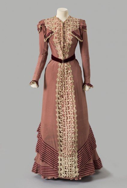
This week’s Rate the Dress is an excellent example of fashions from the last years of the Victorian era.
Albany Institute of History and Art 1980.2.2ab
The huge sleeves of the early 1890s have disappeared, replaced by a slight puff and a bit of shoulder decoration. The silhouette here is trim and streamlined (at least as streamlined as the 19th century got) with just a suggestion of the slight fullness that will later become the Edwardian pigeon breast.

Albany Institute of History and Art 1980.2.2ab
The dusky rose that forms the main body of the dress is trimmed with two kinds of lace, and dark pink-red silk velvet.

Albany Institute of History and Art 1980.2.2ab
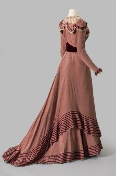
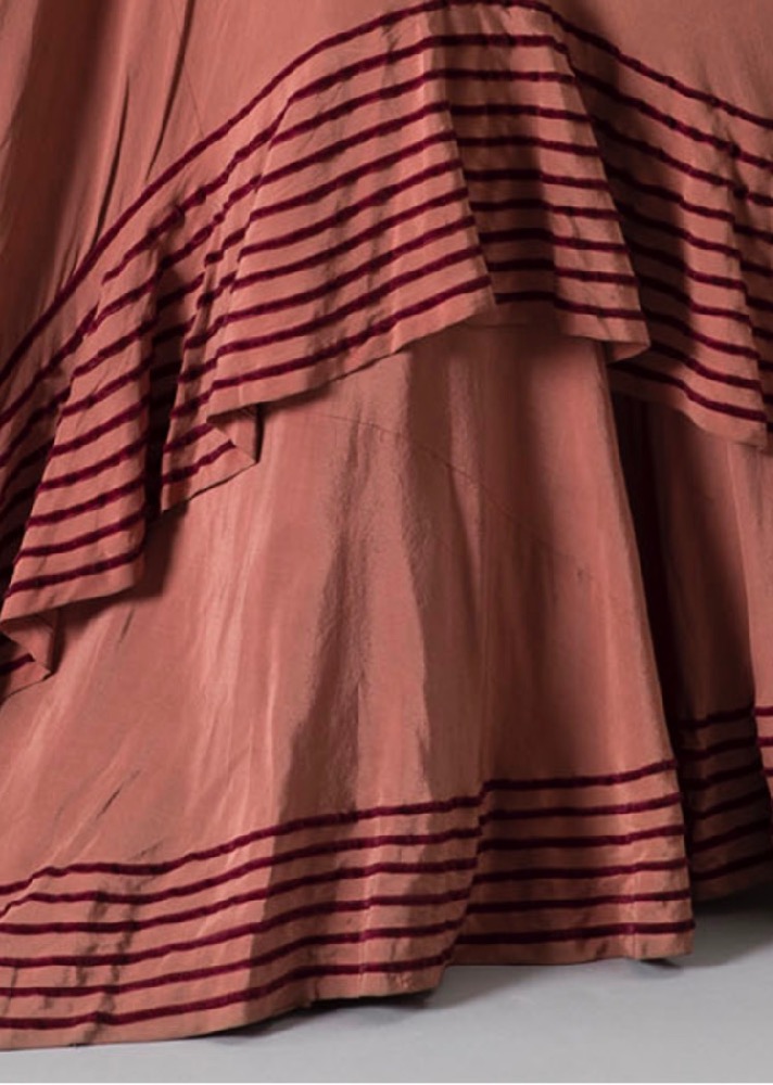
The velvet is used a decorative belt around the waist. Narrow ribbons of it form stripes which follow the collar (or is it technically a yoke ruffle?), sleeve caps, and layers of the skirt, highlighting the pick-ups of the collar, and the bias ruffles of the skirt.
Albany Institute of History and Art 1980.2.2ab
Albany Institute of History and Art 1980.2.2ab
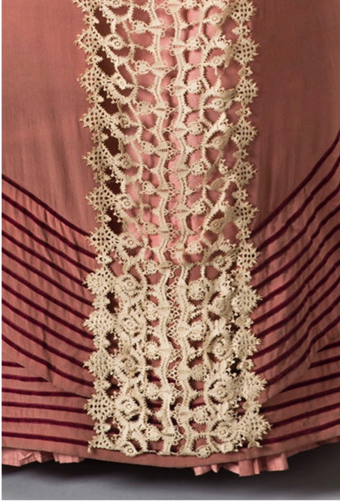
A line of heavy lace running down the front of the dress interrupts the velvet stripes, providing a vertical balance to the curves and horizontal lines.
Albany Institute of History and Art 1980.2.2ab
A lighter lace frames the collar/yoke ruffle/shoulder swag, and edges the wrist cuff.
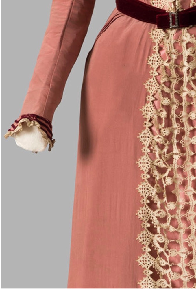
Albany Institute of History and Art 1980.2.2ab
What do you think? Is the dress an elegant example of its time? Do all the elements achieve balance?
Rate the Dress on a Scale of 1 to 10
A reminder about rating — feel free to be critical if you don’t like a thing, but make sure that your comments aren’t actually insulting to those who do like a garment. Phrase criticism as your opinion, rather than a flat fact. Our different tastes are what make Rate the Dress so interesting. It’s no fun when a comment implies that anyone who doesn’t agree with it, or who would wear a garment, is totally lacking in taste.
(as usual, nothing more complicated than a .5. I also hugely appreciate it if you only do one rating, and set it on a line at the very end of your comment

I find this quite lovely.
The color scheme is fresh, yet sophisticated.
I find the elements of decoration well-balanced and almost architecturally designed.
I also find the more natural silhouette of the era most appealing, as well as the sweep of the skirt.
10 of 10
Love the lines of this-the contrast trim at the edge of the skirt and sleeve cap detail really accentuates the architecture of the piece. It’s one where I really just want to nerd out over the pattern. I’m not super convinced on the lace- maybe because I’m a minimalist, or maybe because it reminds me of orange pith. The lace also makes the pleating a the center front of the bodice look clunky, although I do appreciate the contrast it creates in the back shoulder area. The colors are lovely, they remind me of some of the local rock formations in Arizona.
7.5/10.
I like the sweep and drape of the skirts. The velvet trim and belt are very nice. I don’t much care for the shape of the collar at the back, and I sincerely hope the lace has changed color, because I don’t like that at all. In general, this seems like a nice dress, but nothing that makes me think either “Wow!” or “Yuck!” 6/10
Is that belt adjustable? If so, I love it. The lines of this dress are lovely. Sleek with some swish. The stripes make me think of sailors and the beach, and the lace reminds me of underwater creatures. I like it all except the draping on the bodice. Odd placement. Otherwise, a solid contender.
8/10
I… it looks like mold. The rest of the dress is lovely, but the lace looks like mold. Also, what’s with those weird shoulder flap things?
4/10
I like the color and silhouette but have to agree with the comments regarding the “weird draping on the bust”. Besides looking odd, seems like it would get in the way when moving your arms.
8/10
This is an interesting dress. At first glance I thought it was rather simple compared to other styles of the Victorian era but looking closer, there is a lot going on. Not being a fan of the Edwardian pigeon breast look, I love the tucks at the waist of this dress and the resulting shape. I love the burgundy stripe details and the belt. I particularly appreciate the perfect amount of ‘flounce’ on the layer at the front. I am rather fond of this shade of pink too. Then the back! Oh la la! The shaping of the belt, the ‘doily’ yoke and the silhouette of the shoulders. Yes, this is very nice indeed. I’d have liked it more if there had been more burgundy stripes down the front instead of the full length ‘doily’ but one makes allowances for the period.
9 out of 10 from me. Thank you for sharing.
I ADORE this dress! I love everything about it..the color, the trims, the draping. I would wear this dress! 10/10. I think I might save this post and try to re create this lovely at a later time.
Not my favorite color combination. Although I like what the burgundy stripes and belt do for the gown, I think that color too harsh. The lace, although beautiful, disrupts the line of the dress. I also don’t like the bat wings under the arms. But that sweep of skirt and all those lovely pleats save it for me. 8/10
You’re right. If the velvet was a darker shade of the that colour it would be prettier. Less stripey.
I like the lines but I just can’t get behind the lace. It just feels too heavy to me.
8/10
Hate the lace down the front but love the dress.
8/10
The bosom collar triangles seem very oddly placed, but I’m actually rather pleasantly surprised that I like it. The shape of the skirt/train and belt is just lovely, and the back pleating is rather satisfying. I’m not sure what happens to the lace at the waist – it looks a bit crushed as it is shown, it would probably be improved by narrowing/shaping the lace itself rather than pleating it in which adds visual bulk, I think. The more I look at the details of the lace (yet another string to my bow, a vague inclination towards lacemaking) the more pleased I am to find a new swirl here, a different stitch/shape there. Colour, however, not so much of a fan.
7
I badly want to like it because there are those elements of the very end of Victorian fashion I like.
But… I can’t bring myself to like that lace. It looks… seaweedy? to me. If it was just at the neckline, I would quite like it, but the way it creeps down the whole front, I don’t like that.
Maybe precisely because it’s anticipating the elements of Edwardian fashion I’m not all that keen on?
Whatever the reason:
7/10
I love this dress. I would definitely wear it. The cut is elegant, the collar is cute. I like the colour of the lace, I think it works nicely with the pink colour scheme.
10/10
I love the bodice tucks and love love love the sweep and trim of the skirt, especially how the hems are highlighted. I like the color of the dress, though it wouldn’t complement my coloring and therefore has never been among my true favorites. I agree that the front bust flap is a little weird, but I like how the idea was executed on the sleeves and back. My biggest problem is the wide lace on the center front and shoulders, which I think looks chunky, too wide, and generally out of proportion. I probably wouldn’t choose to put any strip of lace running straight down the center like that, but something finer could have balanced better at least. I agree with a previous comment that more velvet striping at CF would have felt more attractive and harmonious to me.
7/10
Beautiful, love everything about it, just would want a bit more flare to the skirt, but that’s me.
10, no question
I don’t like the lace, at all. Shape of the applique, texture of it, the cloth under it, everything strikes me as wrong.
6/10
Trying once more…
In short, I agree with Hana and Kathy Hanyok. The lace makes an otherwise nice dress ugly.
5.5 out of 10
I love it all! The colour is lovely, the lace makes it very dressy, the whole silhouette is gorgeous. 10/10.
I don’t really get this dress. It looks to me like it really makes an effort to please and…fails…sadly. It‘s at the same time too much and too little. Like it wants to be special and then backs off half way into timid modesty.Some elements in the close-up picture are actually rather nice like the pleated side panels of the bodice.So there are refined elements, yet as a whole the dress isn’t looking refined to me, because the proportions are wrong. The way the lace is just attached to the skirt looks too basic. No movement. Also this collar gimmick looks unfinished. Maybe if there was some sophisticated embellishment on top of each side it could help to make it less obviously like: „ “ah how sassy, she did attach the collar to the side bust“ . But the basic problem with this is that the proportions don‘t work for the dress as a whole. I‘d simplify it radically. Then it could make at least a cute house dress. 5/10
nope. huh-uh. nononono. i just don’t like anything about this frock. the colour is so reminiscent of pepto-bismol tummy remedy, and the burgundy trim does not go with it at all in my book. i do not care for the odd bits of embellishment that protrude over the breasts. i do like the odd, undifferentiated waterfall of lace spilling alllllllll the way down the front. i think the overskirt is graceless in some way i cannot define, and there is nothing about it that attracts me. it’s not that i don’t care for victorian styles; there are many victorian ensembles that i think are lovely. this doesn’t happen to be one of them.
rating: 2/10
edit: do NOT like the lace waterfall. can’t type, apparently…
This one doesn’t really do it for me. The proportions are off somehow. I also don’t like any of the lace and I don’t know what to think of the flappy shoulder things! On the positive side, The colors would be nice at Christmas, it’s somewhat “sugarplum-my”. The belt, velvet band trimming, and pleats at the bodice are lovely as is the sweep of the skirt. The side view is much better than the front.
5.5
Beautiful! The silhouette of those transitional years between Victorian and Edwardian is one of my favorites, particularly the graceful sweep of the skirts. The velvet is a lovely touch and I think the lace is gorgeous, although I agree with some commenters that carrying it ALL the way down the front was a bit too much. I’m going with “yoke” for the collar-thingy and I think it’s delightful. Perfectly representative of the fashion of the day.
9/10
Oo. It should be quite pretty but it don’t find it is.
The pleats on the bodice are really neat and I would like to get a really good look at them. The shape of the sleeves and neckline please me. I like the colour scheme in the more vibrant pictures. I wonder which is the true colour of the dress?
I don’t know if I like much else. Its a bit blah and then there are little details I don’t appreciate like the velvet stripe trim, the odd back details, the lace bunched in at the waist, those weird little flappy things on the front that make it look like a wardrobe malfunction is in progress.
Sorry dress, I know someone went to a lot of work to make you but I just can’t love you the way you deserve. 5/10
Oh this is lovely. Love the pleats and the trim. Had a good long think about the lace and decided it works – going all the way down elongates the silhouette and I think it would have looked odd and chopped off if it had ended above the flounces. Beautifully made too.
10/10
I am maybe the only person here who likes the lace! But I really dislike the flappy bits that look like your armpit dress shields are trying to get away.
A generous 8/10 (more like a 7.5)